29 December 2016

Link roundup for December 2016

Who else got a Christmas present delivered in poster-styled gift wrapping?


Hat tip to Shit Academics Say.

Sometimes we have a best poster of the month, but this is probably the first nominee for best poster tube (click to enlarge):


Hat tip to Ashley Cambell for discovering the whiskey tube scientist. From a geology meeting. Naturally.

Post of the month for December goes to Scott Cole, who analyzed the attendance at 2,579 posters at Neuroscience.


It is disappointing to learn 17% of posters had nobody at them. But if you ever have more than two people at your poster, you’re in the top half! Hat tip to Adam Calhoun.

Your title is the headline for your poster. This article looks at how headlines matter like never before, particularly online.

(E)ven with the best-crafted headline in the world, for every person who clicks on it, there are hundreds, if not thousands, who see it, digest it, and simply move on. People get their news from headlines now in a way they never did in the past, just because they see so many of those headlines on Twitter and Facebook.

People are used to getting news from headlines. Pay attention to your title. Your title is 90% of your poster.

Julie Lee has several poster viewing tips she learned from her first Neuroscience meeting.

Posters > Talks

I was repeatedly told this by SfN veterans and I’m glad I listened. The few talks I went to (that were directly incredibly relevant) were fairly useful but I definitely got more out of interacting with poster presenters. Also, for presenting, I would almost unreservedly give a poster for the longer interaction it offers with attendees (five minute Q&A vs. Four. Whole. Hours.).
  • Keep your eyes open. Due to the aforementioned advice, I ended up getting more free time than anticipated, and was able to randomly wander around quite a few times. The most interesting things I saw at the conference were often not planned. A few times I ended up double-taking because the poster I just walked past was being presented by authors of papers I’ve used as inspiration for my work or read because they were doing very similar things. Additionally I ended up walking past some very interesting work that may not be relevant but were still cool to learn about.
  • Budget for only a few posters per session. For me, 3-5 posters per session was the sweet spot for really getting the time to engage with posters (15-30 minutes each). However …
  • Keep a back-up list. In case the posters are busy or withdrawn, or maybe turn out to be less interesting than you anticipated, save a list of 5-10 others of secondary interests or friends if you get the time (which I did, frequently).
  • Priority label your itinerary. With the above said, it’s super useful (if you’re over-organised like me) to label your posters by priority (you can export your itinerary to google calendar!). Sounds like overkill but this gave me a quick way to see how many posters were essential per session and ration my time accordingly. Perhaps most importantly, it also let me (once) see which morning I could give a miss after a late night..

Head scratch of the month goes to Magda Havas, who convinced editors to use this figure as a graphic abstract to a journal article:


Hat tip to Neuroskeptic.

In the last few weeks, “fake news” has been the topic of much discussion. Part of the issue is that design decisions are taken away:

Over centuries, print media developed a visual language of credibility that became second nature to most readers: crisp type and clean, uninterrupted columns communicate integrity, while exaggerated images, messy layouts, and goofy text inspire doubt. On a physical newsstand, it’s still easy to tell the National Enquirer from, say, The Atlantic Online, it’s becoming increasingly difficult to differentiate between the two. ...

Over the last several years, upscale publishers that don’t draw a large percentage of revenue from banner display advertising, like Medium and Vice News, have embraced an extreme minimalist style that features text and blank white space above all else — the better to differentiate themselves from the noise of fake news and chum boxes. This visual austerity is the new mark of an upscale publisher.

Yet questionable outlets are starting to adopt these very same aesthetics of reliability, albeit on a delay of several years. Sites like Civic Tribune and the satirical National Report look no worse than The Huffington Post or Drudge Report, which are seen as legitimate publishers, more or less. Some, like the semi-satirical Real News Right Now, have even echoed the clean, gridded layout and decisive typography of sites like Digg and the defunct Atlantic Wire, an aesthetic that once suggested value-added aggregation.

Hat tip to Ellen Lupton.

This segues nicely into a look at the importance of the low design of the Trump campaign hat. Designer Matt Ipcar is quoted:

It was easy for me, as a Brooklyn-born creative director, to describe the hat as bad design. But the hat was worn. It was simple, unisex, familiar, and practical during a summer of hot crowded rallies throughout the South. Design-wise, it was lazy and loud, but also deceptively brand-aware and unmistakably Trump—a brash and calculated brand extension for a house whose luxury properties are awash in Gotham, understated bling, and lots of white space.

Another thank you to Ellen Lupton.

Ann Emery shares six ideas for displaying quantitative data in a more visual way, including putting faces with quotes and icons with text. Hat tip to Katy Kennedy.

And that, my friends, is that for 2016. Here’s a picture that reflects what many of us think of 2016:

 Hat tip to Hilda Bastian.

23 December 2016

Critique: Water balance

Today’s poster is up a little late because the contributor asked that it be shown after the conference ended, and totally not because of bad time management on my part. That’s my story and I’m sticking to it.

Anjuli Figueroa just got done preseninting this poster at the annual American Geophysical Union fall meeting. Click to enlarge version 1!


My first reaction was, “This poster looks like it’s yelling.”

I wanted the typography to calm down a bit! There are multiple fonts, multiple sizes, multiple methods of emphasis (size, colour, bullets). I suggested trying to pare down the number of styles, and using sentences instead of bullet lists. Similarly, the headings are big enough that underlining for emphasis was not needed and just contributed to making the poster look “shouty.”

Another thing made the poster feel loud is that lots of things are pushed right to the edges of space.

  • The maps in section 4 are almost crowding out of the box they’re in.
  • The text in section 2 feels like it’s crushing the globe underneath it.
  • The title is ramming into the poster number divider.

More white space would calm the poster, so I recommended using blank space to divide the poster instead of lines.

The biggest request, though, was probably to fix the, “1, 2, 3, 5, 4” reading order. It was just  frustrating. I suggested breaking section 4 apart, and putting the top half where 5 was, and the bottom half of 4 where top half of 4 was.

Anjuli sent back version two:


I thought this was already much improved, but that it could go even further. I’m not a fan of underlining, and have rarely found reason to use it. Here, it drew attention to inconsistencies like whether spaces or punctuation marks were underlined.

Similarly, using bold plus red for the key results still seems like “crushing a walnut with a sledgehammer” emphasis.

Version number three was the one that hung on the conference posterboard:


I hope the conference goers were happier to see version three on that board than version one!

18 December 2016

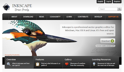
No more slidesters, part 7: Inkscape

Inkscape is a free software that creates vector-based illustrations. As such, it’s the freeware answer to Adobe Illustrator and CorelDRAW.

Inkscape has been on my radar for some time, but I hadn’t had a chance to sit down and use it seriously until the second #SciFund poster class earlier this year. We had used Adobe Illustrator in round one of the class, but this year, we decided to let people try Inkscape in case they didn’t have access to Illustrator.

At one point, I had read that Inkscape followed some of the same conventions as CoredlDRAW rather than Illustrator. I’ve used CorelDRAW for a long time, so I expected to be able to pick up Inkscape quite quickly. This was about 50% right.

Drawing was reasonably straightforward. Making objects and layering was much like I had encountered in other programs. Making a grid was not intuitive, but I chalked that up to unfamiliarity and interference from previously learned software.

It was working with text that drove me nuts. On posters, you often have to work with paragraphs of text, so this was a major sticking point. In most graphics programs, you put text into a text box. In PowerPoint, there can be a lot of automatic resizing to make the text or box fit. In CorelDRAW, you can opt for “paragraph text” that fits inside a box you define.

In Inkscape, a regular text object forms a single line. A paragraph will make for a long line. You can put that text into a box, but the text and the shape are always two separate things. You have to create your text, create your shape, then flow the text into that shape.

Inkscape allows you to have text fit into any shape you choose, which seems quite powerful on the surface. But I was constantly struggling to have my text appear how I wanted it. Resizing the shape didn’t always treat the text in the way I expected, leading to weird placements. Rather than moving or resizing shapes, I would draw a new shape, cut the text out of the old one, then place the text into the new shape.

When you look at the Inkscape gallery, it’s clear you can get some fantastic results from this program. But when you look at the examples, you’ll notice very few of them have much text.

My experience with Inkscape makes me unlikely to use it again for posters in the near future. Microsoft Publisher remains my software tool of choice, hitting the sweet spot between power and ease of use.

Update: Luke on Twitter said:

Inkscape does have text boxes though – created by click and dragging the text tool. Resizing is trivial then!

I will look again, but still. I cannot figure out why I was fighting so much.

Related posts
No more slidesters, part 1: The wrong tool for the job
No more slidesters, part 3: Draw in the open
No more slidesters, part 4: Memory whiplash with Poster 8
No more slidesters, part 5: The specialist, PosterGenius 1.5
No more slidesters, part 6: Publisher 2010’s fall from grace
Text wrapping in Publisher, or, “Why are you still using PowerPoint for posters?”

External links

Inkscape
Inkscape manual

08 December 2016

Critique: Epigenome reorganization

Today’s poster comes from Corey Duke. His Neuroscience poster got lots of love when he posted it on Twitter. (In flagrant violation of Neuroscience meeting rules, I expect.) Click to enlarge!


Corey generously shared a lot of commentary on creating this poster. He wrote:

In the work we present here, we put a great deal of thought into determining exactly what stories we wanted to highlight. When dealing with large data sets, there is a delicate balancing act in trying not to overwhelm or detract from the larger broader story lines, while still presenting the interesting findings that are more “in the weeds”. With audiences at meetings like Neuroscience being so broad in background and knowledge, our general goal with this poster was to strike that balance, to give brief captivating broad overview presentations, particularly to those less familiar with the field, while still presenting the more detailed findings that experts would perhaps find most interesting. Although it is overwhelming at first glance, I believe we were able to achieve that here, and in a way that we found alluring.

With all of that in mind, we chose to build the poster around the large circular plot we present in the middle (a circos plot), which shows the specific location of the genomic changes we were interested in across the genome. We wanted to blow it up to emphasize just how robust the changes we observed were, and to highlight some of the interesting analyses we performed in the middle of the circos plot. Because it was so large, we were able to add quite a bit of detail and make it intricate without fear of it being too small to read or pick out. It also became quite fun, as attendees could search for genes they knew out of the ones we highlight in the middle, and follow them down to the bubbles to learn about what they were doing. This was much more captivating than for instance presenting gene lists in a table, etc. Although I’m not always a fan, once we tried the plot on it we fell in love and had to go for the solid black background.

In general, I avoid posters that are walls of text, and we tried to minimize it here. Because we didn’t have much of it here though, aspects of the poster would have been difficult to understand were I not there to present it. I really like our methods section diagram, as it was simple, straightforward, and easy to understand and refer back to as I presented, which really helped to keep the larger picture in mind as I went through our results. I also think all the circular data presentations go beautifully together. We had another earlier version of this poster where all of the data is represented through circular plots, and the way it all came together was stunning. In the end, we elected to swap that out for the plots on the right side though, as we thought that told a few more interesting arcs than the circles.

We made the plots using several software programs and several of our own lines of code, but we put it all together in Adobe Illustrator. Overall, we’re very happy with how the poster turned, and everyone seemed to love it. I had 3 different run-throughs depending on the audience: 2 mins, 5-6 mins, and 10 mins. I think being able to cater the presentation so readily to the audience’s interest, background, and attention span was appreciated by all, and allowed for many people to be drawn in who were from different backgrounds. Because the poster was so aesthetically pleasing, we drew quite large crowds at Neuroscience. When you devote so much effort to the science, it’s unjust not to devote yourself to the presentation as well.

Hat tip to Caitlin Vander Weele.

01 December 2016

“Eye protein”: Lessons from giant monster movies


I recently got the chance to rewatch one of my favourite movies of the last few years on Blu-ray: Pacific Rim. It has a fantastic commentary track by director Guillermo del Toro. There is a lot of interesting stuff in the commentary (for a film buff like me, at least), but I was particularly struck by how well he articulated some points I try to get across on this blog all the time.

1. Design is all about making choices. When you listen to the commentary, you soon realize that nothing on the screen – nothing – is there by accident. Everything is a the result of a careful, deliberative process (my emphasis).

We designed everything in this movie and patches in the shirt and uniforms. We designed the banners, badges, all the advisory and doors. We designed the Jaegers to the minimum details. You know, we designed the Jaegers so that if you zoom in into the controls, you would see electrical discharge warnings. You would see ladders; you would see places where you would connect. Engineering this amount of detail mechanically, the amount of detail in design is staggering. We spent about a year texturing this world. And the accumulation of that mosaic of details design-wide gives you the sense of a real world.

People think that world creation, movie, for example, is big gestures. But it is not. It is all these small details. Look at the markings; look at the vehicles that open the doors; look at the banners and this marking, the crawlers that move the robots. Everything is full of detail. We design these. Look at the bomber art on the chest. Gipsy Danger, this robot is designed to resemble a war plane from WWII.


So we have big riveting; we have the majestic lines of article building in New York. We gave the gait of a gunslinger of western fighter. Each of the robots has a personality and Gipsy has that strong personality of gunslinger out of a duel, sort of John Wayne gait.

2. Design isn’t about making this look pretty. Too often, design is derided, particularly by academics: “Serious people care about the content, and don’t care about eye candy.” I love del Toro’s riposte (my emphasis):

It is very important for me to not just design for design, not to create eye candy but to create eye protein. Because I think that 50 per cent of the narrative of a film is submerged in the audiovisual details. And you are not doing this for doing this just because it looks cool. You are actually doing it for a narrative reason.


It is important, for example, to see the two brothers are in white. And we are going to stain this white with a color that I am very careful to use in my design, sparingly, which is red. Red is very fundamental in this film to be used carefully as I will explain it later. It becomes vital for the story of another character. And basically it is going to symbolizing the way of life.

So we stain the white suit of the pilot with red. It is fundamental, it is very dramatic moment. ...

Everything is telling you the story. They are not just aesthetic choices, they are narrative choices. For example, look at this sequence [Fight between Gipsy Danger and Knifehead - ZF], and you realize that it is not lit like a normal movie sequence where everything has fill light and key light. It is mostly lit with the light of the Jaeger lighting the kaiju. Listen to the sound track, there is no music. Look at the way we are, just when the light of the Jaeger hit the kaiju, you see the kaiju. But if you don’t, you are almost in the darkness. We break the line of the water. We stain the lens with water. We deliberately put “mistakes” into shots that are very expensive and very elaborate. Why? Because it is (not only) an aesthetic choice, but also a narrative choice.


I don’t want to make the narrative, regular narrative CG movie that every shot looks super cool. I want to get in the way. I want to give you reality. Stain the lens with water, have error on the operation of the camera, make the images obscured by water, by fog, by… later in the movie, obscured by the compensation in the lens.

And del Toto gets all these points in during the opening scenes, before the title of the movie even appears on screen! del Toro has the advantage of working with a team of creative people to help him realize his vision. But your advantage is that you’re just making a single poster, not a two hour movie. You can use some of the same principles that del Toro does.

External links

Pacific Rim Director’s Commentary by Guillermo del Toro

24 November 2016

Link roundup for November 2016


The posters up for the National Science Foundation’s annual Vizzie awards make for an interesting gallery. Some nice work there! Vote for your favourite!


Every panel in the figure above shows the same data. It’s a nice example of the choices you have to make in the design process, from Rousselet and colleagues. They are also the latest to fire salvos against bar graphs, with neuroscience being their main target:

Unfortunately, graphical representations in many scientific journals, including neuroscience journals, tend to hide underlying distributions, with their excessive use of line and bar graphs.


Your colleagues in Human Resources are making posters, too. Check this guide for making posters for Human Resources procedures.

I disagree with the final advice of, “Start with a template,” though. To me, that leaves too many decisions in the hands of other people, and they may not be good ones. How many below par PowerPoint decks have we sat through because people just grabbed whatever template was there?

Hat tip to Sarah McGuire.

I’ve been on a social media diet, so I don’t have as many poster related goods from Neuroscience 2016 as I sometimes do. But:

Fabric posters still don’t look as sharp as paper, according to Anne Martin:

I’ve yet to see a fabric poster that isn’t fairly wrinkled.

 Elizabeth Sandquist gave us this haunting image of a poster graveyard:

17 November 2016

Critique: Making enzymes

Today’s contribution come from Ian Haydon, who is kind enough to share it with us. Click to enlarge!


Ian writes:

The attached poster won best in show at my departmental retreat last week. I think why this took best poster was that two of the judges commented that I “told a nice story” (at least when I talked them through the poster, not clear it's as evident as a static document)

I designed the entire thing in Google Slides.

I think that makes Ian’s poster a first. I don’t think I have ever shown a poster made in Google Slides on the blog before. Ian wrote:

I love Google’s web apps. I make all my presentations in Slides and use Docs for all word processing so I’m quite comfortable with the controls. They offer all the essential features I’d use in fuller apps like Powerpoint/Keynote/Word, plus they cut out all the junk fonts and themes that I’d never use anyway. The ability to access all my media from any device is a huge plus. The collaboration tools are also top notch. I shared this poster with labmates in comment-only mode to get feedback before printing, for example. And Google apps never crash on me.

The only trick to using Google Slides to make a poster in is setting up the slide size. File > Page Setup > Custom. This should be done before you do any work, because changing it later will cause everything to scale to the new slide size.

Once I am happy with the final poster design, I save it as a giant PDF and print that.

This poster is built on a solid foundation. It’s a three column layout with a clear reading order, and everything is big enough that it can easily pass the “arm’s length” test. The colours are consistent and relaxed.

I appreciate that the institutional affiliations in the title bar are widely spaced. That makes it easy to match the subscript behind the author’s name with the institution.

My main concern is with the amount of white space on this page. Everything fits. Nothing is touching, but nothing feels comfortable, either. It feels like:


For comparison, standard letter paper (8½ × 11”) usually has about a one inch margin. If this poster is shrunk down to about that size, 7½ × 10”, the margins would be something like an eighth of an inch. When we are so used to seeing documents with larger margins, tiny margins look weird, no matter how well organized everything is within them. I would try shrinking major elements of the poster by 90-95% to provide those wider margins.

I’m never a big fan of logos bookending the title. But the title here is short, at least, so the logos are not chewing up room the title needs. But my objection to having the logos in the title is compounded a bit by the right one, the stylized “P,” being repeated down in the right corner. Putting two logos down in the corner doesn’t quite work. First, one is left aligned, while the other is centered, creating some visual tension between them. Worse, the two don’t line up:


Some of the colours used to highlight phrases in the text are a bit cryptic. The colours seem to be referring to elements in adjacent images, but I’m always not sure how. In the example below, the highlighted gold text refers to “missing side chains,” but the yellow in the diagram below (the closest visual match) seems to show alpha helices that are present, not side chains that are missing.


This may reflect my own ignorance more than it represents a design flaw, however.

10 November 2016

Critique: Establishing axons

Today’s contribution was tweeted out by Christopher Leterrier. Click to enlarge!


This poster promptly attracted compliments, and Christopher asked for my take.

This poster has one obstacle standing between it and total victory: it is dense.

This poster was made for the massive Society for Neuroscience meeting. With attendance usually around 30,000, people at that conference are already coping with information overload. Unless someone is already very interested in axons, she or he is unlikely to stop at a poster with 108 micrographs and 25 bar graphs (I counted).

That said, this poster convinces me that anyone who does stop to talk to the author will be rewarded. It’s clear that Christopher put a lot of thought into organizing this.

The layout is clear. All the data sections are structured exactly the same way, so that once you understand one, you should be able to follow them all.

Each section has a clear take home message. The one exception is one that Christopher himself identified:

Now that I look at it, “Conclusion and Perspectives” is wrong. Obvious title and zero specific info!

I agree with that self-assessment. Positive statements win over generic headings!

Looking at this poster shrunk down at thumbnail size, the poster number in the upper right is a shade too big. It’s bigger and more prominent than the title, and I generally argue that nothing should compete with the title. That said, this problem is not a bad one, because the poster number is well separated from the title, and the title is large and easily read.

This poster tries to fit an entire manuscript on to a single piece of paper. I do not recommend that as a strategy for a poster. But, given that decision to put all that information on the page, this poster solved the problem probably as well as it could be solved.

03 November 2016

Critique: Catalyst judging

Today’s contributor is Luca Biasolo, who gave me permission to show this:


This poster has more ambition and design sense than probably 90% of the posters I see at conferences.

I like that Luca committed to the green colour scheme, but I almost want a little more variation in colour. There is a little red and blue in the figures, so I wonder if those could be used someplace else in the poster, like the numbers in the headings. Maybe even some lighter or darker shades of green would break it up a little more. I’m not sure if I’m right on this; maybe it should stay the way it is. Luca wrote:

I’ve tried few colors more but it was a bit confusing. Maybe I haven't choosen them right ones or I mixed them to much. You are free to try. ;)

My major in looking at this poster was whether the numbers in the headings reflected the intended order? Luca replied that yes, that was the intention. That is, the reader is supposed to go around the poster clockwise:


My reaction to this might be summed up thus:


I think the idea is that because the central image is a cycle, the rest of the poster should also follow the path of that cycle. I think that’s going a bit too far. That might work if that central cycle was much bigger and more dominant part of the poster, but it isn’t. So the cycling around just seems out of place.

In fairness, I do think that the use of numbered headings here is appropriate. If you are going to deviate from the expected reading order, I do appreciate that you warned me about it.

27 October 2016

Link roundup for October 2016


Contrast matters, and web page designers are starting to forget that. Kevin Marks delves into how grey text is becoming so prominent on the web. Marks notes something I’ve talked about before: the difference between the screen and a poster handing on a wall.

(W)hen you design in perfect settings, with big, contrast-rich monitors, you blind yourself to users. To arbitrarily throw away contrast based on a fashion that “looks good on my perfect screen in my perfectly lit office” is abdicating designers’ responsibilities to the very people for whom they are designing.

Hat tip to Robert J. Sawyer.

It’s great when you have a lab to go to a conference with. But not everyone has a lab. Here are tips for how to rock a conference solo.

An occasional reminder that if your poster hangs for several days, create opportunities for people to give feedback when you are not there:


Hat tip to Ciera Martinez.

Stephen Heard is unimpressed with most conference badges. This led me to another discussion of badge shortcomings, both of which reminded me of an older article on conference badges in American Scientist (paywalled).

20 October 2016

Critique: Catching a DRAGON

Today’s poster is from Athanasios Psaltis, in my old stomping grounds in in Canada (McMaster University, to be exact). This poster was shown at a school on “Origin of nuclei in the universe,” and appears here with his permission. Click to enlarge!


I appreciated immediately was that I could read everything on this poster, even shrunk down on the computer screen. You only have to go back a week on this blog to see that this doesn’t always happen.

The mix of red, or bold, or red and bold for emphasis would be better replaced with just one style. I liked the use of red bolding for emphasis on the left introductory material, and wish it was carried over on the right side (e.g., “transmission” and “efficiency” in the “Testing the DRAGON” section). Athanasios agreed.

The bullet points in the introduction are adding space, but not much clarity, at least for me. The “1, 2, 3” numbering under “Wanajo” works, though, and I would leave that.

Dashes or hyphens should have spaces on both sides, or neither. Seeing spaces on only one side of the dash in the pointers to the figures (e.g., “Figure 1- Right”) is making me crazy in an obsessive type nerd way.

The ticks in the Figure 1 graphs are a bit obtrusive. I understand log scales need a lot of ticks, but they don’t need to be protruding so far into the graph. They could be shorter. I would try removing the top and right axes, too. Or, if the top and right lines stay, remove the tick marks.

13 October 2016

Critique: Cubic slip-systems

Today’s poster is from Danyel Cavasoz. Now, although I live in a region with a large Hispanic population, my Spanish is pretty bad. But based on the arXiv notice in his poster, I am reasonably confident this is a physics poster. Alas, my physics is also bad, since I’m not sure what a “cubic slip-system” is. He’s been kind enough to give permission to share this. Click to enlarge!


I love the individual graphics here. They evoke the feel of being hand drawn, but are never sloppy.

The muted colours all work well together. The darker background allows some of the red and blue in those diagrams to stand out.

My major concern is the main text. When I see the poster at a small size, like the thumbnail here on the blog, the text is almost unreadable. There are three things contributing here. The first is whether the background is dark enough to make white text stand out. The second is the point size of the text (it’s 22 point, according to Danyel). The third is a bit more subtle.

Danyel used Century Gothic. This geometric typeface has very even strokes and similar shapes throughout, which is making it hard to distinguish letter shapes. Let’s have a closer look at it:


Notice how many letters are based on an almost identical circle? The a, c, d, e, g, o, p, and q: that’s eight letters, almost a third of the alphabet, built on the same shape. By comparison, let’s look at another famous geometric sans serif, Futura:


The round letters are similar, but not as much as in the one above. You can see the line width varying, such as where the round parts meet the descenders in p and g.

When you move into a serif font like Sitka, you see the letters are even less similar:


By the way, “Quack Beep God” is the name of my new indie band.

Danyel wrote:

I can safely say that one can read it standing 2 m away from it. Now that I think about it, the light gray might be too light indeed for a room illuminated under a very white light.

    07 October 2016

    Critique: On spec(trographic)

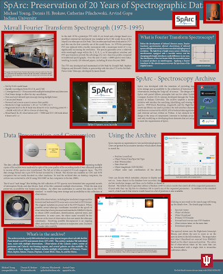
    Today’s contribution come from Michael Young. This will be shown at this year’s Astronomical Data Analysis Software and Systems conference, but he’s given me permission to show you as preview. Click to enlarge!


    Because the poster is intended to show off the website, it features near the middle of the poster, which is appropriate placement.

    Michael’s own assessment of the poster is that despite much editing, it is still too wordy. I agree, but the good news is that the typography is clean and understandable, apart from a tenuous touch of the institution name with the title bar. The descender on the “y” in “University” is killing me.

    I also the colour combination of blues and tans. It’s consistent throughout. The blues provides a good contrast to the logo, appropriately situated out of the way, unobtrusive and quiet.

    The underlying structure of this portrait style poster is a solid two row grid:


    I might have preferred a little more space between the rows to separate them, but the space between each row is not the biggest problem here. You might not notice the simple two row layout because of the placement of everything in those rows. Let’s highlight the pictures and sidebars:


    Just to make it a little more obvious, here’s the position of all those elements without the distraction of the poster contents:


    Now it looks just a bit like a Mondrian painting.

    The point, though, is to highlight that there’s no underlying plan for those pictures. Almost no two are the same size. They’re only aligned if they happen to be along the poster’s edge.

    Consequently, the reading order of the poster, while clear (thanks to the underlying two row grid), is circuitous. You have to wind and wend your way around all those pictures.


    What might have helped this poster is a stronger secondary grid. How is the row going to be divided? Could it be quartered, or otherwise sectioned into smaller pieces?

    Related posts

    Avoid the tenuous touch

    29 September 2016

    Link roundup for September 2016

    Quote of the month:

    A conference poster should be readable in 3 minutes, from 3 metres away, after 3 beers.

    The tweet is from Torsten Seemann, but It think he’s quoting Matthew Wakefield.

    Michael Skvarla has a nominee for the best poster title of this year’s International Congress of Entomology:


    Hat top to Megan Lynch.

    “There is  no substitute for a scatterplot, at least for relatively small sample sizes.” Also, stop plotting standard error of the mean (SEM).

    Conference organizers, watch out for bias.

    I’m not sure if I’ve linked to the Junk Charts blog before on this blog, but here it is, just in case. I know I haven’t linked out to this list of five great design blogs, though. Hat tip to The Old Reader.

    24 September 2016

    Avoid the tenuous touch

    There are two good choices for placing objects on a page. You can separate them.


    Or you can overlap them.


    But it’s a bad option is to have two objects almost touching...


    Or just barely touching.


    Of course, it can be worse. Having sharp edges and round edges almost touching creates a discomfort to your eyes that you can almost feel. You’re just waiting for the balloon to pop.


    You get the same effects with the rectangles you see more often on posters. Having objects very close, but with neither clear separation or overlap, feels much less comfortable


    Than clear overlap...


    Or distinct separation.


    Unless you are going for visual tension, make a choice. Split them apart or have one cover the other. Don’t have any tenuous touches. To sum up: