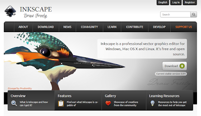
 Inkscape is a free software that creates vector-based illustrations. As such, it’s the freeware answer to Adobe Illustrator and CorelDRAW.
Inkscape has been on my radar for some time, but I hadn’t had a chance to sit down and use it seriously until the second #SciFund poster class earlier this year. We had used Adobe Illustrator in round one of the class, but this year, we decided to let people try Inkscape in case they didn’t have access to Illustrator.
At one point, I had read that Inkscape followed some of the same conventions as CoredlDRAW rather than Illustrator. I’ve used CorelDRAW for a long time, so I expected to be able to pick up Inkscape quite quickly. This was about 50% right.
Drawing was reasonably straightforward. Making objects and layering was much like I had encountered in other programs. Making a grid was not intuitive, but I chalked that up to unfamiliarity and interference from previously learned software.
It was working with text that drove me nuts. On posters, you often have to work with paragraphs of text, so this was a major sticking point. In most graphics programs, you put text into a text box. In PowerPoint, there can be a lot of automatic resizing to make the text or box fit. In CorelDRAW, you can opt for “paragraph text” that fits inside a box you define.
In Inkscape, a regular text object forms a single line. A paragraph will make for a long line. You can put that text into a box, but the text and the shape are always two separate things. You have to create your text, create your shape, then flow the text into that shape.
Inkscape allows you to have text fit into any shape you choose, which seems quite powerful on the surface. But I was constantly struggling to have my text appear how I wanted it. Resizing the shape didn’t always treat the text in the way I expected, leading to weird placements. Rather than moving or resizing shapes, I would draw a new shape, cut the text out of the old one, then place the text into the new shape.
When you look at the Inkscape gallery, it’s clear you can get some fantastic results from this program. But when you look at the examples, you’ll notice very few of them have much text.
My experience with Inkscape makes me unlikely to use it again for posters in the near future. Microsoft Publisher remains my software tool of choice, hitting the sweet spot between power and ease of use.
Update: Luke on Twitter said:
Inkscape does have text boxes though – created by click and dragging the text tool. Resizing is trivial then!
I will look again, but still. I cannot figure out why I was fighting so much.
Related posts
No more slidesters, part 1: The wrong tool for the job
No more slidesters, part 3: Draw in the open
No more slidesters, part 4: Memory whiplash with Poster 8
No more slidesters, part 5: The specialist, PosterGenius 1.5
No more slidesters, part 6: Publisher 2010’s fall from grace
Text wrapping in Publisher, or, “Why are you still using PowerPoint for posters?”
External links
Inkscape
Inkscape manual


2 comments:
Inkscape certainly does have text boxes, but the resizing thing is unintuitive. Rather than being able to treat the text box like any other box, you need to have clicked in the text with the text tool to make the resizing handle appear, and you use the text tool to resize it.
The blog is very interesting and will be much useful for us. thank you for sharing the blog with us. please keep on updating.
school logo design uk
Post a Comment