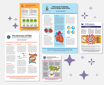
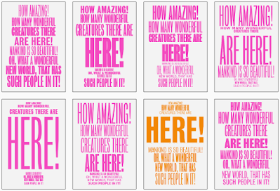
Animate Your Science has a gallery of four excellent conference posters. They even go so far as to call them the “best” posters! The post has a nice little evaluation checklist:
- First impression
- Title
- Colour scheme
- Layout
- Figures
- Other features of note
- What could be improved?
One of the posters, by René Campbell, was recently featured in one of the link round-ups on this blog. I’m pretty sure I’ve seen Caterina Funghi’s poster somewhere, too!
• • • • •
Mind the Graph has released a poster making app!
I hope to have a review in the near future.
• • • • •
Echo Rivera reviews the Animate Your Science poster design class and brings in a few ideas of her own on poster design.
Echo specializes in slides, and her post talks a little about the similarities and differences of slide talks and posters.
Similarities: You need to storyboard that 💩!
Differences: One big blank canvas instead of a bunch of little ones.
But there’s more good points in her post!
• • • • •
Baker and Philips have a short paper in the Journal of Perioperative Practice about how to make conference posters. Excerpt:
Has anyone ever done this?Sometimes scientists will be asked to present their research to members of the public in a poster.
Hey, perioperative practice practitioners, send me your posters!
• • • • •
The last year, I’ve tried to get a handle on what people mean by “online posters,” “electronic posters,” and “digital posters.” But I think I would balk at calling an Instagram post a “poster.”
But maybe this paper about using Instagram to teach chemistry will change your mind.
• • • • •
Yet another study showing that conference talks are more likely to be published than conference posters. I don’t think I have ever seen a study (of which thee are many) where that has not been the case.
• • • • •
This graph purports to say something about crime, but the graph itself is a crime. Click to enlarge if you don’t see the problem.
Catch it yet?
Time on the X axis is running right to left, not left to right.
Hat tip to Oren Gur and Katie Mack.
• • • • •
A paper about automatic typesetting for “posters” (but really, short blocks of text).
The images above are found in the supplementary information. Interesting as proof of concept, maybe.
• • • • •
A PDF by Shanda Hunt about presenting research. This appears to be supporting documents for a webinar, but it stands alone.
• • • • •
Students love posters! At least according to the title of this article by Lamar and Sheperis, who asked students in counseling to make a conference-style poster presentation. The text of this short paper describes the exercises students did. The evidence of students loving the assignment is brief:
According to follow up surveys of the classes, the Virtual Research Conference Presentation assignment is loved by students because they get to be creative and explore a topic of interest to them.
Maybe this paper could have been a little longer?
• • • • •
Posters as student assignments are also described in this article by Tarigan and Listyani. This has more assessment of the outcomes, but for only three students and three teachers.
• • • • •
Li and colleagues describe how they organized an online conference in 2020. It includes this description of how they handled poster sessions.
The poster session provided an opportunity to experiment with GatherTown, which aims to approximate the experience of in-person interaction. GatherTown enables the building of 2D environments that can be designed to simulate a conference hall, complete with space to ‘hang’ posters. Delegates navigate around the space with an avatar [the happy default being a yellow-scarfed snowman] and can zoom in on posters they wish to see. A delegate’s video and mic are on at all times but only become visible and audible to other delegates when their avatars are physically near each other. Delegates could also search and message other delegates directly. The conference feedback suggested that delegates enjoyed this format of seeing posters.
Here is their figure for how that looked. Click to enlarge!
I tried a GatherTown demo. And oh my, but does it have some strong old school role-playing game vibes. It’s cute. But I’m not sure “cute” is the vibe I’d necessarily want for an academic conference.
• • • • •
Love this one-liner from Nancy Duarte:
We rely on data to tell us what has happened, and stories to tell us what it means.
The article she is linking out to, by Hanna Marcus, is also good examination of the relationship between data and empathy.
When writing about conference posters, I am acutely aware that I am often giving advice that is not data driven. And my people, fellow scientists and other academics, have been trained to be extremely data driven. So much so that long established conventions tend to get dismissed until someone “rediscovers” the practice by some experiment or other.
Data matters, but it is not the only thing. You need narrative. People need to know why your data matter.
• • • • •
That’s all for this month!


No comments:
Post a Comment