
Movie posters have very different goals than academic conference posters. But both increasingly have one thing in common: they have to fit a lot of contributors into a limited space.
Here’s a recent example. Click to enlarge!


In that space, we have:
- One studio.
- Three production companies.
- Five actors.
- One title.
- Six technical creators.
- Six producers.
- Five writers.
- Two directors.
- Three social media hashtags.
- Soundtrack availability.
- Sound system.
- One studio logo.
- One release date.
All of that is contained within just 12% of the poster. That's an efficient use of space.
Much of that efficiency is coming from the narrow typeface. This is a well established look for movie poster credits. The credit list on the classic poster for Jaws (1975) look very much like the one above.

Classic typefaces like Univers have a huge range of weights, down to skinny condensed fonts.

There are plenty of options, however, such as the descriptively named Tall Skinny Condensed, below. This one is a little less readable because lowercase letters are larger (technically, they have a larger x-height).

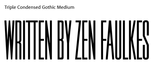
Triple Condensed Gothic Medium, below, has no lowercase options, which might not matter for some purposes. The movie poster above has few lowercase letters.

The movie credits also use space efficiently by making job descriptions about half the height of the name.

This is a trick that might be applied to institutional affiliations, which always try to chew up space on posters, especially where there are collaborations.

Meanwhile, if the same information on the movie poster was on an academic poster, it’d probably look something like this:

The “movie credit” style makes more sense than the “footnotes” style because it follows a basic principle of graphic design: keep related things together.
Another thing that is notable about movie posters is that the credits are normally at the bottom of the poster. Sure, the “big names” of the actors or director might be up at the top, but the full list is not.
This is another thing that academic posters might imitate, particularly for big collaborative projects. The poster presenter – the most relevant name – might be the only name up at the top, and the full list of contributors might be down along the bottom.
Related posts
External links
What font do they use for movie poster credits?
Hat tip to Mike Morrison for this prompt. (Movie credits are mentioned in one of his YouTube videos, “How to create a better research poster in less time (#BetterPoster generation 2)”.


No comments:
Post a Comment