I love seeing how people’s approaches to posters change over time. I am tickled we have a trio of posters from Nadav Ben-Assa. Click any of them to enlarge!
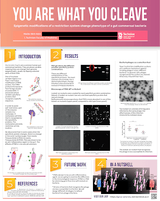
This first iteration is a clean, straightforward design that shows lots of good design decisions. There a clean columnar layout. The text and images are integrated. The margins are generous and have lots of white space.
The “In a nutshell” section has a few decisions that I might question. “In a nutshell” is clearly a summary box. The logical places to put a summary are the top left or bottom right. The sidebar in the bottom middle is okay. But I wonder if the sidebar is in that position “because it fit there,” rather then, “This is where it should go, so I’ll make it fit.”
There are some parts of the poster I would like to see more edges aligned.
Perhaps the main issue with this first iteration is that it doesn’t have a lot of personality. The title bar is a sort of unassuming brown. The sort of colour you might expect a 1970s kitchen to be.
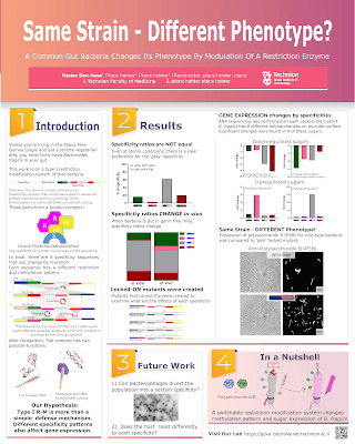
Version 2 of this project does not have that issue.
Right away, you can see so much more personality! The colour choices are more bold and frankly, more fun. The title has gone from a generic sans serif to a condensed typeface that is bigger and easier to read. The text and images are integrated in a more sophisticated way.
The is still one thing that immediately makes me twitchy. The use of numbers to signpost the reading order is excellent. However, it does draw attention to “5. References” down in the lower right corner. You travel from section “1” to section “4” easily, then... you have to throw the car in reverse and back up all the way to the other side of the poster. Because the poster is in portrait mode, the distance from corner to corner isn’t great, but it’s jarring to glance at the poster and see, “1, 2, 5, 3, 4.”
Just remove the number “5” and the problem goes away. You don’t need to give directions to optional fine print.
Version 3 clearly has some of the same DNA as version 2.
The signposting issue is gone, and the numbers fall in their expected order!
The more confident colour choices are starting to extend into the figures used. Compare this to the first poster, and you can see how many more little spots of colour are popping out.
There also seems to be less text in this version than the previous two.
The title, you note, has changed. Nadav liked the title, but it wasn’t connecting with the audience. I think this is a good lesson: you only improve certain things by testing it out on other people.
There is a very clear improvement in graphic design with each version. We can all only hope to improve as much as Nadav!


No comments:
Post a Comment