Allison wrote:
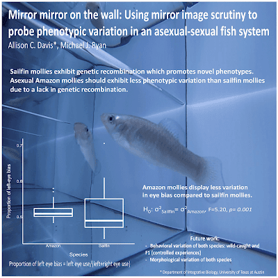
This is the first poster I’ve made, and my advisor told me to follow a minimalist style as it encourages people to talk to you. I did notice that not many people followed this style at the conference, so I was a bit worried about how it would be received, but many people came up and started their conversation with how much they enjoyed the poster.
This poster reminded me a lot of one by James O’Hanlon, which I’ve featured here before. A full bleed photo, a question, a single graph in the lower left corner, and a single take-home message that answers the question in the bottom right. Allison wrote that this similarity is purely coincidental.
As for making it, finding a good image that popped was difficult (especially since fish never want to cooperate), but the more difficult aspect was constructing concise sentences that actually conveyed my punchlines. It’s definitely easier to write more!
That editorial focus helps make this poster sing, but that too many poster presenters shy away from. Particularly at SICB, I saw lot of posters that were busily trying to cram the results of at least four experiments on to a single poster. Many posters would be improved mightily if they could just decide on one experiment and have that take up most of the poster.
Perhaps the main thing I would like to do is to soften the portions of the picture that overlap with the figure and text. In the all-important title, all the instances of the word “mirror” run over a series of light to dark colour chages, all in sharp focus.
We associate sharpness with a single focal place where our attention is focused. Things in the background are out of focus. So when crisp intersecting lines or images overlap, it can add visual confusion. Blurring out the background creates a clearer impression of which is in the foreground, and which is the background.
Here’s one I did earlier, as they say on the television shows:
If you click to enlarge, you’ll be able to see that the books on the shelf below the quote are in sharp focus. The books behind the quote are not. They’re blurry. They’re also a bit darker. It makes the text more distinct and easier to read.
For similar reasons, I would have liked the box plots to be filled with a colour so that they stood out more against the photo background. Here’s a quick revision:
This is not necessarily the best or only colour the boxes could be filled with. But the fill makes the graph stand out as clearly part of the foreground and makes it more visible and “read” better from a distance.
External links
Conference posters: Less is more!


No comments:
Post a Comment