
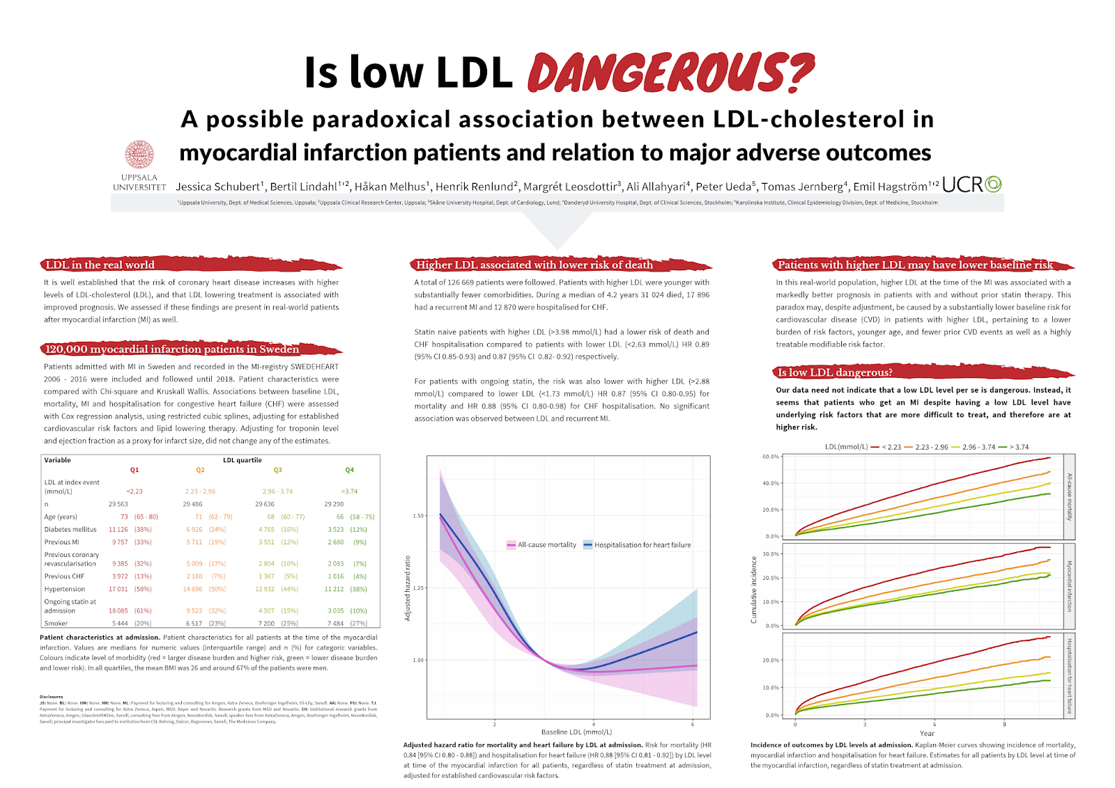
This week’s contribution comes from Jessica Schubert. She gave this work at the 2019 European Society for Cardiology conference. This is one of the bigger conferences, with over 30,000 participants (or, as Jessica put it, “kind of a big deal”). Click to enlarge!
Jessica writes:
The most useful input from my peers was seeing what kind of poster I didn’t want to make. I found a really great website called Canva, which I used to make the poster. I don’t think I’ve seen you mention it.
I have not mentioned Canva before, so am happy for the pointer. You can use a limited version online for free, or pay a subscription fee for a “Pro” version with more features.

Canva seemed geared towards beginners. There are a lot of templates for calendars, cards, brochures, handouts, and so on. It feels a little bit like Microsoft Publisher with the type and variety of templates. I haven’t had time to dig into all the features, but may do so in a later post.
Getting back to Jessica’s poster, the title bar is one of the strongest things about it. The title pops out, thanks to both its size and the highlighting of the word “dangerous.” It’s big and red and you can’t miss it. It might be even stronger, though.
One of the basic exercises of graphic design is, “Use a type that represents what the word shows.” For instance, I think most people would agree that the type on the left doesn’t represent the feel of the word as well as the words on the right.

The colour and heavy weight for “dangerous” are right, but the letter forms are not. They are round and soft, which most reader as “safe” or “non-threatening.” I would have liked to see “dangerous” set in type that was even more angular and aggressive.
The deft use of red continues in the highlighting for the headings. Again, the jagged stripes fit with the “danger” from the title. It makes it very easy to identify the sections. I would have liked the headings to be a bit bigger to more clearly differentiate them from the text.
I also like that the sections are descriptive (“LDL in the real world”), rather than generic (“Introduction”).
There’s a few places there might be some improvements.

The positioning of the logos, particularly the right “UCR” on, seems far to close to the author lines. It’s puzzling given how much white space is available and how the poster generally provides enough white space.
The alignment could be more consistent and tighter. The margins between the text columns isn’t even, although it’s so close I had to check! The intrusion of the graphs at the bottom into the column margins is another place where making edges line up could significantly improve the look of the poster.
I like the idea of using colour in the table to group columns, but using light colours makes it a bit hard to read.
Finally, there isn’t anything visual on the poster than tells me what it is about. That graphic elements, that is that table and line graphs, are generic.
Posters are a visual medium, and it is helpful to have an image that can set it apart. That might be hard to do in a very focused meeting where most of the topics are the same. But in a large one with tens of thousands of participants, a specific image is incredibly helpful.
I admit that I don’t know what image I would use. A cholesterol molecule is one possibility, although the differences between HDL and LDL might be too subtle. Jessica’s solution was to make the title so short and punchy that it can serve as that entry point, and that might be the best option in this case.


No comments:
Post a Comment