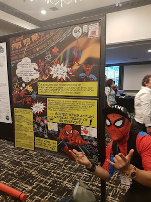
While the last post was about Charles’s cosplay, I wanted to talk more about the poster and what led up to it. Click to enlarge the poster!
Charles wrote (lightly edited):
The inspiration for the poster probably started when I participated in ComSciCon 2018 in Boston last year. I met Matteo Farinella who draws comics about neuroscience and was there as an expert panelist about creative storytelling. He talked about the importance of engaging the public through alternative forms of media and the utility of using comics to communicate science.
So when I was brainstorming ways to showcase my spider web DNA research for the CSEE/ESC/AES meeting this year, I thought, “What better way than to use Spider-Man?”
We all know that at least half the battle is simply drawing people to your poster when there are countless others to stop by. Seeing a bunch of Spider-Men on a poster is as good of a reason to stop than any other. Even if you have no idea what molecular ecology is or even if you don’t care about science at all, you have probably heard of Spider-Man and are probably curious enough look over. Sometimes, that’s all it takes.
Science can be very intimidating, even for people who go to conferences. This was my attempt to try and break down barriers and communicate my science in a fun and inclusive way.
I have shared quite a few posters inspired by comics on the blog (see list at end), but this one is different. It looks like a comic, but doesn’t read like a comic. That is to say: it uses the visual aesthetic in terms of the fonts, colours, and art. But unlike previous examples, this one doesn’t use panels in sequence. Spider-Man is used more for decoration than a character.
Charles continues on how he made the poster.
I made the whole thing on PowerPoint. A lot of people were surprised by that. All of the images came from Google and there is a disclaimer about copyright at the bottom. Like the rest of the poster, I tried to match the typefaces to original Spider-Man comics and used custom fonts, which are attributed at the bottom as well.
When I was making the poster, I did receive some significant pushback in the early stages that could have made me ditch the whole idea. For example, “There is nothing of any substance here,” or “This would be fine at a elementary or high school science fair or public outreach event, but I don’t think it works for a professional ecology and evolution conference,” or “I think the yellow boxes look a bit ugly.” Admittedly, some of the suggestions I received were useful and did, in the end, help improve the poster to its final version.
But I think when doing something like this, it is important to believe in yourself and know your purpose attempting something new. Pushback is expected especially given the traditional nature of academia but try not to let it defeat you.
During the conference, Charles got many requests for selfies.
Surprisingly, it was not just students either. Multiple professors who taught science communication courses asked if they could use it as teaching material. Even after the poster session was over, random conference goers would tell me, “Great job on the poster!” on the streets of Fredericton, so it seems like it made an impact.
As I said, I commend this poster’s commitment to its theme. I could pick at some stylistic things that I personally might have done differently. A little more of this, a little less of that. But a detailed critique of a poster that so obviously achieved its goals seems kind of crass. So I will just leave it here.
Related posts
Networking flair: Reasons to wear something ridiculous at a conference
Comics-inspired posters
Critique: Hansard
Critique: Protein biosynthesis
Critique: The eyes have it – as inspired by xkcd
Critique: Beach plastics


No comments:
Post a Comment