31 October 2019

Link round-up for October 2019

Since this link round-up happens to fall exactly on Halloween, I must start with a font for the season. Hellvetica. Courtesy of Zack’s Bad Jokes.


This isn’t just a mock-up, this is a real TrueType font you can download. If you dare.

(But seriously, download it now in case there’s some copyright violation case that’s launched at this is taken down.)


Hat tip to Mike Nitabach.

• • • • •

Hey! Established researchers! Give your own poster presentations!

Seeing super-famous PIs presenting posters at Biology of Genomes was a formative moment for me.

That reminder of the importance of being “down in the trenches” from Michael Hoffman.

• • • • •

Coincidentally, a recent meeting at Cold Spring Harbor made senior researchers give posters. Dan Tracey gave this poster:


Dan wrote

A policy to promote early career scientists meant nearly every talk at #cshlDros was by a grad student, postdoc or new PI. This made for a fantastic meeting, with the people DOING the actual exciting new work telling us about it. This “senior person” gave a poster!

• • • • •

If people don’t come to the poster, the poster must come to the people.


Spotted by Joe Parker. Hat tip to Heidi Smith Parker.

• • • • •

Marilia is keeping track of her favourite scientific posters by threading them together on Twitter.

Over twenty examples to inspire! Here’s just one:


• • • • •

The journal Nature has been given a redesign, all the way from the logo to an entirely new custom typeface. Kelly Krause does a fantastic job of explaining the process here. SHe also has a Twitter thread that includes a few more details that aren’t in the main article.


Hat tip to Martin Krzywinski.

• • • • •

Speaking of logos, Megan Clement starts describes this logo thus:


The French Olympic logo tumbles out of bed on a Parisian morning. She tousles her messy bob, dons breton stripes and ballet flats and whisks down the stairs from her fifth-floor apartment to grab a baguette before enigmatically texting two men who are pursuing her romantically.

The thread continues from there.

• • • • •

A networking tip to avoid embarrassment on your part and annoyance of the person you’re talking to:

Don’t try to guess someone’s job/career stage by what you guess their age to be! Just ask them, “Hey, what organization do you work for? What kind of work do you do? What are you most excited about in your job?”

These are great ways to get to know them. Without any assumptions about their career stage (since age and career stage are not the same thing, we all move through those stages differently.)

And you’ll probably hear cool stuff that they are excited to talk about!

From Auriel Fournier.

• • • • •

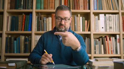
The Netflix series on design, Abstract, just dropped its second season. The episode so far that seems most relevant to poster design is an episode featuring Jonathan Hoefler. There is some cool stuff on how type has to be designed to take visual illusions into account. It’s a nice reminder that design isn’t math.

Jonathan Hoefler

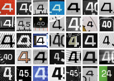
One of the threads in the episode is the creation of a new typeface based on watchfaces, which was just released as Decimal.

Number "4" from many vintage watchfaces


The process of creating Decimal is also described at Heofler’s own website, Typography.com.

The Abstract episode about Instagram also looks like it may have a few gems.

• • • • •

Sam wondered if people want conference memorabilia.

For every person who liked the swag, five people said the organizers should put the money elsewhere. There were over 7,500 votes in the poll, so this seems a solid answer.

• • • • •

This graphical abstract would work great as a poster:


Created by Rafeal Missagia. Hat tip to Milton Tan.

(Searching for this abstract led me to this one. Which is... I don’t know.)

• • • • •

The Canadian National Institute for the Blind (CNIB) has a Clear Print Guide (direct link to PDF here) that covers some basics about designing for people with visual impairments of various sorts.

It contains at least one tip I had not thought of before. The choice of paper affects accessibility. Glossy paper looks sharper, but creates glare that could obscure the printed content for people who have difficulty seeing.

Hat tip to S. Lewis Simpson.

• • • • •

Lincoln Michel tweeted a taxonomy of type:


Brings a whole new meaning to alignment. Hat tip to Melissa Vaught.

• • • • •

We have nominees for worst poster ever and worst poster presenter ever. These two things are connected, not surprisingly. At the Geological Society of American 2019 meeting, Jane Willenbring wrote:

A man who presented an entire poster at a meeting about me being unethical for reporting sexual harassment is now at a conference with me.

In response to a query, Jane shared the abstract of the poster in question. Many people expressed sympathy and disbelief that such a poster actually happened.

Unsolicited advice that I should not have to give: A poster session is not a place to air your personal grudges, grievances, or vendettas.

Conference organizers: Review the damn abstracts. Too often, conferences have exercised a light in reviewing presentation abstracts. This is why there should be a little more effort put into reviewing abstracts.


24 October 2019

Psychology teaching poster conference on Twitter

The Society for the Teaching of Psychology is the latest organization to hold a poster session on Twitter.

It will run 1-2 November, using the hashtags #stp19poster and #stp19thread.

You can pre-register, but it isn’t required to present. (I mean, you can tweet whatever you want.)

I have previously written about making posters just for Twitter here.

Related posts

Top tips for Twitter posters

External links

STP’s International Twitter Poster Conference (ITPC)

17 October 2019

Critique: The Amazing Spider-Poster!

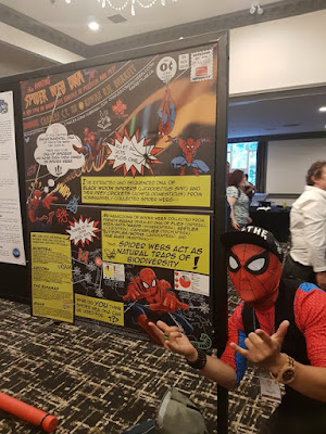
A few weeks back, I introduced Charles Cong Xu in a post about wearing distinctive clothing as a networking tool. You may recall Charles presented his poster kind of like this:


While the last post was about Charles’s cosplay, I wanted to talk more about the poster and what led up to it. Click to enlarge the poster!


Charles wrote (lightly edited):

The inspiration for the poster probably started when I participated in ComSciCon 2018 in Boston last year. I met Matteo Farinella who draws comics about neuroscience and was there as an expert panelist about creative storytelling. He talked about the importance of engaging the public through alternative forms of media and the utility of using comics to communicate science.

So when I was brainstorming ways to showcase my spider web DNA research for the CSEE/ESC/AES meeting this year, I thought, “What better way than to use Spider-Man?”

We all know that at least half the battle is simply drawing people to your poster when there are countless others to stop by. Seeing a bunch of Spider-Men on a poster is as good of a reason to stop than any other. Even if you have no idea what molecular ecology is or even if you don’t care about science at all, you have probably heard of Spider-Man and are probably curious enough look over. Sometimes, that’s all it takes.

Science can be very intimidating, even for people who go to conferences. This was my attempt to try and break down barriers and communicate my science in a fun and inclusive way.

I have shared quite a few posters inspired by comics on the blog (see list at end), but this one is different. It looks like a comic, but doesn’t read like a comic. That is to say: it uses the visual aesthetic in terms of the fonts, colours, and art. But unlike previous examples, this one doesn’t use panels in sequence. Spider-Man is used more for decoration than a character.

Charles continues on how he made the poster.

I made the whole thing on PowerPoint. A lot of people were surprised by that. All of the images came from Google and there is a disclaimer about copyright at the bottom. Like the rest of the poster, I tried to match the typefaces to original Spider-Man comics and used custom fonts, which are attributed at the bottom as well.

When I was making the poster, I did receive some significant pushback in the early stages that could have made me ditch the whole idea. For example, “There is nothing of any substance here,” or “This would be fine at a elementary or high school science fair or public outreach event, but I don’t think it works for a professional ecology and evolution conference,” or “I think the yellow boxes look a bit ugly.” Admittedly, some of the suggestions I received were useful and did, in the end, help improve the poster to its final version.

But I think when doing something like this, it is important to believe in yourself and know your purpose attempting something new. Pushback is expected especially given the traditional nature of academia but try not to let it defeat you.

During the conference, Charles got many requests for selfies.

Surprisingly, it was not just students either. Multiple professors who taught science communication courses asked if they could use it as teaching material. Even after the poster session was over, random conference goers would tell me, “Great job on the poster!” on the streets of Fredericton, so it seems like it made an impact.

As I said, I commend this poster’s commitment to its theme. I could pick at some stylistic things that I personally might have done differently. A little more of this, a little less of that. But a detailed critique of a poster that so obviously achieved its goals seems kind of crass. So I will just leave it here.

Related posts

Networking flair: Reasons to wear something ridiculous at a conference

Comics-inspired posters

Critique: Hansard
Critique: Protein biosynthesis
Critique: The eyes have it – as inspired by xkcd
Critique: Beach plastics

10 October 2019

How to make a 3-D poster

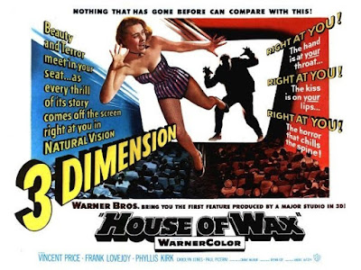
I love when media that are normally flat reach into the third dimension!

Poster for House of Wax (1953) movie in 3-D

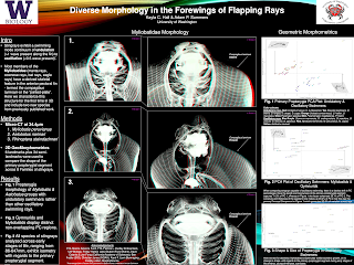
This week, I have a guest post from Kayla Hall, who created this poster. Click to enlarge!

Poster for "Diverse morhology in the forewings of flapping rays"

I reached out to Kayla because all of her central images are in 3-D!

These images can be viewed in 3-D using the red-green glasses, which is the same technique that was used by filmmakers in the 1950s for movies like House of Wax and Creature from the Black Lagoon. Even Alfred Hitchock made a 3-D movie: Dial “M” for Murder. Interest in 3-D movies was high for a few years, then petered out.

This red/green 3-D image is technically called an anaglyph. I’ve seen this technique used rarely, but consistently, at poster sessions through the years, but never had reason to make one myself. I wanted to know how it was done.

First of all, why? Kayla wrote (lightly edited):

I had a few reasons for choosing to display these specimens in 3-D:

Firstly, our previous publication characterized a skeletal structure in the fins of one family of stingrays, but that project solely used 2-D radiography. This was the first time we’ve been able to see this morphology in 3-D space and quantify all of the other aspects, such as thickness and curvature depth (for muscle attachment) of the primary cartilages across families.

Second, most of my work has used specimens from museum collections. Computerized tomography (CT) scanning allows us to gather all of the anatomical and morphological information without destructively sampling rare specimens. In fact, two of the stingrays displayed on the poster are actually new species to us, not previously included in our publication, so this was a first for visualizing and characterizing their anatomy. Scanning and viewing the Myliobatis specimen (#1) in 3-D space allowed us to add this new species to the list of individuals that lack the pectoral fin framework, as this is the only genus to exhibit variation in the presence/absence of this trait across species.

So that’s the why, but what about the how?

We used the Bruker micro-CT scanner, reconstructed the CT images using the program NRecon, and finally visualized the reconstruction in CTVox. CTVox is also the program I used to generate the 3-D images. They have a “Stereo viewing” button that converts the reconstruction into a 3-D image viewable with standard red-blue glasses.

You are not able to tweak the red-blue hues, but you can always toggle with the original histogram settings that produce the 3-D reconstruction to alter the color contrast.

I bought a multi-pack of basic red and blue glasses from an online retailer. (Search “anaglyph 3-D glasses” or just “3-D glasses.”- ZF)

Printing on matte paper works best for visualizing the 3-D work.

Easy once you know how!

And here Kayla shows off her results to Kelsi Rutledge and Jules Chabain.

Kayla Hall showing her poster to Kelsi Rutledge and Jules Chabain, all wearing 3-D glasses

You can produce the 3-D effect with just a high-quality graphic editor. In brief:

  1. Get two images. You either need to take or find two pictures from slightly different viewpoints, or you need to edit an image to mimic the effect.
  2. Merge the photos.
  3. Remove the red from one image.
  4. Remove green and/or blue from one image.
  5. Crop the edges where they don’t overlap.

If you do this to a single image, however, you are creating an illusion. It isn’t “real data” in the sense that am image generated using a CT scan or two actual photographs. Be sure to label images with appropriate disclaimers!

External links

Diverse morphology in the forewings of flapping rays
How To Create Anaglyph 3D Images That Really Work!
How To Make Classic Red/Cyan 3D Photos Out of Any Image

03 October 2019

Critique: Agricultural landscapes

Aleksandra Dolezal will testify that Neil Gaiman’s law of typos, originally applied to books, also applies to conference posters. It doesn’t matter how closely you check, you will find a mistake as soon as the thing is printed and you can’t fix it.

Double, triple checked my poster PDF before printing and after it was done I found a small alignment mistake. Damn you brain for not seeing it earlier 🧠!! Oh well what’s done is done. I like the colours so still happy 🤗

Click to enlarge!


Before it went up, Hannah Brazeau said,

This very well may be the most beautifully designed poster I’ve seen. Amazing.

Hannah was not alone in her opinion. This poster won the award at the joint meeting of The Canadian Society for Ecology & Evolution, the Entomological Society of Canada, and the Acadian Entomological Society (or EcoEvoEnto2019 for short)! And the competition was fierce.

Aleksandra collaborated with her sister to achieve the distinct look of the poster (lightly edited from email).

Me and my sister, Amelia Dolezal, came up with this idea together. She helped make the flowers and icons. She was more of the fancy design guru whereas I was the logical researcher fitting in the blanks.

I’m pleased to give Amelia more visibility for her work on this poster, since her name was not on the original poster. Amelia has some graphic skills that she is putting into work as a tattoo artist.

This poster is a legitimate work of art.

The whole poster was drawn by using a tablet with Photoshop cs6, using a several different brushes. And all that text? That isn’t a font. The entire thing is hand lettered by Aleksandra. She wrote:

This was done with hand lettering in my own handwriting. I wanted it to be as personal as possible. I wanted it to look like my field notes and lab bench.

My only comment on the graphics is that I might like a tiny bit more contrast and/or brightness in some colours. When shrunk down (like for the preview on this blog), some of the text and images fade away. But when expanded to full size (three feet wide by four feet tall), I could see everything fine, so this is a very minor problem.

On her own blog, Aleksandra describes some of the creation of the poster, focusing more on the conceptual side of things rather than the nitty-gritty details. I particularly like this:

I have around 6 analyses in my these project that all have awesome, cool results but for this poster I decided on focusing on 3 that I think really put out the message I wanted.

It’s easy to look at the tasty visuals and conclude that’s why it’s successful, but Aleksandra clearly did the hard editorial work deciding what to include and what to cut.

External links

My advice for creating an academic poster on Aleksandra’s blog