Years ago, I showed this poster:
It does not matter whether this poster does a lot of the detail work right. It does not matter how good the layout is, or how good the typography is, or whether the colour scheme is consistent and pleasing to the eye, or whether there is enough white space. None of that matters.
The authors of this poster doomed it at the very beginning, when they picked a page size... and got it wrong.
In my experience, there are two places where posters fail early on.
On the content side, people do not edit enough. They want to include everything, rather than focusing on one thing, and the poster suffers.
On the design side, people do not make a grid. They start drawing boxes without any underlying thought to structure, and treat their data like some sort of jigsaw puzzle to fit together.
I was reminded of the while I was making a poster for the Student and Post-Doctoral Affairs Committee (SPDAC) for the recent Society for Integrative and Comparative Biology (SICB) meeting in Tampa (#SICB2019 on Twitter).
This poster was not a typical data-driven poster. Authorship was on my mind, and I wanted to do some consciousness raising about this issue to early career researchers.
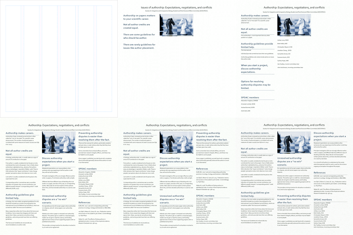
What struck me was how little the poster changed from beginning to end. You can see this in the animation:
Here are a few frames from that process. I had created a six column grid template for a poster class I was doing for SPDAC:
I decided to used that as a basis for a three column layout. And I knew what kind of graphic I wanted*. And those were apparent in the very first stages of layout, shown below:
Even as the poster is filling out, the underlying structure stays the same:
And here is the final version:
Looking at it now, I should have made the title bigger. Oh well.
I have noticed a similar pattern when I’ve created animations of my design process before (here and here). This first one from 2015 keeps the same five column structure throughout the design process. A second one (from 2017) has a little more movement early on, but quickly settles down.
While you can see in the animations that a lot of time is spent tinkering. But the late stage tinkering is the polish that will differentiate the “okay” from the “excellent.”
It’s the early stage decisions that make the difference between “competent” and “embarrassing,” “okay” and “crap,” “success” and “fail.”
* From this blog post:
(T)wo chess pieces suggest conflict. But if you know how knights move in chess, the reality is that neither can capture the other. In other words, from the point of view of those pieces, it’s a “no win” situation.
I think that represents most authorship disputes pretty well.
Related posts
Posters should not be usable as drapes
A poster with no conference, or: What I made in that #SciFund poster class
Critique: Sand crab summer


No comments:
Post a Comment