17 January 2019
Critique: Lending low tech tools
Today’s poster contributor is Scott Johnson. Click to enlarge!
This is a great marriage of content and form. The content is about something that is unabashedly “low tech,” so the hand-written, slightly lo-fi (okay, low tech) look is completely right here. It adds character and interest.
Regular readers know that I personally am anti-underlining, and try to remove it in almost every instance I see it. But here, because it’s hand written, I can see the case for it. When people write by hand, they do underline for emphasis. I would experiment a bit with removing the underline, but I don’t know if removing the the underlines for headings and making the headinga a bit bolder would lose the look.
I appreciate the purity of the monochrome greyscale, but it does wash out from a distance.
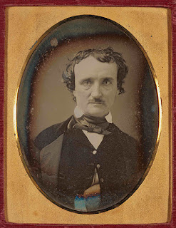
I would like to see a little colour – even if subdued, and not everywhere. To keep the “low tech” look, I would suggest referencing some old photos, like daguerreotypes. They often weren’t pure shades of grey – certainly not as pure as here. Old pictures often have creamy or brownish overtones to them, as you can see in this picture of American write Edgar Allen Poe.
Making the background of the page a subtle shade off-white or something might help.
Alternately, the poster might use a single colour to highlight a few elements, like duotone printing.
I'm thinking of maybe a very light yellow for the “sunburst” behind the building.
If the poster stays pure monochrome, it could use a little more contrast to make some portions stand out. I like how the lines around the house and title are heavier to make them stand out at distance. But the text, as mentioned, is fading a little.
Very charming work!
Picture from here.
Subscribe to:
Post Comments (Atom)


No comments:
Post a Comment