31 January 2019

Link round-up for January 2019

Very helpful article about how to pick two typefaces that complement each other,


Almost every text-based layout will benefit from more than one typeface. ... With the right pairing, your typography will instantly appear more professional, polished, and attractive.

• • • • •

Kaoru Sakabe discusses best practices in figure assembly.


Hat tip to ASBMB.

• • • • •

Brent Thorne has help for R users:

Do you like #RMarkdown but also need to make a conference poster? Well, the posterdown 📦 has been updated to include: fully customised colour options, sizing of your #PDF conference poster, and automated citation generation🙃🎉 Check it out here.

• • • • •

A listicle on the eight most popular types of posters says this about conference style posters:


What makes educational or research posters different is that most posters are very visually pleasing to the eye and rely on composition and aesthetic qualities while educational ones often rely on information and presenting a resumed version of the research. Notice that the entire scientific process of the research seems to be resumed in the academic poster above.

This is a very round about way of saying, “Damn, you ugly!”

Sigh. Just another reason this blog won’t be going out of business any time soon.

24 January 2019

Poster sessions for wheelchair users

Amy-Charlotte Devitz and service dog Fisher in front of a “Society for Integrative and Comparative Biology" sign.

I’ve visited the issue of poster accessibility on this blog, but mainly in the context of visual issues, like colour blindness and dyslexia. Of course, these are not the only challenges the people might face attending a scientific conference. Amy-Charlotte Devitz, a.k.a. The Bendy Biologist on Twitter, has a great blog post talking about navigating a scientific conference in a wheelchair with a service dog. The conference at hand is the Society for Integrative and Comparative Biology (SICB) meeting this month in Tampa, Florida.

Here’s an excerpt, focusing in on what she says about poster sessions (emphasis added).

100+ posters were on display and you had a chance to interact with those who had made them. These were admittedly a bit of a challenge to navigate in a chair. It was crowded, meaning it was very hard to move around, and with so many people around I wasn’t able to get a proper look at many of the posters. The alternative was to come and look at the posters before the official sessions started, a time when very few people were present, so I did this often. The downside of this was that one, the presenters weren’t there to speak with and two, it meant skipping other events to come look at the posters. Improvements in accessibility could be made by the increasing the space between rows of posters as well as the posters themselves to open things up a bit. This may be limited by the space available in the venue, but it something to consider.

As I said in the beginning, my focus in this post would be on accessibility for individuals for mobility impairments, but I have a few points left to make. For one, almost every talk I saw used color-blind friendly color palettes in making their slides, and most used large fonts that were easy to read even from the back of the room. Encouraging these in all talks and posters would assure someone colorblind or visually impaired could view any material.

Full disclosure: I was the chair of the Student and Post-Doctoral Affairs Committee during this meeting, so I have a professional interest here above and beyond the usual. I was supposed to attend this meeting, but could not due to unexpected events.

It’s worth noting that SICB’s poster sessions used to allow people to have eight foot posters. Here’s one from 2017. In 2018, this was reduced to less than four feet of space for a poster. I do not know how far apart the poster boards were placed in those years, but it seems likely that the square footage of poster viewing space was probably about halved by this move.

That square footage of viewing space is extremely important for wheelchair users. Whatever reasons there are for shrinking the poster size (and there are probably reasonable ones), this does not change the fact that it virtually guarantees that the poster session is a worse experience for everyone, even if wheelchair users are a little more affected than most.

There is a lot more in Charlotte’s post, and I recommend it highly to you.

External links

SICB 2019 – An accessibility perspective

17 January 2019

Critique: Lending low tech tools

Today’s poster contributor is Scott Johnson. Click to enlarge!


This is a great marriage of content and form. The content is about something that is unabashedly “low tech,” so the hand-written, slightly lo-fi (okay, low tech) look is completely right here. It adds character and interest.

Regular readers know that I personally am anti-underlining, and try to remove it in almost every instance I see it. But here, because it’s hand written, I can see the case for it. When people write by hand, they do underline for emphasis. I would experiment a bit with removing the underline, but I don’t know if removing the the underlines for headings and making the headinga a bit bolder would lose the look.

I appreciate the purity of the monochrome greyscale, but it does wash out from a distance.

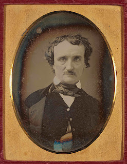
I would like to see a little colour – even if subdued, and not everywhere. To keep the “low tech” look, I would suggest referencing some old photos, like daguerreotypes. They often weren’t pure shades of grey – certainly not as pure as here. Old pictures often have creamy or brownish overtones to them, as you can see in this picture of American write Edgar Allen Poe.

Edgar Allen Poe daguerreotype


Making the background of the page a subtle shade off-white or something might help.

Alternately, the poster might use a single colour to highlight a few elements, like duotone printing.
I'm thinking of maybe a very light yellow for the “sunburst” behind the building.

If the poster stays pure monochrome, it could use a little more contrast to make some portions stand out. I like how the lines around the house and title are heavier to make them stand out at distance. But the text, as mentioned, is fading a little.

Very charming work!

Picture from here.

10 January 2019

When posters fail

When a poster fails, it’s usually because it failed early in the design process.

Years ago, I showed this poster:

Poster overflowing poster board and spilling onto floor

It does not matter whether this poster does a lot of the detail work right. It does not matter how good the layout is, or how good the typography is, or whether the colour scheme is consistent and pleasing to the eye, or whether there is enough white space. None of that matters.

The authors of this poster doomed it at the very beginning, when they picked a page size... and got it wrong.

In my experience, there are two places where posters fail early on.

On the content side, people do not edit enough. They want to include everything, rather than focusing on one thing, and the poster suffers.

On the design side, people do not make a grid. They start drawing boxes without any underlying thought to structure, and treat their data like some sort of jigsaw puzzle to fit together.

I was reminded of the while I was making a poster for the Student and Post-Doctoral Affairs Committee (SPDAC) for the recent Society for Integrative and Comparative Biology (SICB) meeting in Tampa (#SICB2019 on Twitter).

This poster was not a typical data-driven poster. Authorship was on my mind, and I wanted to do some consciousness raising about this issue to early career researchers.

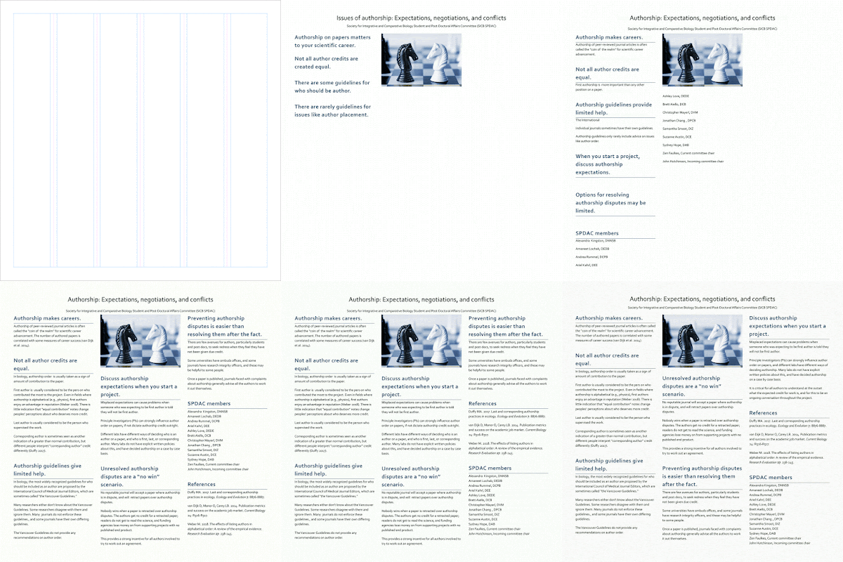
What struck me was how little the poster changed from beginning to end. You can see this in the animation:

Animation of SICB authorship poster creation

Here are a few frames from that process. I had created a six column grid template for a poster class I was doing for SPDAC:


I decided to used that as a basis for a three column layout. And I knew what kind of graphic I wanted*. And those were apparent in the very first stages of layout, shown below:

Draft one of SICB authorship poster

Even as the poster is filling out, the underlying structure stays the same:

Draft two of SICB authorship poster

And here is the final version:

Final version of SICB authorship poster

Looking at it now, I should have made the title bigger. Oh well.

I have noticed a similar pattern when I’ve created animations of my design process before (here and here). This first one from 2015 keeps the same five column structure throughout the design process. A second one (from 2017) has a little more movement early on, but quickly settles down.

While you can see in the animations that a lot of time is spent tinkering. But the late stage tinkering is the polish that will differentiate the “okay” from the “excellent.”

It’s the early stage decisions that make the difference between “competent” and “embarrassing,” “okay” and “crap,” “success” and “fail.”

* From this blog post


(T)wo chess pieces suggest conflict. But if you know how knights move in chess, the reality is that neither can capture the other. In other words, from the point of view of those pieces, it’s a “no win” situation.
I think that represents most authorship disputes pretty well.

Related posts

Posters should not be usable as drapes
A poster with no conference, or: What I made in that #SciFund poster class
Critique: Sand crab summer

03 January 2019

Critque and ruination: Antibiotic resistance CARD

For the first blog post of the year, allow me to ruin a poster. And even more ironically, I’m about to ruin an award-winning poster.

This week’s contribution came from Sally Min. It was presented at McMaster Innovation Showcase, where it won the People’s Choice poster award. Click to enlarge!


When I first opened the file, I thought, “This is strong.” We have that intense White Stripes colour scheme. The diagonals add a lot of visual interest and make the poster look different than the usual rectangular format. There is not a lot to read, because the poster uses icons and flow charts effectively.

But those diagonals, which bring so much of the cool look to the poster, also mess with the poster.

They look like arrow heads. We expect to follow arrows.

At a glance, this is how I expect the order of stuff on the poster to flow.


But the numbers make is clear that this is the order the authors intended.


We don’t expect to go “left and up” from section 5 to 6, because there is stuff to the left we’ve already read (section 2).

Because those numbers are so helpful, it might be worth making them bigger or more prominent somehow. Maybe numbers inside bullets would make them more visible. Here’s a very quick and dirty version:


While I know intellectually what the problem is, I don’t know how to fix it in a way that doesn’t make the poster look worse.

My first thought was, “The top row is confusing. It looks like there is an arrow pointing right to left, from black section 2 to the red section 1. I’ll keep the diagonals, but reverse it so the implied arrow is consistent with the reading order.”

I tried that, but you have the same problem with the diagonals looking like arrows on the right side of the section 4, which pointed across to section 6, when the authors want you to go down to black section 5.


I tried to create a visual cue, another arrowhead made of diagonals, to show the authors preferred direction, and that’s a hot mess. The shape created by black section 5 is just a weird polygon that makes no sense.


Maybe the solution is to flip the content. Put the material in black section 5 where red section 6 currently is, and vice versa.

I think this style of design could work, but the back and forth reading flow would need to be built in at the beginning. Something like:


You end up with “half boxes,” which in this sketch I’ve used for fine print.

The thing is that after all this struggling, I’m actually not sure it matters much. This is still a sharp looking poster, and that the authors were smart enough to add the explicit guideposts by numbering each section. That means that I am only momentarily confused looking at the poster.

Presentation pic! The poster in real life...