29 August 2013

Link roundup for August 2013

Katie M. Everson has created The Scientist’s Guide to Poster Design. One resource there that you won’t find here is an tutorial for Adobe Indesign.

Also extremely good is this recorded webinar on poster design, modestly titled, “Poster Presentations that Rock!”

This month’s “run. don’t walk” link is to a compilation of Nature’s Points of View column. It is awesome. Hat tip to Biochem Belle for sending this my way. There are compiled columns about:

  • Composition and layout
  • Using color
  • Elements of a figure
  • Improving figure clarity
  • Multidimensional data
  • Data exploration

Here is a good set of conference-going tips from David Shiffman over at Southern Fried Science. Sarah Semmler has even more.

Meanwhile, Mark Rom calls conferences “lumbering dinosaurs”. It’s mainly a criticism of “panels” (what some conferences might call “symposia”) more than anything else. But poster sessions are mentioned:

Scholars Prefer Presentations, Not Posters

For conventional conferences, this is probably true. (It is, as I’ve documented a few times on this blog. - ZF.) To the extent this is true, it is probably due to the weight of tradition and the fact that authorities largely determine who gives papers and who gives posters (‘‘I’m sorry to inform you that your paper proposal was not accepted, but you may present at a poster session.’’) This perception is probably reinforced through cultural norms that give the signal that ‘‘real scholars’’ give panel presentations, while the posters are merely a sympathy prize for the less fortunate.

A summary of some of his points are at the College Guide blog.

This retrospective on how scientific papers have been typeset over the past 350 years is worth a peek for thinking about designing with text. Hat tip to Anna Sharman for this one.

Why do we need such big text on posters? Gary Foster nails it:

That's why all students are taught to use big fonts on posters. It's hard to read when tipsy ;-)

But big should not be the sole criteria for font choice (from What we should call grad school):


I Can Haz Cheeseburger is not to be outdone:


You might remember that I am a big fan of the TV show Samurai Jack. Fellow fans, rejoice! It’s coming back in comic form.

22 August 2013

Mug shot

Should you put your picture on your poster?

I understand the theory. The theory is that by putting your picture on your poster, you make it easier for people to recognize and find you, particularly if the poster has been up for quite a while before the actual poster presentation time. Plus, people are naturally drawn to looking at faces.

I’ve never done this, and I’ve never been a fan of the idea. It always seemed to me to be a little contrived and overly eager. I’m skeptical that a picture works better than a name tag. Posters always have author lists, and attendees have name tags. In my experience, it is rare that there is confusion about whose poster it is.

If you want someone to be able to recognize your face, it can't be the size of a postage stamp on the poster. It would have to be fairly big. Poster real estate is limited and valuable. I am very much in favour of maximizing the work.

Similarly, if you wanted a picture to serve as a way to recognize you, probably the best place to put it is at the top of the poster. Then, you run into a lot of the same layout problems that you have with logos.

If you have collaborators, do you put all the pictures? If not, how will people know which name the photo is associated with?

Finally, not everyone takes a great picture every single time.


Hat tip to the webinar on conference posters, where this question came up.

External links

Poster presentations that rock

Passport photo from here.

15 August 2013

Put down your tablet and phone


I was listening to a webinar on poster presentations, when the host mentioned how it was a big turn off when a poster presenter was “playing Angry Birds when someone is walking by.”

Part of the secret to getting people to stop by your poster is to look willing to engage with people. You can’t do that if:

  • You’re looking at your phone or tablet for more than a few moments.
  • You’re sitting on the floor reading or eating.
  • You’re talking to someone else about something completely unrelated to your poster.

Now, there is a happy medium. You don’t want to appear disengaged, but desperation is not appealing, either. You don’t want to:

  • Stare at people as they walk bye with pleading puppy dog eyes.
  • Haul people off the conference floor.
  • Launch into detailed explanations of your poster when nobody asked for it.

External links

Poster presentations that rock

Picture by ftrc on Flickr; used under a Creative Commons license.

08 August 2013

Critique and makeover: Prediciting pollinators project

Today’s poster is courtesy of Adriana De Palma. This poster is also available from predicts.org.uk. She notes, “At the bottom where it says ‘please pick up a flyer’, I obviously had flyers by the poster that could be taken!” You can click to enlarge.


Adriana is a regular reader of the blog, so not surprisingly, there a lot I like about this poster. There’s an attractive photo in the upper left to provide an entry point. The reading order is clear. The text is large and visible, and the colours on the graphs and bottom logos are cohesive.

Regular readers will also not be surprised to learn that my biggest concern is with the logo next to the title. First, the logo is so big that it is competing with the title for attention. Second, that the logo contains a word, in the same colour as the title, makes it a bit difficult to separate the two, causing a bit of visual confusion. My first attempt was to try flipping the position of the title and the logo, and make the logo a little smaller.


Then, I tried making the logo a light gray, so as to be a little less obtrusive and distinct from the title.


Regular readers will also know my anti-box prejudice, and shouldn’t be surprised that I removed the box around the material at the bottom.


The “Imperial College London” and “BBSRC” logos are uncomfortably close to touching. I shrank both of them to give them a little more breathing room:


Finally, I went back to that top logo again. I still wasn’t happy with it. While I liked the title displayed more prominently on the left and the logo on the right, I decided to try an alternate version without the “Predicts” logo at the top at all:


Personally, I like this version with just the title. If I had the inclination to keep fiddling with it, I probably would have tried to move the “Predicts” logo down to the bottom, next to the QR code, but the amount of fiddling it would have taken to get it right deterred me from attempting it.

Thanks to Adriana for sharing!

Related posts

The epic logo post
Boxism

01 August 2013

Detective stories: “Whodunnit?” versus “How’s he gonna prove it?”

Academics are curious people. They are driven by questions. They assume their fellow academics are also curious. Consequently, we often write things as though it’s a detective novel.

Everything start with questions. You see posters that have question in the title, questions in the introduction, questions leading off the results... and everything is revealed at the end.

It’s just like in a detective novel where all the clues are laid out, the suspects are gathered, then the big revelation: “The butler did it!”, so to speak.

I contend that it is much better to make statements than ask questions on a poster.

Always remember this: in poster sessions, there are always more posters than time to view them. And questions are more work for the reader than statements. I have to understand the question, then see the evidence, get to the answer, and check that the evidence and the answer line up. Now, these are good practices... but they are time consuming. Respect people’s time and tell them the bottom line right away.

This need not make for a disappointing story. If you go back to detective fiction, one famed detective series made it a point of revealing the killer at the start of every episode:


The question in Columbo was not “Whodunnit?” but “How’s he gonna prove it?” The fun in Columbo was in watching the cat and mouse dynamic between the detective and the murderer, and seeing the killer try to answer the infamous “Just one more thing” question that Columbo was always asking.

Update, 2 August 2013: Science Refinery agrees!

Update, 20 July 2016: There’s now research data that supports this method! “Positive framing” in a title (as the paper calls it) was associated with more online attention than questions or generic statements.

25 July 2013

Link roundup for July 2013

The NIH has been giving workshops on poster presentations. Here is the latest one from earlier this summer (embed link doesn’t allow graceful resizing to fit in blog column, alas).

That the presentation started with standard bullet point slides did not fill me with hope. And this is reflected in one of the pieces of advice that I am not sure I disagree with: “Use bullet points if at all possible.” I still prefer paragraphs.

The information within is generally quite good, however. Hat tip to Mike Pascoe for spotting these.

PVP illustrates rule 34 of the Internet, regarding type:


This post by Nina K. Simon isn’t about posters, but it is about conferences more generally. Organizers:try more workshops, hackathons, and the like.

It is amazing to actually DO things with colleagues in professional development situations instead of just talking. In 2009, after we hosted the Creativity and Collaboration retreat, I wrote a post about ditching "conferences" for "camp" experiences. Four years later, my appetite for these kinds of experiences hasn't changed. It felt great to once again be working with people--brainstorming exhibit challenges, editing label text, even just messing around on the player piano together.

External links

Creating and presenting a dynamic poster (2010): Event listing (with PDF of slides)
Creating and presenting dynamic posters (2013): Event listing

18 July 2013

Critiqe and makeover: Quackenbush! (Because it’s fun to say)

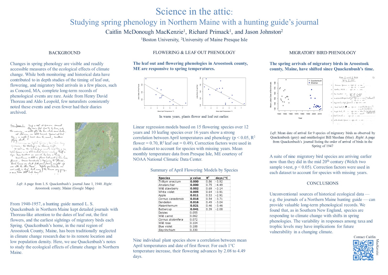
Today’s poster from an upcoming Ecological Society of America meeting comes from lead author Caitlin McDonough MacKenzie and is shown with her permission. Click to enlarge:


Caitlin’s poster has a nice clean layout. However, one thing that you can see by drawing a couple of lines is that the grid is not very tight, particularly in the left column, where the image sticks out further than the text:


Let’s start cleaning up. Shadowed text? No reason for it. It obscures the letter shapes in the title, where readability from a distance is critical. Also pulled out the colons from the sub-headings, since nothing is following them.


The next change I made was starting to work on the data prison in the table. Lots of vertical and horizontal lines went bye-bye:


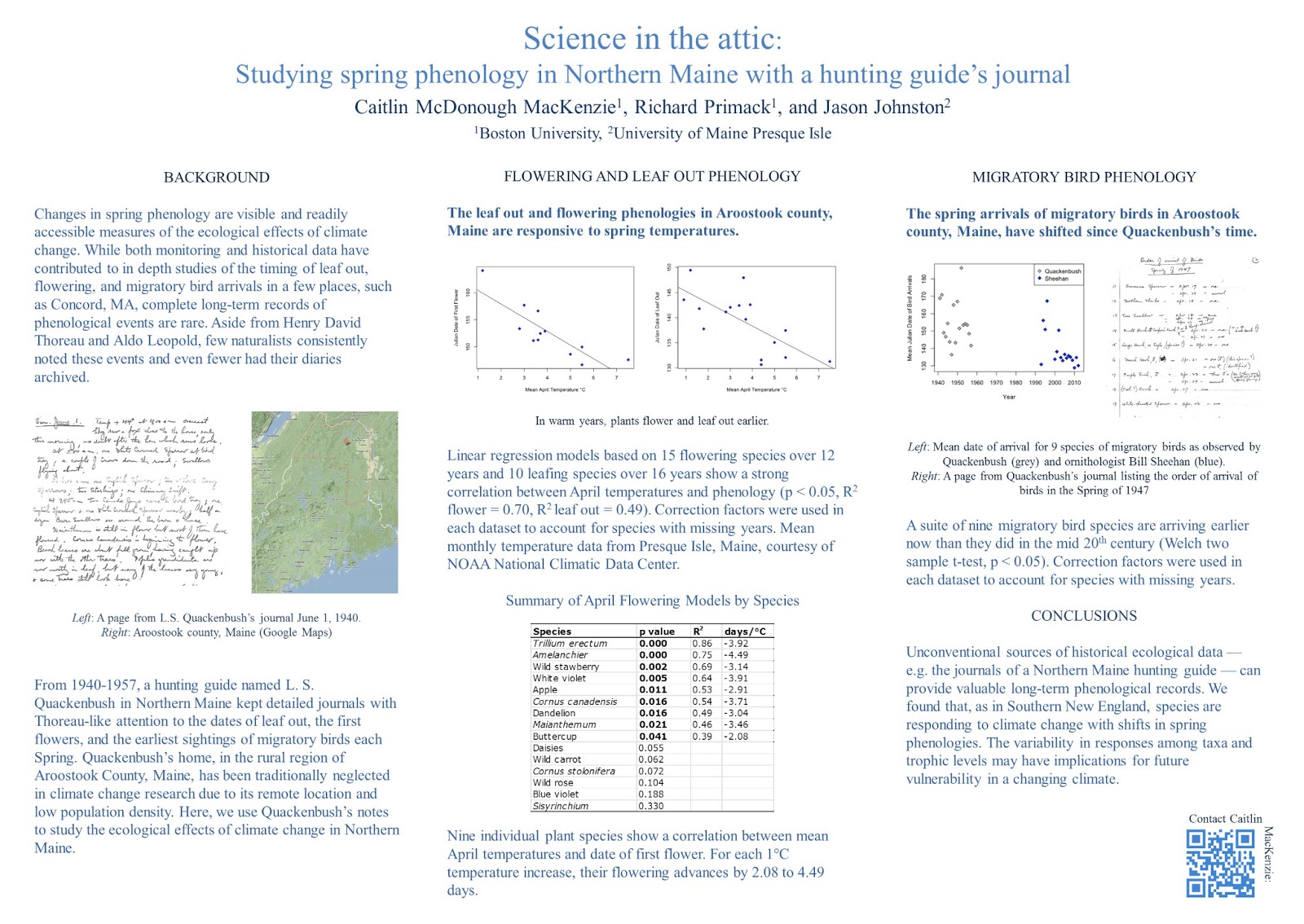
I then lined up the table, and tweaked the figure captions. For instance, I spelled “L” and “R” as “Left” and “Right.” Abbreviations almost always make extra work for the reader (exceptions for super common ones, like DNA, where the acronym is better known than the words). If you have space, spell things out!


The biggest change in the next version was to emphasize the message in the central and right columns’ sub-headings. I did that in three ways.
  • I made them bold, creating a cue that these sentences were important.
  • I changed them from questions to statements, making it easier to get the point right away when scanning.
  • I left aligned the text to make it more consistent with the paragraphs below, and to emphasize the grid.


The final changes were to adjust the spacing in the central column. I made the top two graphs a little larger, so their edges would be flush with the text below them. I also moved the QR code a bit to create a more comfortable space between it and the text. And a final adjustment to the figure legends, so that “Left” and “Right” start their own lines.


The final poster looks much like the first poster. All of these little changes together give it a cleaner, classier, more polished look. It’s all about the details.

Caitlin was happy with the end result:

Wow! Thank you so much! It’s amazing how much of a difference those little tweaks can make. I have a renewed appreciation for the power of design in communication.