• • • • •
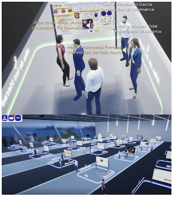
Secpholand is yet another contender for “Second Life clone elevated to use for online conferences.”
de la Heras and colleagues write of this platform:
This... environment has been selected mainly for the possibilities of interactivity with other attendees, since networking options are significantly increased compared to the standard video conference format at online meetings. What is especially attractive is how posters are presented, which for us was very important given the high number of poster contributions and considering that many of the presenters were early-career researchers, sometimes at their first conference participation. ... Moving your avatar around, you can see the posters, zoom on them to check them out and especially, when entering in the dedicated area next to the poster, a voice call with the other people in the area is started, giving the possibility to talk with the authors and other attendees in front of the poster. Thus, the platform is able to reproduce a traditional poster session in an online platform reaching more than 2600 poster visualizations.
I have questions about how smooth the navigation experience is. The post-conference survey notes people were generally satisfied, but they don’t drill down to specifically how the poster session went. But this comment seems important:
(N)ot everybody had the same approach to the online platform and virtual environment, whose interface was not immediately user-friendly for everyone.
Read more:
de las Heras A, Gómez-Varela AI, Tomás M-B, Perez-Herrera RA, Sánchez LA, Gallazzi F, Fernández BS, Garcia-Lechuga M, Vinas-Pena M, Delgado-Pinar M, González-Fernández V. 2023. Innovative approaches for organizing an inclusive optics and photonics conference in virtual format. Optics 4(1): 156-170. https://doi.org/10.3390/opt4010012
• • • • •
A new preprint looks at how biologists make posters.
Jambor HK. Insights on poster preparation practices in life sciences. bioRxiv 2023:2020.10.08.331413. https://doi.org/10.1101/2020.10.08.331413.
Most make a poster in two days and get no feedback.
There’s your problem. That’s nowhere near enough time. And what do you expect if you don’t get input from other people?
Another little result of the poll that baffles me is that less than a third of people polled used PowerPoint, which is not consistent with what I have found surveying people online about what they used to make their poster (42% used PowerPoint) and asking people at conferences what they used to make their poster (61% used PowerPoint).But those surveys of mine were years ago (downside to having a long running project), so maybe it’s time for a new poll on Twitter.
• • • • •
Speaking of polls, here’s a Twitter poll asking about whether people prefer paper or screen posters.
• • • • •
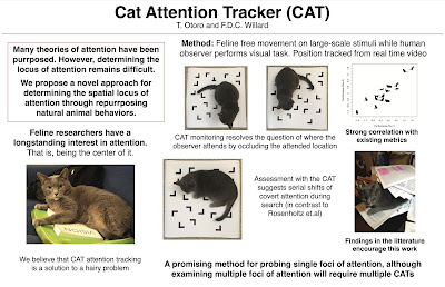
Speaking of e-posters, this is what is passing as a “digital poster” now:
According to the presenter, this is a video recording of a PowerPoint presentation. The same recording is used for people browsing online as in attendance.
I am baffled as two why anyone would call this a “poster.”
It’s always something to read outside your own field.
I explore the science poster medium’s performativities, its potential for producing greater discourse about the institutional structures that hold up academic conferences.
That “hegemonies,” “deconstruction,” and “post-war fetish” all appear on the first page alone tell yous this is not a typical scientific article.
This book chapter by Alen Agaranove describes two performance art pieces which were presented as hoax poster presentations (Agaranov calls them “lecture-performances”). One occurred during an actual conference.
Why do this, beside, you know, for art’s sake?
The goal behind the lecture-performance, no matter how nonsensical or illogical, is to prevent a conversation about science communication from immediately degenerating into inquiry or research.
Read more:
Agaronov A. 2023. Conference of the oppressed: Lecture-performing the science poster presentation, In: Haste H, Bempechat J, New Civics, New Citizens: Critical, Competent, and Responsible Agents, pp. 131-143. Brill.
• • • • •
Maybe Ben Wolfe’s poster could be considered “lecture-performance.”
Ben snuck this fake poster into a conference.
• • • • •
If you share your poster online at any point, make sure to provide alt text for accessibility.
Here’s a guide for writing alt text for data visualizations, with a tip of the hat to Jon Schwabish.
• • • • •
For you who like to teach using posters, here’s a new paper.
Ariyani A, Muhayyang M, Munir M, & Sakkir G. 2023. Students’ voices: Poster session as an alternative way of teaching writing. ARRUS Journal of Social Sciences and Humanities 3(2): 97-103. https://doi.org/10.35877/soshum1749
This paper talks about teaching written English to university students, for whom English is an additional language.
Most students like writing for poster sessions.
• • • • •
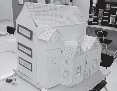
Annmarie Guzy used posters instead of a midterm. This is not perhaps super unusual, except that it was from the humanities. Specifically, horror.
But “poster” is broadly defined. Here is what one student made for The Haunting of Hill House:
Guzy A. 2023. A creative midterm alternative: The horror author poster session. Honors in Practice 19: 138–41. https://digitalcommons.unl.edu/nchchip/389
Making things consistent is a central design challenge. This paper in press tells you how to build a guide to make graphic designs consistent.
Graze M, Schwabish J. 2023. Building color palettes in your data visualization style guides. Journal of the American Medical Informatics Association. https://10.1093/jamia/ocad084
The paper identifies eight things you need in a style guide:- Colour
- Type
- Sizes
- Content
- Chart parts
- Visualization types
- Accessibility
- Resources
There is a website of sample guides and resources: www.datavizstyleguide.com.
Colour is first on the list, and most of the paper describes what you should think about when picking colours to use. What kind of purpose is the colour being used for? Categories, sequences, or differences? Do some colours unintentionally look “better” than others? What are the cultural connotations of the colours?
This article could be useful for people who run labs that produce multiple posters every year, each made by multiple students. Make a guide so that the output from you lab looks somewhat consistent. It will save supervisor and students time in the long run because they don’t have to keep making design decisions from scratch.
• • • • •
That’s it for this month! Thanks for joining us!


No comments:
Post a Comment