
I’ve written about the importance of respecting reading order on this blog many times. English readers generally look at the top left of a page first, because that’s where we have learned that text starts.

Lately, I’ve been thinking a lot about how scientific journal articles break information apart. But I didn’t realize another shortcoming of typical journal figure layouts.
You are supposed to start reading in the middle. It’s not necessarily clear if you will end up at the last image in the figure or the end of the figure legend.
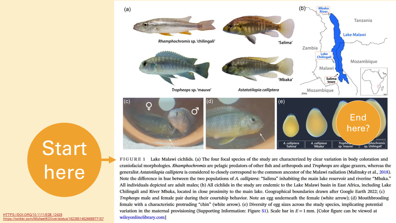
Not only that, you have to look back and forth from the legend to the images. Your eyes are constantly travelling.

But graphics from news organizations (like the New York Times, FiveThirtyEight, Nature or Science magazines, and so on) do things a different way. The title goes at the top.

Rather than having the description underneath, the graph is annotated. This makes the graph less compact, true, but reading it is more in line with our reading expectations.
The more I think about it, the more I think this format is a much better model for figures on posters..


No comments:
Post a Comment