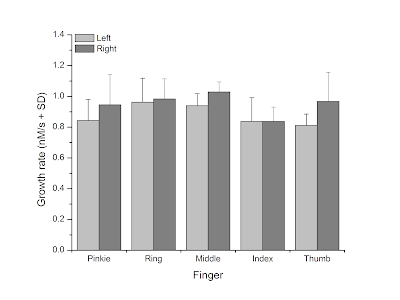
Years ago on my general blog, NeuroDojo, I wrote a post about how fast my fingernails grew. As part of that post, I made this graph:
I created this graph in OriginLab, and it is clear enough. It’s very much the sort of thing you expect to create for a technical journal article.
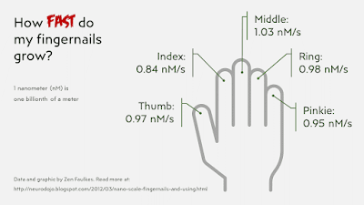
I recently looked at that post again, and got an idea for a more graphic way of showing the data.
This does not have the same amount of detail as the bar graph, but is more more readily understood at a glance. It makes it more obvious what the numbers are showing: something related to each finger of a hand.
If I was more ambitious, I might have made the graphic even more personal by taking photographs of my own hand.
This approach (if not this particular quick and dirty graph) would be much better for a conference poster than the more traditional bar graph.
Remember, graphs are anonymous. Photos and illustrations and icons have personalities.
Update, 12 February 2023: I should have mentioned I did this graph makeover and submitted as part of a Storytelling with Data challenge for January called “The quantified self.”.
This then got featured on the Storytelling with Data podcast, episode #61: “AI, quantified self, and fingernails.” So yeah, those are my fingernails they’re talking about!


No comments:
Post a Comment