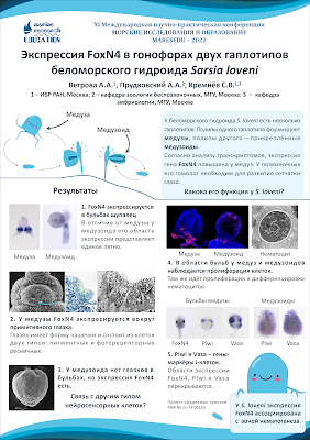
Last year, I was putting out a call for conference posters in languages other than English. This week, I can thank Alexandra Vetrova for answering the call with this blog’s second poster in Russian, and another in our roster of award-winning posters! Click to enlarge!
To translate a little, this poster is about FoxN4 expression in Sarsia lovenii. Alexandra wrote:
I was forced to use a PowerPoint template with the conference logo, blue header, and footer, so I played around a little. If only I had more time to do better typing... It still won an award though.
Usually awards are given on the basis of content, but this is a good poster in design terms, too. There’s a consistent colour scheme, a signposted two-column layout, and lots of images.
Some small changes that might benefit the poster might include:
Flipping text and pictures. Because paragraphs are numbered, I would try making is so that the numbers were in the upper left corner of every one of their sections. In sections 1 and 3, the numbers is pushed to the right by the photos. In sections 2, 4, and 5, the numbers are pushed down below by the photos.
Consistent spacing between pictures. The pictures above section “2” have very thing dividers compared to the pictures in all other sections.
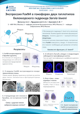
This is my quick and dirty revision:
I had to cheat a little with section 5. I couldn’t just reposition the elements, but had to shrink some of the pictures (now in the upper right of the section) to be able to fit. I think it improves the “scannability” of the posters, but the difference is not huge. That’s a testament to Alexandra’s design.Спасибо, Alexandra!


No comments:
Post a Comment