
Alexandra Lai is a repeat customer of the blog. She was kind enough to share her work some time ago. She wrote, “I appreciated your critique so I am coming back for more!”
Well, when someone asks, I have to give it. Click to enlarge!

When I open a poster for review, there’s always that first reaction. Sometimes, it’s an overall impression that makes me go “Ooooh...” it I like it or that sound of sucking air through my teeth if I don’t. But sometimes, it’s one thing that you spot right away and you cant let go of.
It’s down in the lower right.
Headings do not just convey information about sections. They help divide a work into chunks, carving the poster at its joints. Here’s the poster with the headings at the top of each section.

While I personally have written about how I dislike changing column widths, I have very little confusion about what the sections are or what order to read the poster.
But in the lower left corner, the short heading accidentally isolates the last column,

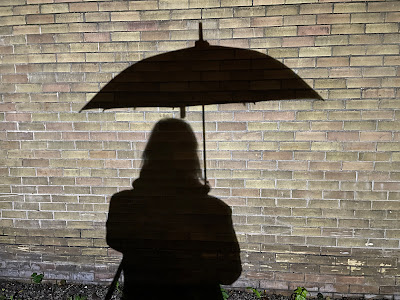
Think of a heading like an umbrella.

Doesn’t just looking at that umbrella just make you want to reach in and pull it over the body? Like this?
– which happens in the first heading.
Similarly, I don’t think it’s common for ellipses to end one line or section…
… And use ellipses again to start the next line or section, which happens in the rightmost headings and in the text. Text lines should start with words, not symbols.
These sorts of decisions are why professional book typesetting, even now, is at least checked by professional typesetter and not isn’t automated like Word documents. Placing line breaks and hyphens are not easily encapsulated in algorithms.
The rest of the poster has a consistent use of contrast colours, blues and oranges, that help add visual interest.
I thank Alexandra for sharing her work again, and wouldn’t mind seeing a third sometime!
Related posts


No comments:
Post a Comment