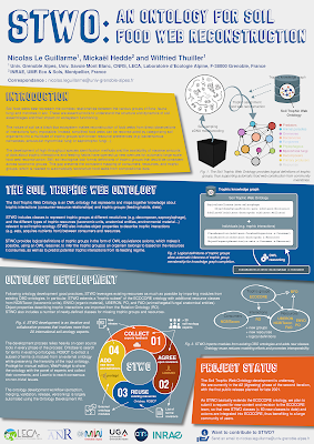
Today’s poster comes from Nicolas Le Guillarme. This was presented at the S4Biodiv workshop.
As always, you can click to enlarge!
My first reaction was, "Ooh, this is really nice.” The bold use of colours and moving the dividers a little off the horizontal give the poster a lot of energy.
In fact, there is so much life here that I didn’t notice there is still quite a bit of text. I would like to see that edited back a little if possible.
My second reaction was to look at the title and headings. The typeface is open, so the colours of the background and the foreground of the text are the same. This can make it a little hard to read some of the letters, and I particularly worry about readability from a distance.
Here’s a quick and dirty attempt to fill some of the letters.
The white fill in the “Introduction” heading works very well, but I didn’t find the right colours for the other headings. I do think that this revision shows that filling the letters increases the visibility, though, even though I didn’t take the time to optimize the colours.
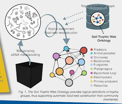
Similarly, I would like to see a little more contrast in Figure 1.
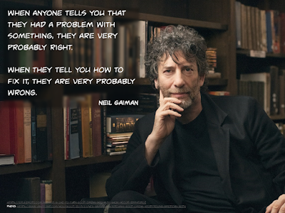
The labels overlap parts of the figure, and makes some of the labels hard to see. In particular, I’m looking at the “Tropic assignment” label over the spiralling arrow. I might try to stick a semi-transparent box under the labels. You can see the technique in the graphic I made for this post:Notice how the books are light and sharp by the elbow but darker and blurry where the quote is? That’s the kind of effect I’m thinking of. Something to make the text a little more distinct from what it sits on top of.
Some of the labels in the network diagram over on the right are also nearly impossible to read. The “Resources” label is almost the same colour as the background. While under most circumstances, having the text and dot be the same colour reinforces the connection, that should not come at the cost of readability.
So in the revision above, I just made all the labels black.
Nicholas wrote:
This is my first attempt to create a poster that is both informative and visually appealing. I am quite satisfied with this first draft, but I am pretty sure that there is plenty of room for improvement.
I think Nicholas is right on both counts. It is very satisfactory – more than satisfactory – but constant improvement is The Way!


No comments:
Post a Comment