Congrats to all the winners of the Royal Astronomical Society poster competitions!
You can find the work in the linked thread above. But I’m featuring Jo Ramasawmy’s poster because she was super nice enough to give shout out to this blog! (Yes, I can be flattered. Sometimes.)
My Fonts has their latest primer on bullets and dingbats (PDF). Did you know there are em bullets and en bullets? I, for one, did not.
That type workhorse, Helvetica, now comes in a variable font. See my introduction to variable fonts here.
• • • • •
Pharmacy students think posters assignments help them learn, but they increasingly prefer digital posters over printed ones.
• • • • •
This article about virtual meetings suggests people prefer poster sessions online, but only supports it with a single quote from a single person.
With no cavernous exhibit hall to accommodate hundreds of posters, MSVirtual2020 replaced posters with brief presentations – 10 slides and, at the author’s option, a brief explanation of the findings – that meeting participants accessed at their convenience. Dr. Cohen, director of experimental therapeutics in the Cleveland Clinic’s Mellen Center for Multiple Sclerosis Treatment and Research, considered that approach to be a big improvement.
“I don’t personally enjoy trying to see 500 posters in a giant exhibit hall, walking up and down the aisles. I barely see the content because I end up just talking to my friends,” he said. “In essence, this was like a three-minute talk that presented the poster, and the audience could stop the presentation and look at something in more detail if they wanted.”
Presumably conferences have been surveying attendees about their experience, but I have yet to see any of that data shared.
• • • • •
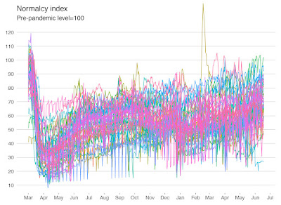
Marie Seggar walks through an excellent graph makeover from The Economist. The starting point is this interpretable mess of lines:
Because one of the major problems I see on many posters is “too much stuff,” this is a great example of how take a complex data set and make something that is more readable. Ultimately, you have to be selective and you have to emphasize some data over others.The final version is much easier to read. Go check it out!
• • • • •
And that’s what I found on the internet this month!


No comments:
Post a Comment