27 May 2021

Link roundup for May 2021

I’m increasingly convinced a major secret to making a good poster is editing – whether you edit yourself or are lucky enough to have someone else do it. Ian Dunt worked as an editor for years, hated it, but learned a lot. And he shared what he learned in this post.

Excerpt from his fifth point:

Your readers are busy. Your job is to make the process of accumulating knowledge about the world easy. They should not struggle to understand you. You are not a poet, writing for people to appreciate your words through introspection in the moonlight. You are a hack, writing for busy people on a bus who are late for work. Your job is to deliver this information into their brain effortlessly.

The post was targeted for political writers, but there are gems in there for anyone who wants to communicate.

• • • • •

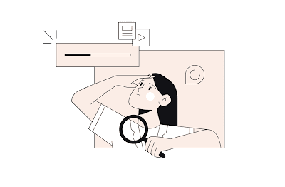
Root Illustrations look to be a useful source of artwork. People are fairly tricky to draw, so “ready to go” illustrations of them are helpful. And to sweeten the deal, they are vector based images, which means they will scale to any size.


Illustration of a person searching for something

There is a modest charge for their use, but... buried down at the bottom of the page is a note that you can get 50% off if you are a student or teacher.

Hat tip to Echo Rivera.

• • • • •

Observable Plot is a tool for data exploration and visualization. It’s a JavaScript thing, if you’re into JavaScript things.

• • • • •

MyFonts offers always excellent advice in their primers. This time it’s about how to create emphasis in text (PDF file). 

Importantly, they have a list of “nevers.”

  1. Never underline.
  2. Never “highlight.”
  3. Never use bold and italic.
  4. Never use all capitals.

And here’s another primer on readability. (Again, PDF.)

• • • • •

Stock photos are sometimes rightfully mocked, but they have their uses. Matic Broz at Photutorial provides a resource comparing stock photo websites

Pros and cons list for stock phot website.

Compares 22 different commercial sites.

• • • • •

The Canadian 🇨🇦 research agency NSERC has a “Science Exposed” People’s Choice competition that features 20 outstanding scientific images. 

Vote vote vote! Voting continues until September 26, 2021.

• • • • •

A tutorial on making graphs in ggplot2

• • • • •

Typefaces often suggest concept and attributes like “feminine.” This article argues that we should avoid using such gendered descriptions of letters.

• • • • •

A new to me Twitter thread (from last November) by Ian Brennan on how to make cartoon-style illustrations of animals.

• • • • •

That’s all for this month!

24 May 2021

Critique: Mercury in peatlands

Yes, the Better Poster book launches today, but you know what? There’s no better way to celebrate than by doing the thing that, if I’m honest, has become the absolute heart and soul of this project: looking at the work of other people and trying to improve it.

Today’s contribution comes to us from Lauren Thompson. Click to enlarge!

Poster: Seasonal patterns of mercury from thawing permafrost catchments

This poster was given at Mer Bleue and Beyond virtual symposium this month. I noticed this poster in my Twitter feed because it had a strong colour scheme (attacking the Pokémon problem). Even shrunk down in my Twitter feed, I could see there was an emphasis on visuals over text. It was clear that this was a solid bit of design work.

Where the poster has a bit of a pain point is, unfortunately, at eye level right smack dab in the middle.

There’s just no way to get around it: The two scatter plots on the left are too close to the bar graphs on the right. The right axis labels for the scatter plots are bumping right up against the left axis labels for the bar graphs. It’s confusing, because the right axis labels almost look like they belong to the right graph.

The scatter plots have a couple of issues. The legend for both is in the bottom graph, not the top one, where one might expect to see it. I suppose this is because the Smith Creek data weren’t as flat as the Scotty Creek data, so there is no convenient space to put the legend inside the top graph. 

Not only does the position makes it easy to overlook the legend, the colours do, too. The colours of the symbols are different in the legend (open symbols) than in the graph themselves (green fill).

Moving over to the bar graphs on the right side, I always have a problem with duplicating information. The same information is shown in the length of the bar and the label. 

The visual noise gets worse because the unit for the data points (shown for all four bars) is long (ng MeHg km-2 d-1) and shown in bold.

The one other element is that the box has two arrows coming from it, which seems to indicate that there are two possible directions to read after reading the section. I do not like “choose your own adventures” on posters. But even then, the background grey is quite light and the arrows are a little hard to see.

Here is a quick and dirty revision.

I separated the two panels, and did quite a few changes to the bar graphs on the to get rid of the visual noise. Cutting the years to two digits was hard, but it helps the separation of the left and right so much. An x axis label is still missing, though.

The rest of the poster doesn’t need much tweaking. The other panels have some of the same issues, but they are not as severe as the section shown. The axis labels are a little heavy, and elements are a little too close. For instance, in the funding section:

Multiple logos of funding agencies.

The Weston Family Foundation logo is kissing the edge. The NSERC logo has no breathing room on either the top left or bottom right.

It turned out Lauren was a reader of the blog. Thanks, Lauren!

20 May 2021

Using poster assignments in courses

This post is for my fellow educators. How can you best use posters in a course?

There are a few reasons you might want to have students make posters for a class. Probably the biggest one is practice for presenting a poster in a professional setting, like a conference. Same reason we ask students, even undergrads, write in journal format: to give them practice communicating like professionals.

I’m going to give an outline for how I integrate posters in a science communication course. 

The science communication course I teach is one semester class for advanced undergraduates.

The poster “officially” takes up only one week of the class, but several exercises before I give students the poster assignment build up and reinforce what I ask students to do in the poster module.

In the first few weeks of the course, I ask students to prepare standard application materials like a CV or résumé and a personal statement. This is usually fairly straightforward in terms of content, because students are writing about themselves. These modules give me a chance to talk about typography. I use these modules to emphasize the importance of good typography in the appearance of a professional document.

The learning objective within the applications module:

  • Describe key elements of typography that improve the appearance of documents.

A couple of weeks later, I ask them to create a few simple plots of data. I usually give them some raw weather data (say, a month of temperature data from two different cities) and ask them to make a few standard summary diagrams like bar graphs (with error bars!) and scatter plots. This module gives me a chance to talk about data visualization and introduce some basic concepts of graphic design.

The learning objectives for the graphing module:

  • Describe advantages of plotting data.
  • Describe and use best practices for creating tables for publication in scientific journals.
  • Describe and use best practices for creating graphs for publication in scientific journals.

In this particular course, I don’t ask students to make a poster about their own project. (They do have a project, but I ask them to do an oral presentation instead.) Instead, I tell them to base their poster on a recently published open access journal article. 

The advantage of asking students to modify a published article instead of making a poster of their own class project is that I want students to edit. It’s often easier to edit someone else’s work than your own.

I tell them:

Do not "dump" the paper into the poster and be done with it! That will get you a crummy score, guaranteed! The best posters are likely to be the ones that are the most different from the original paper. For an example, compare a paper I published here to a poster I made about the same project here (from this blog post). The paper has ten figures; the poster has only five. The difference in the number of words is obvious.

The learning objectives for the poster module:

  • Describe how posters are presented in academic conferences.
  • Create a design brief for a conference poster.
  • Describe basic concepts used in graphic design.
  • Describe and use several best principles for conference poster design.
  • Design a conference poster.
  • Use a checklist to evaluate your poster.

Of course, they also end up revisiting some of the learning objectives from the previous modules.

I direct students to a checklist here on this blog to assess their own posters. I use a modified version of the checklist as the scoring rubric.

After the students design and submit their poster, I ask them to do a round of peer review. In an online course, I do this using a discussion forum. Depending on how the semester is going, I might give students an opportunity to resubmit a poster for a revised grade. 

Later, I have students give an oral presentation of their class project, and that gives them another opportunity to revisit some of the graphic design and typography skills from the poster module.

18 May 2021

The Better Posters book has shipped!

Yesterday, a good friend of mine posted this on Facebook:

Better Poster book in a box

Proof of life!

That’s right, the book has shipped early!

You still have a few days to “pre-order” the book from the publisher at a 30% discount. Use the code “POSTERS30” at checkout.

Edit: And friend of the blog Melissa Vaught got hers!

Keep those pictures coming! I love them!

17 May 2021

Online posters at National Biotechnology Conference

Speaker, National Biotechnology Conference

This week, I am pleased to be speaking at the National Biotechnology Conference! I’ll be presenting on Thursday, 20 May, at 8:00 am Eastern Daylight Time on poster design.

Some of the conference content was available last week, so I went in and looked at how this meeting is handling posters.

As I’ve mentioned before, the concept of a “poster session” in an online space is an interesting thing. Different meetings have handled them in very different ways.

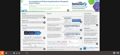
Below is a screenshot of one sample poster, just pulled by happenstance. I have blurred the title and authors, and at the preview scale, the rest is not really readable.

The conference provided a limited number of poster templates, so my focus is not on the poster design, but the viewer experience.

Sample online poster from National Biotechnology Conference 2021

How it works is that when you click “View eposter,” a preview screen pops up that shows you an overview of the entire poster. 

You can see controls for the poster – menu, forward and backward arrows – down in the lower left corner.

Media controls

If you read comics using an app like Comixology, the poster experience is rather like their “Guided view.” You step through each individual panel of the comic or poster, then advance to the next one.  In the poster situation, though, you have the option of playing narration.

The poster is scattered with little “sound” icons. These are obviously added in by the software, because the icons cover parts of text and graphs. There was clearly no consideration of where the icons would fit into the design.

Every section with an icon has a pre-recorded message.

Sound icons

When you click play, you can hear narration recorded by the presenter. There is no “autoplay” through the entire poster. You have to click to advance to each section.

Judging from a few posters picked haphazardly, if you just listen at normal presentation speed, it takes about six to eight minutes to listen to a presenter walk you through a poster.

Luckily, the “speedometer” icon allows you to play it faster (unspecified, but I think it might be 1.5×, 1.75× and 2× regular speed). A nice touch.

I have not made a comprehensive review of all posters, but I will say that sometimes listening to the narration is an odd experience. On text blocks, many presenters start reading the text exactly as written on the poster, but then deviate from it at unpredictable points. The transition from following along to trying to parse the difference between what is written and what is said is jarring. 

It feels a lot like people reading PowerPoint slides. And we know what crushing experience that is. Most people read faster than presenters talk. 

Eposters mimic one aspect of some paper posters. Despite seeing only one panel at a time, it’s often hard to read the text because people write too much stuff that is too small. Even when I’m viewing a a single panel full screen, I see sections that I cannot hope to read without learning in uncomfortably close to my screen.

You can also download the poster as a PDF.

So while this is technically a kind of interesting way of presenting, I’m still unsure why this should even be called a “poster.” In practice, it feels like it would be much more natural either to have people record slide talks or upload a single static document, like a manuscript.

External links

National Biotechnology Conference


13 May 2021

Solving the Pokémon problem for posters

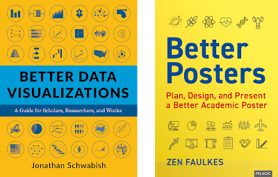
My editor on the Better Posters book forwarded the copy of Jon Schwabish’s book Better Data Visualizations. (I have not read it yet, but hope to soon!) If you remember of one the rejected cover designs I posted a while back, it’s fair to say we dodged a bullet by changing my book cover.

Covers of Better Data Visualization and Better Posters

Similar titles, concept, colour scheme, and layout? These covers would have had the Pokémon problem.

I play Pokémon Go. I have a dog and it gives me something to do while I walk. When you’re playing, you usually see a screen something like this:

Pokémon Go screen showing Clauncher

When I saw a screen like the one above, I thought, “Ooh. What’s that?” The game periodically introduces new Pokémon, and one of the newer ones (shown above) is a new snapping shrimp inspired Pokémon called Clauncher.

Clauncher

I study crustaceans, so obviously a lot of the crustacean inspired Pokémon are my favourites.

But what struck me when I was looking for those first few Claunchers was how obvious it was when the first one popped onto my screen that I had never seen it before

The more I thought about it, the more I realized how brilliant the Pokémon designers are. When you’re playing, you need to clearly distinguish different characters. Those characters are appearing as just a few pixels on the screen. 

Even though these are all nominally “cat Pokémon,” it’s easy to recognize them as different kinds of characters. 

Cat pokémon.

Conference posters suffer badly from the Pokémon problem. 

There is a lot of sameness on those poster boards. I remember someone saying that if you image search for “Good conference poster”...

Google image search for good conference poster

and then search for “Bad conference poster,” the results look... almost the same.

Google image results for bad conference poster

How do the Pokémon designers do it? Mostly they pay attention to colour and shape. Some Pokémon are light, some are dark, some are striped. They generally don’t have subtle differences (though some of the shiny ones are quite a bit like the normal ones). They colours and patterns are big and bold.

But even if you saw them in grayscale or in outline, each Pokémon cuts a different silhouette. 

As a poster maker, you’re probably going to have a rectangular poster. But you can pay a lot of attention to the shapes within your poster. Things that are not rectangular are going to make a strong impression and distinguish your poster from the crowd.

Having a strong colour scheme is even better. You can see the colour of something from a long way away, long before you can see any detail. When I walk through poster sessions, many posters are black text on a white background. 

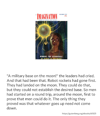
Magazine cover and black text on white background
 

In big sessions, though, there is often someone who has a black poster with white text, and it just pops out. 

Magazine cover and white text on black background

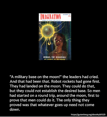
But that is still monochrome. When I have images, I like to use the eyedropper tool to take something from the image and make it the dominant colour for the poster.

In this example, I sampled the yellow in the glowing ball.

Magazine cover and black text on yellow background

But I could have easily pulled from the dark blues in the background.

Magazine cover and white text on blue background

Even though all four have the identical content, nobody would mistake one for any of the others if they were hanging up in the poster hall.

This is one of the reasons conference templates create problems for presenters. For a local student conference, I once provided  all the student with a template of black text on white background. It’s the most readable, right? It was bad, because it was so monotonous to look at.

So to get back to the cover of my book and Jon’s book... it would have been a disaster for both of us if my cover had stayed the same. It’s enough that the topics and title are similar, but if those covers had been so much alike?

I think there would have been a lot of readers who would have confused our books. People would have thought, “Well, I am going to show data, but where’s the stuff on posters?” Or “Man, I’m show slogging through a lot of poster stuff to learn a little about data visualizations.”

And the moral of the story is: Look for ways to make your poster as distinct as a Pokémon!

Related posts

Sunday scraps: Second book cover draft

Sunday scraps: Third book cover draft

External links

Pokécrustacea: the crustacean-inspired Pokémon

08 May 2021

Custom Better Posters bookplates

Bookplate saying "Ex libris", "With the gratitude of the author" and "Pelagic publishing".

Here’s one for the book nerds.

For people who ordered the physical copies of the Better Posters book, I have a little something for you. I have just ordered some custom bookplates for you!

Some of my friends told me they want signed copies of the book. I personally am not all that interested in packing up books and hauling them to the post office or where. But sticking bookplates in an envelope? That I can do!

These will probably arrive slightly after the book does. (Grading my classes kept me from being slightly more prompt about this. Sorry.)

If you want one, show “proof of life” (that is, a picture of your copy of the book) on social media (Twitter, Instagram, Facebook, or wherever). Email me the link at BetterPosters@gmail.com and include your mailing address. Pics of the book next to pets, in cool places, or by smiling faces are appreciated but not required.

While I freely admit that this is a bit of a marketing gimmick, the bigger thing I hope to get out of this is to see the book out in the world and in the hands of people who I hope will find it useful and enjoyable.

03 May 2021

Never use a graph you can’t explain


Box plot on left, violin plot on right showing same data.
 

Irena Chelyseva asked if people preferred box plots or violin plots. She said, “I guess there is no right answer.”

I think there is, if not a right answer, a justifiable answer for why some people should use one or the other.

I can explain absolutely every element in my box plots. Usually, center line in the median, box is 50% of the data, whiskers are 95% of the data, and I have symbols for minimum and maximum. 

There is no accepted standard for box plot displays, however, particularly for the whiskers. People often fail to label the graph enough for me to interpret them.

So I frequently have to ask people, “What are the whiskers in your box plot showing?” (Or bar graph, but people are usually a bit better at labeling them.) And I am surprised by how often they can’t tell me. They’ve forgotten.

I recently asked, and the presenter said, “I think they’re quartiles.” But quartiles should include the entire range of data, and their plot had data points past the end of the whiskers.

This makes for an uncomfortable moment when you’re presenting a poster.

Getting back to the original question, this is why there is at least one good justification for preferring one chart over the other. 

I can’t explain what a violin plot shows. I know in principle that the curve shows and estimate of distribution. But I can’t tell you how the curve in a violin plot is calculated or derived. Because it’s an estimate, I suspect there are different methods of estimating distribution, and I don’t know how they differ.

I should use box plots instead of violin plots, regardless of the data, because I know how to explain what one shows but not the other.

It doesn’t matter if one graph shows something better in theory if I can’t communicate exactly what is being shown.