This week, more from Stephen Herd! If you haven’t seen his first effort, go back and have a peek before seeing how he pushed the envelope even further. Click to enlarge!
Stephen has this to say about this work (lightly edited).
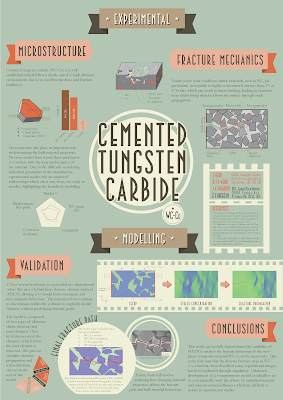
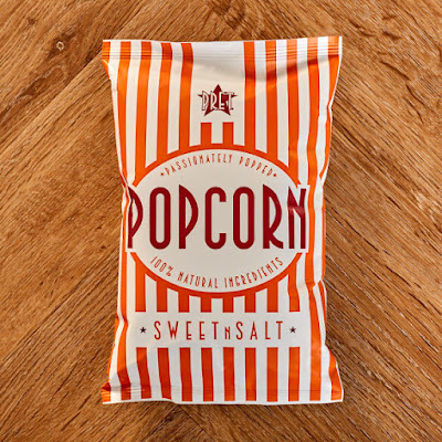
I decided to focus on the images and text would be more like figure titles. This one was more ambitious. Inspiration for the second poster came from a packet of popcorn and also looking at movie posters.
Stephen attached this picture:
I see the resemblance. I would have guessed circus posters more than movie posters, but maybe that’s just the typeface.
Stephen continues:
One of my aims was to see if you can create a poster where the title isn’t at the top of the page. This created a lot of problems in how the other elements sit on the page and how they interact with the title at the center.
I mostly agree with Stephen’s analysis. That the title is in the middle is not an insurmountable challenge. In fact, I think it succeeds here in that it is immediately obvious what the title is. The type size, the circle, and the contrast all give the title a lot of visual weight and draw your eye there first.
The problem is, “Where do I go next?”
Stephen has two levels of headings. The major headings are “Experimental” and “Modelling.” Then there are subheadings like “Microstructure” and “Conclusion.” A problem is that the headings are too similar in size and appearance to clearly mark one as “major” and the other as “minor.”
I would have tried to stretch the “Experimental” and “Modelling” headings right across the width of the page, to more clearly separate the two sections of the poster. I think Stephen didn’t because he ended up with too much content in the “Experimental” section, and the “Modelling” banner is narrowed as a result, and once you have one heading in a narrow banner, the other gets put in a narrow banner so it’ll match.
It looks like an editorial problem more than a design problem. Too much stuff!Stephen concludes:
While I am still not 100% satisfied with the design, the poster was successful as it brought many people over to discuss the unique design and then go on to discuss my work.
I agree with Stephen again. This poster’s bold graphic sensibilities in the type choice, circles, and good use of text wrapping, make this stand out at a glance. And that “first glance” is critical for gaining and keeping attention.
Update: I heard more from Stephen about his choice of InDesign to create his posters.
The two main reasons I use InDesign are ease of controlling lots of elements on a single page and control of typography. Specifically:
Some other smaller advantages include: creating colour pallets, printing options like bleeds and efficient rendering of images ensures your computer doesn't slow down with heavy files.
- Being able to set guides on a page makes it a lot easier to create grid patterns and align objects.
- Putting elements on layers and controlling those layers, like locking or hiding layers. This can get particularly painful when you have lots of elements on a single page.
- Text wrapping is easy in desktop publishing software, but also things like drop caps, tracking, character width/height, paths etc.
I think that once you're over the initial learning curve, life is a lot easier when using the right tool for the job. I would be pretty daunted if someone asked me to replicate the poster designs exactly in PowerPoint. While you could get close to the overall design, I think it would both take longer and you would sacrifice the precise control that InDesign gives you.
Hope you enjoyed this two parter!
Related posts


No comments:
Post a Comment