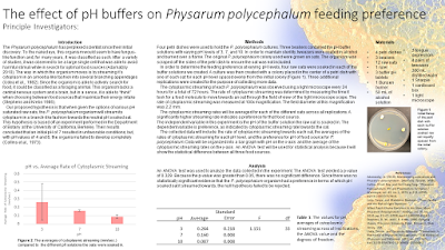
Now, I have to apologize to William here, because my first reaction to this poster is not a kind one. But sometimes, my first reaction to a poster is:
“Blow it up. Blow it all up. Blow it all up and start again.”
This poster has deep structural issues. There is too much text. The reading order is all over the place. When the problems are that big, you want to see a fresh page.
But first impressions can lie. Then I calm down and start tinkering. And by following some of the usual design principles, the poster slowly but steadily gets better.
The first thing I did was get rid of lines. Underlined text and boxes were immediately banished. Headline case was replaced with sentence case.
Next, I tackled the table. I gave it a more standard format, with just horizontal lines separating the top, header, and bottom. I cut the large number of decimal places down to a more reasonable three.
Getting rid of the long numbers in the table made it more compact. I started pushing the elements around so I could line up the left edge of the table with the text blocks above. I did the same with the figure on the right. Columns started to take shape.
All the headings were made bold.
The text was a mix of Calibri and Arial, so I made it all Arial. I continued to try to make the text the same point size whenever possible.
I justified the text blocks to emphasize that things are aligned on the page now instead of scattered higgildy piggildy.
The deep problems remain – to get rid of those you really do have to blow it up and start again. But I’ll be darned if the poster doesn’t look noticeably better. And there isn’t anything complicated about what I did here. It mostly boiled down to:
- Get rid of lines and boxes.
- Line things up.
- Put space between things.
- Make the text consistent.
Sometimes, I’m kind of amazed by how much the appearance of a poster can improve with simple fixes. It’s not crazy complex stuff. It’s like how getting a good haircut and a little makeup can take years off someone’s apparent age.


No comments:
Post a Comment