30 March 2017

Link roundup for March 2017

My last link roundup came out just before this year’s Academy Awards, which featured an ill-fated announcement of announcing the wrong winner.


This article argues that the card design could have been much better and possibly avoided that memorable but embarassing moment.

That’s horrible typography. I will emphasize that again: horrible. Or, to be nicer, not good. Look at it again. Of course anyone could’ve made the same honest error!

The words “Best Actress” are on there  —  at the very bottom  —  in small print.

You are on television with millions of people around the world watching. You are a little nervous, and you have to read a card. You will most likely read it from top to bottom without questioning whether the card is right. ...

Here’s what should’ve been changed based on the three critiques I just made:

  • The logo doesn’t need to be at the top of this card. Everyone knows it’s the Oscars. We move the Oscars logo to the bottom where it’s least important in this context.
  • The award category, Best Actress, is moved to the top so that it’s the first thing anyone sees and reads. There is no confusion what the category is because it’s clearly stated first.
  • Emma Stone’s name is bigger than the title, La La Land, because she is the winner of this category. The winner should be the most emphasized thing on the card, with all other information, like the film’s title, in a smaller or thinner font.

Friggin’ logos mess things up all the time.


For a few years, some journals have been playing around with “graphic abstracts” or “visual abstracts.” Clearly, many of the same principles that you would use in a graphic abstract you would also use for a poster. This post looks at their proliferation in the field of nephrology. Hat tip to Hilda Bastian.

A century ago, an artist made a beautiful typeface.


And threw it into the river.  A brilliant bit of history.

Speaking of fonts, check out this article on Futuracha Pro, described in the article title as a “crazy gorgeous font” that “evolves as you type.”


You can pre-order it here.

This is supposed to say, “Arise.”


Hat tip to Alistair Coleman and Stephen Curry.

Ace doodler Sunni Brown posted this reminder on her Instagram:


Good design is not just about thinking outside the box. It is more about climbing into the box of others. - Caroline Korowicki

Design is about empathy as much as colour and typefaces.

23 March 2017

Critique: Electric India

Today’s poster comes from Anjali Sharma. It is being presented at the Energy For Society conference in April. Click to enlarge!

It’s... square. This is interesting, because I don’t see many square posters here on the blog.

Something you may not see (depending on browser settings and such) is that this poster has a wide margin. Margins are very undervalued on many posters, and the margin helps give this poster some lightness.

I’m having a hard time moving past the title. Those letters touching the top of the box are just killing me. There is room to center the text better vertically, since none of the bottom descenders (the lower case Gs) are threatening to touch the bottom of the red box.

The lines around the columns are not heavy handed. They are light and well placed far from the text, so they add some visual interest rather than feeling like an attempt shoehorn too much content into too little space. But I always like to see what a poster looks like without boxes.

Speaking of lines, there are a couple of stray vertical gray lines on either side of the bottom bar graph that seem to be left over from importing the graphic on to the poster.

Here’s a slightly revised version of the poster. I cheated with the title, extending the coloured box up rather than centering the text. this leaves the poster no longer perfectly square, nor all margins equal. But I think you can see what I was going for.

This is a rare case where I think the removal of the boxes does not benefit the poster.

The poster feels grey and text heavy, even though there are some reasonably nice big images on it. This might be happening because of the visuals are buried in the bottom and the right, far from where people look first.

But this poster is is clean, readable, and no one would be embarrassed to hand it on a poster board.

16 March 2017

Critique: Oil spill

Today’s contribution is an award winning poster from Ryan Gilchrist. Click to enlarge!


Ryan writes:
My aim here was to balance on the fence between a poster and an infographic, and try to convey some complex physics in an intuitive manner. My concern is that there isn’t enough information on the poster to keep the reader interested. Additionally, I’ve been trying to find an alternative colour scheme than ‘sideways traffic light’, but haven’t had much success yet!

This poster would definitely stand out at a typical conference. It makes a strong statement visually, with its big blocks of colours, curved lines, and slightly low fi images. It looks different than most posters you see at academic conferences, generally in a good way.

There are a few changes that I might try, although I’m not convinced I would implement them.

I’d try seeing how the central headings (“Subsurface spill dynamics”) would look if placed horizontally instead of at an angle. I appreciate that a little use of the diagonal breaks up the poster and adds some visual interest. But I would like to see it with the order and structure that a more typical placement provides.

All the different coloured sections have a black line diving them, except one. There is a colour shift between the top and bottom in the middle column. It’s even more noticeable because the implied line along the colour boundary continues on the right hand side, and there’s a black line dividing those sections. I might have tried making that middle section all one colour, or continuing the right hand black line (the one above “Research aims”).

I like the icons in the “Areas of uncertainty” section, though not their placement. It looks like they alternate between the left and right sides so that the icons don’t bump into each other. I suggest zig-zagging text and images, because it just makes more work for the reader. Again, the right column makes matters worse by comparison. In the list of research aims, the letters are so big and bold that they almost act like icons. And they are all on the left hand side. If you are going to zig-zag the icons in the central column, zig-zag the letters in the right list! Commit to the choice! Commit, I say!

Behind it all is a picture of an ocean spill on fire. The smoke mostly reads a texture, darkening up the central column, not as an image. I literally did not notice it until about the third time I looked at the poster. This is both good and bad. It’s good that I didn’t notice the photograph, because it means my attention was focused on where it needed to be: the content of the poster. But it’s bad because if I don’t notice it or recognize what it is, what is the point? What value does it add to the poster?

12 March 2017

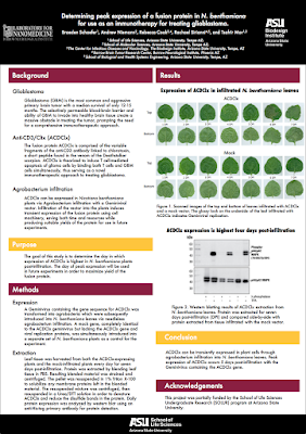
Critique: Peak fusion protein

Today’s poster comes from contributor Braeden Schaefer, and is shared with his permission. Click to enlarge!


Braeden notes:

The poster theme colors had to fall within ASU’s maroon, gold, black and white color palette. The western blot in the results section is only a placeholder that I found online. I’m still waiting on my western blotting results but wanted to see how it would look now.

There is a lot to like about this poster. The two column layout is crisp from a distance. Up close, though, you notice that the left hand labels for the figure break through into the left column, rather than staying contained where they ought to be.

The left hand side is nothing but text, but it is typeset well enough. The text is big enough to be readable, has wide margins, and clear subheading that remove some of the intimidation factor.

This poster is a nice follow-up from the last entry about the design problem inherent in collaborative posters. In this case, it’s not the authors so much that are the problem as the institutional affiliations. The affiliations are chewing up for more space than I would like in the title bar.


There are five affiliations given. But four of them are different schools within the same institution, Arizona State University. I would cut the author affiliations down to lines: the university and the institute. Yes, you lose information about the schools, but I’m not sure anyone in the audience cares. You could then put the institutions on one line, freeing up more room for the title.

Speaking of the title bar, I have no love lost for logos bookending the title. The left institute logo looks like it has been distorted and squished horizontally. But I’m even more baffled here that the ASU logo is repeated at the bottom of the poster. And in an optically heavy black box, no less.

The use of the campus’s colours works well. Generally, campus colours have been picked by pros to go together. They are a good way to provide a subtle bit of branding that doesn’t chew up space. I have no clear idea if there is any reason why some of the bars are in gold and some are in maroon. It seems like the gold might be trying to highlight the main messages, but it’s a muddied signal (if that is the intention) at best.

02 March 2017

Showing authorship on posters

More and more academic projects are collaborative. This means more contributors, and more authors to list on posters. I’ve been thinking about how long author lists might be best displayed on posters, and have a few attempts here. You can click to enlarge any picture!

This might be the simplest multi-author scenario, where there are many authors, all from one institution.


Many big collaborative projects involve people from different institutions, however. How can you show the affiliations of those authors? Many people emulate journals and use superscripts.


This gets very complicated to read and difficult to read very quickly, however.

Another approach might be to group the contributors by their institution. Let “relative contribution” or “alphabetical order” or “whatever other reason you have for deciding the order of authors” be damned. Everyone from a particular university goes together.


This chews up more space, so you might be forced to use initials for the authors and cut back on punctuation.


But if the team is that big, it is unlikely that they are all going to be at the conference. If we step into the needs of the reader for a second, what is the thing a conference goer might want to know? They certainly want to know who they might be talking to, that is, the poster presenter. They might also want to know the person behind the project, who is usually the most senior professor or staffer, and often the most recognizable “name” the poster might have.


Putting the full author list on an external link or down in find print in the corner might is harsh for the contributors. I know that. But in design, you have to grit your teeth and remember that it is not about you, or your friends. It’s about what the audience needs.

External links

When does authorship stop meaning anything useful?

01 March 2017

Eight is great!

We interrupt your regularly scheduled blog about making conference posters that don’t suck to note that this project has been running eight years now! Which is kind of awesome.

Thank you for your support!

Photo by Luca Sbardella on Flickr; used under a Creative Commons license.