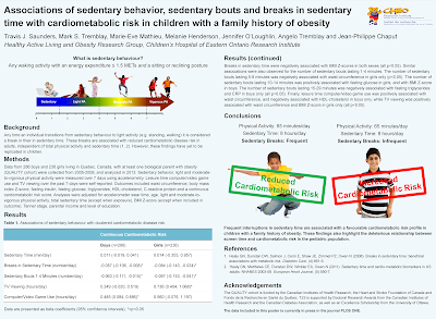
I’ve tried to focus on visual elements, while minimizing text. Unfortunately this is an epidemiology study with no actual visuals (the results section of the paper itself is 2 pages of adjusted and unadjusted associations... not pretty or easy to display graphically), so I didn’t find it all that easy.
While not easy, Travis has done a good job. I like the pictures at the top left, and on the right hand side for the conclusions. That the left hand pictures are identical freak me out a little, though. Maybe it’s because the boys are having the exact same reaction to diametrically opposite effects! I didn’t change this, though, as it would require combing back through lots of images to find appropriate ones.
The table was the biggest thing that cried out like a lost puppy for change.
- The indentation scheme violated hierarchy rules. We expect headings to be furthest left, then sub-headings or text to be more to the right.
- The layout hid comparisons between boys and girls, because it separated similar measures. I moved them side by side so people could direct comparisons more easily.
- The colours didn’t mesh with anything else.
It turned out that a revision also made it possible for the text to be significantly larger.
Coloured background always worry me, just because I’ve so often seen them in bad lighting conditions. I worry about the top and bottom if this is in dim light. In the revision below, there is a colour, but it’s a very light blue that you might not see depending on your screen settings.
The logo is in the right place (stashed on the right, away from the prime real estate), but too close to the title text. In general, things need a hair more room to breath. I made the Methods, Results and Acknowledgements a hair smaller to create a little more space. I also removed the figure legends, because I was not sure they’re necessary here.
Travis made this in Publisher. I was surprised to see that it didn’t have columns, so I created column grids to make the two columns equal widths.
I made some minor text changes, too.
Here’s the revision I sent to Travis:
That the heading for the first picture is smaller than all the others violates the normal rules for hierachy, but I wasn’t sure what to do about it. Only later did I think of turning the heading into a caption.
Here is the final version Travis went with:


No comments:
Post a Comment