20 June 2013
Critique and makeover: Corn proteins
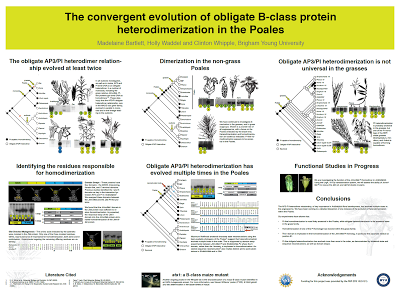
I’m always grateful to contributors like Madelaine Bartlett from Brigham Young University, who kindly submitted this poster and allowed it to be shown on the blog. Click to enlarge:
This is a nice use of a grid, with all the columns and rows clearly defined. The colours are well chosen, and the fine print is unobtrusive at the bottom.
However, in her email, Madelaine made note of my “attitude towards boxes.” Indeed! Away with them, I say! I banish thee! Let the white space do the work!
In this case, the elements do feel a little tight even after removing the boxes. We can make space by removing the summary under the title. It is difficult to read not only because of the small text, but because the line length stretches almost four feet across. Abstracts on a poster are redundant in any case.
I also shrank the each element by about 95% so that I could make the spaces between the columns wider. This made it clear that these are meant to be read down, and not across.
The section headings in the top row were all coming too near the figures immediately underneath them, so I spaced those out a little more.
Finally, I tried aligning the text to the top of the picture in the “Functional studies in progress.” I’m not sure it’s better, but it’s worth trying such things.
Normally, I would increase the size of the text in the “Functional studies in progress” and “Conclusions” section. Changing text size without changing column width is hard to do with the file I had, though. Larger text for “Conclusions” would be appropriate, since it is the take home message and thus important. The white space between the conclusions and acknowledgements is also a bit large, and making the concluding text come closer to it would provide a little more continuity.
Subscribe to:
Post Comments (Atom)


No comments:
Post a Comment