23 July 2009
Critique: Crustacean digging
Turnabout, it is said, is fair play. Since I have critiqued other peoples’ posters, I thought I would put up one of my own. Now, obviously, I am going to pick one that I am generally pretty pleased with, but I’m not going to claim it is perfect.
Before I go on to the critique, let me give you a few pieces of information. This poster was done for the Society of Integrative and Comparative Biology (SICB) meeting, which gives one of the most generous poster sizes of any meeting anywhere. It’s something like 230 cm (7 feet, 8 inches) across. Another thing that makes SICB unusual is that they actually request that posters include the abstract on the poster. Many presenters do not do this, but I like to follow guidelines when I know about them.
Even with a few years distance between me and the meeting, there is a lot I like about this poster. The columns are clear and well defined. There are big headings that allow you to take in the gist of each section with a quick read. It is highly visual, with most of the space being take up with pictures. There’s a little colour incorporated into the figures, and it is used consistently. The icons of the species are always the same colour, for example.
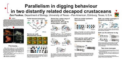
That said, the title is much larger than it needs to be. Looking at it now, I would reduce the title size to give the columns below some more vertical white space.
The small map to the right of the title reflects my insecurity. I had just started a new job at a new university with very little research track record at the time, so I knew “Where’s that?” would be a commonly asked question. It’s a distraction that I should have removed.
I generally hate having abstracts on posters, but I can console myself by saying that SICB made me put it in.
The photo compilations, while neatly aligned, could probably benefit from having a little more white space between each frame.
Now it’s your turn. Does this poster show evidence that I practice what I preach in poster design?
References
Faulkes Z. 2001. Parallelism in digging behaviour in two distantly related decapod crustaceans. American Zoologist 41(6): 1642. Archived at ePosters.net, EP10900.
Subscribe to:
Post Comments (Atom)
No comments:
Post a Comment