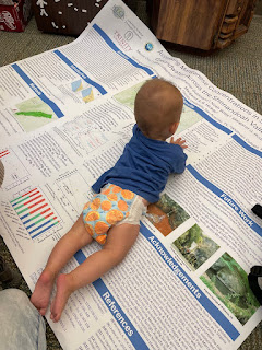
You know, Twitter has many problems now, but it is still the best place for me to find posters like this. Click to enlarge!
It in pink. And unabashedly so!
This poster is by Natasha Latouf and I just had to get the inside scoop on the story behind this. Natasha generously replied. (Lightly edited.)
The design was in part inspired by the new Barbie movie by Greta Gerwig! I had been looking forward to the movie since it was announced, and decided to run with the theme when I was starting to write my paper draft. I wanted something fun decided to roll with having all my figures in pink and purple.
The title actually didn’t come about until later, until the first draft was nearly completed. This project ended up becoming a multi-paper effort, and thus I was able to use an overarching acronym that will describe the entirety of the project. I’ll be the first to tell you that I started with the acronym BARBIE and worked backwards to fill it in!
This has a long and proud tradition in science. I’ve heard of funding agencies like the NSF spend a lot of time figuring out what their grant titles mean, because they developed the name first.
As for the actual making of the poster:
The lead up to the design is what took the most time – determining a
colour palette, making sure the colours within my paper match the
colours in the design, etc. Once that was decided, it went faster! I
will note, the background image has to be remade per different poster
sizes, but I enjoy the process of design and making the science I do
visually appealing.
I used Canva to design the background of the poster (including where the
text would go, the title, the specialty logo), saved that as an image,
and then used PowerPoint to finish the poster using the previously
designed image as the background!
The tone of most conference posters is the exact opposite of this one. This poster is emphatically playful, feminine, and funny. And these are characteristics that a lot of academics do not want used to describe their work. The inevitable question is, “Were you scared to do this?”
I wasn’t concerned about using humour! I find that humour helps in technical presentations on multiple axes. It allows audiences to get engaged, especially in the middle of a full slate of presentations; it makes the science more accessible especially to early career researchers; and it helps you and your project remain memorable! It is much more likely that your audience will remember the BARBIE project, than the entirety of the project name. Simultaneously, a well-designed poster can accomplish all of the above as well! Bright colours, an interesting design, and careful selection of text.
So far the reactions have been very positive! I have presented a talk internally at NASA Goddard Space Flight Center with the design scheme, and my PhD advisor presented my poster at the Science with the Habitable Worlds Observatory and Beyond conference. Each time, the audience has greatly enjoyed the design, the humour, and the pop culture reference. In fact, that can be seen currently on Twitter!
A few people who saw my retweet of this poster said this reminded them of a story told by Raven the Science Maven on the “Ologies” podcast. Let me entice you with a snippet:
I’m at the craft store, my cart is overflowing with feathers 🪶, glitter ✨, stickers, stamps. Gosh, different types of scrapbook paper, glue, ribbons 🎀, everything. Everything. And I was so proud. I lugged all of that stuff into my dorm room and I go to town making my poster.
And my advisor gave me a poster tube because he told me, “Put your poster in it. Roll your poster up, put it in the tube so it stays nice for your symposium.” So, I finished making my poster, with literally all of the things I just described that were in my cart at the craft store, and he says, “I want to check your poster before the symposium tomorrow.”
I come to my advisor’s office, and he’s like, “Okay, let’s see your poster,” excited for tomorrow. I take my poster out of the tube and you know how when you glue glitter onto stuff it doesn’t really stay on, it kinda falls off? So, I’m unrolling the poster and there’s, like, chunks of glitter ✨ falling out and, like, feathers collapsing to the floor, and it’s all crinkly and stuff. He’s like, “Oh… my god. Oh my god.” ... I’ve never seen anybody so disappointed in my entire life.
But that is not the end of this story! you should listen to the podcast (or search the transcript for “poster”) to see how the whole thing went down. Trust me. It’s worth your time.
Maggie Swift wrote a Twitter thread about how Raven’s story resonated with her.
I HAVE THIS EXACT SAME STORY. ... I had never been to a poster session. My advisor asked me if I needed help. I was like, nah girl, I know how to make a poster!
I’ll give Natasha final word on this:
I strongly encourage any scientist, but especially early career
researchers, not to shy away from humour and adding personality to your
presentations. You are the one doing the science in the first place!
Humanity does not have to separated from science, and it makes for more
interesting, engaging, and memorable presentations when you, the
presenter, are imbuing your personality into it!
Hat tip to Emily Rickman for the tweet that started this.
External links
Molecular Biology (PROTEINS + SCIENCE COMMUNICATION) with Raven “The Science Maven” Baxter (Transcript in PDF)
Raven the Science Maven homepage


