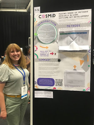
Nicola Harman recently tweeted a short video of a poster that invited the viewer to reach out and touch it.
“This year my poster is interactive and has a voice recording of the poster walk through.” Take a look:
I reached out to Nicola for more information, and she graciously took the time to answer some questions (lightly edited).
• • • • •
 Q: What has your conference and poster session experience before this meeting?
A: I’ve presented both oral and poster presentations at national and international conferences. I also won a poster prize back in 2008 just after finishing my PhD. Although I’ve been to a few conferences now I’m always revisiting how best to share information and this extends to my current research in clinical trials methodology too.
Q: The recorded tour was something I’ve never seen done before. What
was the inspiration and how did you do it?
A: I think accessibility of information is really important. A typical poster relies on someone reading the information, but offering an audio description opened the poster content up to people who preferred to listen or found listening easier. It also meant that someone could listen even if I wasn’t at the poster at the time.
I kept the recording to just under 2 minutes assuming that’s about as long as someone has to spend with each poster.
The kit I used was an mp3 chip from a UK company called Talking Products, it costs around £12, is really easy to use and can hold a 4 megabyte file (about 4 minutes of playback). You could also use an mp3 module with a microcontroller like an Arduino or Raspberry Pi if you wanted a longer recording.
Q: Can you tell me
about the inspiration for the papercraft and how you
created it?
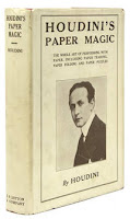
A: I really enjoy making stuff and paper is a great medium to work with. I’ve been reading Harry Houdini’s book
Paper Magic and felt inspired by how simple paper folds and cuts could create a sense of wonder and excitement. I thought it would be interesting to see how this might work on a poster and what sorts of paper methods I could use. I essentially wanted things that created excitement, made things easier to read, and were a little bit magic.
I used three different techniques on the poster:
The Introduction section had a circular reveal. I hoped that this would have the exciting magic element and also make things easier to read as I could maintain a good font size by essentially doubling the space available.
The Methods section used a Turkish map fold to share a categorization system. Again, this method meant that I could have extra space and make the table much larger.
The Results section used an acetate reveal (I’m not sure if that’s actually what it’s called!). Essentially, the results table was layered so that the graph was empty until you pulled it up to reveal the content. I think this was mostly magic!
I designed the poster to scale in Adobe Illustrator, printed components using a Canon ip8750 that could print at A3, cut some elements using a Silhouette portrait and then printed the main poster at A0 using the university printing services.
Everything was mounted on a foam core board so that I could embed the speaker and mp3 chip together with some magnets that helped keep the Turkish map table open and hold up the Results tab.
Q: Interactive features could fray or fail with
repeated use. The video makes it seem that the “voice tour” button
was a bit hard to press because the board wobbled. How long did the
poster session run for, and how well did the poster hold up?
A: The poster was available to view over two and a half days. It was in the same room as the coffee breaks so typically had the most footfall then. I was worried about the paper elements too, so tested a few out before finalizing the design.
One technique that I loved was a woven paper reveal but that wasn’t going to hold up over the conference, so I put it to one side.
Overall the poster held up really well, the circular reveal was the bit that needed a little bit of repair afterwards but if constructed a little differently this shouldn’t be a problem. The other two elements were fine and didn’t need any repair afterwards.
The battery pack did mean that the poster wasn’t flush to the board so I’d probably re-think its positioning next time. There was also a tiny delay in the audio file starting after pressing the button which is why my colleague pressed it again, the third time was to switch it off.
Q. I tried to see the survey, but it was closed. What was on the survey?
A: I’m a trials methodologist so I was keen to evaluate the methods used in the poster. I used a QR code to link to an online survey that had twelve short questions with a five point Likert scale response. The questions were grouped into two main categories:
Questions about the poster design: For example, did the interactive elements help to highlight information? Did you enjoy engaging with the elements? Did the interactive components motivate you to talk to colleagues about the poster?
Questions about the content: Was the content easy to understand? Did it flow well? Did the interactive elements help you to remember the content/key messages?
Q: How many people clicked on the QR code and did the survey?
A: There were fifteen responses to the QR code survey which was quite a low response rate taking into account the conference size and the number of people that I spoke to. It was still valuable information though and the response rate has also given me a few things to think about in terms of methods to collect feedback in this sort of busy environment, especially when competing with coffee, pastries and chatting to friends!
Q: What was the audience reaction like on the
poster session floor?
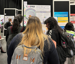
A: The audience reaction was great, lots of people engaged with the poster and then told their colleagues about it so they could try it out too. It created a really fun atmosphere. Reflecting on it personally I engaged with more people than ever at a poster session/conference. It helped to establish a two way dialogue with others, including those who’s research area was very different to my own, so was a great way to share my research, learn about others research and make new connections.
Q: Your tweet got thousands of likes and the video in it was viewed tens of thousands of times. Did you expect that much of a
reaction? Was that online response been similar to the face-to-face
response?
A: I did not expect that reaction to the tweet. If I had known I might have spent a little more time on the video! It was fantastic to get such a positive reaction both online and face-to-face and I feel inspired to take this further and think about academic applications beyond poster presentations. I’m currently working on a zine about it to summarize what I did but also share some more inspiration and resources.
• • • • •
Thanks again to Nicola for sharing your experience and for daring to be different!
Book cover from here.
External links
Turkish map fold with a square sheet of paper
Houdini’s Paper Magic summary


