28 October 2021

Link roundup for October 2021

I’ve cautioned against outdoor poster sessions before. They always seem to me to be Just Asking For Trouble™. But with the COVID-19 pandemic, outdoors is safer than indoors, so...

Outdoor poster session

This looks lovely. But do other places have Lisbon’s weather? And were there back-ups in case the weather turned bad?

From Megan Carey, via Patricia Churchland.

• • • • •

Ajanji and colleagues have what I think is a preprint that tests the effectiveness of decluttering and annotation (which they call “focusing”) on graphs.


Author Steve Franconeri says, “We found that decluttered graphs make you look more professional, but no evidence of cognitive benefits. Focusing led to far better memory for key data patterns.”

• • • • •

MyFonts has a PDF primer on justified versus ragged right text. It contains a simple rule of thumb I had not heard before:

Don’t justify text if the average line of text contains less than nine words.

• • • • •

Duarte Communication surveyed a lot of people about online presentations. Seeing how most conferences are now online and look to keep some kind of online presence, there are lots of things that apply to poster sessions going forward.


Most virtual presentations are just "Meh"

Key suggestions:

  • People want presenters to vary their voice, tone, and pitch.
  • You need to earn the audience’s attention by telling compelling stories.
  • Focus on one idea per slide.
  • Be prepared for what might go wrong during a virtual presentation.
  • Familiarize yourself with the most preferred virtual platforms (which is Zoom, by a long way).
  • Both audiences and presenters prefer cameras on.
  • People will hang around longer for an interactive talk than a one way one.

You can get a copy of their report if you let them know your name and email address. This is clearly an attempt to drum up business for the company... but there is real information there that is worth perusing.

• • • • •

Speaking on online presentations, this description of an online conference shows how meaningless the word “poster” is becoming in an online context. Emphasis added.

For Journées Ouvertes en Biologie, Informatique et Mathématiques (JOBIM) 2020, we held a poster session with a homemade solution based on the Jitsi Meet platform(.) The idea was to dynamically create a room for each poster. After a search on the conference website using poster filtering facilities, the attendees were able to join the poster room and meet the authors or other attendees interested in the topic. To encourage more dynamic and interactive discussions, we also proposed to the authors to present their work through a few slides instead of the classic poster format(.) The idea was also to avoid zooming in to view figures or texts. We also invited the authors to prepare a short video of their work, and we selected a few of them to present during the breaks. One can also imagine allowing attendees to schedule meetings for the poster session.

First, I am not sure why conferences keep using these homebrew solutions instead of just using Zoom. 


Second, there is nothing wrong with “zooming in” to see text and figures: the problem is that most tools, like PowerPoint or PDF documents, suck at it.

Prezi seems ideally suited to an online poster format for exactly this reason. It was built on the “whiteboard” model rather than a “slide deck” model and zooming was its original differentiation from PowerPoint.

• • • • •

And that’s the round-up for this month!

25 October 2021

Ten simple rules for conference posters

I am being a lazy blogger and turning a Twitter thread into a blog post. John Butler asked for, “Something like 10 steps for a good conference poster.”

So I made something up off the top of my head.

  1. Read the instructions. Sounds easy, but printers say “wrong size” is the #1 problem they see.
  2. Your title is most of your communication effort. It’s all most people will ever read. Spend a lot of time on your title! Don’t just use the first one that comes to mind. Simple declarative statements of the main finding work well.
  3. You should be able say what your poster is about in one sentence. Too many people want to show everything they have done. Focus.
  4. Make you one sentence in an ABT (and, but, therefore) format. What are a couple of facts? (“We know X and Y...”) What is the problem? (“But X doesn't hold in this case...”) What is the consequence of that? (“Therefore...”)
  5. Make a grid. A three column grid is really hard to screw up. It’s not the only way. More or fewer columns can work. Rows can work. But three columns is a robust layout.
  6. Leave space. Lots of people, because they did not focus enough (#3), make skinny little margins to try to fit more stuff on. It’s hard to read. Be generous with margins between columns, and with white space between text and graphics.
  7. Be consistent. Consistent fonts. Consistent colours. Consistent column width. A common is that people make graphs before the poster, and don’t go back to make the graph fit with the rest of the poster.
  8. Bigger is better. A common question is, “What’s the minimum font size for a poster?” (This is often coming from people trying to shove too much stuff on the page.) Accessibility guidelines usually recommend type be several times bigger than what many people use.
  9. Practice what you are going to say. Do this before you print your poster. Sometimes you’ll find the order you laid stuff out in (because “It just fit there”) is not the natural order when you talk it through. The visuals and your explanation should follow the same order.
  10. Do the “arm’s length” test. When you’re done layout, print your poster scaled down to a single letter sized piece of paper. Hold it at arm’s length. If your vision is reasonable, you should be able to read your shrunk down poster at arm's length. If you can’t, it’s too small.

The Twitter thread has marginally related GIFs.

External links

Ten simple rules for a good poster presentation

(PLOS Computational Biology)

14 October 2021

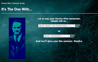
“Ooh, it’s the one with...”

Doctor Who classic series episode guide - It's the one with
Years ago, the BBC website for Doctor Who had a “memory jogger” to help viewers recall the title of some episode. (Still online, in fact!) After all, the original classic show had run over 25 years and had hundreds of stories. Easy to let a title slip.

I loved the prompt it gave people.

“It’s the one with...”

Because titles are good and all, but they aren’t always the things our memories glom on to.

Imagine that someone who saw your poster tells a friend they should see your poster, and tries to help their friend find it.

“Ooh, it’s the one with…”

How would they complete that sentence? What obvious feature could someone use to point out your poster?

“It’s the one with the shark.” 

“It’s the one with the kabuki mask.”

“It’s the one with the big red triangle.” 

Those could all work. Those are all specific, concrete nouns that are easy to recognize.

But “It’s the one with the bar graph” is unlikely to be helpful. “It’s the one with the analysis of history of Japanese theatre” is unlikely to be helpful.