30 May 2013

Link roundup for May 2013

SpotON

A bit of old news that came out just after last month’s link roundup. Better Posters was one of the social media case studies at SpotOn (short for Science Policy, Outreach and Tools Online). If I may, I liked how this turn of phrase came out when I was asked for advice on tips:

Find a problem and help people fix it. The Internet produces criticism as easily as most of us produce carbon dioxide and heat – it’s so much part of you, you don’t even realize that you’re doing it most of the time. Creating a resource that people can use, and offering to help, stands out from the crowd.

Logos

Design lessons from game logos. One of the mantras of this blog is “Design is all about decisions.” With that in mind, look at the number of explicit, conscious decisions that were made as you read through this.

Here’s a look at the creation of another logo, this time from Duarte Design. I’ll call out two notes from the article:

  1. Never underestimate the power of music in the creative process.
  2. Always take a moment to step away from intense ideation and give your mind a break from the assignment at hand.

And, here’s a third logo design, this one from Alex Jay. This one was done a while ago, so it was done with paper, pencil, and rulers!

I’ve saved the most familiar logo for last. If you’re a Star Wars fan, you need to read this amazing retrospective of the design of the film’s iconic title. Alex Jay again.

Typefaces

Seth Godin reminds us that sometimes, you should just make simple choices in your type, and embrace the power of pastiche:

(D)on’t call attention to your typeface choices unless you want the typeface to speak for you. Instead, start with the look and feel of the industry leaders and go from there. ...

It’s a bit like wearing a dark blue suit to a meeting with a banker. You can wear something else, sure, but make sure you want it to be noticed, because it will be.

Or, to put it another way... here’s today’s Comic Sans bon mot from David Shiffman:

If you give a conference presentation using Comic Sans font, that's what 100% of the twitter discussion of your talk will be about.

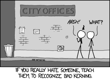
Seth’s piece also reminds us of this xkcd comic:


Garamond will save you ink. (Hat tip to Biochem Belle.)

Would you like to know what that cool typeface is? Type identification is a tricky and subtle art that requires a lot of knowledge. MyFonts provides a tool that might get you part of the way home. (Hat tip to Stacy Baker and Holly Bik.)

Lawsuits

Colin Purrington updates us on the bizarre plagiarism charge for his old poster website.

Fame and glory

Readers of this blog are, I hope, people who care about doing good job on data and graphics and visualization. I would love it of one of my readers were to make a splash in the International Science & Engineering Visualization Challenge, co-sponsored by the National Science Foundation and Science magazine. The rules and entry forms and all that good stuff are here.

The Symbiartic blog has announcements for two scientific illustration conferences this summer. Cool! Now there are two meetings where I’d love to walk through the poster sessions!

23 May 2013

Lessons from lingerie

I have said before that inspiration and design can come from anywhere. Today, I think I am really putting that claim to the test. I want to make the case that there are lessons to be learned about conference posters... from looking at bras.

There’s a phrase in this bra commercial* that you can apply to conference posters:


“Lift... and separate.”

Lesson 1: Lift. A good bra does not allow things to droop. Keep your key information – the question you’re investigating, your critical results, or your take-home message – just underneath your title. If possible, avoid sticking them down at the bottom of the poster.

Here’s another (sort of) bra-related way to remember this advice:


“My eyes are up here.” Remember where people’s eyes are, and you will have a much better chance of getting people to look at the right stuff on your poster, and of having a good interaction with them. Put your important information at eye level. If you’re pointlessely tall or of compact stature, put your information where most people’s eye are, not necessarily where yours are.

Lesson 2: Separate. A good bra makes it clear that a woman has two breasts. A good bra is structured to create space between them, avoiding smooshing, squishing, and the dreaded “uniboob” look. (Well, normally dreaded...)


Conference posters commit the uniboob mistake all the time. Here is an example that was sent to me recently from Adam Wolfe (click to enlarge):


Adam wrote:

I have already removed one logo (a duplicated “old well” logo with different text for the hospital underneath). I am also going against the grain of a standardize template we usually use in hopes of showcasing some new “standard” designs.

This file showed me the bottom right corner when it opened, and I my very first thought was, “Oooh, that’s a lot of reading.” If it were my poster, I would be trying to shorten the text, and convert it to regular paragraphs instead of so many bullet points.

There’s much to like here. The headers work well at pulling apart the different sections. The colour scheme is consistent and attractive.

When I looked a bit longer, I found the uniboob moments, where there wasn’t enough separation between elements (highlighted in orange):


I first noticed in in Figure 3, which drove me bonkers. Text should not overlap lines. The other examples are not as bad, but “not overlapping” is too lax a standard for separating items on a page.

Margins and white spaces are undervalued. To show this, let’s me ask you for a quick, “off the top of your head” estimate:  

How much of a typical piece of paper is white space?

A standard 8½ × 11" piece of paper (or 93.5 square inches) usually has a one inch margin. That means the space you’re putting your words on is confined to an area of 6½ × 9" (or 58.5 square inches).

The white space from margins alone is taking up about 37% of the page. And we’re not even considering spaces between lines or spaces between words. I’d be willing to guess that most people would probably name a number about half that amount if they were trying to figure out how much white space should be on a poster.

In my revision, I follow the “bra rule,” and separated text with white space. I moved some of the text in the figures away from the edges. Adam’s poster isn’t heavy handed in its use of boxes or the data prison, but I still ended up removing a lot of lines and just using white space, particularly in the tables.

I also removed the “±” sign between the mean and standard deviation from Table 1, following the advice of Curran-Everett and Benos (2004). You can’t have a negative standard deviation, so “±” is “superfluous.”

I also changed much of the text to sentence casing rather than headline casing.

The final result is only subtly different. A major redo would tackle the amount of text on the page, but you can get a lot of improvement in the overall look just by tackling the details.


The details are often things that always end up making the difference between an okay looking poster and a smart one. Just like in a bra.


Lesson 3: Detailing. Most bras are very similar, when you come down to it: cups, straps, and snaps. Sure, strictly speaking, you don’t need that little rosebud here, that extra bit of lace there... but what a difference it can make to the overall impression it leaves.  It’s the details that make the difference between boring and daring.

Related posts

Poster real estate
The data prison

Reference

Curran-Everett D, Benos DJ. 2004. Guidelines for reporting statistics in journals published by the American Physiological Society. American Journal of Physiology - Gastrointestinal and Liver Physiology 287: G307-G309, doi: 10.1152/ajpgi.00229.2004

Pictures from here; here; here; here; here.

* Including this commercial is in no way an endorsement; other bras are available.

16 May 2013

Undo the underline

Next time you’re reading a book – or, indeed, any professionally typeset publication, whether it be a journal or a magazine or a newspaper – look for something. Look for underlined text. You know, like this.

I pulled a dozen different books off my bookshelf while writing this post. I opened them up at random, to a different two page spread. I scanned the pages. The number of underlines I saw was zero.

Yet I see people underlining stuff on posters all the time. There are two reasons for this.

  1. Underlining is the quickest and easiest way to emphasize text in handwriting. But everyone makes conference posters with computers, where other formatting tools are as available as air.
  2. The silly little underline button is visible in a prominent place on every piece of basic office software. It sits there, tempting you to press it. “Come on, baby. You’ve pressed pressed bold. You pressed italic. Why can’t you press me, too?”


Pro typesetters normally use italics for emphasis, particularly for long texts. You also see bold used for emphasis, but less often. Bold text is good for posters, however, because it is more recognizable when skimming text. An underline crosses and obscures the shape of descending letters, like g, j, and q, making the text harder to read.

Underlining is one of those little signs that scream “Amateur!” once you recognize it. Just don’t touch it.

Related posts

The data prison

09 May 2013

Critique and makeover: Healthcare

Today’s poster comes from reader Chris Skedgel, and is shown with permission (click to enlarge):


Chris wrote:

I recognise that it is heavy on text, and although I appreciate your advice to think of a poster as a business card rather than a condensed manuscript, I am loathe to hang a poster that I believe doesn’t sufficiently explain what I'm doing or my results. My compromise was to use a font large enough to be read at a distance, with some whitespace to avoid the dreaded “wall of text.”

The tension between completeness and readability is very real. Some of the earliest posts on the blog were about the decision to “writing down everything” and “write very little.” It takes a lot of practice (and ruthlessness) to cut, and cut, and cut, and say the most important stuff in the fewest words. Academics don't always get the most practice at being concise. Usually, comprehensiveness is valued more than concision.

Chris continues:

I also know your thoughts on logos, but I stuck with the institutional template rather than rock the boat. It does crowd out the title a bit, but I also think it looks sharp.

This is one case where I actually like the logo. First, that the white box bleeds off the page. That makes it clear that it’s a deliberate design element, not slapdash addition. Second, there's a single logo, rather than the usual bookends. No duplication. The logo makes its point once, and is done with it.

Here’s a makeover, with some mild chances to the text.


First, the underlined text went away. You almost never see underlines in professionally typeset text. Bold or italics do the job. When I showed this, Chris replied, “I see your point about underlining – it does look a lot cleaner now.”

Speaking of emphasis, I removed the bold from the Conclusions, and the "read more". The less bold, the more punch the remaining bold has. When everything is emphasized, nothing is.

The title, authors, and institutions looked far too crowded; I opened up some space between them. Because the logo was offset and only on one side, centering the title in the remaining space at top made little sense because it didn’t line up with anything below it. The difference is not huge, though. Likewise, I removed the shadowing from the title, but I don’t mind it with the shadowing. Just trying alternate looks.

Personally, I find the font for the main text to be a little fussy and doesn’t read terribly well from a distance. It does have a bit of personality, so I didn’t change it, not wanting to mess with the poster’s style too much.

I tweaked the placement of the uni logo very slightly to align with the edge of the main text box.

One thing I could not do with the file Chris sent me, but would like to, would be to make the font in the graphs the same as the rest of the poster.

Update: At the suggestion of Mike Taylor in the comments, here is a version of the poster without the frame:


02 May 2013

Lessons from Samurai Jack

The animated television show Samurai Jack (created by Gennedy Tartakovsky) won rave reviews for its bold, distinctive designs. A key element to the show’s look was the extensive use of colour holds (at least, that’s what I’ve heard it called in comics). See if you can spot the difference. Here’s Jack:


Now compare Jack to a previous Tartakovsky project, The Powerpuff Girls. What’s different?


Here’s an explanation of colour holds (my emphasis):

“Overlays” or “color holds” (where there is no black outline or the outline is in a specific colour) are done on a separate sheet of acetate or vellum overlaying the original art. This is usually done by the penciler or inker as a special effect – simulating invisibility or colours in a fire or explosion.

Now back to Jack. The only place you see black lines is to delineate his eyes and a couple of other facial features.


Early in the “making of” clip below, creator Tartakovsky talks about the design, saying:


If you look at cartoons, every character has a black outline around them. For us, we took the line completely off, so if it’s a white robe, you just see the white shape, you see no linework around it.

I seem to remember a longer version of this interview where Tartakovsky said this style, with no lines around objects, was something you saw a lot in kid’s books. And this gave that kind of artwork a real charm.

Here’s a clip that shows the astonishing design and graphics sensibilities the creative team brought to the show. It takes about a minute for the ball to get rolling, but when it does...


Note that this amazing action sequence depends on characters not having lines around them.

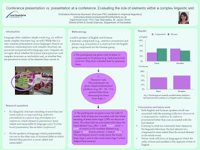
I thought about this when I received this request for feedback from Svetoslava Antonova-Baumann (as always, click for a closer look). She wrote:

Before coming across your blog last week, I hadn’t made a single poster in my life. Armed with your advice, I managed to produce my first specimen today.


My first thought was, “Oh no, not boxes again.” Lines around every section! I went Samurai Jack on this, erasing the first, most obvious, set of black lines around the boxes:


Just that one change immediately lifts and lightens the poster. Next, I eliminated the horizontal dividers within the columns:


Then I thought, “Maybe we can get rid of some more black outlines in the flowchart in the center.”


But I will add lines back in, in this case, to create an explicit X axis in the graphs at right, while taking out the horizontal gridlines:


Then I went about removing the white box around the institutional logo, and resizing and moving the author’s picture so that they both sit at a more comfortable distance from the title.


And a final, small move to the last “Conclusions and future work” section heading, again moving it away from the text.


Differences in colour alone can do the job of dividing spaces just fine. Black lines are almost always gratuitous.

I sent this last version to Svetoslava, who replied:

I really like the new version without the black frames. It feels somewhat “fresher”.

Samurai means “to serve.” I live to serve.

Related posts

Boxism
Critique and makeover: Aptamer biosensors