30 September 2010

Dear conference organizers

Poster sessions can be the beating heart and transcendent soul of a conference, or the first thing on the list at the bitch session afterward. Here’s how you conference organizers can help your attendees love your poster session.

Give us space – lots of it. 15 square feet minimum. 20 square feet or more is even better. Get the square footage of the room you are planning on holding the session in, and divide it by the number of posters. (Hat tip to Jim Belanger for this observation!)

Not all at once. It’s tempting to put all the posters in a single related topic together. It makes them easier to find. But don’t forget, people who are presenting posters are often the the very people who most want to see those other posters on the same topic. Give presenters a chance to look around; they want to see other stuff, too.
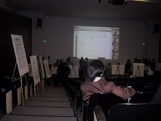
Lighting. Too many poster session rooms are wannabe nightclubs. They’re just too dim. And given that scientists tend to make dubious colour choices, as I have documented in this blog many, many times, it can make it hard to read the poster.

Flat floor. What could possibly go wrong with posters on tripods on stairs?

Nothing in the walkways. Too often, there is a table stuck apparently at random in the the middle of a corridor. Suddenly, you have a traffic jam. Put everything at the end of the poster row.

Water. All that talking can make you thirsty. Make sure there is a source of water readily and constantly available that doesn’t require someone to leave the session for ten minutes. Other refreshments are nice, but nothing beats water.

Photo by kirinqueen on Flickr. Used under a Creative Commons license.

23 September 2010

PowerPoint posters: Don’t turn away for even a second

If you use PowerPoint to make a conference poster, remember that it’ll screw you if you’re not watching it closely.

It has the best intentions. It’s just trying to help. But intentional or not, it still screws you.

The problem arises when you try to stick a lengthy block of text into a text box that is too big. PowerPoint will try to make all those words fit.

It’s fairly obvious when PowerPoint changes the point size. Point size is prominently displayed on the ribbon, and when you right click the text. But point size isn’t the only thing PowerPoint fiddles with.


PowerPoint tries to preserve the point size whenever it can. To keep the words as large as possible, it will first rachet down the line spacing (a.k.a. leading). A mild case is shown above.

To check the spacing in PowerPoint 2010, right click the text and select the “Paragraph...” option. This will show line spacing options. PowerPoint 2003 users will go to the “Format” menu, then look for “Line Spacing...”


From there, you can set if from “Multiple” back to “Single,” or even better, a value bigger than 1.

You can turn this “autofit” option off, but you have to dig for it. In PowerPoint 2010, you have to go up to the “Customize Quick Access Toolbar” (The down arrow in the upper left) and pick “More commands.” You’ll be in the main “Options” menu, at the “Quick Access Toolbar” section. Look left and up to find then go to “Proofing” section. Then look for “AutoCorrect Options...” and pick the second tab, “AutoFormat As You Type.” Finally, uncheck “AutoFit body text to placeholder.”

No, the PowerPoint team don’t exactly go out of their way to make it easy to find.

Here’s the single spaced version:


This one paragraph on its own may not look so bad, but people making posters with PowerPoint often end up with a lot of text boxes. Because the PowerPoint squishes the text in each box differently, you can easily end up with of different line spacing all across the poster. One paragraph with single space, another paragraph with 0.8, another with 0.9...

Lack of consistency makes a poster look sloppy, even if a viewer may not be able to say exactly why.

Related posts

Leading thoughts

16 September 2010

Myths of beautiful text

Ian Millington has suggestions about making text look good. He’s talking about text on the web, but there is some material relevant to posters.

Some claims are supported more by tradition than anything else, but this is often the case with text. For instance, Millington, in agreement with many other typographers, claims:

First-language English readers recognize words by their shape(.)

Kevin Larson lays this claim to waste in one of the most epic articles I have ever read on the science of reading, complete with a lengthy reference list of peer-reviewed research articles.

Word shape is no longer a viable model of word recognition. The bulk of scientific evidence says that we recognize a word’s component letters, then use that visual information to recognize a word.

I also think Millington is too hard on sans serif fonts, geometric fonts, and white paper. (And, as a neurobiologist, I also think that he overuses the term “hardwired” for the brain.) But lots of good ideas nevertheless.

Hat tip to Chris Atherton, WildWinter, Jan Schultnik, and Daniel Tenner.

09 September 2010

RTFP?

What the least read book in the world?

The owner’s manual.

What fraction of your owner’s manuals have read completely? Your car? Your digital camera? Your graphics software?

Recently, I put up a Venn diagram showing what people put on posters versus what people want from posters. That resonated with some ideas that Kathy Sierra discussed in an online presentation. in particular, she showed another version of this figure from from her brilliant and much-missed Creating Passionate Users blog.


Which attracts you and makes you want to learn more?

Most posters look more like less like the brochures on the left and a lot more like the owner’s manuals on the right. I think posters look like owner’s manuals because people are aping journal articles.

Remember the trap? Making a poster is often the first time you’re thinking through the data. And it’s easy to think more about, “How is that data is going to go into the paper I eventually want to publish?” than “What’s right for the poster?”

Related posts

Should your first presentation be a poster?

Poster Venn

02 September 2010

Poster Venn


If you’ve presented or viewed posters, you’ve probably noticed there’s a lot of stuff on them that don’t really matter.

We put them on because we want to mimic scientific papers. References are a great example. Several of my colleagues are of the opinion that any academic work without a reference list is unacceptable. Listening to some, you’d think that such a poster would cause the conference hall to explode and leave every molecule in your body streaming away from the center of the blast at near the speed of light.

So we cave. We stick on a terminal reference list in Harvard format that nobody looks at. It might be shorter than the one in the published paper, but few dare to cut it entirely.

Graphic inspired by xkcd.

Related posts

References on posters
Containment

01 September 2010

Okay, you win

PowerPoint is the wrong tool for making posters.

But it is the most popular software for doing so, by a wide margin. So says the survey I ran on my blog all summer long, though the thick of the conference season (1 May to 31 August).

Over the coming weeks and months, I plan dig in to find the features that might allow you to cobble together a decent poster in PowerPoint. I recently bought Office 2010, which obviously includes the latest version of PowerPoint. I never upgraded to PowerPoint 2007, so I’m just starting to learn where all the knobs and dials are in PowerPoint 2010 compared to the 2003 version.

I may be holding my nose while I write the PowerPoint posts. And I’ll be admonishing you to get a real graphics software package every time. But they will be coming.