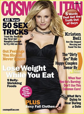
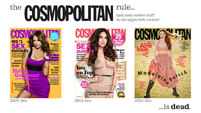
For years, I’ve used covers of Cosmopolitan magazine to illustrate a point.
Cosmo always had a sex story, and it was always featured in the upper left corner of the cover. That’s where people who read in English look first. Sex sells, so of course that’s where you want to put a sexy headline.
But I can’t use Cosmo as my example any more. I went looking for more recent examples and found the newest cover:
Acne?!
A search through the magazine’s Twitter feed for the last year shows this is no aberration. The sexy headlines seem to have been mostly banished from the cover for a while.
Clearly Cosmo is under the control of a new editorial staff or new graphic design staff. Can’t tell which. Or maybe it’s a reflection of more of its readers being online, so the “gotta compete for attention on the supermarket check-out rack” need is less pressing.
If that’s so, that’s worth noting. Graphic design changes with time. Being viewed on the supermarket checkout is different than being seen on a screen.
As conferences moved online in the last year, similar forces are at work today for conference posters. Many design principles are the same, but the design demands of choosing which physical piece of paper on a board in a hallway to view are not the same as navigating menus on screen.
Now I have to come up with a new, more au courant metaphor to describe the importance of that upper left part of the page.
Related posts


No comments:
Post a Comment