Today in, “Please don’t.”
Spotted by Ben Bolker. Hat tip to Dani Rabiotti.
• • • • •
Because so many people make their posters in PowerPiint, I see a lot of SmartArt on posters.
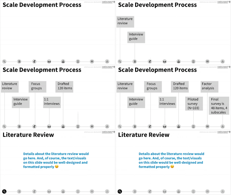
Echo Rivera picks apart the problems with the tool. Why use this...
When you could have this?
• • • • •
New to me: the Everything Hertz podcast has an interview with Mike Morrison talking about the billboard poster design.
• • • • •
A new paper looks to reignite debate on where to start the Y axis on bar graphs. Excerpt:
(W)e investigate the practice of truncating the y-axis of bar graphs to start at a non-zero value. While this has been called one of “the worst of crimes in data visualization” by The Economist, it is surprisingly common in not just news and social media, but also in scientific conferences and publications. This might be because the injunction to “not truncate the axis!” may be seen as more dogmatic than data-driven.
Hat tip to Roger Giner-Sorolla.
• • • • •
You’re not an artist, so why not work with someone who is? Virginia Gewin at Nature looks at how to create a good scientist / artist collaboration. The takeaways?
- Do your homework.
- Define “success” and expectations.
- Make research multi-sensory.
- Create a two-way experience.
- Take risks.
- Add emotion to science.
Of course, graphic design is not art, but there may be some ideas here to use.
• • • • •
How the New York Times visualizes the first half a million deaths in the United States from COVID-19. They showed every dead person in their plot. Every one.
Hat tip to Alexandra Witze and Marc Abrahams.
• • • • •
A few weeks ago, I suggested you look at your design and ask, “What’s it for?”
This is Australian footballer Krstel Petrevski modelling a jumper she designed for the Melbourne Demons featuring indigenous art. The league has an indigenous round to celebrate Australian and Torres Strait Islander indigenous culture.
Here’s a close-up:
Krstel talks about the design in the YouTube video below. Her talk is a great lesson in, “What’s it for?” Everything you see in that design has meaning. The exact number of circles down the sides, the hand prints, everything.
(And by the way, can you imagine a professional sports league in North American having a week where every team in the league played in uniforms designed by Native American artists? I can’t. Alas.)


No comments:
Post a Comment