25 July 2013

Link roundup for July 2013

The NIH has been giving workshops on poster presentations. Here is the latest one from earlier this summer (embed link doesn’t allow graceful resizing to fit in blog column, alas).

That the presentation started with standard bullet point slides did not fill me with hope. And this is reflected in one of the pieces of advice that I am not sure I disagree with: “Use bullet points if at all possible.” I still prefer paragraphs.

The information within is generally quite good, however. Hat tip to Mike Pascoe for spotting these.

PVP illustrates rule 34 of the Internet, regarding type:


This post by Nina K. Simon isn’t about posters, but it is about conferences more generally. Organizers:try more workshops, hackathons, and the like.

It is amazing to actually DO things with colleagues in professional development situations instead of just talking. In 2009, after we hosted the Creativity and Collaboration retreat, I wrote a post about ditching "conferences" for "camp" experiences. Four years later, my appetite for these kinds of experiences hasn't changed. It felt great to once again be working with people--brainstorming exhibit challenges, editing label text, even just messing around on the player piano together.

External links

Creating and presenting a dynamic poster (2010): Event listing (with PDF of slides)
Creating and presenting dynamic posters (2013): Event listing

18 July 2013

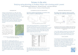
Critiqe and makeover: Quackenbush! (Because it’s fun to say)

Today’s poster from an upcoming Ecological Society of America meeting comes from lead author Caitlin McDonough MacKenzie and is shown with her permission. Click to enlarge:


Caitlin’s poster has a nice clean layout. However, one thing that you can see by drawing a couple of lines is that the grid is not very tight, particularly in the left column, where the image sticks out further than the text:


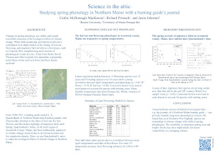
Let’s start cleaning up. Shadowed text? No reason for it. It obscures the letter shapes in the title, where readability from a distance is critical. Also pulled out the colons from the sub-headings, since nothing is following them.


The next change I made was starting to work on the data prison in the table. Lots of vertical and horizontal lines went bye-bye:


I then lined up the table, and tweaked the figure captions. For instance, I spelled “L” and “R” as “Left” and “Right.” Abbreviations almost always make extra work for the reader (exceptions for super common ones, like DNA, where the acronym is better known than the words). If you have space, spell things out!


The biggest change in the next version was to emphasize the message in the central and right columns’ sub-headings. I did that in three ways.
  • I made them bold, creating a cue that these sentences were important.
  • I changed them from questions to statements, making it easier to get the point right away when scanning.
  • I left aligned the text to make it more consistent with the paragraphs below, and to emphasize the grid.


The final changes were to adjust the spacing in the central column. I made the top two graphs a little larger, so their edges would be flush with the text below them. I also moved the QR code a bit to create a more comfortable space between it and the text. And a final adjustment to the figure legends, so that “Left” and “Right” start their own lines.


The final poster looks much like the first poster. All of these little changes together give it a cleaner, classier, more polished look. It’s all about the details.

Caitlin was happy with the end result:

Wow! Thank you so much! It’s amazing how much of a difference those little tweaks can make. I have a renewed appreciation for the power of design in communication.

11 July 2013

Posters should not be usable as drapes

Sometimes, we scientists are the world’s dumbest smart people.

Reader Ewan McNay spotted this at this year’s meeting of the American Diabetes Association:


He wrote:

I think someone inverted length and width of the available posterboard...

Even if someone thought this was a vertical space, how did they think they would hang the poster?

Check the size of the available space. Then double check it. Then make your poster a few inches shorter in both directions in case the organizers chew up space with board numbers.

04 July 2013

The screen vs. the page

My university has an award-winning annual student magazine called Panorama. The new issue, excellent as always, contained a lesson in this two page spread:


What you see on the screen is not what you see on the page.

I bet this looked great on the computer screen. This is an ambitious layout. Outlining text around the women’s figures is tricky and well done here. And I bet you could see the face of the middle model  on the computer screen.

But the printed paper pages were bound together with glue to give the magazine a square spine. The pages don't lay flat, and there’s a gutter margin where you can’t see anything. And so we have a model who is all limbs.

This particular problem is not likely to arise on a poster, but the principle is the same. For posters, colours that look bright on your computer screen can look muddy in ink. Images that look fine at less than 100 pixels per inch on screen can look terrible when printed at 300 or 600 pixels per inch on paper.

What works in theory on the screen doesn’t always work in practice on the page.