29 October 2009
Critique: Ape scapula
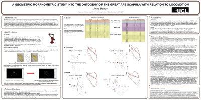
I stumbled upon this poster while reading the blog Anna’s Bones. She described as being finished “just in the nick of time.”
A few more hours, and a stronger editorial hand, probably would have been welcomed.
As for the title, I’ve talked before about the use of using all capital letters and why sentence case is often preferable.
I haven’t written about the use of institutional logos very much. I understand that researchers are proud of their institutions, but ask this. How many logos of institutions other than your own do you recognize? Does it really help people to recognize who you are and what you’re about?
This is an example of a problem with institution logos. Where do you put them? Here, the logo breaks the symmetry of the title bar and makes it lopsided.
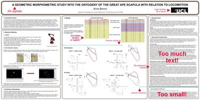
The three column layout is reasonably clean, although it would be preferable if all three columns were the same width. The widest center column has quite a bit of white space compared to the ones on either side, so it probably would have been possible to even them out.
Perhaps the biggest deal breaker for this poster – the one thing more than any other that is likely to make someone walk past – is the forbidding amount of text the outer two columns. The amount (lots) and size (small) is not assisted by the complete absence of any paragraph indents, which makes the text look even more like a intimidating, uniform block of gray, rather than words conveying information.
I have mixed feelings about the boxes around each section of text. In general, I think a strong layout does not need them, but I don’t mind them too much here, given the rest of the layout. In this case, taking them away doesn’t appear to help much.
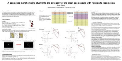
If anything, removing the boxes exposes some of the weaknesses in the layout. For example, it becomes more noticeable without the boxes that the text in the lower right doesn't align with the text above it.
In the modification above, I also changed the title to sentence case and removed the logo to see how it would look.
22 October 2009
Review: Scientific Poster Design
Scientific Poster Design is a PDF from LiLynn Graves at the Cornell Center for Materials Research. At first glance, its 69 pages make it look quite substantive. Unfortunately, the PDF is exported from a PowerPoint deck, with lots of one sentence pages complemented with low resolution clip art.
Fortunately, the advice is better than the package it’s presented in. There are good reminders of basic advice. Keep the text simple and large, use lots of pictures, and more.
One of the most useful features of this PDF is that there are lots of examples shown, ranging from good to shocking. They’re very low resolution, so you can’t read the text, but you can see the overall layout. The comments are one sentence summary judgments (“I’m feeling sleepy,” “Nice flow, but too metallic”), but are pretty much on the money. In fact, a poster critiqued previously on this blog shows up here, with some interesting “remixes” of the background.
On the other hand, there is advice that I disagree with. I would say that a poster is much more than an “illustrated abstract.” I’m also puzzled by her recommendation to use *.png format for graphs. The *.png format creates bitmapped graphics, and will become pixellated if enlarged too much.
One aspect I didn’t like are attempts at humour. We get pages showing scientists going to posters sessions for booze, lazy and profane grad students, and a competitor drawn as a caveman. (Have we learned nothing from caveman commercials?) It might work in the context of a verbal presentation, but on its own, it comes across as mean-spirited.
15 October 2009
Do you need to go to that conference?
Today is Blog Action Day, when bloggers are encouraged to write about a single topic to spark debate. This year, the topic is climate change.
Research posters are created for research conferences, particularly the big, international conferences where there are more people than you could possibly have opportunities to give talks. I love those conferences. Attending conferences and presenting at them is one of my favourite things about being a researcher.
Unfortunately, big conferences can have a substantial carbon footprint. Lester (2007) wrote:
Every December, geoscientists descend on San Francisco for the Fall Meeting of the American Geophysical Union (AGU). In 2002, the 9500 participants traveled an average of 7971 kilometers to get there and back. That means their share of the carbon dioxide emitted by the planes they flew on totals about 11,000 metric tons – roughly the same as 2250 Honda Civics during a year’s worth of normal driving.
Before you start working on that poster, think hard about the conference, the distance to it, and what you expect to get out of it. Ask, “Do I need to go to that conference?”
Reference
Lester B. 2007. Sustainable science: Greening the meeting Science 318: 36-38. doi: 10.1126/science.318.5847.36
No more slidesters, interlude: Making presentations more like posters
Form follows function. The function of PowerPoint is to emulate a series of 35 mm slides. Because many researchers use PowerPoint for their talks and lectures, they also tend to use it for every graphic problem, including posters. Predictably, the form of the resulting posters often look like nothing more than a series of ugly PowerPoint slides tacked together.
A poster is more like a whiteboard than slides. But because many researchers give more presentations than posters, they’re not used to thinking in terms of a big space, viewed all at once, instead of a series of small spaces, viewed one at a time.
If you want to break out of the “Next slide, please” rut, check out Prezi, presentation software that is available free online. Its presentation metaphor is that of a big whiteboard, much like a poster, rather than individual slides. There are many things you can do in Prezi that you cannot do with a poster, like zooming in and out. Prezi is still very much a work in progress. Currently, you don’t have a lot of control over graphic elements; you have only limited ability to change fonts and colours and so on.
Nevertheless, it forces you to think about using space in a totally different way than you do when using PowerPoint. It’s good practice.
The “No more slidesters” series will be back after I have time to sit and review more software!
13 October 2009
Explaining a handle
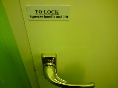
Calling someone a “doorknob” is an insult to intelligence because doorknobs are simple. At least, they should be. From Tim Tucker Online, where Tim writes:
Not sure who said it first, but it bears repeating: Design only calls attention to itself at the point of failure.
Spotted on Twitter.
Related posts
Don’t hold my hand
If your door handle needs a note explaining how to use it, you know there’s got to be something wrong with the design.
Not sure who said it first, but it bears repeating: Design only calls attention to itself at the point of failure.
Spotted on Twitter.
Related posts
Don’t hold my hand
08 October 2009
No more slidesters, part 3: Draw in the open
As discussed recently, many people use PowerPoint to design posters, an act that borders on criminal. PowerPoint was designed for multiple projected images with minimal text, not one large image with complex text and graphics. People use PowerPoint because it’s the only thing remotely resembling a graphics software that people are familiar with. Microsoft Office simply doesn’t have a good, high end graphics component. Publisher comes close.
OpenOffice does have a graphics component, simply called Draw. If you are not willing to shell out the big bucks generally required of a professional graphics software package, Draw has several features in its favour.
First, it makes vector based images. This means that the images created in it will stay sharp even when printed very large.
Second, it has a PDF export function. This makes it easier to print at just about any workstation with a printer.
Third, it is free.
It is not as feature rich as commercial software, and I’ve found it to be a trifle buggy. It is not perfect, but whereas PowerPoint might get you 40% of the way to what you need to make a good poster, Draw probably gets you closer to 80% of the way there.
If you’re looking to put pixel-based images on your poster, but don’t have a full professional graphics package (though every scientist should have one), check out GIMP.
01 October 2009
No more slidesters, part 2: Three Publisher tips
I have used Microsoft Publisher a lot for posters, as I mentioned previously. I’m going to show three easy things that Publisher does well that are useful when making a conference poster.
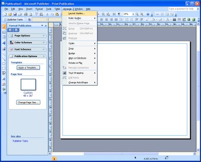
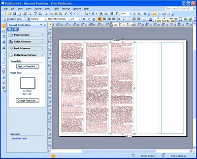
Grids are at the heart of successful poster design. Under “Arrange,” pick “Layout guides,” then pick the “Grid guides” tab.
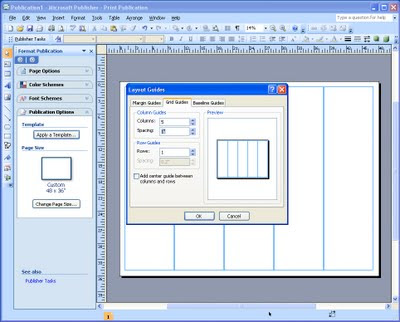
From there, all you have to do is pick the number of columns you want to have, and the space between them. And you’ve now got an evenly spaced grid!
Setting up grid guidelines in other programs is rarely this painless. You usually have to do a lot of calculating to set up each individual guideline.
You can also set up rows in the same way. This is not as useful as often in posters, which are usually dominated by vertical divisions, rather than horizontal (apart from the title).
Once you’ve got columns, draw a single text box in each one and paste in your text. Because posters usually have many graphics, you’ll want to insert pictures, too. This is where another feature of Publisher comes in handy.
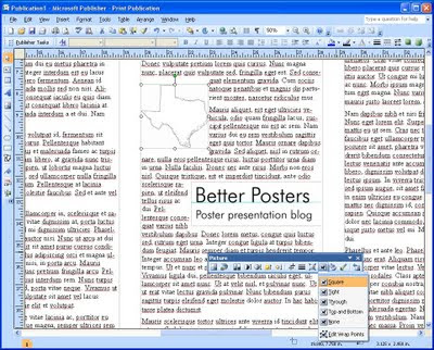
Many other programs either cannot wrap text automatically (like PowerPoint) or make you jump through hoops to get there. When you insert a picture into Publisher, the text will normally flow around it. If the picture is the same width as the column, the text will break and continue below it.
The default spacing is not particularly graceful, so it is worth fiddling with the settings after the picture is in so that the text isn’t too close to the picture.
Many people, particularly those working with PowerPoint, create their posters as a zillions small text boxes that almost invariably go out of alignment because there are so many of them, and they are all different widths. Publisher allows you to link text boxes into one continuous piece of text.
Click on a text box. If there is more text than will fit in the space, it will show an “overflow” symbol at the bottom. On the menu bar, there is a “Create Text Box Link” button. Click it, then bring the mouse down to the next column. The mouse icon will change to a bucket. Click it within the box to “pour” the overflowing text into the next column.
Continue this for each column. Once this is done, the text will automatically rescale through all the text boxes. For example, if you add a picture to text box one that displaces some of the text, the text will shift down automatically, through to the last linked text box. The same thing will also happen if you enlarge or reduce the text.
Grids are a cinch
Grids are at the heart of successful poster design. Under “Arrange,” pick “Layout guides,” then pick the “Grid guides” tab.
From there, all you have to do is pick the number of columns you want to have, and the space between them. And you’ve now got an evenly spaced grid!
Setting up grid guidelines in other programs is rarely this painless. You usually have to do a lot of calculating to set up each individual guideline.
You can also set up rows in the same way. This is not as useful as often in posters, which are usually dominated by vertical divisions, rather than horizontal (apart from the title).
Once you’ve got columns, draw a single text box in each one and paste in your text. Because posters usually have many graphics, you’ll want to insert pictures, too. This is where another feature of Publisher comes in handy.
Text wraps around pictures
Many other programs either cannot wrap text automatically (like PowerPoint) or make you jump through hoops to get there. When you insert a picture into Publisher, the text will normally flow around it. If the picture is the same width as the column, the text will break and continue below it.
The default spacing is not particularly graceful, so it is worth fiddling with the settings after the picture is in so that the text isn’t too close to the picture.
Joining text across columns
Many people, particularly those working with PowerPoint, create their posters as a zillions small text boxes that almost invariably go out of alignment because there are so many of them, and they are all different widths. Publisher allows you to link text boxes into one continuous piece of text.
Click on a text box. If there is more text than will fit in the space, it will show an “overflow” symbol at the bottom. On the menu bar, there is a “Create Text Box Link” button. Click it, then bring the mouse down to the next column. The mouse icon will change to a bucket. Click it within the box to “pour” the overflowing text into the next column.
Continue this for each column. Once this is done, the text will automatically rescale through all the text boxes. For example, if you add a picture to text box one that displaces some of the text, the text will shift down automatically, through to the last linked text box. The same thing will also happen if you enlarge or reduce the text.
Subscribe to:
Posts (Atom)