31 August 2021

What is the carbon footprint of a conference poster?

Single use.
The COVID-19 crisis delivered a shock to the academic conference scene from which it may never recover. We have seen conferences completely retooled and reformatted in a very short span of time, with varying degrees of success.

But we are also in a climate crisis. If the COVID-19 pandemic hadn’t arrived, the climate emergency would probably have forced a similar re-examination of how we hold academic conferences – although it probably would have happened over decades instead of years.

A forthcoming paper by Leochico and colleagues looks at how we should change conferences in light of the climate crisis. They have multiple recommendations, but this is the one that includes posters.

Avoid single-use items: Require electronic instead of physical posters; re-evaluate use of booklets, lanyards, plastic water bottles, coffee cups, and other conference items.

As a basis for this recommendation, they cite another very recent article by Milford and colleagues (2021). They make the same general statement about reducing single-use items at conferences.

These are good recommendations, but it’s worth digging deeper.

First, most of the time posters have at least one additional use. They can go on display at their institution, where they can have a role in showing work to students and colleagues.

Second, posters are not in the same category as coffee cups or lanyards. Posters are one of the reasons you hold a conference. Lanyards are not. So if you do not want to use paper posters, you must have some sort of substitute.

The substitute both articles recommend is to move from paper posters to electronic posters. But neither of them provide any attempt to show that the carbon footprint of an electronic poster is lower than that of a paper poster. They simply assert it.

Trying to come up with an estimate of carbon costs for these kinds of alternatives is mind-numbingly hard. I have noticed, however, is that people often tend to underestimate the carbon costs of electronics. 

For example, in a class I taught once on global change, students suggested that all students get tablets so that the university wouldn’t have to use so much paper. On the surface, it sounds great: less waste! 

But I started asking them if they considered factors like what it took to create a tablet. Consumer electronics like smart phones use almost every chemical element in the periodic table, and many are rare and hard to extract. But paper is from trees, so by definition, if you want paper, you are drawing down atmospheric carbon to grow trees.

There’s also an end-of-life question. Recycling components of electronics is a challenging engineering problem that people are actively trying to solve. One the other hand, recycling paper is so simple that kids in grade school can do it. (Though it gets more complicated if you have glossy photo paper.)

Then there is the power use involved in storing and displaying an electronic poster. Unless the power is sourced from renewable energy, there is going to be an ongoing carbon cost of storing an electronic poster so it can be viewed on demand during the conference and afterwards. Yes, paper costs energy, but the energy cost ends after it’s printed and transported.

I am not saying that paper posters are obviously more climate friendly than electronic ones. I don’t know, but I don’t think anyone else does, either. I would like to know.

Update, 1 September 2021: To be explicit, I am assuming a situation where people are traveling to the conference, regardless of poster format. Given the high carbon cost of flying, an entirely online conference probably has a lower carbon footprint than any in person conference, regardless of poster format.

References

Leochico CFD, Di Giusto ML, Mitre R. 2021. Impact of scientific conferences on climate change and how to make them eco-friendly and inclusive: A scoping review. The Journal of Climate Change and Health: in press. https://doi.org/10.1016/j.joclim.2021.100042

Milford K, Rickard M, Chua M, Tomczyk K, Gatley-Dewing A, Lorenzo AJ. 2021. Medical conferences in the era of environmental conscientiousness and a global health crisis: The carbon footprint of presenter flights to pre-COVID pediatric urology conferences and a consideration of future options. Practice Management/Training 56(8): P1312-1316. https://doi.org/10.1016/j.jpedsurg.2020.07.013

26 August 2021

Link roundup for August 2021

Congrats to all the winners of the Royal Astronomical Society poster competitions!

Poster titled, 'A sub-mm SDSS with the Atacama Large Aperture Submillimetre Telescope'

You can find the work in the linked thread above. But I’m featuring Jo Ramasawmy’s poster because she was super nice enough to give shout out to this blog! (Yes, I can be flattered. Sometimes.)

• • • • •

My Fonts has their latest primer on bullets and dingbats (PDF). Did you know there are em bullets and en bullets? I, for one, did not.

• • • • •

Helvetica Now sample showing weight, width, and optical size variation.

That type workhorse, Helvetica, now comes in a variable font. See my introduction to variable fonts here.

• • • • •

Pharmacy students think posters assignments help them learn, but they increasingly prefer digital posters over printed ones. 

• • • • • 

This article about virtual meetings suggests people prefer poster sessions online, but only supports it with a single quote from a single person.

With no cavernous exhibit hall to accommodate hundreds of posters, MSVirtual2020 replaced posters with brief presentations – 10 slides and, at the author’s option, a brief explanation of the findings – that meeting participants accessed at their convenience. Dr. Cohen, director of experimental therapeutics in the Cleveland Clinic’s Mellen Center for Multiple Sclerosis Treatment and Research, considered that approach to be a big improvement.

“I don’t personally enjoy trying to see 500 posters in a giant exhibit hall, walking up and down the aisles. I barely see the content because I end up just talking to my friends,” he said. “In essence, this was like a three-minute talk that presented the poster, and the audience could stop the presentation and look at something in more detail if they wanted.”

Presumably conferences have been surveying attendees about their experience, but I have yet to see any of that data shared.

• • • • •

Marie Seggar walks through an excellent graph makeover from The Economist. The starting point is this interpretable mess of lines:

Line graph with 50 lines, each a different colour, with large amounts of noise.

Because one of the major problems I see on many posters is “too much stuff,” this is a great example of how take a complex data set and make something that is more readable. Ultimately, you have to be selective and you have to emphasize some data over others.

The final version is much easier to read. Go check it out!

• • • • •

And that’s what I found on the internet this month!

19 August 2021

Critique: Bioremediation in the Philippines

Today’s poster comes from Vladamir William. It was presented at 2021 De La Salle University Research Congress in the Philippines back in July. Click to enlarge!

Poster titled, "Bioremidiation of nickel using microorganisms from an active mining site in Zambales, Philippines".

There is also a video presenting the poster here.

I appreciate that this summary is less that 3 minutes long!

Vladamir wrote: 

I wanted to highlight as much as possible the readability of the text when read on a screen, and put emphasis on the figures; opting to exclude any redundant design elements, and choosing a color scheme similar to my University's colors. I used Keynote for this poster, using the standard A0 size set by the guidelines.

 (Note to North Americans: A0 is a standard paper size in many nations It’s about 33 by 46 inches.)

The fundamentals of this poster are sound. It’s aiming for visuals and the layout is clear.

Vladamir described the colour scheme as following the institution’s colours. This makes for consistency, but the green is very saturated and intense. The bars for the headings carry a lot of visual weight. I worry that they are drawing too much attention to themselves.

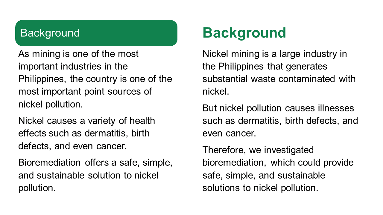
Below, I try removing the boxes and making the heading text bold and green.

Background section as it originally appeared on left and revision on right. Original heading was white text in green box; revision has bolded green text for heading.
I took the liberty of revising the introductory paragraphs slightly. In particular, I added “But” to the second paragraph to make it clear what the problem to be solved it.

De-emphasizing the heading slightly would make the callouts, currently in boxes with dotted red lines, stand out a little more. 

The two callouts look a little different. The “Objectives” callout has rounded corners, while the one in the Results section has squared off corners. It would be nice to have both the same.

The results showcase one number: 587 ppm of nickel. Immediately below that, the callout provides context for that number, which is good. But putting the comparison in a callout disconnects the two numbers, which is less good. It makes it not obvious that the two are connected.

One possible revision might be to put something like, “Microorganisms tolerated over 7× more nickel than typical soil concentrations” as the graphic representation. Then, fine print could give the detailed numbers. For example, “Nickel in soil: 4-80 ppm. Nickel tolerated: 587 ppm.”

Finally, the “Future directions” list strikes me as a little busier than it needs to be. Big green checks, and highlighted text, and a shadow box behind each list item.

Excerpt from poster that reads "Future directions." Text has checks, is highlighted, and has shadow box.

Let’s see what happens if we pull back on one of those three.

Excerpt from poster that reads "Future directions." Text has checks and is highlighted.

Or even two.

Excerpt from poster that reads "Future directions." Text has checks.

I like the checks and think those alone might do the job. But something that removing the other colours does make much more obvious is that the text is not aligned.

Here’s how those changes play out when you put that section back in context. Here’s no shadow boxes...

Poster titled, "Bioremidiation of nickel using microorganisms from an active mining site in Zambales, Philippines". Future directions box has checks and highlights.

And no highlights.

Future directions box has checks.

The checks alone do the job, but that might be a little sparse and uninteresting. Particularly because the tan highlights are used above, in other parts of the poster. The highlights in the “Future directions” helps bring some balance in colour, so that the tan isn’t all stuck up at the top.

Sometimes the posters that show preliminary data are the best posters because they are not burdened down by too much stuff.

12 August 2021

How is a conference poster like a joke?

It’s probably hard for people who grew up with pervasive Internet to understand that newspaper comics were important cultural touchstones for decades. In the 1980s and 1990s, one of the most successful was The Far Side, created by Gary Larson.

Academics got Gary Larson.

I lost count of how many Far Side cartoons I saw taped up on university doors and included in presentations. I once heard a presenter jokingly call him, “the official cartoonist of the Animal Behavior Society” (at the annual conference of the society, naturally).

But I suspect even academics went “Huh?” when newspapers ran, “Cow tools.”

A single panel cartoon that depicts a cow standing on its hind legs at a table, on which four oddly-shaped objects are placed. One object resembles a crude hand saw, while the others are more abstract. The caption simply reads "Cow tools."

People did not get it. 

They did not get it so much that this single cartoon now has its own Wikipedia page. Larson is lucky that this was published pre-Internet. He only had to deal with phone calls and not angry emails and Twitter notifications. If it was published today, it would have gone viral, been ratioed on Twitter, and been denounced by pundits on political panel shows.

Larson wrote in The History of the Far Side that he was trying to riff off how culture limits our ability to interpret artifacts:

(O)ne day I started thinking about an anthropology course I had in college and how we learned that man used to be defined as “the only animal that made and shaped tools.” Unfortunately, researchers discovered that certain primates and even some bird species did the same thing – so the definition had to be expanded somewhat to avoid awkward situations such as someone hiring a crew of chimpanzees to remodel their kitchen.

Inevitably, I began thinking about cows, and what if they, too, were discovered as toolmakers. What would they make? ... The “cow tools”were supposed to be just meaningless artifacts – only the cow or a cowthropologist is is supposed to know what they’re used for.

Larson was so far down the rabbit hole of his thought process that he lost the ability to judge his own work. 

This is a state that I know very well. Something about a project that I have been living with in my head for months or years that I might think is obvious is far from obvious to other people. It might not even be sensible to other people.

So to return to the question posed in the title of this post.

How is a conference poster like a joke?

If you have to explain it, you’ve failed.

As “Cow tools” shows, it’s easy for you to get in your own head and create something that makes perfect sense to you, but not to others.

If you have to explain something on a poster, you’ve failed.

Sticking with comics, here’s another example of the principle, this time more visual than conceptual:

SIngle page from Batman #30, using arrows to show reading order.

The reading order of the page is confusing, and the artist knows it. The artist has to explain the reading order using arrows.

If you have to explain it, you’ve failed.

External links

The Far Side

How to read Nancy review (features Batman page)

08 August 2021

Critique: Frog parasites

This week’s work comes from Anneke Schoemanan. This was created for British Society of Parasitology (BSP) Parasites Online 2021. Click to enlarge!


Poster titled, "The multiplex response of co-introduced parasites to the range expansion of their globally invasive frog host".

The influence of the billboard poster is evident here, with a bold as brass take-home message under the title. The title is practically unnecessary, because the take-home leaves nobody wondering what this poster is about. I personally think that if the title is right, it is the take-home message. 

The colour palette is extremely subdued. It almost looks like it’s been run through a “fade” filter compared to most posters I see on the blog. While neutral colours are useful and pastels are elegant, I found myself wishing for a little more brightness somewhere on the poster so that something would “pop” visually.

I asked Anneke to talk a little about what was asked for and how she went about creating the work. She wrote: 

 For this specific conference, the organisers asked for a static PDF of our posters. That was it. During the scheduled poster sessions, the presenters were supposed to be online to field questions and the attendees browsed all the posters in a virtual poster hall. (Below. - ZF).

Virtual poster hall.

Her supervisor challenged everyone to think visually and cut back on text. Anneke continued (lightly edited):

I approached my presentation from two angles. 

First, I wanted to rethink the traditional conference poster design in general. I relied on advice from Twitter and blogs. These resources are summarised in my tips and tricks blog post.

Second, I wanted to rethink the design for a virtual audience.

I asked, “What will attendees see before they zoom in?”, since they would be viewing it on a computer screen. I wanted design elements that conveyed my main message at this low level of magnification, so I added the main text box with the plain language explanation of my main finding.

I realised that after a viewer zoomed in, it might be difficult to navigate the page if there was no clear starting point that could “draw the eye in.” I visualised my results in a circular flow diagram and numbered the text boxes in the order that they should be read.

The flow diagram is a strong visual element. I might try some different directions for the components of the flow diagram so that the reader isn’t forced reading right to left (oval 3 to 4, and 4 to 5) or bottom up (oval 4 to 5) as often.

Anneke took advantage of the simple online format.

I also realised that the PDF could include hyperlinks in the virtual format (virtual version of the QR code). I thought it would be a nice personal touch. I added a link to a short video of what I would have said if someone walked up to my poster at an in-person conference and asked me what it was about. 

Besides her formal presentation, Anneke archived her poster in a nice blog post. It’s mobile friendly, too!

The accompanying blog post seemed like a good idea for a number of reasons:

First, the conference organisers did not require a narration or video but I wanted to introduce myself and explain my poster to attendees who wanted to know more without feeling obliged to send me an email and I had a platform to do it. In that sense, it was “bonus material” for conference goers.

Second, it gave me the opportunity to try my hand at my first “scicomm” video. I’ll definitely do some things differently next time but it was a fun exercise.

Third, I just finished my PhD and this was a way of advertising my blog and putting myself and my work out there.

Finally, the blog post and mainly jargon-free video are also targeted at the non-scientist audience that I am trying to reach. Now my conference poster and the information contained therein are accessible to everyone! – In theory. (I don’t think my blog has that many readers. 😉)

That may change, Anneke, that may change. Hey everyone, I suggest popping over to Anneke’s blog and checking out her poster!

External links

Some frogs carry more parasites than others – Why?

Less is more! Resources for an eye-catching conference poster

29 July 2021

Link roundup for July 2021

Animate Your Science has a gallery of four excellent conference posters. They even go so far as to call them the “best” posters! The post has a nice little evaluation checklist:

  1. First impression
  2. Title
  3. Colour scheme
  4. Layout
  5. Figures
  6. Other features of note
  7. What could be improved?

One of the posters, by René Campbell, was recently featured in one of the link round-ups on this blog. I’m pretty sure I’ve seen Caterina Funghi’s poster somewhere, too!

• • • • •

Mind the Graph has released a poster making app! 

Sample posters make with Mind the Graph poster maker.

 I hope to have a review in the near future.

• • • • •

Echo Rivera reviews the Animate Your Science poster design class and brings in a few ideas of her own on poster design. 

Echo specializes in slides, and her post talks a little about the similarities and differences of slide talks and posters.

Similarities: You need to storyboard that 💩! 

Differences: One big blank canvas instead of a bunch of little ones.

But there’s more good points in her post!

• • • • •

Baker and Philips have a short paper in the Journal of Perioperative Practice about how to make conference posters. Excerpt:

Sometimes scientists will be asked to present their research to members of the public in a poster.

Has anyone ever done this?

Hey, perioperative practice practitioners, send me your posters!

• • • • •

The last year, I’ve tried to get a handle on what people mean by “online posters,” “electronic posters,” and “digital posters.” But I think I would balk at calling an Instagram post a “poster.”

But maybe this paper about using Instagram to teach chemistry will change your mind.

• • • • •

Yet another study showing that conference talks are more likely to be published than conference posters. I don’t think I have ever seen a study (of which thee are many) where that has not been the case.

• • • • •

This graph purports to say something about crime, but the graph itself is a crime. Click to enlarge if you don’t see the problem.

CNN graph with time on X axis running from right to left instead of left to right.

Catch it yet?

Time on the X axis is running right to left, not left to right.

Hat tip to Oren Gur and Katie Mack.

• • • • •

A paper about automatic typesetting for “posters” (but really, short blocks of text). 

Eight posters with the quote, "How amazing! How many wonderful creatures are here! Mankind is so beautiful! Oh, what a wonderful new world, that has such people in it!"

The images above are found in the supplementary information. Interesting as proof of concept, maybe.

• • • • •

A PDF by Shanda Hunt about presenting research.  This appears to be supporting documents for a webinar, but it stands alone.

• • • • •

Students love posters! At least according to the title of this article by Lamar and Sheperis, who asked students in counseling to make a conference-style poster presentation. The text of this short paper describes the exercises students did. The evidence of students loving the assignment is brief:

According to follow up surveys of the classes, the Virtual Research Conference Presentation assignment is loved by students because they get to be creative and explore a topic of interest to them.

Maybe this paper could have been a little longer?

• • • • •

Posters as student assignments are also described in this article by Tarigan and Listyani. This has more assessment of the outcomes, but for only three students and three teachers.

• • • • •


Li and colleagues describe how they organized an online conference in 2020. It includes this description of  how they handled poster sessions.

The poster session provided an opportunity to experiment with GatherTown, which aims to approximate the experience of in-person interaction. GatherTown enables the building of 2D environments that can be designed to simulate a conference hall, complete with space to ‘hang’ posters. Delegates navigate around the space with an avatar [the happy default being a yellow-scarfed snowman] and can zoom in on posters they wish to see. A delegate’s video and mic are on at all times but only become visible and audible to other delegates when their avatars are physically near each other. Delegates could also search and message other delegates directly. The conference feedback suggested that delegates enjoyed this format of seeing posters.

Here is their figure for how that looked. Click to enlarge!

I tried a GatherTown demo. And oh my, but does it have some strong old school role-playing game vibes. It’s cute. But I’m not sure “cute” is the vibe I’d necessarily want for an academic conference.

• • • • •

Love this one-liner from Nancy Duarte:

We rely on data to tell us what has happened, and stories to tell us what it means.

The article she is linking out to, by Hanna Marcus, is also good examination of the relationship between data and empathy. 

When writing about conference posters, I am acutely aware that I am often giving advice that is not data driven. And my people, fellow scientists and other academics, have been trained to be extremely data driven. So much so that long established conventions tend to get dismissed until someone “rediscovers” the practice by some experiment or other.

Data matters, but it is not the only thing. You need narrative. People need to know why your data matter.

• • • • •

That’s all for this month!

23 July 2021

Review: How Design Makes the World

Note: Author Scott Berkun recently announced to his email subscribers that he has had a medical event that has seriously affected his voice. This is a concerning set back for someone who makes a living in part by public speaking. I wish Scott well and hope he eventually return to public speaking. He has a list of ways you can help him at this difficult time.


• • • • •

How Design Makes the World delivers a big, serious subject in a short, breezy book.

Scott Berkun takes a very high level view of design. He is not interested so much in how to design in a nuts and bolts sense. This is more about general processes and, importantly, their impacts. Berkun asks early on, “Why are so many things seem to be badly designed?”

I appreciate that Berkun’s answer to that question acknowledges things like power dynamics and economics. People who might make good design decisions don’t necessarily get to make the decisions or get the resources they need to make them. 

For example, the borders of Middle East were drawn by mid-level bureaucrats who were not from the region. We have been living with the consequences of those decisions ever since.

That example is just one of many historical anecdotes in this book. Berkun has a good nose for finding these, and they are consistently interesting. And he casts a wide net. So while I have spent a lot of time thinking about graphic design on this blog, I learned a lot about other kinds of design. “Norman doors” are going to be part of my vocabulary forever now.

Is there anything here for a poster maker? Maybe. Scott includes four key questions to evaluate designs:

 
The four questions of design. 1. What are you trying to improve? 2. Who are you trying to improve it for? 3. How will you ensure you are successful? 4. Who might be hurt by your work? Now or in the future?
 

What are you trying to improve? Who for? How will you be successful? Who might be hurt by the work?

Let me take a stab at applying them to conference posters.

1. What are you trying to improve?

I see two things poster designers are often striving for. 

The first is efficient use off time spent making the poster. Berkun addresses that: “Efficiency is often taught to mean working in a straight line, but the trap is that efficiency is not the same as quality.“

The second is maximizing the information information content on the poster.

Why I think these are both dubious improvements lie in the answer to Berkun’s second question.

2. Who are you trying to improve it for?

People trying to minimize time on creating posters and maximizing information on posters are usually trying to improve those things for themselves, not other people.

3. How will you ensure you are successful?

I think a lot of poster makers don’t have an answer for that beyond having a supervisor say it’s okay. I don’t know how many people show off drafts of their poster or rehearse their poster presentation  to others before they head to a conference. 

4. Who might be hurt by your work? Now or in the future?

Luckily, posters are mostly harmless. The content of the posters might not be, but that’s another issue for a different blog. Perhaps a more helpful way to frame this question is, “Who might be left out?” Who might not be able to benefit from your data and insights because of how you have made your poster?

This book is not essential for poster makers. It’s not a “how to” and lacks the nitty gritty details that someone looking for concrete advice on graphic design might want. But if you are interested in stepping back and looking at that bigger picture, Berkun paints a rewarding view.