28 December 2017

Link round-up for December 2017

One of the problems with free fonts is that they often don’t have special characters that are necessary for proper display of characters from other languages, or symbols.


Google Noto is a series of fonts meant to have almost every character (and emoji!) in as many languages as possible. When I scrolled down the list and saw, “Canadian aboriginal,” I knew they were serious.


I downloaded Noto Sans, and was impressed.

Not only are there over 30 variations of Noto Sans, including thin, bold, condensed, extended, and combinations thereof, going into “Insert symbol” to see the individual characters is eye-opening. You think you’re a typographic sophisticate for recognizing and using an interrobang? Noto has that, and an inverted interrobang. There are combinations of letters and accents and umlauts and currency symbols I have never seen before.

The range of options is, frankly, staggering. There is no font package that comes Windows standard with this many options. Buying a font package with this many options would usually cost you many hundreds of dollars.

And Noto fonts are all free.

You have no excuse to use a lower case letter x in place of a multiplication sign, or not put an accent in a co-author's name, ever again.

Hat tip to Robert J. Sawyer.

• • • • •

Asada and colleagues have a new paper reviewing effective graphs, particularly in the are of public health. They’re very big into dot charts. I’m not convinced by their representation of variation in dot charts, though.


Hat tip to Hilda Bastian.

• • • • •

Another hat tip to Hilda for spotting a timeline of data visualizations and graphs.

• • • • •

Tony Roepke has good advice:

Note to poster presenters...don’t go out for a cigarette break right before your poster session.

14 December 2017

Critique: Badger parasites

Today’s poster comes from Rachel Byrne. Click to enlarge!


Rachel was kind enough to respond to my request to share this, which I think is just a delightful work. It demonstrates the old adage that necessity is often the parent of invention. This wasn’t supposed to be a poster. Rachel explains (lightly edited):

To be completely honest I had applied for a talk at the 32nd Mustelid Colloquium held in Lyon, but they didn’t have space so offered me a poster. That’s when I began to panic. I am just one year into my project and did not have any real statistic analysis (which I think is often present on posters). Because my topic is very much about parasites, I also was a little worried that a bunch of behavioural ecologists and mustelid enthusiasts wouldn’t be that interested/familiar with parasitology jargon, so I might have to spend half my poster space on definitions etc.

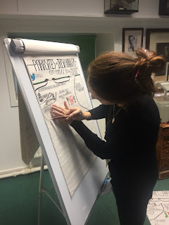
As badgers live in underground burrow systems called setts, I wanted to use this as a way of laying out my poster. As I’m a keen (but not very good) artist I played around with the idea of drawing out my poster.

Rachel Byrne drawing her conference poster.
Author Dan Roam is often faced with people who say, “I can’t draw.” He replies, “Everyone can draw, even people who know they can’t.” I think Rachel undersells her skills. I’ve lettered comics by hand (Time City #5), and it’s not easy to get hand drawn text to look as as consistent and readable as Rachel did here.

Rachel continues:

I wanted it to be very clear and easy to read and, and very importantly, eye catching. I posted a preview on Twitter and it received a very positive response. I think at poster session the key is getting people over to talk to you and ask questions. I decided to include my twitter handle rather than my email address which I think demonstrates the move for a more social and communicative science community.


To quote Dan Roam again, “Hand-drawn pictures make people smile, and smiling people think better.” And it’s hard not to look at Rachel’s poster and not smile. There is a charm to something so obviously personal.

In a time when computers are everywhere, and it’s easy to pop together a few pictures and text blocks in a computer file, something hand drawn is going to be remarkable. It will be worth talking about.

And people were definitely talking. Despite being started in a moment of slight desperation. Rachel’s efforts were rewarded with a first place prize poster!

Rachel may not go that route every time, though:

I definitely won’t be drawing every poster for conferences but I think if it’s a friendly and accepting group, it can be very fun!

07 December 2017

Critique: baby heads

Today’s poster comes to us courtesy of Laura Steinmann, presented at the 2018 American Nurses Association conference. Click to enlarge!


She writes:

I developed a 4 foot by 8 foot poster which is crammed with great info, and that’s the problem. ... The poster is less data and more instructional, based on two publications I wrote to teach providers how to recognize asymmetry.

Laura went on to say that she used a poster template provided on a commercial site. Coincidentally, the last talk I gave on posters, one of the questions from the end was about whether I knew any sites with good poster templates. This is a good example of why I try to steer people away from templates. People slap up templates that are... not necessarily very good.

Let’s look at just the template background, with the content removed:


The space alloted for the title and author is tiny. The space between the columns, and the margins around them, are also tiny. A poster maker would be better served if those areas were larger:


I’m still not crazy about this as a template for a poster, but I think it would have gotten someone off to a better start.

I agree with Laura’s self assessment: this poster is crammed. I often complain that people try to turn a manuscript into a poster, and in this case, there are two manuscripts residing on this poster. While I absolutely sympathize with the desire to tell a complete story, the complete story exists in the papers. They do not need to exist in the poster.

The first column is perhaps both the best. It is the best because it has a clear, wonderful diagram that Laura created (highlighted at right). Laura’s diagrams are very good, and I wish they were bigger and more prominent. They convey so much information.

The first column, unfortunately, also features some inconsistent typesetting. And it is crammed. For instance, several paragraphs in the first column might be cut down to a couple of sentences: “Infants’ skull growth is affected by internal factors, such as the normal malleability of the skull. Skull growth is also affected by external factors, such as the positioning of infants.”

There are about 1,800 words on this poster. While I personally never aim for some particular arbitrary target number, other people have had good success with posters containing a few hundred words.

Ruthless editing is hard. But that is what this poster needed.

Update: Laura sent me her revised version of the poster. Click to enlarge!


So. Much. Better.

Yes, it is still crammed. I would still want to cut down the number of words and resize some things. For instance, the references might be printed in a smaller point size. That would free up some space to make the takeaway messages in that column bigger and bolder for the viewer.

But the title is readable from a distance. The images are bigger. There’s less distracting background. The typography is consistent. It’s more inviting and interesting looking.

I particularly like the thin line running along the left side of the headings. It provides a little definition to the columns, but is subtle, and is a nice graphic touch.

30 November 2017

Link round-up for November 2017

The link roundup after the massive Neuroscience meeting is always fun. Just ask Shaena Montanari, “How big is that meeting?”

Was at the bar tonight in DC and saw poster tubes... I’m not even a neuroscientist and I knew. #SfN17

With tens of thousands of posters, I find classics like this, from Steve Ramirez:

Always check your dimensions before printing.


I have written before about how people incorporated video into their poster demonstrations (QR codes, iPdas, etc.). But this is the first time I have seen anyone do a virtual reality (VR) demo at a poster:


Advice from Caitlin Vanderweele:

Convince your labmate to carry the poster tube.

Justin Kiggins noted:

Incredible how many posters at #SfN17 have "Preprint available at @biorxivpreprint" & a DOI/QR #asapbio

Coffee & Science asked:

Poster session didn’t go well?


• • • • •

Everything old is new again. Fabric posters have been done since the 17th century:


The thesis of François Marescot, printed on silk, is on display at the British Musuem. Hat tip to Raychelle Burks.

• • • • •

A couple of weeks back, I wrote a bit the relative accessibility of posters. I am pleased to be directed to this preprint on making scientific presentations of all sorts, inclduing posters, more accessible.

Hat tip to Simon Goring and Toby (itatiVCS).

• • • • •

May Gun has been curating a list of unusual scientific graphics.

• • • • •

I don’t think I’ve mentioned this conference guide by Errant Science from late last year before .


Hat tip to Helena and Prachee Avasthi.

• • • • •

Today in type crimes:


Punctuation makes a difference. Hat tip to John Lopez and Mark Siddall.

• • • • •

23 November 2017

The shut out: when nobody visits your posters

A couple of weeks ago, I featured a poster that had no visitors. This, followed by having to defend poster sessions the next week got me wondering.

Just how many people put in the time and effort to give a poster and talk to nobody?

I ran a Twitter poll. I even ran it during the Neuroscience meeting, one of the biggest venues for poster presentations in the world. I was surprised.


Almost half of respondents have put in a good faith effort and got shut out, with no one talking to them.

This might explain why people have such differing reactions to poster sessions. I have given 38 posters at conferences. I have never lacked an audience. And I don’t think that’s because I’m particularly charming or do the hottest science or make the most visually interesting posters. (Of those 38, I’ve made maybe two or three posters I’ve been very happy with). I think I’m just another presenter in the session.

My experience has been consistently positive, but now I know I’m in the lucky half. I can see how the experience of having nobody talk to you could turn someone off poster sessions right quick. Many would probably never want to do a poster after even a single experience like that.

This points out how important it is for those who are not presenting posters – often the senior academics – to get out into the poster sessions and be the most active audience members, not hanging around in the “zone of intimidation” (which I dubbed the PIZI).

Madison Fletcher wrote:

During undergrad poster sessions especially, I actively seek out students who have people walk right by even if I don’t know anything about their topic. Invariably, I learn something!

Be like Madison!

16 November 2017

Posters teach visual science communication skills


The National Academy of Sciences of the US regularly sponsors the Sackler symposium on science communication. I’ve had gripes with them in the past. I have another this year:

Increase of poster sessions, at the expense of actual speaking opportunities, has a negative effect on #scicomm training of young scientists. – John Burris (Tweeted by Kat Bradford)

“We’ve moved away from encouraging graduate students to speak as part of their training – poster sessions instead of seminars etc. Creates an oral skills gap.” (Tweeted by Lou Woodley)

Burris: Our educational system has moved away from #scicomm (ex. grad talks have been replaced by poster sessions). (Tweeted by Sarah Mojarad)

This sounds a lot like a “Back in my day...” opinion that is not provable. Are presentation skills worse than they used to be? Maybe, but maybe not.

Poster sessions are the domain of academic conferences. Presentations at conferences, whether oral or poster presentations, are not the sort of broad science communication. Giving a lot of academic conference talks to peers does not in and of itself does not make someone an effective science communicator.

Similarly, it’s weird to worry about an “oral skills gap” when most scientists are never going to get to speak in front of large audiences. Successful science communication isn’t about going on a lecture circuit now. Science communication that reaches a lot of people is about television and the internet. (Smaller scale science communication is important too, but those are niche audiences, not broad.)

I appreciate Mammody coming to defence:

I mean okay, yes, getting up in front of people is important, but “audience” is not always literally an audience in a theater or conference room – poster sessions do provide great opportunities to talk about your research and actually engage in dialogue.

Exactly. Burris seems to think that people giving a poster don’t talk. In contrast, someone at a poster session may be talking for hours instead of 12 minutes.

I’m going to flip the script. We should not chastise conference organizers and poster sessions for taking away students’ opportunities to talk (which I doubt). Instead, we should praise posters for introducing visual skills to students that would otherwise not be taught at all.

Look, it seems that one of the most effective communication campaigns last year was carried out by Russia. It appears Russia successfully influenced the 2016 US election. What was one of their methods of choice? Tweets, Facebook posts, and memes, like this one:


This is visual communication.

This is what thinking and working with posters can teach you.

And for all its problems, there is no denying the success of I Fucking Love Science, which has something in the neighbourhood of 25 million followers. It got to that number the same way as Russia: with pictures. As this critique of IFLS notes:

What you actually “love” is photography, not science.

As I noted elsewhere:

There is a lot to learn from the successful formula of I Fucking Love Science. Pictures get shared; see the data from Google Plus below:


People interested in spreading their science shouldn’t just work on their sound bites. They should work on their social media meme images.

Visual communication is powerful communication. Making posters should teach scientists how to focus on creating fewer, more focused, more powerful images.

Update: Close to the end of the day, someone finally remembered imagery:

What picture do you use to illustrate your point? What is this picture conveying to the audience? Finally the importance of #visualcomm mentioned at the #SacklerSciComm – Tweeted by Dominique Brossard

External links

Self-defeating prophecy (2012)
Sackler symposium still doesn’t practice what it preaches (2013)
Sackler improves (2013)

Visual communication image from here.

The perils of PIZI: the “PI Zone of Intimidation”


Justin Kiggins wrote:

The zone of PIs chatting with each other between the posters was always super intimidating to me.

Science writer Bethany Brookshire agrees.

It was super intimidating to me. The only thing that gives me courage now is a press badge. ☺️

I know exactly what my colleagues are talking about: little knots of people with grey hair talking to each other, and not to the poster presenters. The age differences make it clear who are students and who are the senior scientists.

The “zone of intimidation” is probably more common and more obvious at big conferences, because there is ample space between posters for people to mingle. Big conferences are more likely to have attract people who go there every year, so there is greater chances for people to establish annual “conference cliques.”

While that hallway conversations are the best part of conferences, it can be poor form on the part of conference veterans to interact mostly with each other. Some say they plan on being in the “zone of intimidation”:

Visit posters from labs you like, introduce yourself. Many PIs will be lurking nearby (including myself) and would be happy to chat briefly then.

Why “lurk” in the PIZI? And why tweet that you can talk “briefly”? Why not talk extensively to students and earlier career colleagues? The organizers of the Keystone Antimicrobial resistance meeting sent this to their participants:

Please attend the poster sessions and interact with junior colleagues. You are the reason the rest of the attendees were attracted to the meeting. Please mingle and inspire the next generation of researchers, clinicians, and policy makers to remain engaged in this amazing important topic.

Yes, talk to your colleagues, but try to not have your full academic reunions (“It’s been so long! How’s your partner and kids? Are you still at...”) in the poster session. Get a phone number, send a text, and meet for dinner.

Another possible solution to that senior people should present a poster of their own. (This is a variation on my belief that senior scientists should have a project of their own.) Get in there in the trenches and remember what it is like to try to attract an audience and talk about the project for hours at a time. Posters should not be the sole domain of first time conference attendees.

Hat tip to Kat Holt and Michael Hoffman for the Keystone quote.

09 November 2017

Why academic conference posters rock


Iva Cheung fires a shot across the bow with a long blog post titled, “Why academic conference posters suck.”

Ahem. Obviously, I have thoughts on this.

Cheung begins by noting that there is not a lot of research on conference posters. This is true, but it is expanding. Melissa Vaught has been tracking this on Twitter with the #conferencetopub hashtag. Some fields, more on the health and medical side, are all over this.

She then makes the arguments that poster sessions are socially awkward. “No one’s quite sure what to do or how to react,” she writes. First, this is a problem with the entire concept of going to an academic conference, not just poster sessions. She even goes on to say, “posters save people with anxiety from having to speak in front of a crowd.” Second, this is a case of, “Your mileage may vary.” I have seen many people who know very clearly what to do and how to react. Some people feel awkward during any social interactions with new people. People can get better at this.

Institutions should have poster printing capabilities


Cheung argues that “posters are expensive.” That is not a problem with the poster format. That is a problem of institutional support. I have not paid for a poster in years, because my university has invested in a large format printer and paper. Department chairs and deans should realize that conference posters are a routine part of academic presentations, and invest accordingly.

Posters force you to think about what you’re doing


“Posters take an enormous amount of time to prepare,” Cheung writes, “whereas presentation slides can be (and frequently are) prepared on the flight over to the conference.” This is a feature of posters, not a bug. You have to think about your content in advance, and make hard decisions about what you are going to include. When you print a poster, your work is mostly done. Making a PowerPoint deck on the plane trip is rushed, half-assed preparation in comparison. If you make a PowerPoint deck on the plane, you still have to practice delivering the talk so that you don’t go over time. At least you should!

Cheung notes “travelling with a poster can be cumbersome. Because of their length, poster tubes technically exceed carry-on size restrictions(.)” I have no doubt this happens sometimes, but it seems to be vanishingly small. I know of nobody personally who’s had a problem taking a poster on a plane. Getting a laptop through security seems almost as bothersome.

Cheung’s next section has the header, “most academic posters are a visual nightmare.” Well, yeah, that’s what keeps this blog in business. But so are most PowerPoint talks.

We can do better on poster accessibility


Cheung’s most important argument is about the accessibility of posters. This is an important conversation, and one that I don’t think conference organizers and presenters think about enough.

Posters are a visual medium, which poses a problem for someone with poor or no eyesight. Cheung argues that “oral presentations give people with visual disabilities immediate access to at least some of the content.” This is true if there is no presenter at a poster. If there is a presenter at a poster, however, the one-on-one nature of a poster presentation means that a presenter can more readily adjust the discussion to take into account the visual issues of the listener. A presenter giving a talk is unlikely to adjust the talk to accommodate anyone in the audience with a visual issue. (See this post about the experience of a blind colleague listening to conference presentations. Also see this post about a blind poster presenter.)

I have also seen posters incorporating 3D printed elements, which could make some aspects accessible to a visually impaired people in a way that a talk could not do.

Some conferences are videorecording talks, which can again make content available to visually impaired people. Some people are archiving posters online, and I thought standard text to voice tools would be able to help this problem.

I pulled up a PDF of my last poster, and asked Acrobat Reader to read out loud. Reader’s “read out loud” was not working for any document, but Acrobat Standard did read it. I learned that the kerning I did to make the poster look better disrupted the text recognition: it treated words where I had moved a letter as separate words. Hyphenated words were also read as separate words. I learned that if I was to archive posters, I should include a plain text version in the description. Like most issues around accessibility, this is not an unsolvable problem.

Cheung argues that posters are horrible for learning, citing ideas about glucose use that sounds rather similar to some contentious ideas about sugar and willpower. She argues that academic posters are too complex to learn from. I agree that most posters are too complex: this is, again, one of the reasons this blog exists. It is seems to me that any form of academic communication faces this problem.

Posters help start dialogue


Cheung suggests more short talks as alternatives to posters. This looks sensible on the face of it. Most people prefer talks, both as a presenter and an audience member. I love talks in the Ignite format. They can work well for small meetings. But I have extreme doubts that they can replace poster sessions or many meetings. The number of presenters is too large, and there is not enough space or time to accommodate them.

I also worry that a whole bunch of five minute talks will blur together in memory. It is hard to stand out when you have four or five talks an hour; imagine if you are sitting through 10 talks an hour. For eight hours. For several days.

Talks, by their nature, are synchronous “one to many” communications, typically with limited time for discussions. (And can you image the difficulty in people switching from room to room every five minutes?) Posters are more complex. Audience members can listen to the speaker at different times. The format permits conversations in ways that talks don’t.

The other main suggestion she has is for conference organizers to building in more networking time. Those hallway conversations are often the best thing about conferences. But just having “the explicit expectation that people with similar research interests can use that time to find each other and chat” is, perhaps, overly optimistic. Talking to strangers is hard. You can’t just put people in room and expect conversations to flow freely. Having a “social object” like a poster helps people identify others with similar interests, and gives them something to talk about.

Poster sessions fill a niche. Posters provide a straightforward way for a listener to identify who is working on topics they are interested in. (There is rarely enough time to read all the article titles in the abstract book, but you can easily scan rows of posters to find who is doing what.) Posters give people more opportunities to talk individually, and to take as much or as little time as possible.

I agree with a lot of Cheung’s points, but not the conclusion that we should kill all poster sessions. Let’s make posters better rather than abandoning them.

External links

The Zen of Presentations, Part 34: Lessons from the blind
The Zen of Presentations, Part 40: Lighting a fire under speakers

Hat tip to Mary Ellen Foster.

02 November 2017

Critique: Life in the cold

Max Showalter had the worst possible poster experience. The thing we all dread. Max wrote:

I recently presented this poster at a large conference and of the thousands of people walking by literally no one stopped to look at my poster. Ignoring that could just be me (I thought I was charming!), could you provide some feedback on what aspects of the poster might be telling people “keep walking”?

Ouch. I feel for you, Max.

What happened? Let’s have a look at Max’s poster, which he gave at the 2017 Association for the Science of Limnology and Oceanography “Aquatic Sciences” meeting. Click to enlarge!


Max’s poster is far from the worst I’ve seen. The layout is clean and the colours are attractive. Why didn’t it find an audience? As journalists say, this poster “buries the lede.” I think the issue is there is no clear entry point.

For starters, the title is maybe a little small, and what it says is not helpful to me. I know what “low temperature” and “taxis” are. But I do not know what a “psychorphile” is.

I don’t recognize the species name. I don’t know if it’s a fish or a flea. It’s a good idea to try to put sort of plain English common name in titles for that reason. In this case, the title might have said, “the marine bacterium Colwellia psychrerythraea.” To make matters worse, the poster switches from the full species name to Cp34h with no warning. If you are glancing at the poster, that is another little obstacle.

The title says what the poster is about, but not what it found. The result numbered “1” give what may have made for a more compelling title: “a new low temperature record for chemotaxis.”

A record? People love records and extremes! I might have just made that phrase alone the title of the poster. Extremes are scientifically interesting, because they tell us about what the limits of possibility are.

The question right below the title helps bring some clarity that the title itself didn’t. But it’s too small, and not high contrast enough. The answer to that question is a block of text that is in a small point size, and stretches all the way across the width of the poster, making it hard to read.

The layout of the three sections of the results is good. But bar graphs are so generic that they don’t help me know what this poster is about.

The iceberg graphic in bottom third is promising. The idea of an infographic is awesome; it just needs refinement to clarify what you are looking at. It is a little unclear that I am supposed to be looking at an iceberg, rather than just a shape.

Finally, the future work section is trying too cram too much stuff in not enough space. Pictures are too close, the type is not laid out consistently (sometimes centered, sometimes not), and boxes overlap boxes.

There may be other ways to clarify and improve this poster, but I think the lack of turnout is due to a failure in the top third of the poster.

Fortunately, Max did have a happier story to tell:

I recently made another conference poster using some tips from your website and won the first place poster prize! Thanks for all the help!

No, Max, thank you. Contributors like you keep this blog alive!

26 October 2017

Link roundup for October 2017

This month’s link round-up begins with a big tutorial on making posters by Desi Quintans, “How I make conference posters.”

Excerpt:

About my design ethos

I think that visual design is just as important as content. I believe that by adapting lessons from other fields of publishing, we can design posters that are unconventional and surprising, and yet attractive to look at and informative to read. The alternative is to be cursed with posters that all look the same.

This lengthy piece covers some material that’s familiar to regular readers, but provides it in a convenient one-stop shop. It’s this month’s “must read!”

•••••


Nichloas Rowe has authored Academic & Scientific Poster Presentation: A Modern Comprehensive Guide for Springer. I may have a longer review later, but wanted to bring this to people’s attention now.

•••••

Earyn McGee also has a thread on Twitter that describes her lessons as an early poster presenter, presenting at the SACNAS 2017 conference. Hat tip to Toby.

•••••

Dan Quintana also provides helpful advice, but it’s more concise.

Can it be read by three people standing three meters away after three beers?

That’s the whole thing.

•••••

An academic poster in a cartoon style.


Hat tip to Rainer Melzer.

•••••

Kayla Brandi makes a cape of her poster.


Hat tip to Juan Ruiz and Auriel Fournier.

•••••

Amber Dance has a nice feature in Nature on what makes for a good conference. The take aways are that you need to create “hallway conversation,” have a diverse group of people, and pick a good location.

•••••

Up for discussion in the PeerJ preprint server by Foster and colleagues is a discussion paper on “Good Practice for Conference Abstracts and Presentations.” Here’s what they say about posters:

3.2 Posters

3.2.1 While it is technically possible to make posters permanently available (e.g. on conference websites or platforms such as F1000 Research), some journals regard this as prior publication so it may prevent full publication. Authors should therefore check the policies of their target journal(s) before agreeing to a poster being publicly posted.

3.2.2 Posters are not peer-reviewed by conferences and may not describe all aspects of the research . Posters should therefore not be viewed as a substitute for a full article in a peer-reviewed journal. However, if a poster is publicly available (and, ideally, searchable via an indexing system or DOI ) it may be cited until the full publication is available (although some journals consider citation of posters as unpublished information rather than full citations).

3.2.3 The lead author (e.g. principal investigator) should be given the first option to attend the poster session(s) but this role may be taken by other authors or a local presenter (if the authors do not speak the language of the conference). The poster presenter should be agreed before the abstract is submitted.

Hat tip to Jackie Marhington and PeerJ.

•••••

Mice, as depicted in scientific journals:


This collection, curated by Neuroskeptic, is a good opportunity to think about the choices behind each figure. No two are the same. Which ones work, and which ones don’t?

•••••

Jared Spool said:

“Great designers do not fall in love with their solution. Great designers fall in love with the problem.”

Hat tip to Julie Dirksen.

•••••

Men ask more questions than women in conference sessions. I wonder if this holds true in poster sessions, too? Hat tip to Amy Hinsley and Joshua Drew.

•••••

When competing for attention, playing against expectations can be powerful:


Hat tip to Jason and Asia Murphy.

•••••

Kimm Hannula has a little Twitter thread about how conferences can create “social capital.”

19 October 2017

Critique and makeover: Bird sperm

Today’s poster is a contribution from Antje Girndt, who presented this at the European Society of Evolutionary Biology (ESEB) 2017 meeting in Groningen, the Netherlands. Click to enlarge!


Antje was kind enough to write her own analysis of this poster:

It uses a Dutch colour theme and comes with little text. The introduction is pushed to the bottom and I am almost not explaining the methods. QR codes link to my profile and the accompanying data and script at the Open Science Framework. ...

I like my final product but at the same time, I am not fully satisfied. The lower bit with the bullets, affiliations and references somehow bugs me, but I cannot pinpoint why.

Antje’s approach is very much in line with the style I have been moving towards lately: make a simple, big statement up top. I think it could have been an even stronger title if the title said “why it matters.” Maybe something like “Sampling methods affect bird sperm data” or “Bird sperm should only be collected with one method.”

Despite the title being large, it feels less prominent than it should be because the colours are so muted. The authors are jumping out, when the title should be. I would have flipped the colours of the title and authors: used dark text for the authors, and white text for the main text. The shadowing on the title is not helping the cause, either, because it is reducing the contrast between the text and background.

I would also have put a little space between each graphic element; the two pictures and the graph. The two pictures, in particular, don’t clearly separate out visually.

Maybe Antje’s concern about the bottom half of the poster springs from a couple of things. I think each element  needed more vertical space between them. It also seemed to me that the “Future studies” statement was a stronger as a concluding sentence. The placement of the QR codes breaks the logical flow of the text.

Here is a quick revision that tries to address those issues:


It has more punch from a distance and flows better.

There are a few other things that I might change that I didn’t put in the revision above. The key graph on the right is a little tricky to interpret. I think each line is an individual. The mean is highlighted, but the difference between the average and the raw data could be enhanced even a title more. There is a lot of white on either side of the data.

The typeface is a handwritten script that is attractive, but is all capitals. This might make it a little harder to read.

The institutional affiliations are listed in footnotes at the bottom. I’m unsure about this. On the one hand, affiliations are the sort of disposable information that footnotes are made for. On the other, if you are going to list affiliations, it makes sense to put them at the point of need. It’s also weird that institutional affiliations come between the references about sperm. The references are incomplete, too. No volume or page numbers.

The QR codes do not follow a good practice: there is no description of what I get if I scan them. There is plenty of white space around them, so it would have been easy to include a description of what each is.

If you want to compare the poster to the final paper, the published paper is here.

05 October 2017

Critique: Crab parasites

Most of the time, I think my poster aesthetic might be described as Swiss style. That’s the period that saw the creation of Helvetica, for instance. It’s a style that is very spare and very organized, with lots of emphasis on grids. You can see it in this poster I made for the American Society for Parasitologists meeting in 2014. Click to enlarge!


This was a noble, but in my mind, failed experiment. I wanted someone to get the main point of the poster by reading across the top row. I wanted people to get the supporting details in each column.

It kind of works, kind of doesn’t.

The top row works best because it is all photos. The graphics in the rows below that are not consistent enough to make the idea work. The text block in the bottom right doesn’t follow through with the lines established in the two rows above, and the three images to the left of it.

I still like using huge numbers to bring home the main difference in infection rates between the two species instead of a graph. Simple numbers can be almost picture-like at that size.

But I’ve wanted, for a long time, to make an elegant poster. I wanted something warmer, artistic, maybe even a little romantic. And I think I’ve finally come close.

This poster started with an email I got from MyFonts, announcing a sale of a new typeface,  Montecatini. I was very inspired by this font sample for (among others).


The description said:

Montecatini takes its cues from the elegant Stile Liberty travel posters of Italy in the early 1900s. The font features distinctive ligatures typical of the time when Art Nouveau emerged as a worldwide phenomenon.

I wanted to make something like that sample. Evocative and graceful. But when I looked at the available characters in Montecatini, I realized it wasn’t going to do the job.

There were no lowercase letters. Montecatini might be great for a title, but with no lowercase letters, it wouldn’t do for an entire poster. There were no italics. And I had species names that needed to be in italics.
I kept looking, and I got lucky. Hitting the jackpot lucky. How could I know that a perfect font for my needs had been released just a day or two before I looked?


I bought Plusquam Sans just three days after it had been released. The main letterforms were clean sans serifs, but the swashes added the calligraphic look I wanted. (See this post for uses swashes.)


Here’s the poster I made for the 2017 meeting of the American Society for Parasitologists conference. Click to enlarge!

This is one of my favourite posters I’ve ever made. Here’s why.

Using Plusquam Sans gave the poster exactly what I wanted: a little humanistic flair. It was obviously not one of the default fonts that gets used over and over (Arial, Calibri, and so on). But it was still clean enough to read well from a distance.

The background is a light cream instead of pure white. I wanted the paper to look like a page from an old book. Book paper is often a bit off-white, not the bright white of the sort we see on computer screens. Again, that gave the poster some warmth.

I picked up on the light pinks and blues in the Montecatini sample that started this whole thing. This turned out to work well, because the light blue picks up on some of the colours in the left picture of the crab. The light pink (used in a couple of symbols in the graph) picks up on the pinks in my hand in the left top picture, and a bit of the warmth in the bottom row of pictures.

The poster is laid out on a six column grid. This lets you divide the poster in two thirds (the graph), halves (divided by the two pictures on top; sand crab data on left, mole crab on right), thirds (the top pictures), or sixths (text columns and small pictures at bottom). That variation in width of objects makes the poster more interesting, but the underlying grid gives the poster organization and structure.

Of those six columns, the central four are mostly graphics. Only about a third of the poster is devoted to text. Thus, the poster is very visual, and quick to understand at a glance.

Plotting the boxes of summary statistics and the raw data made the graph visually interesting enough to hold the space allocated to it. The poster would have looked boring if there were just two boxes in that big block in the middle. Plus, It helps the poster a lot that the difference between the two species is so stark. You can see what is going on easily.

I am not a 100% happy with this poster, though. I wish the two crab pictures were more similar. One is on my hand, one is on a benchtop. I fixed this in Figure 1 of the paper that arose from this.

The crustaceans definitely get pride of place in the layout, reflecting my interests. Considering that I presented this at a parasitology meeting, I may have been a little dumb to not have a close-up picture of the parasite species, even if it was relegated to the bottom row of images. I didn’t fix that for the paper, though: still no close-ups of baby tapeworms.

I felt I met my goals in making this poster: something warm and human that was reminiscent of old European posters. I think it was successful because I didn’t make a straight copy of the Montecatini font sample that started this. I didn’t copy the colour using the eyedropper, or buy the Montecatini font. Instead of stealing the specifics, I stole the sentiment.

Having had the success with doing something a little more adventurous with type in this poster, I have a goal for my next poster. I want to push the typography even further. I want my next poster to push the envelope with typefaces even further.

That is one of the joys of a successful project: it makes you excited about the next one!

Related posts

How to swash: using a font’s alternate glyphs, text styles, and numbers
Critique: Protein biosynthesis

External links


When two lines of research collide


References

Faulkes Z. 2017. Filtering out parasites: Sand crabs (Lepidopa benedicti) are infected by more parasites than sympatric mole crabs (Emerita benedicti). PeerJ 5: e3852. https://doi.org/10.7717/peerj.3852

28 September 2017

Link roundup for September 2017

Best repurposing of a conference poster for the month goes to Wendy Yoder:


(For something on this Internet, this blog has not had enough cats.) Hat tip to Colin Purrington.

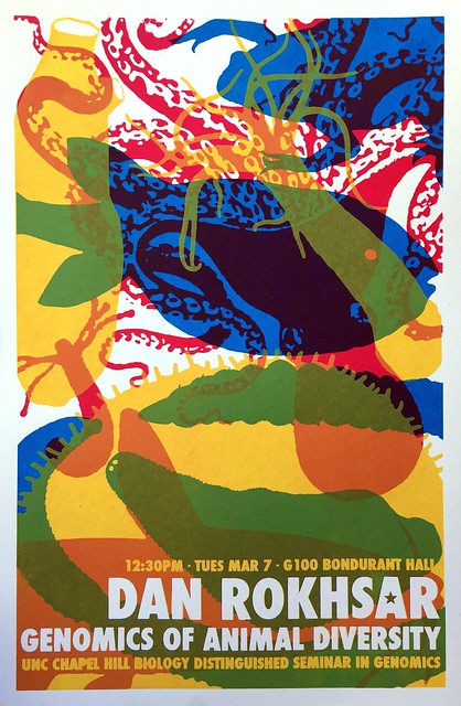
A collection of awesome seminar posters at University of North Carolina Chapel Hill. I may have featured these on the blog before... but there have been more since then, so it’s worth revisting.

Dan Rokhsar

Yun Tao (via Holly Bik) observed:

Our current crappy seminar posters (word doc, comic sans) trivialize the gravitas/seriousness of seminars.

Hat tip to Jenny Merritt and Dr. Becca.

Quote of the month from Benjamin Mazer:

“So you have to make a poster for the science fair? Didn’t you do that in elementary school?” – my mother, clearly not an academic.

Sparklines are mini graphs inserted into text, created by Edward Tufte. Now it’s easier than ever to create them with a special typeface. It’s called ATF Spark. Hat tip to Dr. Becca.

Typography jokes:


Hat tip to Janet Stemwedel.

If you have anxiety about attending conferences, try this post from the Where There Is Light blog:

This is a really difficult thing for anxious people, because new things are scary and we love to overthink and play out every worst-case scenario in our head beforehand. However, I know from experience that it is highly unlikely that any of these scenarios will ever become reality and what also helped me is to approach anxiety as excitement and chances for bravery.

Graphic design appears in a New Scientist feature, of all places. It’s a review of a Wellcome Collection exhibition, “Can Graphic Design Save Your Life?” The exhibition is feature on the Wellcome Collection website.

This is a tribute to the joy of using something well designed and well made. In this case, nail clippers.

This nail clipper was forged, not stamped out of cheap sheet metal. It wasn’t just forged, it was forged well, with machines without any rattles or squeaks, and probably inline measurement of temperature to keep the steel exactly hot enough. I don't know how to explain the shock of seeing such a skillfully forged nail clipper to someone not in the metalworking industry.  It was like seeing a dog with six legs, or opening up a lawnmower and seeing the jet engine from a 747. Nail clippers simply aren’t forged, nobody puts that much thought and quality into tools for trimming nails. ...

I took off my other shoe and sock, and trimmed those nails unnecessarily, just for an excuse to keep using this wonderful tool, all the while wondering “What is wrong with me? Why am I enjoying this chore of trimming my nails, when I could be out skiing?” That’s how amazing those clippers were.

Rounding out the month with this quote from Sophia Wassermann:

Posters: my favourite part of a conference cause of all the people & research you can see.

Me too, Sophia. Me too.


21 September 2017

Critique: Sand crab summer

Some projects show up as posters at conferences, and then are neatly converted and are published as journal papers soon after. My newest paper (Faulkes 2017)... did not happen that way. The bulk of the paper never got presented at a conference.

I featured bits and pieces of my new paper on an Ecological Society of America poster, way back in 2012. I wasn’t even there for that meeting; I had my co-author put it up. Now that I have some distance between that meeting, it’s a good time to review how it’s held up. Click to enlarge!

 
This was a big poster; seven and a half feet wide!

The graphs in this paper shows up as Figure 4 in Faulkes (2017). But one bit, the crab at the bottom of the third column, made it into a separate paper earlier (Faulkes 2014). Looking back, that picture was a bad choice. One thing I think I still like is the repetition in the four central columns: they all have a map above and a graph below, and a little explanatory text underneath. The picture in the third column breaks the pattern. Not sure if I should have tried to include it at all.

It was also dumb of me to put the photo on the right column underneath a block of text, instead of aligning it along the top with all the other images. All of the images along the top should have been the same width.

The poster is mostly grey, because the sand crabs were grey, and the maps I made were mostly grey. When you enlarge, you can see dots on the map are in brighter, saturated colours. I might have made those dots even bigger.

Although I never presented most of the data at a conference, I did use it in an example I did for a #SciFund poster class in 2016. When I do that class, I always make a poster at the same time as the students, so I am working alongside them and facing the same struggles they are. (Here’s a poster from an earlier #SciFund class.)

When I was teaching this class, I had just come back from the Evolution meeting where I had seen what has now become the most popular poster ever on this blog. I was very influenced by it and wanted to make something similarly big and simple. I’m happier with this poster today than the one above. Click to enlarge!


I still like the approach of making the picture of the animals big to act as an entry point to the poster, and staying very focused on a small number of graphs.

I’m not convinced I found the right colour palette, or typeface. The brown was lifted from the colour of the beach they are found in. The font was Sitka, which I had blogged about as being highly readable.

I made this poster in Inkscape. I struggled a lot with Inkscape. I know now that some of the things I complained about were not fair comments about the software. I was working with new software and didn’t know how to do certain things. Some of the walls I ran into were the limits of my knowledge, not of the program.

I did learn how to “export” in Inkscape, though. I managed to keep a bit better track of the “making of” than usual. Watch the poster take shape in this animation!


You can see that the big changes happen early, as I make decisions about the layout. After that, it’s mostly a lot of tweaking. Moving here, changing the colour there, rewording the text. Trifles make perfection. I may not have reached perfection here, but the degree I got close to it was due to the trifling I did.

Related posts

A poster with no conference, or: What I made in that #SciFund poster class
Critique: Anther colours
No more slidesters, part 7: Inkscape

References

Faulkes Z. 2014. A new southern record for a sand crab, Lepidopa websteri Benedict, 1903 (Decapoda, Albuneidae). Crustaceana 87(7): 881-885. https://doi.org/10.1163/15685403-00003326

Faulkes Z. 2017. The phenology of sand crabs, Lepidopa benedicti (Decapoda: Albuneidae). Journal of Coastal Research 33(5): 1095-1101. https://doi.org/10.2112/JCOASTRES-D-16-00125.1