26 November 2015

Link roundup for November 2015

Posters are a visual medium. But not everyone sees equally well, and I’ve written about taking factors like colour blindness or presbyopia into account in design. But I had not considered the challenges faced by a blind presenter, which makes this article absolutely fascinating.


Ashleigh Gonzales (pink blouse on left) is blind, and her poster is on converting flat images to three-dimensional ones that could be felt by blind students. I’m fascinated that Ashleigh’s poster (abstract here), has Braille in the title and headings. I can’t make out whether this is actually readable Braille (i.e., raised paper) or not, but would love to find out more.

The Society for Neuroscience introduced “dynamic posters” a few years ago, and the response has been... well, flat. As it happens, I have not made it to this conference since these have been introduced, so I haven’t had a chance to see, or create, one myself. I’m tickled that the Neuwrite blog has a long post detailing the creation of a dynamic poster. To be honest, dipping into the process of creating something that truly exploits the dynamic format is intimidating:

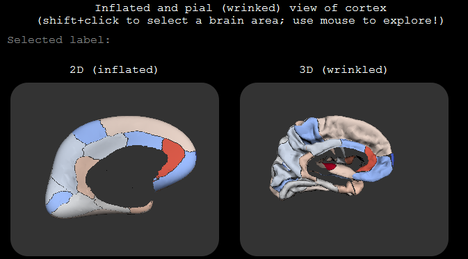
My goal this year was to make my “dynamic” poster interactive. ... I didn’t know how to do any of this, but I new it is possible and that, with a bit of effort, I could figure it out. A “bit of effort” turned out to be 6 weeks of sleepless nights(.)

But the results are pretty amazing. Go to the post to see these in models that you can rotate and zoom.


The PLOS Paleo blog has started a series about academic conferences. Their first entry tries to characterize the type of people who attend conferences.

With this potential range of attendees in mind, there is no single uniform audience at a scientific conference.

Looking forward to more!

Apple has long been recognized as a company that spends a lot of time thinking about design. But former employees takes the company to task for forgetting the user (not to mention a few swipes at other products, like Google Maps):

Gone are the fundamental principles of good design: discoverability, feedback, recovery, and so on. Instead, Apple has, in striving for beauty, created fonts that are so small or thin, coupled with low contrast, that they are difficult or impossible for many people with normal vision to read. We have obscure gestures that are beyond even the developer’s ability to remember. We have great features that most people don’t realize exist.

Probably the deepest article in this month’s round-up. Hat tip to Clause Wilke and Leonard Kruglyak.

Vox magazine makes the argument that Y axes shouldn’t always start at zero.


I try not to be a zealot about things, but in general, starting axes at zero is a better practice than not. Will there be exceptions? Sure. As the Vox video points out, if you have negative numbers, you have to extend past zero.

One thing that Vox overlooks is that there is a standard way to extend a section of a graph: it’s to insert a break in the axis. It alerts a viewer to the non-standard start.

KatieSci on Twitter:

Presentation Preference choices for #EB16 abstract submission: Oral, Poster, Indifferent. The “Indifferent” is kind of cracking me up.

The “indifferent” abstracts are like this:


PeachPit Press asked Jim Krause for typography tips. I like these:

Explore your font choices THOROUGHLY before picking a winner.

Combine fonts that are either clearly alike or clearly different. Middle-ground=bad

Hat tip to Garr Reynolds.

19 November 2015

Critique: SAS depot

Today’s poster come from Maxine Davis, which she did for a small conference. Click to enlarge!

There are a couple of things that are very successful on this poster. The colour scheme is very cohesive, helped by the poster being a pastiche of Home Depot branding. As I’ve said before, basing a poster on an existing colour or branding scheme is a handy shortcut, because they’re tried and tested designs that you know will work.


The yellow highlighting breaks the colour scheme slightly, but it is so effective at drawing attention to key elements of the text that it is okay.

The poster clearly shows that it is meant to be read in rows, so there is no problem in determining reading order. The big orange “How to” balloons on the left are very good guides.

Still, there is probably too much going on in this poster. I suspect that the individual sections might looking fine when you’re looking at part of the poster, but when you step back, there is a lot of stuff competing for attention.

The typesetting is a little frantic. I count at least six different typefaces, which I’ve highlighted below:


Even when the typeface is the same, there’s a lot of other variations that contribute to the feeling of mild disorganization (bullets, bolding, boxes, italics, highlighting, rotation...). Wider margins might also bring a needed sense of calm to the poster.

I like the idea of having the top left image acting as an entry point (and making the homage to Home Depot obvious), but the execution is compromised because the picture is distorted. The store logo should be square, like so:


I would have kept the image in its original, slightly narrower form, and made more room for the subtitle over at the right.

While it’s not visible in thumbnail, there are some overlap and ragged edge problems between the image anf the author credits:

I’m not sure about the winking face next to the name. Some will find it friendly; some will find it frivolous. Home Depot employees do have buttons and badges on their store aprons, and this might potentially be continuing the imitation of the flair of Home Depot staff. But it’s not quite a match, and I feel that if you’re going to follow the design of something, you need to go all the way.

This poster is off to a good start, but would benefit from a very thorough polish of the text, with attention to making the text more consistent across the poster.

12 November 2015

Critique: 3D sound

Today’s poster comes from Erlend Magnus Viggen. Click to enlarge!


Erlend had a few notes on this creation.

Since the article is about a computational method that we developed, the poster is a flowchart of the method.

The flowchart works reasonably well, although the reading order of the “Propogation” box in the upper right is a little tricky. If there was a little more room, I might try placing “Sound processing” slightly lower than the text block flanking it. That way, the “Source sound” and “Propogation” would sort of funnel down into “Sound processing.” But this poster has a nice balance of text and margins, and you couldn’t move “sound processing” down without messing with that.

There’s no introduction. I’m not sure to which degree an introduction beyond the title is useful on a poster in any case, but in this case our method is far more relevant for our conference audience than our motivation is. Our use-case is basically outside the scope of the conference.

Smart move, and an excellent example of how designs are often improved by taking things away.

I like how subtle colour gradients are used to distinguish blocks of text instead of heavy-handed outlines.

I’m particularly interested by Erlend’s comments about using institutional styles. I’ve been wary of institutional style guides, because they often prioritize advertising the institution over the content that a poster viewer cares about. Erlend, I think, takes a sensible approach:

I tried to follow the guidelines of my research institute: use a grid, use the official typeface (though I only used it for headers as it’s more of a display typeface), and use colours from the official scheme. While there are more colours in the official scheme, the dark blue one is our main colour and the light gray-brown is the only bright-ish colour among our “main” colours.

Erlend isn’t slavishly following a template, but looking for ways to use elements of the institution’s style. Institutional colour schemes are usually closely examined by professional designers, so you end up with palettes that are harmonious, and maybe a little conservative. The colours should work in lots of different conditions. And you don’t have to use every official colour.

I did something similar recently, when I made a new logo for my homepage. I deliberately wanted to harmonize it with my institution’s logo:


Like Erlend’s case, my university has navy blue and green as secondary colours, but I didn’t use those. I used the same primary colours and font (Caecilia), and customized a swishy capital:


By using the institutional typeface for headings, you evoke the institution in a subtle way. It’s got more finesse than just shoving a logo somewhere on the page. And if you do put in a logo, you avoid having a lot of different fonts fighting each other.

I'm not too happy with not having more pictures, but unfortunately we just don't have any more that would fit well.

Alas! I agree that more graphics and a little less text would be more appealing. Nevertheless, this poster has enough space on it that it doesn’t become an indistinguishable block of grey from a distance.

Related posts

Misplaced priorities on institutional templates

05 November 2015

Casing a poster

I’m fascinated by the ways people recycle posters. Traditionally, posters are one-shot ephemera, which usually gotten reuse only by decorating department hallways. While fabric posters has some shortcomings for display compared to high quality paper posters, I have to admit: the reuse possibilities are much greater.

Christie Rowe has been steadily converting her posters into these awesome pencil cases! She shared this with me back in September:


And here’s some more finished ones.


The earth tones come naturally for Christie, who is in an Earth & Planetary Sciences department.


Data flash!