26 November 2020

Link roundup for November 2020

One of the advantages of an online conference is that you can more readily measure what is working and what is not. Clicks, attendance, and visits are easily measured. Lucas Braun does some analysis of an online poster session:

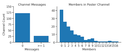
Poster session turnout at @cshlmeetings From Neuroscience to Artificially Intelligent Systems online conference (#NAISys on Twitter) seems to be bleak. Only ~18% of the dedicated slack channels had more than one message, and only ~55% had more than one external member. How can we do better online poster sessions?

Two bar graphs. Left: Channel messages showing <18% have a message. Right: Histogram showing mode number of poster visitors is zero.

It’s worth remembering that almost half of poster presenters in the long ago days of face-to-face conferences have given at least one poster where nobody talked to them.

I am hoping some organizers from other conferences would be willing to share their data!

• • • • •

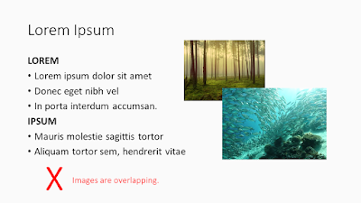
Amy Cheu has a free PowerPoint deck about designing presentations.

Sample slide showing the problem of overlapping images

Lots of good reminders in a compact space!

• • • • •

The Society for Integrative and Comparative Biology, like many conferences, is going online for its next meeting. It has created a short “tip sheet” for its online posters here. The poster material is on page 2 of the PDF.

The examples they use are pretty good, although they all have too many damn boxes!

Warning! Contains this blog.

• • • • •

Everyone’s got a chart they want gone. Nick Desbarats says were probably should stop using slope charts. Graphs that look like this:


Slope charg comparing productivity of several European countries.

This take-home message applies to all graphs (emphasis in original):

(T)he risk isn’t that readers will miss out on important insights, it’s that they’ll get completely wrong insights, which is obviously a much bigger problem.

Hat tip to Boris Gorelick.

• • • • •

A poster presentation should be short. It should also be an opportunity for dialogue. I like this article by Mark Goulston about how to stop yourself from talking too much. 

I think this paragraph might resonate with a few people in poster sessions:

One reason some people are long-winded is because they’re trying to impress their conversational counterpart with how smart they are, often because they don’t actually feel that way underneath. If this is the case for you, realize that continuing to talk will only cause the other person to be less impressed.

Hat tip to Viola Nawrocka.

• • • • •

Thoughtful Twitter thread about American election maps by César Hidalgo. He discusses that “visualizations are metaphors,” and he hits on a problem that has been bugging me about maps that try to minimize the “all or nothing” effect of by using purple:

Comparing shades of purple is nearly impossible.

Hat tip to Emily Rollinson.

• • • • •

To my surprise, César does not mention the election map from Le Monde, which won a lot of praise on Twitter.

American electoral college votes superimposed on geographic map of United States

• • • • •

And one more analysis of  American election data by cartographers. There is much more than election maps, though:

The Washington Post tried making bar charts (showing the votes that have been counted so far) supplemented by a blurry zone to the right of the bar... Perhaps this “Fuzzy Bar” would be the famous viz to come out of this year?

• • • • •

I should really stop putting out every primer from MyFonts. But they’re so good. This one about using gray is no exception (PDF).

• • • • •

Three online courses for scientific illustration.

  1. Introduction to Organic 3D Modelling: 11-22 January 2021.
  2. Naturalistic and Scientific Illustration 1: Traditional Techniques: 25-29 January 2021.
  3. Naturalistic and Scientific Illustration 2: Digital techniques, 1-3 February 2021.

• • • • •

Acdamics are cheap and always resisting paying for professional graphics software. This answer on Quora examines the difference between Adobe Photoshop and its free alternative, GNU image processing. 

Photoshop is a bit like an iceberg—what you see above the surface is only a small percentage of what’s there. You’ll find little symbols and hidden features in almost every Photoshop dialog that hide functionality most users don’t know about.

You can debate whether all that extra stuff is stuff you “need” as a poster maker for a conference. But at least be aware that the differences in the products are real.

20 November 2020

Better Posters available from major bookstores Amazon, BN, Indigo, more!

Y’all.

The Better Posters book is up on Amazon!

Screenshot of Amazon showing Better Posters

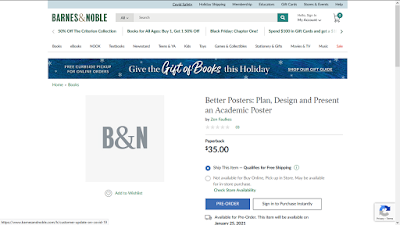
And Barnes & Noble

Screenshot of Barnes and Noble website with Better Posters

And for my fellow Canadiana, on Indigo!

And ready for pre-order! 

(These are not endorsements. Other bookstores are available and I love them all and hope you support the bookstore you love most. I love local bookstores, not everyone has a local bookstore.)

I haven’t been checking, so I don’t know when this went up. But it’s here now! 

I would be ecstatic if you would pre-order this book. Pre-orders mean a lot to a new book in terms of getting exposure, shelf space, and more.

I guess I better check those page proofs and fix those figures like I’m supposed to. I mean, it’s on bookstores so I guess it’s real!

External links

Bookshop.org (local booksellers) https://bookshop.org/books/better-posters-plan-design-and-present-an-academic-poster/9781784272357
Indigo https://www.chapters.indigo.ca/en-ca/books/better-posters-plan-design-and/9781784272357-item.html
Barnes & Noble https://www.barnesandnoble.com/w/better-posters-zen-faulkes/1137705604
Amazon US https://www.amazon.com/dp/1784272353
Amazon UK https://www.amazon.co.uk/Better-Posters-design-present-academic/dp/1784272353/ 
Amazon Australia https://www.amazon.com.au/Better-Posters-Design-Present-Academic/dp/1784272353/ 
Dymocks (Australia) https://www.dymocks.com.au/book/better-posters-by-zen-faulkes-9781784272357

19 November 2020

The AGU’s ePoster format

For a couple of years, the American Geophysical Union has had a digital poster format that it chose to call eLighning. Here’s a introductory video from 2017:

The provider for this service is iPosters. I’m sure I’ve seen their logo somewhere before, but I can’t find any earlier posts about them on the blog.

Previously, AGU used this to have people present their “posters” on HD screens instead of paper at face-to-face meetings. Obviously, in the time of COVID-19, a huge meeting like AGU is not going to happen. The society has decided that this ePoster format is the one and only way to go. No PDFs, no PowerPoint, no PNGs.

Julia Carr has been playing with this format. Her impressions (edited):

You can’t customize the layout, meaning that you’re stuck with one of the templates. You have to click on individual panels to view the content of the poster. A simpler format would be a webpage format where presenters place information in a way that is designed for online consumption, or if that's too complicated, just encouraging presenters to submit PDFs arranged to scroll down.

The template with the largest “sections” that I saw divides the poster into quarters. So bad luck if you wanted to show off a single “hero” graphic.

The “clicking panels to open” motif feels like early multi-media experiments with CD-ROMs in the 1990s, where everyone was playing with hyperlinks and embedded videos. I agree with Julia that simple navigation in one direction would be far easier than constant opening and closeing windows. Because these are landscape screens, I would seems to me that something more like a slideshow would be optimal: swipe from right to left to see the next section.

The software both encourages and discourages bad habits.

The biggest pro to this software is that the posters are easy to build, and will help avoid some of the pitfalls of other posters (for example, there's a minimum font size, and the templates are fine for setting up a conventional poster layout).

That minimum font size is 10 points, however. That may not be as bad as it sounds, because these are online. But I would definitely go larger, considering that the size is a standard Windows desktop screen: 1920 by 1080 pixels. (If you have a computer screen that size, what you see will be what you get.)

There’s unlimited space within the boxes, so I’m anticipating folks copying entire manuscripts into the space.

The software also allows for people to upload random background pictures, which I have seen it misused many times.

I’m still trying to understand why so many online presentations are trying to imitate the common form of a poster when it has been freed from the constraints of paper.

Thanks to Julia Carr for the tip and comments!

External links

Creating your virtual poster presentation

iPoster demo video (over an hour long)

12 November 2020

Critique: Tungsten carbide, part 2

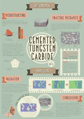
This week, more from Stephen Herd! If you haven’t seen his first effort, go back and have a peek before seeing how he pushed the envelope even further. Click to enlarge!

Poster titled, "Cemented tungsten carbide."

Stephen has this to say about this work (lightly edited).

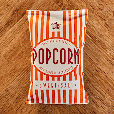
I decided to focus on the images and text would be more like figure titles. This one was more ambitious. Inspiration for the second poster came from a packet of popcorn  and also looking at movie posters.

Stephen attached this picture: 

Bag of popcorn.

I see the resemblance. I would have guessed circus posters more than movie posters, but maybe that’s just the typeface.

Stephen continues:

One of my aims was to see if you can create a poster where the title isn’t at the top of the page. This created a lot of problems in how the other elements sit on the page and how they interact with the title at the center. 

I mostly agree with Stephen’s analysis. That the title is in the middle is not an insurmountable challenge. In fact, I think it succeeds here in that it is immediately obvious what the title is. The type size, the circle, and the contrast all give the title a lot of visual weight and draw your eye there first.

The problem is, “Where do I go next?”

Stephen has two levels of headings. The major headings are “Experimental” and “Modelling.” Then there are subheadings like “Microstructure” and “Conclusion.” A problem is that the headings are too similar in size and appearance to clearly mark one as “major” and the other as “minor.”

I would have tried to stretch the “Experimental” and “Modelling” headings right across the width of the page, to more clearly separate the two sections of the poster. I think Stephen didn’t because he ended up with too much content in the “Experimental” section, and the “Modelling” banner is narrowed as a result, and once you have one heading in a narrow banner, the other gets put in a narrow banner so it’ll match.

It looks like an editorial problem more than a design problem. Too much stuff!

Stephen concludes:

While I am still not 100% satisfied with the design, the poster was successful as it brought many people over to discuss the unique design and then go on to discuss my work. 

I agree with Stephen again. This poster’s bold graphic sensibilities in the type choice, circles, and good use of text wrapping, make this stand out at a glance. And that “first glance” is critical for gaining and keeping attention.

Update: I heard more from Stephen about his choice of InDesign to create his posters.

The two main reasons I use InDesign are ease of controlling lots of elements on a single page and control of typography. Specifically:
  1. Being able to set guides on a page makes it a lot easier to create grid patterns and align objects.
  2. Putting elements on layers and controlling those layers, like locking or hiding layers. This can get particularly painful when you have lots of elements on a single page.
  3. Text wrapping is easy in desktop publishing software, but also things like drop caps, tracking, character width/height, paths etc.
Some other smaller advantages include: creating colour pallets, printing options like bleeds and efficient rendering of images ensures your computer doesn't slow down with heavy files.

I think that once you're over the initial learning curve, life is a lot easier when using the right tool for the job. I would be pretty daunted if someone asked me to replicate the poster designs exactly in PowerPoint. While you could get close to the overall design, I think it would both take longer and you would sacrifice the precise control that InDesign gives you.

Hope you enjoyed this two parter!

Related posts


07 November 2020

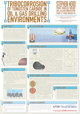
Critique: Tungsten carbide, part 1

I thank Stephen Herd for taking pity on me after I complained about lack of material and sharing some of his old posters. Click to enlarge!

Poster titled, "Tribocorrosion of tungsten carbide in oil & gas drilling environments"

The poster was designed to print on A0 paper (for those in North America, that’s 33.1 inches by 46.8 inches).

The individual graphic elements were created in Adobe Illustrator. Stephen then assembled them in Adobe InDesign.

I think it’s worth pausing for a second to talk about InDesign.

I’ve met a good chunk of people over the years who at least know about Illustrator. I’ve seen a lot of very nice posters made entirely in Illustrator. I’ve made poster in Illustrator as part of a class I did for #SciFund.

InDesign is desktop publishing software. Desktop publishing software is something that few academics apparently know about, let alone use. Over the years, I’ve long been surprised that Microsoft’s desktop publishing software, Publisher, isn’t used more for posters. QuarkXPress is less popular than it was, but is still very much around.

Graphics software like Illustrator or CorelDraw are focused on creating an individual image. They aren’t as concerned with their placement on a page, and particularly a series of pages. The line between “graphics” and “layout” has gotten incredibly blurry, but doing page layout in a graphics program or PowerPoint is a kludge. Desktop publishing programs have print considerations “baked in,” which is probably why Publisher has often been my “go to” for posters.

Eep, that was more a moment than a second. Back to Stephen’s poster...

Stephen wrote (lightly edited):

Two area of focus were finding a more interesting way to present the title and making each section digestible. Even after I thought I minimised the words, people still read only a few sentences here and there.

I completely agree with Stephen’s analysis. Looking at it in reduced size on the blog, the title pops. It’s one of the strongest visual elements of the poster, which is exactly what you always want.

The res of the poster looks wordy. The text fades to nothingness in the main body. This is partly due to the thin lines in the font used (Gill Sans Light, I think).

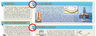
From a distance, the imminent collision between left banners and the boxes to the right is also immediately noticeable.

Poster except showing heading banners almost touching adjacent boxes.

This is not as noticeable when you look at the image enlarged, which just goes to show you need to look at your poster at a very small size to see how it holds up.

Similarly, there is a lot of detail in the illustrations. It is a little hard to judge just how close you would have to be to be able to make it out.

The positioning of some the elements within the boxes become more apparent when you zoom in. Above, you can see how close the text comes to some of the images. (By the way, text wrapping is one of those features that desktop publishing software has that graphics software often does not.)

Stephen has a nice colour selection on this poster, too. He writes (lightly edited):

One of the first things I do in my poster is decide on a colour palette. These usually consist of three colours, plus two or three shades of each colour. This helps to build consistency across the poster and hierarchy into the different elements. I ensure that diagrams follow this colour palette to help keep the content cohesive and reduce items that stand out too much on the page due to their colours.

Because Stephen was nice enough to send me two posters, I will look at his second – and much more ambitious – poster next week!

01 November 2020

One year down, three months to go

It's been a year since I made a flurry of last minute changes to the Better Posters manuscript and sent it to the editor. 

I won’t pretend it hasn’t been a frustrating year.

The book, as I’ve mentioned, was originally supposed to come out in the first quarter of 2020. The initial editing of the book went well. Then the pandemic hit, the bottom fell out of the book market and the live academic conference scene simultaneously. Pushing the release back made absolute sense.

Meanwhile, I’ve watched other books that were being written at the same time I was writing Better Posters come out. Sometimes in multiple editions or with shiny covers with foil highlights. I’ve been a little jealous.

But now there are less then three months to go! I’m still looking forward to sharing this project with you. Expect a Better Posters advent calendar in January 2021!