The question of whether there can be rules to design, including data visualizations, is a vexed one. This thoughtful blog post suggests that there are come helpful steps you can use to help land on a good graph.
I think that many common dataviz design decisions can be
codified as formal rules that can be followed by practitioners of any
experience level to make the best possible design choice in any
situation, without exception. The bad news is that these rules can’t be
captured in simple “always/never” sentences... . The good news is that many of them can be captured in relatively simple decision trees.
WHhn I was on the PolicyViz podcast, there was one joke I left on the floor that I wish I'd told. When Jon asked me about poster competitions, I should have said, “I know: academia isn’t competetive enough. Let’s organize the backstabbing.”
Molly Gordon describes her experience at an ASCB conference:
When someone rates my poster 1 ⭐️ at the American Society of Cell Biology... my thesis work, that I pushed forward through a pandemic, poured my heart and soul into, and did my absolute best to summarize into a 5 minute video.
Also, it is not unnoticed that my labmate got a single ⭐️ as well. Someone is actually out there targeting research from certain labs with bad reviews? Geeeeeeez science feels hopeless at times.
If you thought my research and or presentation style was that abysmal, why not offer advice or critique in addition to your rating? Thanks for making the field a more inclusive space ❤️/sarcasm /rant.
ASCB replied that this is part of the meeting platform and they cannot turn it off. So... maybe a good reason not to use that platform? The person in charge of their Twitter account wrote:
Hopefully we won’t have to organize a virtual meeting on this scale again. It takes all year and 1,000s of hours of planning and team work. It just goes to show you, it’s always something.
I know that the person running a social media account is not the entire leadership of the organization, but this response is a too low key for my taste. If this kind of behaviour took place in a face-to face environment, it might violate a code of conduct.
The ASCB Twitter account also took a moment to complement Molly but not apologize.
Update: ASCB says most one star ratings were “accidental.” The society does have a code of conduct. It was just hard to find, because it was under “Meeting policies and terms.”
Last week, I wrote about why posters should be reviewed a little more stringently than they usually are. I put out a call on Twitter for posters that people thought should have been nipped in the bud by conference organizers.
And so it was that I learned of the curious case of a 2019 Ecological Society of America poster, presented by one William S. Romoser.
William Romoser died earlier this year. He was an emeritus professor of Ohio University, where he had a 45 year research career until he retired in 2010. Besides a healthy number of technical articles (many on mosquitoes), he published a major textbook on entomology that went through four editions.
I say all this because I want to stress that Romoser was the real deal. He was no crank. He has earned respect.
Yet he presented the poster below, apparently in all seriousness.
The abstract reads, in part:
To my knowledge... this is the first professional report of direct evidence of identifiable life forms beyond the confines of Earth.
You read that right. Romoser claimed to have found alien life. He claimed there were many insects and reptiles on Mars.
If this were the case, you expect you might have heard about it by now. You haven’t, so... let’s just say that Romoser did not make a compelling case.
Indeed, the idea that the discover of alien life would be announced on a poster at an ecology meeting rather than with an international press conference and coverage in Nature and Science feels absurd on the face of it.
Here is the poster.
Now, since this is a poster blog that normally focuses on design rather than content, It is frustrating that someone who had been in the game for as long as Romoser was making easily fixed mistakes.
The text is inexcusably tiny throughout. And there is a lot of it.
But back to the content. This poster appears to be a case of a common psychological phenomenon, pareidolia. It’s just ramped up to an extreme.
pareidolia (par·ei·do·lia), noun: the tendency to perceive a specific, often meaningful image in a random or ambiguous visual pattern.
Romoser is far from the first person to fall prey to pareidolia and similar over interpretations. Percival Lowell thought he saw canals on Mars, and believed they were evidence of a vast Martian civilization.
Japanese physician Chonosuke Okamura claimed to have discovered microfossils of miniature humans and other species. He was posthumously awarded an IgNobel prize for this work.
And many amateurs have claimed to see a face on Mars in blurry NASA photographs.
I completely missed this story at the time. perhaps because Romoser put a “No tweeting” icon on the poster, there seems to be not chatter about it under the #esa2019 hashtag. Romoser’s request to keep the poster off social media was ineffective, given that Ohio University initially put out a press release about Romoser’s
poster. It was soon removed. According to the university,
Romoser did not wish to interact with media.
Several people in the Twitter thread suggested that at the time this poster was presented, Remoser was experiencing some mental health issues. That is not for me to say. Regardless of why he believed that these blurry photographs were evidence of insects and snakes, it’s unfortunate that he spent so much effort on a dead end line of inquiry.
I have to agree that this is a poster that the conference organizers should have rejected. I don’t think its presentation at the meeting did anyone any favours, including Romoser.
I recently spoke to Jon Schwabish (author of Better Data Visualizations, reviewed here) on the PolicyViz podcast, and I’m happy that the episode is now available wherever you listen to podcasts!
Jon is a great person to talk to, and his questions got me thinking about some new topics that I hadn’t considered before.
This season, Jon has been experimenting with a video version of the podcast. I already knew of my bad speaking habits as an interviewer on audio (I go on tangents way to easily, I start sentences without knowing where they’ll land), but now I get to see entirely new bad habits (looking away from the camera, shifting my weight).
The show notes also contain a complete transcript in case you read faster than I can talk.
Lander Foquet has a worrying Twitter thread about how a poster abstract – no even a whole poster, just an abstract – is making the rounds in the medical disinformation circles.
Foquet says “a poster is never peer-reviewed.” This might be true for the meeting in question (The American Heart Association Scientific Sessions 2021), but there are some conferences that do peer review submissions. It is rare, though.
Regardless, there are occasionally stories that crop up from some academic conference or another where someone gives a poster or talk that is at odds with the views of the field. Once, well known racist Phillipe Rushton gave a poster at the Neuroscience meeting (sometime in the 1990s, can’t recall the year). I’ve seen other cases where people brought some sort of presentation that most society members said, “That shouldn’t have been presented at this meeting.”
You can read the thread for a detailed debunking of the particulars of the abstract, but the issue of vetting conference posters has been on my mind for a while. In an interview, I was asked about poster competitions. Part of the question about competitions was that posters aren’t peer reviewed, so is there not a risk that we might be rewarding dodgy work?
Because anything online (like conference abstracts) can be quickly weaponized, maybe it is time for conference organizers to implement some light peer review. A sanity check, if you will.
A physics conference should not accept a poster about a claimed perpetual motion machine.
A chemistry conference should not accept a poster about the elements are earth, air, fire, and water.
A biology conference should not accept a poster about how natural selection isn’t real.
A geology conference should not accept a poster about how the Earth is flat.
An anthropology conference should not accept a paper about how Africans are inferior human beings.
And so on. In fact, now that I think of it, none of those topics should be permissible at any professional academic conference. These should not be controversial calls.
I know what the immediate objections from conference organizers will be.
It takes a lot of time and effort. This is undoubtedly true. Each one would have to be read by a human being with some level of professional expertise. (No, I don’t think machine learning is ready to tackle this yet.)
But how much is too much? Let’s look at the meeting that started Foquet on his thread.
Judging from the American Heart Association program planner, it looks like there are between three hundred and four hundred posters spread out over four days. Let’s say a team of four professionals reviewed abstracts. Maybe one person takes five minutes maximum to read an abstract. That’s twelve an hour. One person could read 96 abstracts in an eight hour day; let’s round to 100 abstracts per person per day.
A team of four could have reviewed all the abstracts for the meeting in one day.
Obviously, this might not scale to the biggest conferences with tens of thousands of posters. But many conferences have hundreds of presentations, which seems potentially manageable.
The “time and effort” argument could be made for journals. Peer review takes time and effort for editors, and yet journals do it. Peer review is considered a mark of a high quality product, so why could not the same be true for journals and conferences?
The second objection is that peer review stifles free discussion. Maybe, and there was a time when I think that argument would have weighed much more heavily for me. But not now.
The last few years have show that “more free speech is always the answer” doesn’t take into account the power asymmetries that exist in the modern communication ecosystem. A well organized misinformation campaigns can spread bad content much faster than reasoned professionals can correct it. Professional organizations have often anywhere from reluctant to perilously slow in combating misinformation.
Science still has credibility. Appearing in a scientific conference, even if not peer reviewed, give a patina of authority and respectability. People with bad motives and worse science will attempt to squeeze into these venue if they have the chance.
Deplatfomring works.
Update: Other potential examples of cases where peer review might have prevented some problems.
At the 2017 meeting of the Ecological Society of America (ESA), someone gave a presentaion on human abortion.
Another year (unknown), at ESA again, someone gave a poster about insects in space. “He was having some obvious mental health issues.”
Update, 22 December 2021: The Mexican Geart Association has taken action on the abstract that prompted this post. Whether this will include stronger review of conference abstracts remains to be seen.
Monday, 8 November 2021: From the online meeting of the Society for Neuroscience, 2021 meeting:
Elizabeth West tweeted, “You misspelled ‘everything.’”
Neuroscience this year was originally announced as a hybrid of in person and virtual, moved to virtual (which prompted anger). Things seemed fine earlier today. But now it seems that almost everything on thie poster session today (Monday, 8 November 2021) is unreachable.
How interesting.
This is a meeting I have gone to before, but was not attending this year. But now I will be watching the hashtag for the next few days with interest to see if things improve.
Great #SfN2021 has transitioned to Zoom for a less chaotic day of poster presentations - apart from sessions where no host is there to start the meeting 🤷♂️
Have you ever had the negative experience of presenting a poster in a busy session where nearby presentations interfere with each other? Well, @SfNtweets has perfected this negative experience at #sfn2021 by placing all poster presenters in a session into a single Zoom meeting
Maria Reva noted that there had been no announcement for rescheduling the lost Monday poster sessions. This came very late in the day, with an announcement that Monday posters would be rescheduled for the same time Thursday,
Scott Knudstrup delivered one of the best one-liners:
Curious decision by SfN to hire the guys that rolled out the Obamacare website
• • • • •
Wednesday, 10 November 2021: The woes of the SfN meeting are covered in Spectrum News.
• • • • •
This tweet pinpoints Cadmium as provider for the SfN online conference.
Apparently the Society for Neuroscience is offering a discounted membership for next year to conference participants. 50% off is nothing to sneeze at, but it would cost the Society nothing to say, “We’re sorry.”
Although it’s fair to point out that this is a minority view, at least one person said it was a “good” conference.
I’ve cautioned against outdoor poster sessions before. They always seem to me to be Just Asking For Trouble™. But with the COVID-19 pandemic, outdoors is safer than indoors, so...
This looks lovely. But do other places have Lisbon’s weather? And were there back-ups in case the weather turned bad?
Ajanji and colleagues have what I think is a preprint that tests the effectiveness of decluttering and annotation (which they call “focusing”) on graphs.
Author Steve Franconeri says, “We found that decluttered graphs make you look more professional, but no evidence of cognitive benefits. Focusing led to far better memory for key data patterns.”
• • • • •
MyFonts has a PDF primer on justified versus ragged right text. It contains a simple rule of thumb I had not heard before:
Don’t justify text if the average line of text contains less than nine words.
• • • • •
Duarte Communication surveyed a lot of people about online presentations. Seeing how most conferences are now online and look to keep some kind of online presence, there are lots of things that apply to poster sessions going forward.
Key suggestions:
People want presenters to vary their voice, tone, and pitch.
You need to earn the audience’s attention by telling compelling stories.
Focus on one idea per slide.
Be prepared for what might go wrong during a virtual presentation.
Familiarize yourself with the most preferred virtual platforms (which is Zoom, by a long way).
Both audiences and presenters prefer cameras on.
People will hang around longer for an interactive talk than a one way one.
You can get a copy of their report if you let them know your name and email address. This is clearly an attempt to drum up business for the company... but there is real information there that is worth perusing.
• • • • •
Speaking on online presentations, this description of an online conference shows how meaningless the word “poster” is becoming in an online context. Emphasis added.
For Journées Ouvertes en Biologie, Informatique et Mathématiques(JOBIM) 2020, we held a poster session with a homemade solution based on the Jitsi Meet platform(.)
The idea was to dynamically create a room for each poster. After a
search on the conference website using poster filtering facilities, the
attendees were able to join the poster room and meet the authors or
other attendees interested in the topic. To encourage more dynamic and
interactive discussions, we also proposed to the authors to present
their work through a few slides instead of the classic poster format(.)
The idea was also to avoid zooming in to view figures or texts. We also
invited the authors to prepare a short video of their work, and we
selected a few of them to present during the breaks. One can also
imagine allowing attendees to schedule meetings for the poster session.
First, I am not sure why conferences keep using these homebrew solutions instead of just using Zoom.
Second, there is nothing wrong with “zooming in” to see text and figures: the problem is that most tools, like PowerPoint or PDF documents, suck at it.
Prezi seems ideally suited to an online poster format for exactly this reason. It was built on the “whiteboard” model rather than a “slide deck” model and zooming was its original differentiation from PowerPoint.
I am being a lazy blogger and turning a Twitter thread into a blog post. John Butler asked for, “Something like 10 steps for a good conference poster.”
So I made something up off the top of my head.
Read the instructions. Sounds easy, but printers say “wrong size” is the #1 problem they see.
Your title is most of your communication effort. It’s all most people will ever read. Spend a lot of time on your title! Don’t just use the first one that comes to mind. Simple declarative statements of the main finding work well.
You should be able say what your poster is about in one sentence. Too many people want to show everything they have done. Focus.
Make you one sentence in an ABT (and, but, therefore) format. What are a couple of facts? (“We know X and Y...”) What is the problem? (“But X doesn't hold in this case...”) What is the consequence of that? (“Therefore...”)
Make a grid. A three column grid is really hard to screw up. It’s not the only way. More or fewer columns can work. Rows can work. But three columns is a robust layout.
Leave space. Lots of people, because they did not focus enough (#3), make skinny little margins to try to fit more stuff on. It’s hard to read. Be generous with margins between columns, and with white space between text and graphics.
Be consistent. Consistent fonts. Consistent colours. Consistent column width. A common is that people make graphs before the poster, and don’t go back to make the graph fit with the rest of the poster.
Bigger is better. A common question is, “What’s the minimum font size for a poster?” (This is often coming from people trying to shove too much stuff on the page.) Accessibility guidelines usually recommend type be several times bigger than what many people use.
Practice what you are going to say. Do this before you print your poster. Sometimes you’ll find the order you laid stuff out in (because “It just fit there”) is not the natural order when you talk it through. The visuals and your explanation should follow the same order.
Do the “arm’s length” test. When you’re done layout, print your poster scaled down to a single letter sized piece of paper. Hold it at arm’s length. If your vision is reasonable, you should be able to read your shrunk down poster at arm's length. If you can’t, it’s too small.
Years ago, the BBC website for Doctor Who had a “memory jogger” to help viewers recall the title of some episode. (Still online, in fact!) After all, the original classic show had run over 25 years and had hundreds of stories. Easy to let a title slip.
I loved the prompt it gave people.
“It’s the one with...”
Because titles are good and all, but they aren’t always the things our memories glom on to.
Imagine that someone who saw your poster tells a friend they should see your poster, and tries to help their friend find it.
“Ooh, it’s the one with…”
How would they complete that sentence? What obvious feature could someone use to point out your poster?
“It’s the one with the shark.”
“It’s the one with the kabuki mask.”
“It’s the one with the big red triangle.”
Those could all work. Those are all specific, concrete nouns that are easy to recognize.
But “It’s the one with the bar graph” is unlikely to be helpful. “It’s the one with the analysis of history of Japanese theatre” is unlikely to be helpful.
Look, we’re scientists, not artists, and rats are hard to draw so you might just have to settle for a rat made out of ovals.
This is the lead example in this great Twitter thread on scientists making figures as best they can.
• • • • •
Goodsett and colleagues have suggestions for creating online conferences, based on their experiences in conference planning for Association of Academic and Research Libraries. Here’s how they handled posters:
Each presenters recorded a short 1 to 3 min introduction about their poster. The overall format of the poster was left open to presenter creativity. Feedback, comments, and questions were submitted and answered asynchronously using a discussion board.
A notable addition to their planning was creating contact personnel that they called “shepards.”
The CPC adopted a “shepherd” support system for presenters... Shepherds served as the (programming committee) contact for each presenter, shared important details, and answered questions, especially any related to media creation and file formats, since pre-recorded videos and online poster presentations had not been required of previous... presenters.
Some participants asked for the online component to be kept when conferences move back to face-to-face:
“The online posters (especially those with recorded descriptions) were very helpful for me (it's hard for me to see physical posters at times, so we might want to keep this option when we move back to a physical conference).”
• • • • •
Marvel comics character or font? Take the quiz! See if you can beat my score of 17 out of 20. 😉 Hat tip to Melissa Vaught.
I don’t like this expression as it applies to poster design.
I have this memory of watching an interview with songwriter Jim Steinman. I think it was for Bat Out of Hell II: Back into Hell.* I have never been able to find it again, but from memory, Steinman said something like:
Less can never be more. Less is always less. Only more can be more.
I suppose the problem I have with the “less is more” aphorism is that there’s too much emphasis on the “less” and not enough on the “more.”
Just hacking away at poster content with no rhyme or reason so that there is “less” will not do anything.
Rather than prioritizing “less content”, think about how to deliver:
More focus.
More efficiency.
More value for the reader.
* Maybe I associate this quote with Bat out of Hell II because it contains a song that so perfectly describes Steinman’s style, “Everything Louder Than Everything Else.”
Today’s poster comes from Nicolas Le Guillarme. This was presented at the S4Biodiv workshop.
As always, you can click to enlarge!
My first reaction was, "Ooh, this is really nice.” The bold use of colours and moving the dividers a little off the horizontal give the poster a lot of energy.
In fact, there is so much life here that I didn’t notice there is still quite a bit of text. I would like to see that edited back a little if possible.
My second reaction was to look at the title and headings. The typeface is open, so the colours of the background and the foreground of the text are the same. This can make it a little hard to read some of the letters, and I particularly worry about readability from a distance.
Here’s a quick and dirty attempt to fill some of the letters.
The white fill in the “Introduction” heading works very well, but I didn’t find the right colours for the other headings. I do think that this revision shows that filling the letters increases the visibility, though, even though I didn’t take the time to optimize the colours.
Similarly, I would like to see a little more contrast in Figure 1.
The labels overlap parts of the figure, and makes some of the labels hard to see. In particular, I’m looking at the “Tropic assignment” label over the spiralling arrow. I might try to stick a semi-transparent box under the labels. You can see the technique in the graphic I made for this post:
Notice how the books are light and sharp by the elbow but darker and blurry where the quote is? That’s the kind of effect I’m thinking of. Something to make the text a little more distinct from what it sits on top of.
Some of the labels in the network diagram over on the right are also nearly impossible to read. The “Resources” label is almost the same colour as the background. While under most circumstances, having the text and dot be the same colour reinforces the connection, that should not come at the cost of readability.
So in the revision above, I just made all the labels black.
Nicholas wrote:
This is my first attempt to create a poster that is both
informative and visually appealing. I am quite satisfied with this
first draft, but I am pretty sure that there is plenty of room for
improvement.
I think Nicholas is right on both counts. It is very satisfactory – more than satisfactory – but constant improvement is The Way!
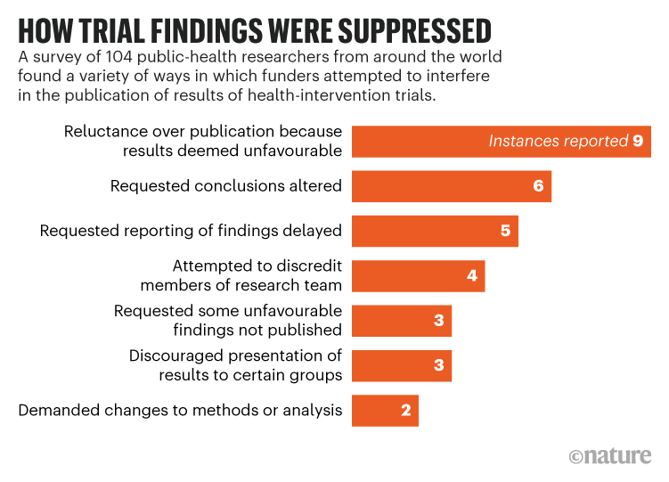
Health researchers report funder pressure to suppress results
Eight words. It’s shorter than the article title, even if you took out the quote. It’s clearer than the article title.
Revised data:
The table has been replaced by an easy to read bar graph. The graph has a clear and bold take-home message. Yes, there is less information. It’s effectively a 2×8 table, but it is easier to read and understand.
Too many conference posters look like the journal article. Posters will be better if they look more like the Nature article.
In the Better Posters book, I wrote about how poster makers could learn lessons from advertising. Advertisers have clear metrics of whether a headline is effective or not: cold hard cash dollars. 💰
This Veritasium video tackles the same question: what makes an effective title? And there are a lot of takeaways for poster makers.
First, the more you are in this game, the more you realize how important titles are. Host Derek Muller says:
I always thought my job was to make great videos. And then a title and thumbnail that adequately represented what the video was about. But now I've realized that making the title and thumbnail is at least half the job.
YouTubers can now measure their success in ways that old school advertisers who worked in print could only have dreamt of. YouTube creators have an incredible array of real-time metrics at their fingertips. In short, they have data.
And data shows that titles make a huge difference in the attention videos get. “Asteroids: Earth's Biggest Threat,” (Muller estimates it might have gotten 1.5 million views) “Asteroid Impact: What Are Our Chances?”, and “Asteroid Impact: What Could We Do?” all underperformed compared to “These Are the Asteroids to Worry About” (now with 14 million views).
There are a few other things worth pulling out from Muller’s video.
First, there can be a big difference between what people say they want and what they actually do.
Now, there seems to be a paradox when it comes to clickbait. People almost universally claim to hate it, but you also see it everywhere. ... - So, why is clickbait everywhere? Well, because it works.
In conference posters, this crops up with people who insist they want to see all the data as though they were going to sit down and read it like a journal article. But people also say they want to be able to spend about 5 minutes at a poster.
Another complaint some academics make about posters is that some posters or other is “mere” advertising. Muller tackles this in his discussion of what people mean when they refer to video titles as “clickbait.” There are at least two mainings to the word.
(W)e don't all agree on the definition of clickbait.
When I google it, the top definition is, on the internet, content whose main purpose is to attract attention and encourage visitors to click on a link to a particular webpage. We could call this type I clickbait, and there doesn't seem to be anything wrong with it. I mean, if you didn't try to attract attention and get people to click on your links, then you wouldn't really be doing your job (Emphasis added. - ZF).
But there is a second definition. One that I think more people ascribe to, which is something such as a headline designed to make readers want to click on a hyperlink, especially when the link leads to content of dubious value or interest.
Muller later calls these two styles “legitbait” and “clicktraps.” Muller goes on to say that are good reasons to strive to create legitbait titles.
First, it opens up the work to more people. Second, Muller has found that his “legitbait” titles end up being more accurate descriptions of the video.
But then we come to the challenge. With all of these real time metrics at their disposal, YouTuber can treat the matter of “What title should I use?” as an empirical problem. Muller compares it to natural selection: you throw out a bunch of variations and see which perform the best.
Poster creators don’t have that luxury. You can’t release three versions of a poster at a conference on day one, see who visits, then leave up the best performinng poster for the rest of the week. It’s another factor that makes conference posters such a challenging format.
But the moral of the story remains: Put a lot of thought into your titles. Try them out on other people. And if someone calls your title “clickbait,” you might be on the right track – if you think it’s legitbait and not a clicktrap.
The COVID-19 crisis delivered a shock to the academic conference scene from which it may never recover. We have seen conferences completely retooled and reformatted in a very short span of time, with varying degrees of success.
But we are also in a climate crisis. If the COVID-19 pandemic hadn’t arrived, the climate emergency would probably have forced a similar re-examination of how we hold academic conferences – although it probably would have happened over decades instead of years.
A forthcoming paper by Leochico and colleagues looks at how we should change conferences in light of the climate crisis. They have multiple recommendations, but this is the one that includes posters.
Avoid single-use items: Require electronic instead of physical posters; re-evaluate use of booklets, lanyards, plastic water bottles, coffee cups, and other conference items.
As a basis for this recommendation, they cite another very recent
article by Milford and colleagues (2021). They make the same
general statement about reducing single-use items at conferences.
These are good recommendations, but it’s worth digging deeper.
First, most of the time posters have at least one additional use.
They can go on display at their institution, where they can have a role
in showing work to students and colleagues.
Second, posters are not in the same category as coffee cups or lanyards. Posters are one of the reasons you hold a conference. Lanyards are not. So if you do not want to use paper posters, you must have some sort of substitute.
The substitute both articles recommend is to move from paper posters to electronic posters. But neither of them provide any attempt to show that the carbon footprint of an electronic poster is lower than that of a paper poster. They simply assert it.
Trying to come up with an estimate of carbon costs for these kinds of alternatives is mind-numbingly hard. I have noticed, however, is that people often tend to underestimate the carbon costs of electronics.
For example, in a class I taught once on global change, students suggested that all students get tablets so that the university wouldn’t have to use so much paper. On the surface, it sounds great: less waste!
But I started asking them if they considered factors like what it took to create a tablet. Consumer electronics like smart phones use almost every chemical element in the periodic table, and many are rare and hard to extract. But paper is from trees, so by definition, if you want paper, you are drawing down atmospheric carbon to grow trees.
There’s also an end-of-life question. Recycling components of electronics is a challenging engineering problem that people are actively trying to solve. One the other hand, recycling paper is so simple that kids in grade school can do it. (Though it gets more complicated if you have glossy photo paper.)
Then there is the power use involved in storing and displaying an electronic poster. Unless the power is sourced from renewable energy, there is going to be an ongoing carbon cost of storing an electronic poster so it can be viewed on demand during the conference and afterwards. Yes, paper costs energy, but the energy cost ends after it’s printed and transported.
I am not saying that paper posters are obviously more climate friendly than electronic ones. I don’t know, but I don’t think anyone else does, either. I would like to know.
Update, 1 September 2021: To be explicit, I am assuming a situation where people are traveling to the conference, regardless of poster format. Given the high carbon cost of flying, an entirely online conference probably has a lower carbon footprint than any in person conference, regardless of poster format.
References
Leochico CFD, Di Giusto ML, Mitre R. 2021. Impact of scientific conferences on climate change and how to make them eco-friendly and inclusive: A scoping review. The Journal of Climate Change and Health: in press. https://doi.org/10.1016/j.joclim.2021.100042
Milford K, Rickard M, Chua M, Tomczyk K, Gatley-Dewing A, Lorenzo AJ. 2021. Medical conferences in the era of environmental conscientiousness and a global health crisis: The carbon footprint of presenter flights to pre-COVID pediatric urology conferences and a consideration of future options. Practice Management/Training56(8): P1312-1316. https://doi.org/10.1016/j.jpedsurg.2020.07.013
You can find the work in the linked thread above. But I’m featuring Jo Ramasawmy’s poster because she was super nice enough to give shout out to this blog! (Yes, I can be flattered. Sometimes.)
• • • • •
My Fonts has their latest primer on bullets and dingbats (PDF). Did you know there are em bullets and en bullets? I, for one, did not.
• • • • •
That type workhorse, Helvetica, now comes in a variable font. See my introduction to variable fonts here.
This article about virtual meetings suggests people prefer poster sessions online, but only supports it with a single quote from a single person.
With
no cavernous exhibit hall to accommodate hundreds of posters,
MSVirtual2020 replaced posters with brief presentations – 10 slides and,
at the author’s option, a brief explanation of the findings – that meeting
participants accessed at their convenience. Dr. Cohen, director of
experimental therapeutics in the Cleveland Clinic’s Mellen Center for
Multiple Sclerosis Treatment and Research, considered that approach to
be a big improvement.
“I
don’t personally enjoy trying to see 500 posters in a giant exhibit
hall, walking up and down the aisles. I barely see the content because I
end up just talking to my friends,” he said. “In essence, this was like
a three-minute talk that presented the poster, and the audience could
stop the presentation and look at something in more detail if they
wanted.”
Presumably conferences have been surveying attendees about their experience, but I have yet to see any of that data shared.
• • • • •
Marie Seggar walks through an excellent graph makeover from The Economist. The starting point is this interpretable mess of lines:
Because one of the major problems I see on many posters is “too much stuff,” this is a great example of how take a complex data set and make something that is more readable. Ultimately, you have to be selective and you have to emphasize some data over others.
The final version is much easier to read. Go check it out!
• • • • •
And that’s what I found on the internet this month!
I appreciate that this summary is less that 3 minutes long!
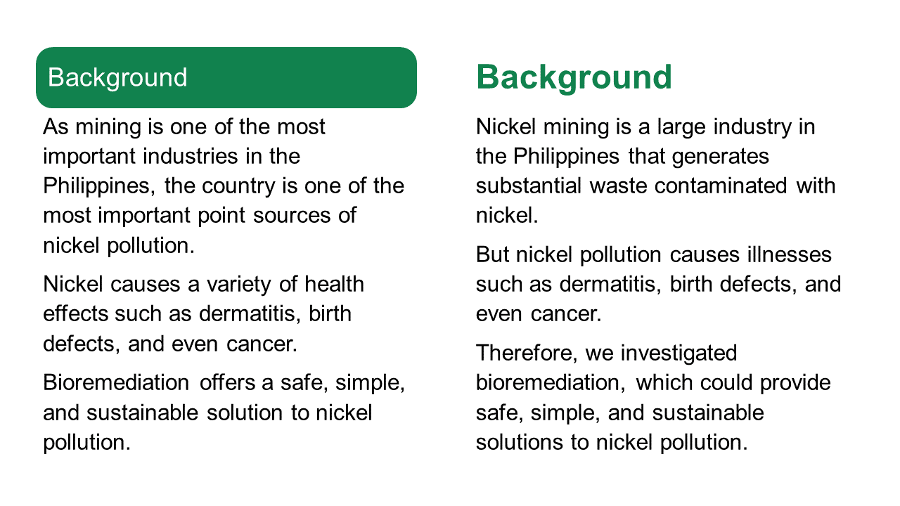
Vladamir wrote:
I wanted to highlight as much as
possible the readability of the text when read on a screen, and put
emphasis on the figures; opting to exclude any redundant design
elements, and choosing a color scheme similar to my University's colors.
I used Keynote for this poster, using the standard A0 size set by the
guidelines.
(Note to North Americans: A0 is a standard paper size in many nations It’s about 33 by 46 inches.)
The fundamentals of this poster are sound. It’s aiming for visuals and the layout is clear.
Vladamir described the colour scheme as following the institution’s colours. This makes for consistency, but the green is very saturated and intense. The bars for the headings carry a lot of visual weight. I worry that they are drawing too much attention to themselves.
Below, I try removing the boxes and making the heading text bold and green.
I took the liberty of revising the introductory paragraphs slightly. In particular, I added “But” to the second paragraph to make it clear what the problem to be solved it.
De-emphasizing the heading slightly would make the callouts, currently in boxes with dotted red lines, stand out a little more.
The two callouts look a little different. The “Objectives” callout has rounded corners, while the one in the Results section has squared off corners. It would be nice to have both the same.
The results showcase one number: 587 ppm of nickel. Immediately below that, the callout provides context for that number, which is good. But putting the comparison in a callout disconnects the two numbers, which is less good. It makes it not obvious that the two are connected.
One possible revision might be to put something like, “Microorganisms tolerated over 7× more nickel than typical soil concentrations” as the graphic representation. Then, fine print could give the detailed numbers. For example, “Nickel in soil: 4-80 ppm. Nickel tolerated: 587 ppm.”
Finally, the “Future directions” list strikes me as a little busier than it needs to be. Big green checks, and highlighted text, and a shadow box behind each list item.
Let’s see what happens if we pull back on one of those three.
Or even two.
I like the checks and think those alone might do the job. But something that removing the other colours does make much more obvious is that the text is not aligned.
Here’s how those changes play out when you put that section back in context. Here’s no shadow boxes...
And no highlights.
The checks alone do the job, but that might be a little sparse and uninteresting. Particularly because the tan highlights are used above, in other parts of the poster. The highlights in the “Future directions” helps bring some balance in colour, so that the tan isn’t all stuck up at the top.
Sometimes the posters that show preliminary data are the best posters because they are not burdened down by too much stuff.
It’s probably hard for people who grew up with pervasive Internet to
understand that newspaper comics were important cultural touchstones for
decades. In the 1980s and 1990s, one of the most successful was The Far Side, created by Gary Larson.
Academics got Gary Larson.
I lost count of how many Far Side cartoons I saw taped up on university doors and included in presentations. I once heard a presenter jokingly call him, “the official cartoonist of the Animal Behavior Society” (at the annual conference of the society, naturally).
But I suspect even academics went “Huh?” when newspapers ran, “Cow tools.”
People did not get it.
They did not get it so much that this single cartoon now has its own Wikipedia page. Larson is lucky that this was published pre-Internet. He only had to deal with phone calls and not angry emails and Twitter notifications. If it was published today, it would have gone viral, been ratioed on Twitter, and been denounced by pundits on political panel shows.
Larson wrote in The History of the Far Side that he was trying to riff off how culture limits our ability to interpret artifacts:
(O)ne day I started thinking about an anthropology course I had in college and how we learned that man used to be defined as “the only animal that made and shaped tools.” Unfortunately, researchers discovered that certain primates and even some bird species did the same thing – so the definition had to be expanded somewhat to avoid awkward situations such as someone hiring a crew of chimpanzees to remodel their kitchen.
Inevitably, I began thinking about cows, and what if they, too, were discovered as toolmakers. What would they make? ... The “cow tools”were supposed to be just meaningless artifacts – only the cow or a cowthropologist is is supposed to know what they’re used for.
Larson was so far down the rabbit hole of his thought process that he lost the ability to judge his own work.
This is a state that I know very well. Something about a project that I have been living with in my head for months or years that I might think is obvious is far from obvious to other people. It might not even be sensible to other people.
So to return to the question posed in the title of this post.
How is a conference poster like a joke?
If you have to explain it, you’ve failed.
As “Cow tools” shows, it’s easy for you to get in your own head and create something that makes perfect sense to you, but not to others.
If you have to explain something on a poster, you’ve failed.
Sticking with comics, here’s another example of the principle, this time more visual than conceptual:
The reading order of the page is confusing, and the artist knows it. The artist has to explain the reading order using arrows.
The influence of the billboard poster is evident here, with a bold as brass take-home message under the title. The title is practically unnecessary, because the take-home leaves nobody wondering what this poster is about. I personally think that if the title is right, it is the take-home message.
The colour palette is extremely subdued. It almost looks like it’s been run through a “fade” filter compared to most posters I see on the blog. While neutral colours are useful and pastels are elegant, I found myself wishing for a little more brightness somewhere on the poster so that something would “pop” visually.
I asked Anneke to talk a little about what was asked for and how she went about creating the work. She wrote:
For this specific conference, the organisers asked for a static PDF of our posters. That was it. During the scheduled poster sessions, the presenters were supposed to be online to field questions and the attendees browsed all the posters in a virtual poster hall. (Below. - ZF).
Her supervisor challenged everyone to think visually and cut back on text. Anneke continued (lightly edited):
I approached my presentation from two angles.
First, I wanted to rethink the traditional conference poster design in general. I relied on advice from Twitter and blogs. These resources are summarised in my tips and tricks blog post.
Second, I wanted to rethink the design for a virtual audience.
I asked, “What will attendees see before they zoom in?”, since they would be viewing it on a computer screen. I wanted design elements that conveyed my main message at this low level of magnification, so I added the main text box with the plain language explanation of my main finding.
I realised that after a viewer zoomed in, it might be difficult to navigate the page if there was no clear starting point that could “draw the eye in.” I visualised my results in a circular flow diagram and numbered the text boxes in the order that they should be read.
The flow diagram is a strong visual element. I might try some different directions for the components of the flow diagram so that the reader isn’t forced reading right to left (oval 3 to 4, and 4 to 5) or bottom up (oval 4 to 5) as often.
Anneke took advantage of the simple online format.
I also realised that the PDF could include hyperlinks in the virtual format (virtual version of the QR code). I thought it would be a nice personal touch. I added a link to a short video of what I would have said if someone walked up to my poster at an in-person conference and asked me what it was about.
Besides her formal presentation, Anneke archived her poster in a nice blog post. It’s mobile friendly, too!
The accompanying blog post seemed like a good idea for a number of reasons:
First, the conference organisers did not require a narration or video but I wanted to introduce myself and explain my poster to attendees who wanted to know more without feeling obliged to send me an email and I had a platform to do it. In that sense, it was “bonus material” for conference goers.
Second, it gave me the opportunity to try my hand at my first “scicomm” video. I’ll definitely do some things differently next time but it was a fun exercise.
Third, I just finished my PhD and this was a way of advertising my blog and putting myself and my work out there.
Finally, the blog post and mainly jargon-free video are also targeted at the non-scientist audience that I am trying to reach. Now my conference poster and the information contained therein are accessible to everyone! – In theory. (I don’t think my blog has that many readers. 😉)
That may change, Anneke, that may change. Hey everyone, I suggest popping over to Anneke’s blog and checking out her poster!
Animate Your Science has a gallery of four excellent conference posters. They even go so far as to call them the “best” posters! The post has a nice little evaluation checklist:
First impression
Title
Colour scheme
Layout
Figures
Other features of note
What could be improved?
One of the posters, by René Campbell, was recently featured in one of the link round-ups on this blog. I’m pretty sure I’ve seen Caterina Funghi’s poster somewhere, too!
Sometimes scientists will be asked to present their research to members of the public in a poster.
Has anyone ever done this?
Hey, perioperative practice practitioners, send me your posters!
• • • • •
The last year, I’ve tried to get a handle on what people mean by “online posters,” “electronic posters,” and “digital posters.” But I think I would balk at calling an Instagram post a “poster.”
But maybe this paper about using Instagram to teach chemistry will change your mind.
The images above are found in the supplementary information. Interesting as proof of concept, maybe.
• • • • •
A PDF by Shanda Hunt about presenting research. This appears to be supporting documents for a webinar, but it stands alone.
• • • • •
Students love posters! At least according to the title of this article by Lamar and Sheperis, who asked students in counseling to make a conference-style poster presentation. The text of this short paper describes the exercises students did. The evidence of students loving the assignment is brief:
According to follow up surveys of the classes, the Virtual Research Conference Presentation assignment is loved by students because they get to be creative and explore a topic of interest to them.
Maybe this paper could have been a little longer?
• • • • •
Posters as student assignments are also described in this article by Tarigan and Listyani. This has more assessment of the outcomes, but for only three students and three teachers.
• • • • •
Li and colleagues describe how they organized an online conference in 2020. It includes this description of how they handled poster sessions.
The poster session provided an opportunity to experiment with GatherTown, which aims to approximate the experience of in-person interaction. GatherTown enables the building of 2D environments that can be designed to simulate a conference hall, complete with space to ‘hang’ posters. Delegates navigate around the space with an avatar [the happy default being a yellow-scarfed snowman] and can zoom in on posters they wish to see. A delegate’s video and mic are on at all times but only become visible and audible to other delegates when their avatars are physically near each other. Delegates could also search and message other delegates directly. The conference feedback suggested that delegates enjoyed this format of seeing posters.
Here is their figure for how that looked. Click to enlarge!
I tried a GatherTown demo. And oh my, but does it have some strong old school role-playing game vibes. It’s cute. But I’m not sure “cute” is the vibe I’d necessarily want for an academic conference.
We rely on data to tell us what has happened, and stories to tell us what it means.
The article she is linking out to, by Hanna Marcus, is also good examination of the relationship between data and empathy.
When writing about conference posters, I am acutely aware that I am often giving advice that is not data driven. And my people, fellow scientists and other academics, have been trained to be extremely data driven. So much so that long established conventions tend to get dismissed until someone “rediscovers” the practice by some experiment or other.
Data matters, but it is not the only thing. You need narrative. People need to know why your data matter.
Academic conference posters are often ugly, with tiny text, confusing layouts, and dubious colour schemes. This blog and book is about making posters informative and beautiful.
This blog usually updates on Thursdays.
Not the viral video. That’s #BetterPoster (singular) on social media.
“Great blog with constantly updated resources.” - The Scientist magazine
“The ‘Go To’ place to send students when they start preparing posters for their first scientific meetings” – Bora Zivcovik
“I wish there were more blogs on this subject(.) Mostly because most scientific poster presentations are absolutely ghastly. Not just bad, or unseemly; ghastly.” – RobertSOakes
“I want to passive-aggressively run around poster sessions putting up Post-it notes with his url on every poster.” – Dominque
“Better Posters blog is A - MAZE-ING” – A. Roehrich
“I find the Better Posters site comforting. I can’t possibly be as bad as some of them there.” – Anne Jefferson
“@DoctorZen's Better Posters Blog is blowing my mind. Love it! #useful” – Elizabeth Sargent
“It’s @DoctorZen’s better poster blog’s fault as to why my poster looks classy & timeless.” – Ricardo Vilain
“Was man alles beachten muss, um ein gutes Poster abzuliefern, an dem die Kollegen auch stehen bleiben, kann man im Blog Better Posters lernen(.)” – Alles was lebt
“recommending reading @doctorzen Better Posters Blog to sci presenters. And anyone who will listen.” – @andrea1
“Should be compulsory reading for academics.” – @sthcrft
“Better Posters blog dispenses solid (much-needed) advice; recognises synergy between aesthetics+info” – Jason Priem
“I’m loving @DoctorZen’s http://betterposters.blogspot.com/ & happy to find I’ve been following the rules! Will show this to ALL students.” – @_modscientist_
“Just put up my poster, it looks fab thanks to @DoctorZen!” – @_modscientist_
“Make sure you read http://betterposters.blogspot.com” – @boris_gorelik
“Conference season is descending upon us, and @DoctorZen's blog will save scientists a lot of grief” – Andrea Wishart
“It's super useful especially to those of us who have a hard time figuring out what is awesome and what is eye-bleedingly terrible.” – Miriam Goldstein