24 April 2023

Accessibility doesn’t happen by chance

Today, there is an encore presentation of work on conference presentation accessibility I helped with. This work was presented back in January at the European meeting of the International Society of Medical Publication Professionals. For the annual meeting in the United States, this work got a new version of the poster:

Are conference presentations accessible? Key takeaways:  Conference attendees with accessibility needs want online access; uncluttered posters; slides with mixed text/images

I was not involved in the design of this poster apart from offering a few comments. You can see how it compares to the first version on Figshare. I am quite happy with how this version came out!

Wells JL, Faulkes Z, Hannan N, Messina EL, Morrison M, Petersen A Heather Robertson, Lauren C. Strother. 2023. Conference presentation accessibility. figshare. Poster. https://doi.org/10.6084/m9.figshare.21892881.v5

The conference website has a nice online version of the poster, along with a seven and a half minute explainer video if that’s your jam.

Update, 26 April 2023: This poster won an award! 🏆

20 April 2023

Review: Building Science Graphics

"Building Science Graphics" book cover

If I hadn’t written a book on poster design, Building Science Graphics might be the book I would recommend to people who wanted help creating posters.

The book is not about posters, no. It’s not about data visualization, either. Jen Christiansen calls the work that she is writing about “illustrated explanatory graphics.” But I am interested in this book because it points the way forward for how a lot more posters could be.

The default format for most conference posters is a three column mini journal article in IMRAD format. There are advantages to this format, but it is both limited and limiting. I would like more people to consider making their posters like this “illustrated explanatory graphic” from Scientific American, where Chistiansen works. Click to enlarge!

Graphic showing data from 100 years of bird banding.

This is the sort of visual that I think would absolutely rock as a conference poster. It’s immediately obvious what it’s about (birds), but has dense, detailed data that wouldn’t be easy to convey as a series of slides.

With this book, I can get to see how those sorts of print illustrations are created. Christiansen noted on Twitter this this graphic was the combined work of three people, excluding herself. (This is in stark contrast to many posters, which might be largely the responsibility of a single grad student.)

If you look at an illustration like that and think, “But I can’t draw realistic birds like that,” the point is not how realistic the birds are. Sure, they add a professional gloss to it, but probably 80% of the effectiveness of the graphic is the understanding and presentation of the content. You could use bird silhouettes from Phylopic or something, and you could still have a winner.

One of the concepts introduced in the book early on is a phrase that I know I will use a lot when I’m discussing graphics: visual jargon.

It’s tempting to proclaim that visual languages are more universal than spoken and written languages, and that the very act of presenting information in the form of a drawing instead of words makes it more accessible. But that’s not necessarily the case. Visual jargon, for example, is just as prevalent as written jargon. Symbols that carry highly specific information within a certain context can be a really efficient way to communicate with others that are fluent in that visual language, like a peer group of scientists. But they are simultaneously a brick wall to outsiders.

“Visual jargon” is a perfect encapsulation of a pattern I notice a lot in scientific graphics. Box plots, raincloud plots, and violin plots are all visual jargon. Protein structure diagrams with ribbons and spirals are visual jargon. Phylogenetic trees are visual jargon. But while we recognize written jargon and there have been many justified critiques of it, visual jargon is often actively encouraged (“Friends don’t let friends make bar graphs”) without recognizing the costs that it brings.

Many chapters will be familiar to readers of this blog and book. The first several chapters, particularly 4 through 9, cover graphic design building blocks like use of contrast and typography. Even in these chapters, there are some insights that you don’t often see covered in other works. For example, her exploration of how to use arrows in illustrations (pages 66-67) is insightful and not something I’d seen elsewhere.

For those looking for something new, Chapters 10 (Visual style), 11 (Visual storytelling), and 13 (Special consideration) cover new territory. The tips and examples of how a graphic can become not just and explanation, but a story, are particularly insightful.

I have to highlight Chapter 7 (Organization and emphasis), because it ends on pages 90-95 with a section on conference posters! Christiansen presents three posters, and gives each a makeover, much like critiques I often do here on the blog. The first two are quite good examples of typical posters and the revisions are helpful and welcome. The third poster (the one with a butterfly) presented as needing a makeover is better than most posters I see! While the makeover is better, I think anyone who put up the first version would be crushing it compared to the competition.

The book ends with a series of “How to” chapters. Several are elaborate flowcharts that try to codify Christiansen’s decision tree and workflow. Chapter 18 (Collaborations) is also an important chapter, because too many people in science try to “go it alone” when creating graphics. 

The book is full colour and has many examples throughout, with a lot drawn from Christiansen’s experience commissioning and developing graphics for Scientific American.

Page 4 from "Building Science Graphics."
Christiansen also designed the book herself, and the book itself exemplifies many of the graphic design practices Christiansen talks about in the book. For instance, there is a lot of direct line labels that connect the image to its place in the text. There are lots of sidebars and clever use of grids so that the appearance of the pages is ordered but not dull.

Clearly, Jen Christiansen is a person after my own heart. Not only graphically, either. She has crustaceans in her background! She even helped describe a new shrimp species. 

Highly recommended.

Update, 28 November 2023: Jen has put up Chapter 3 for free on her website.

Reference

Christiansen J. 2022. Building Science Graphics: An Illustrated Guide to Communicating Science Through Diagrams and Visualizations. CRC Press: New York. https://doi.org/10.1201/9781003217817

External links

Building Science Graphics (The “More to explore” provides a useful and detailed bibliography)

Jen Christiansen home page

Jen Christiansen on Twitter

What scientists have learned from 100 years of bird banding (graphic)

PolicyViz Podcast #235 Interview with Jen

Data Viz Today #85 Interview with Jen

13 April 2023

Review: Creating Effective Conference Abstracts and Posters in Biomedicine: 500 Tips for Success

Cover of 'Creating Effective Conference Abstracts and Posters in Biomedicine: 500 Tips for Success"

I started this blog back in 2009. But unbeknownst to me, a trio of authors published a book about conference posters around the same time. Somehow, Creating Effective Conference Abstracts and Posters in Biomedicine escaped my notice for all these years! Why did nobody tell me? Goodness knows I looked for books on this topic when I started blogging.

In many ways, this book is similar to mine: a “walk through” of advice on the poster presentation experience, from initial planning to presentation.

Chapters 2 through 5 cover conference abstracts, and Chapters 6 through 21 – more than three-quarters of the book! – are about posters. So this really is a conference posters book, much more than the title lets on. 

It’s not clear why the book title mentions biomedicine specifically. The advice here is widely applicable to any academic conference.

The style of the book is literally a series of tips. Most pages have about three or four headings, with a brief paragraph – sometimes a few – under each. This has the advantage of making the book skimmable, but can also make it harder to get into reading flow.

The book’s biggest shortcoming is that there are almost no illustrations. This is fine for the chapters on abstracts, but baffling for the chapters on poster creation. There are a few examples of posters way back at the very end of the book, tucked away in appendices. The poster examples are mundane and don’t get much explanation of why they are showcased.

This is touted as an example of a “creatively designed landscape poster.”

Poster titled "Cytokine release from alveolar epithelial cells: A role for thioredoxin?"

I wouldn’t have counted as cutting edge poster design – even in 2009.

I generally agree with most of the advice here. I do disagree with a few things, like, “Put most of the text in bullet points.” They also lean too much into templates for my taste.

The book references online resources in several places, but because the book is more than ten years old now, there is a lot of link rot. Even the author’s home page, shown early on, has succumbed to link rot. Likewise, many specific suggestions on how to do things in PowerPoint 2007 seem quaint, even if the you would do it the same way in modern PowerPoint. But overall, the book has aged well. Most of the advice is still solid.

When gearing up to write my book, one of my incentives was that I didn’t think a book like Creating Effective Conference Abstracts and Posters in Biomedicine existed! If I knew of this book, would I have written mine? I think so. This book has solid advice, but the lack of illustrations and example, plus that it has “aged out” a bit, left space for a new book on the topic.

Reference

Fraser J, Fuller L, Hutber G. 2009. Creating Effective Conference Abstracts and Posters in Biomedicine: 500 Tips for Success. CRC Press. https://www.routledge.com/Creating-Effective-Conference-Abstracts-and-Posters-in-Biomedicine-500/Fraser-Fuller-Hutber/p/book/9781846193118

06 April 2023

What shall we do with a missing poster?

This was the plan:

Poster titled "Disgust Sensitivity as a Predictor of Religious Attitudes"

This was the reality.

Hand drawn poster saying, "Disgust and religion: Ask me about it" and not much else.

A plain sheet of paper with hand drawn lettering (possibly done with a Sharpie) saying, “Disgust and religion, ask me about it!”

I wondered, “What do you want to bet that presenter John Terrizzi had more conversations at this meeting than if he’d brought his planned poster?”

I reached out to John for his story, which he was kind enough to share (lightly edited; emphasis added).

This was quite a “happy accident.” It was one of my favourite human moments. 

Here is the backstory about how it happened.

My wife and daughters accompanied me on the trip to Belgium for the International Convention of Psychological Science. Traveling for us is always a calamity.  If you are familiar with National Lampoon’s vacation movies, we are sort of the “Griswolds” of family adventures.


Upon boarding the train from the airport, I did a sort of accounting of all our stuff. Poster, check. Both kids, check. Kids stuff, check. I began putting all of the stuff on the rack above us. First, the poster then all of our daughters' bags, stuffed animals, and favorite blanky.

When we departed the train, I grabbed all of the important things, my children and their stuff. The poster, which had rolled to the back (out of sight, out of mind) was left behind, hopefully to do its own European tour, but more likely to get stuck in a Sysphysean back and forth from downtown Brussels to the airport.

Upon arriving at our hotel, I realized my blunder. No poster!

Rather than be dismayed, I resolved to share my story with my fellow confrencers. With my wife’s help, I repurposed my colleague’s discarded poster and shared my story. It resulted in a lot of fruitful conversations.

I research the emotion of disgust. This particular poster was about some of my work that explores the relationship between disgust and religious beliefs. Disgust is a particularly nasty emotion that can have costly consequences for our attitudes toward other people (i.e., prejudice and xenophobia), but it can also have negative consequences for our attitudes toward ourselves (e.g., self-disgust and shame). One of the potential solutions to the problems that disgust can present is exposure. Accepting that we make mistakes and being alright with that.

As a person that has made a lot of mistakes in my life, I have developed compassion for myself and others, which allows me to tolerate the messy world that we live in. Losing my poster allowed me to model this tolerance in a way that, hopefully, inspires others to risk being human.

I don’t have any social media accounts, so I didn’t realize this went viral until I started getting emails and texts from colleagues and friends. One of my favourite references to this was an email that I got from the print shop on my university campus. I was having some posters printed for my undergraduates who are presenting at a regional conference.  The woman who works in the print shop emailed me to let me know that the posters were ready to be picked up and said, “Don’t leave them on the train this time. 😉”

Thanks to John for sharing this story – and giving a chance for people to see his original poster!

Photo by Olivier Klein.

P.S.—The title of this blog post is more fun if you sing it to the tune of “What shall we do with a drunken sailor?”

Related posts

A tale of... terror!

30 March 2023

Link roundup for March 2023

It’s time for you monthly anthology of quick hits on things that are somehow tangentially related to poster, poster sessions, and conferences!

• • • • •

Cover to "Wissenschaftliche Poster: Vom Kongressabstract bis zur Postersession".
There are going to be quite a few book reviews here on the blog over the next few weeks. But there’s one I just learned about, that I want to review but can’t.

It’s in German. Alas, I do not read German.

Stefan Lang was written a guide to conference posters called Wissenschaftliche Poster: Vom Kongressabstract bis zur Postersession. He has a blog post describing the book. An excerpt (using of Google Translate):

In my book you will find neither a theoretical theory of colours nor the rules of the golden ratio. Rather, it’s about how you should go about doing things practically to create a scientific poster—a poster that doesn’t just show data, but presents research results. My guide therefore deals with the following questions:

  • Selection of information: Which facts belong on the poster?
  • Core message and keywords: Where do I place my most important statements?
  • Professional tools or PowerPoint: How do I implement my ideas?
  • Reader guidance: How do I guide the viewer through difficult material?
  • Leave nothing to chance: How do I prepare for the congress ?

If you are reading this blog post in German using Google Translate, you may want to check out this book instead of mine. If you do, please tell me more about it!

• • • • •

Icon for Apple Music Classical app.
This thread by Jessie Char on why Apple has both a Music app and a Music Classical app is super interesting.

Classical music is tricky to categorize. There are who knows how many recordings of Holst’s The Planets, for instance. (Wikipedia says there are at least 80 recordings of The Planets.) How will a classical musical fan search for the recording they want? The composer? The conductor? The year the music was written or the year it was recorded?

The selection task is so different from typical contemporary pop music that it makes more sense for there to be a dedicated app.

Journal articles are like classical music: they revel in rich, detailed information. Posters are like pop music: the information you need is streamlined and more suitable for quick browsing.

Char sure doesn’t like the icon, though.

• • • • •

I’m not sure what a conference abstract from 10 years ago popped up in my alerts, but it did. If anyone was in Japan in 2012 and saw this presentation about tracking people in poster sessions, let me know. Excerpt: 

This paper proposes a new real-time 3-D head shape and pose estimation method for analyzing inter- actions in poster sessions. ... We implement a proof-of-concept system and demonstrate our method can estimate shapes and poses of two unknown person in real-time.

 • • • • •

 Berkeley Mono typeface is inspired by classic computer monitors.

Berkeley Mono text sample.

Hat tip to Edward Tufte.

• • • • •

Poster projects are fun!

At least, 95% of students in the paper below agreed that poster projects are fun.

Here’s a paper on the use of posters for teaching.

Cuenca Gotor V et al. 2022. Project-based learning using scientific poster as a tool for learning and acquisition of skills in physics subjects of engineering bachelor’s degrees. A: SEFI 50th Annual conference of The European Society for Engineering Education. Barcelona: Universitat Politècnica de Catalunya, p. 1113-1121. https://doi.org/5821/conference-9788412322262.1138

 • • • • •

Thanks for joining me this month!

16 March 2023

Canva revisited

I reviewed Canva back in 2020. Canva has introduced many new features since then, so here are a few quick updates on the platform. 

Size seems to have increased, but is still limited. I still can’t make a poster that’s 6 feet wide by 4 feet tall. But now it seems to have a limit on total area. I think when I reviewed it before, it had a hard limit on height and width. I can now make a poster that’s 6 feet wide by 2 feet tall, which I don't think I could before.

There are now university research poster templates. (They may have been there before, but I don’t think so.) Search the templates for “Research Posters” and you get about 20 or so different templates. 

Poster template with large grey title bar and sans serif type.


 A couple are recognizably based on Mike Morrison’s billboard style posters.

Poster template with large central text and sans serif type.


 Many have the same boilerplate text that doubles as a guide.

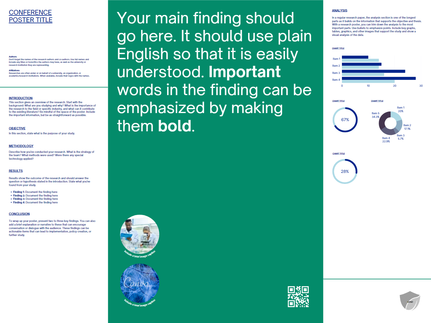
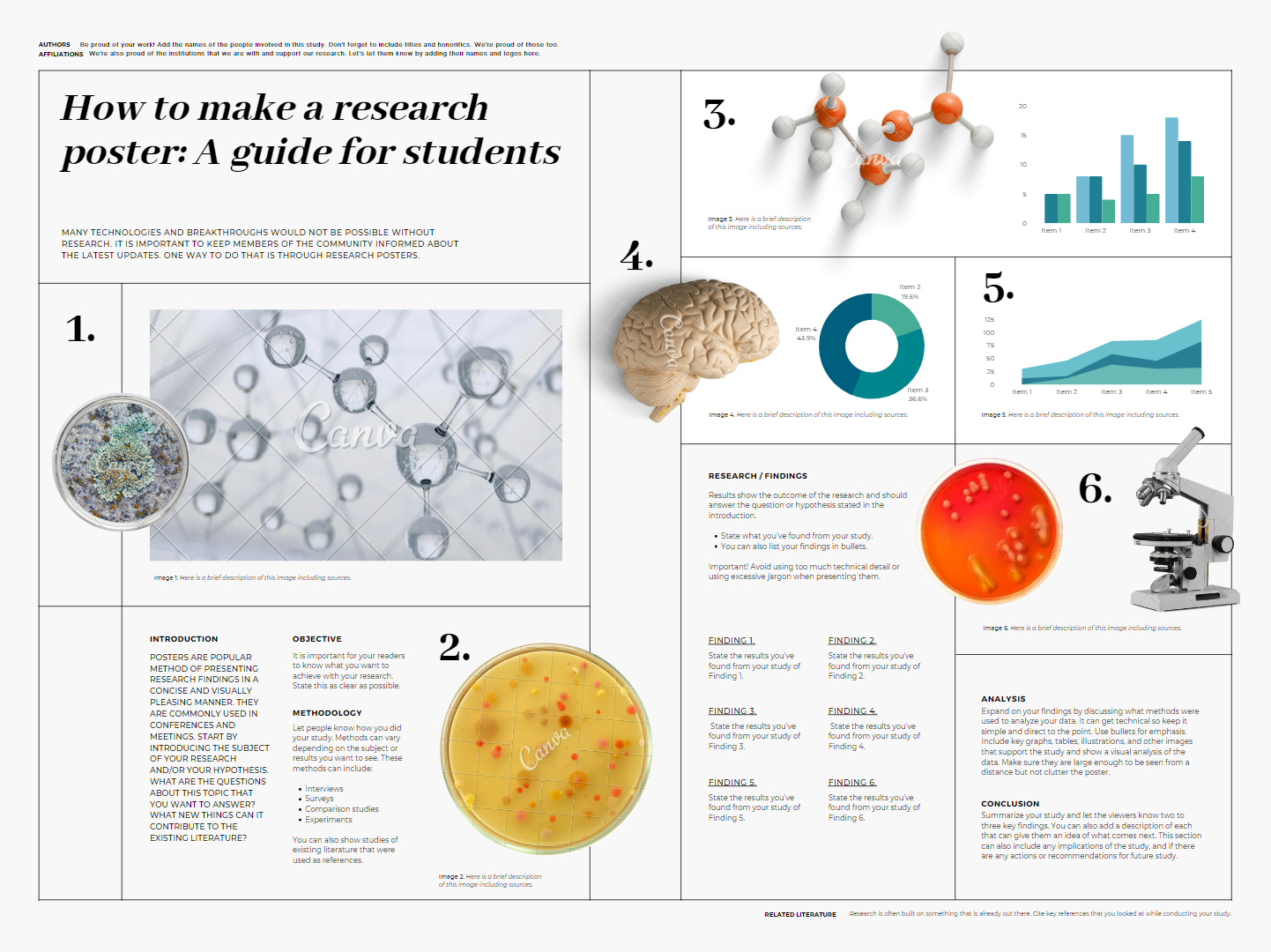
How to make a research poster: A guide for students

Many technologies and breakthroughs would not be possible without research.
It is important to keep members of the community informed about the latest updates. One way to do that is through research posters.

Most of the templates are good on colour and typography. 

Poster template with light background and serif type.

But most have too much fine text. 

Poster template with half black, half light background and sans serif type.

Some have confusing layouts.

Poster template blue title bar and sans serif type.

Canva has certainly improved as a platform for making conference posters. It would still not be my “go to” for posters, because the size limitations bother me.

Related posts 

Canva review

09 March 2023

Don’t make your figures like journal figures

I’ve written about the importance of respecting reading order on this blog many times. English readers generally look at the top left of a page first, because that’s where we have learned that text starts.

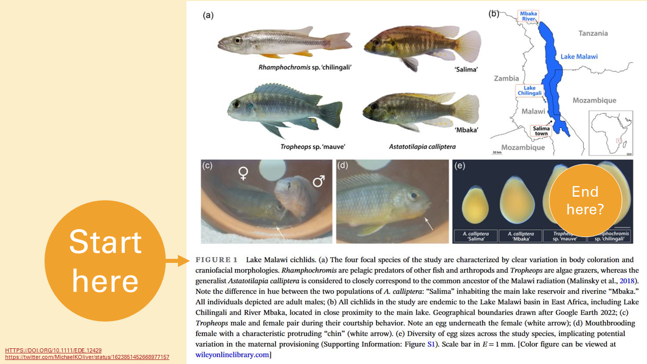
Rectangle with "Start here" in upper left and "End here" in lower right.

Lately, I’ve been thinking a lot about how scientific journal articles break information apart. But I didn’t realize another shortcoming of typical journal figure layouts.

You are supposed to start reading in the middle. It’s not necessarily clear if you will end up at the last image in the figure or the end of the figure legend.

A figure from a scientific journal, showing "Start here" pointing at the start of the figure legend under the images.

Not only that, you have to look back and forth from the legend to the images. Your eyes are constantly travelling. 

Multi-panel journal figure with overlay showing reading pathway back and forth from text to figure and back to text.

But graphics from news organizations (like the New York Times, FiveThirtyEight, Nature or Science magazines, and so on) do things a different way. The title goes at the top.

A graph from news in Nature, with "Start here" pointing at the title above the figure..

Rather than having the description underneath, the graph is annotated. This makes the graph less compact, true, but reading it is more in line with our reading expectations.

The more I think about it, the more I think this format is a much better model for figures on posters..