24 February 2022

Link roundup for February 2022

Cartoon of poster session.

 Bruce Kirchoff, author of Presenting Science Concisely, has a nice blog post on strong scientific posters. You know, the ones that can bench press twice their weight. He discusses two misconceptions:

  1. People read posters like papers.
  2. A title just introduces the work.

John Wagner’s illustrations from the book (above) are also lovely!

• • • • •

Very helpful design post by Lisa Muth on how to cut down on too many colours. Nine of her ten suggestions can apply to posters:

  1. Simply don’t show different colors
  2. Show shades, not hues
  3. Emphasize
  4. Label directly
  5. Merge categories
  6. Group categories, but keep showing them
  7. Change the chart type
  8. “Small multiply” it
  9. Add other indicators

 I particularly think points 2, 4, and 8 are underused.

• • • • •
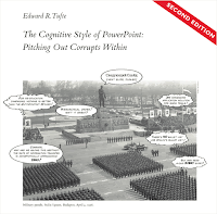
The Cognitive Style of PowerPoint
PowerPoint probably remains the main tool that people use to make posters. This Twitter thread by C. Thi Nguyen style shows that arguments by Edward Tufte against PowerPoint are new and powerful insights for many.

(J)ust had a peak teaching experience teaching Tufte's classic mega-rant, The Cognitive Style of Powerpoint, in my Tech & Design Ethics class. It went so good and I kinda want to teach it in my intro ethics class now.

Tufte says that PPT tends to get us to squeeze the really important details into small-font indented bullet points at the bottom, which de-emphasizes their importance. And I believe this from observation, but I was like: Why does it push that way? The students convinced me that it was really important that you didn't want the large-font lines in PowerPoint to wrap, and so you ended up writing very simple short things into the large-font headers, and saving the details for the tiny-font sub-points.

The default structure of PowerPoint templates asks you to constantly summarize. Bullet point structure asks you to have quick summaries of details. Every slide asks you to have a title-summary of all the bullet points. This mimics the management structure. Engineers have to give the “bullet-point” summary to middle-managers. Middle managers have to give the very compressed “action-summary” to upper administration. And PowerPoint is constantly looking over your shoulder, asking you to provide those summaries, and super-summaries. It wants your information already formatted into the right shape to be sent up the chain. Pre-digested.

Another way to put it: a lot of science, and other forms of reasoning, the details matter the most. In paragraph-narrative form, you can dwell on the details without summarizing until you choose to. But PowerPoint is constantly asking for the action summary of each slide. PowerPoint embeds the voice of management, constantly at your side, constantly demanding "the upshot, and make it snappy." (T)his also had the ultra-peak moment of us all wondering why people tended towards bullet points on PowerPoint, my firing up PowerPoint onscreen, picking the first template, and finding bullet-points as the default, and the whole class screaming “OH SHIT IT’S THE DEFAAAULT!”

(Lightly edited.)

Far from being a neutral container for information, PowerPoint (and other slideware) affects that information in specific ways.

03 February 2022

Online conferences offer many benefits, but online poster sessions still suck

Since 2020, most academic conferences have been online. A recent paper on conferences found many positive effects from online conferences. In short:

  • More people overall.
  • People from more places.
  • More women.

The paper argues that online conferences also reduced carbon footprint, but do this by calculating carbon emissions of air travel only. They do not calculate the carbon emissions from hosted server space, energy use of uploads and downloads, and so on. As blockchain technology has proved, “digital” does not mean “carbon neutral.”

The paper highlights the problems with online poster sessions in the abstract: “(F)urther development of virtual networking features and poster sessions is necessary to achieve widespread adoption and acceptance of this new format.”

A dive into the main text shows a more complex picture.

Skiles and company go into more details in this excerpt, lightly edited (acronyms removed):

Analysed virtual conferencess had poster authors publish their posters via Twitter, using a web-based iPoster sharing platform, or by uploading a 5-minute prerecorded presentation to the conference website. The poster presentations had high view counts (NAMS iPosters had on average 142 views) but presenters could not tell how many attendees were viewing their posters and features for communicating with poster viewers were not effective. In contrast, Twitter-based poster sessions are increasing in frequency and allow asynchronous communication. However, Twitter is not available in every country, limiting access. Consequently, virtual posters were less popular, with 85% of North American Membrane Society survey respondents and 43% of Photonics Online Meetups 2 survey respondents indicating that they preferred in-person poster sessions to virtual poster sessions.

So they present a sample size of two, with an even split on preference. One crowd preferred face-to-face poster sessions, the other preferred online poster sessions. The “preferred” margin for online poster sessions is smaller in one meeting than the other, but still. I’m amazed that one conference had more than half of respondents favouring online poster sessions.

References

Skiles M, Yang E, Reshef O, Muñoz DR, Cintron D, Lind ML, Rush A, Calleja PP, Nerenberg R, Armani A, M. Faust K, Kumar M. 2021. Conference demographics and footprint changed by virtual platforms. Nature Sustainability. https://doi.org/10.1038/s41893-021-00823-2

27 January 2022

Link roundup for January 2022

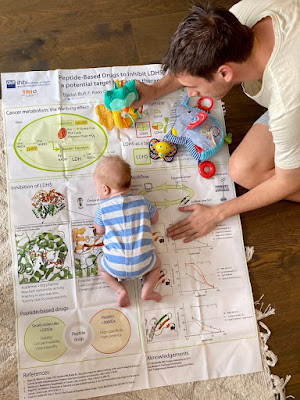
I have seen a lot of repurposing of fabric posters, but this one is surely the cutest:


Baby sleeping on conference poster made of fabric

Ferran Nadal-Bufi writes:

Award winning poster on peptide-based drugs to target cancer becomes play mat for tummy time 🥰

Hat tip to Needhi Bhalla.

• • • • •

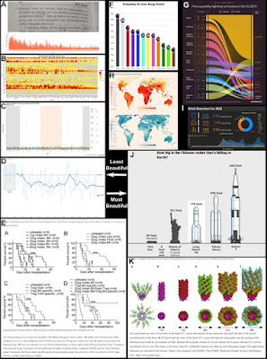
In my field of neuroscience, it’s been known for some time that images of brains “lighting up” are more persuasive that tables or graphs. So a new preprint that suggests graph aesthetics influence their persuasiveness is not especially surprising.

Lin C, Thornton MA. 2022. Fooled by beautiful data: Visualization aesthetics bias trust in science, news, and social media. https://psyarxiv.com/dnr9s/

The authors say the graphs on the left were considered least beautiful, and the ones on the right were most beautiful.

Collage of eight graphs, with the ones on the left rated as more beautiful than those on the right.

A Twitter thread 🧵 from one of the authors is here.

I suspect a lot of people will flip out about this, because academics have been made very twitchy about misinformation. Any many cling to the idea that a graph should somehow be a completely neutral and impartial conveyor of data.

But graphs have always been a tool for persuasion. 

So the lesson here is not only,  “Be suspicious of beautiful graphs,” because really, you should be suspicious of any graph, but also, “It is worth the time and effort to make a nice graph, because it will spread your ideas farther. And as Seth Godin says, ‘Ideas that spread, win’.”

• • • • •

Last year, one of the big things that happened to me was getting my right eye fixed up. I’d had low vision for a few years, thanks to an undiagnosed cataract. I’m glad to be rid of it and now have the best vision I’ve had since I was a kid. But I am also greatful for the experience because it made me more alert to problems face by people with visual impairments that can't be fixed with a simple surgery.

On that note, I’m currently trying to lay my hands on a copy of:

Wu Y-H, Martiniello N, Swenor BK. Building a more accessible conference for researchers with vision impairment. JAMA Ophthalmology. In press. https://doi.org/10.1001/jamaophthalmol.2021.5613

If anyone has a copy, please email me! It seems relevant to my interests.

• • • • •

“How to present a poster at a conference?” is a short chapter (Chapter 3) in the book, How to Practice Academic Medicine and Publish from Developing Countries? A Practical Guide. (The authors chose to have a stylistic thing where not only the book title, but the chapters, and every heading ends in a question mark, whether it needs it or not.)

Open access and free to read.

Nundy S, Kakar A, Bhutta ZA. 2022. How to Practice Academic Medicine and Publish from Developing Countries? A Practical Guide. Singapore, Springer Singapore. https://doi.org/10.1007/978-981-16-5248-6_37

• • • • •

Helena Jambor reviews trends in data visualization for 2021. Topics include:

  • The ubiquity of the “viridis” colour scheme
  • Axis breaks
  • Slope charts
  • Pictograms
  • Scale bars

And more!


07 January 2022

The New York Times COVID-19 serpent

 Opinion is split on this New York Times graph:

CVOID-19 cases plotting by width of line in a spiral, with month the points on the radius.

This spiral is showing the same thing as this:

Line graph of VOIC-19 cases

A lot of people were dunking on the circular top graph. Zach Freed, who wrote, “Literally no reason to make this graph into a spiral.”

But several data viz folks perked up to defend it (here, here, here, here, here, here). (I’m not pasting in the quotes because I want to finish this post.)

And there are already remixes floating around. Amerlia Wattenberger has several.

I am more on the “detractor” side than “supporter” side. To me, this looks a lot like being different just for the sake of being different. And I don’t like that distance from center seems to be purely arbitrary.

Now, there are arguments that maybe being different is a good thing here. Neil Richards wrote, “(I)f it gets us talking about it, the chart's doing a great job!”

Yeah, but we’re talking about the graph and not the data or the ideas in the article.

It’s like when CERN announced the confirmation of the Higgs boson on slides using Comic Sans. Suddenly, people were talking about the typeface and not the data or the significance of the discovery.

The big potential advantage of a circular graph is that it is the best way to show circular data. If the big point of the graph was to explore whether COVID-19 was seasonal, yes, then this would start to make a lot more sense.

But that’s not what the article is about. Besides, even if the point was, “COVID-19 sure looks seasonal, peaking in December,” that’s n = 2 in any case.

I think Alyssa Fowers’s point that this is at the top of an op-ed article is relevant. I don’t think this is meant to show data; I think this is intended as an illustration that is based on data. I am willing to be the phrase 

“Spiralling out of control”

was uttered at some point in a story meeting. And that was the driving force leading to this graph.

Regardless of whether this plays in the “paper of record,” where people are expected to be able to spend all the time they want poring over it while sipping a hot beverage, I absolutely would not recommend this kind of graph on a conference poster.*

One of the main reasons we standardize graphs is that you don’t have to re-learn and decipher graphs anew every time. In a poster session setting, where people are busy and distracted, it’s a little rude to foist a non-standard graph on your audience if another type of graph is a much more common way of showing the data.

* Unless you were trying to show seasonality. And if you were trying to show seasonality, I would explictly annotate that on the graph.

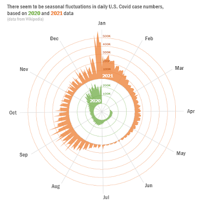
Update, 8 January 2022: This makeover from Joe Travers is closer to what I might do. I would want some way to put the two years on the same scale, though.

Circular graph of COVID-19 cases from 2020 and 2021.

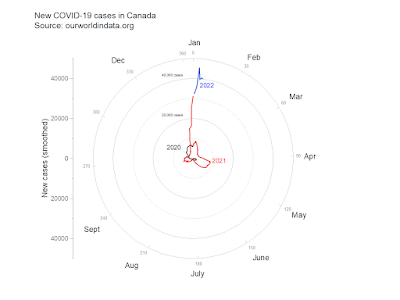
Another update, 8 January 2022: I should be writing a syllabus, not remixing graphs. Yet here I am.

CIrcular plot of new COVID-19 cases in Canada.


This is a quick and dirty proof of concept. Yes, I know the months are sloppily positioned. Yes, I know there are other things that need fixing. But I was too curious what a circular plot looked like.

Dates are a pain to work with. Spreadsheets and graphing software really, really, really want your dates to include a year and add one if you don’t. Not to mention leap years, like 2020 was.

The spiral graph was by Gus Wezerek and Sara Chodosh, though it's not clear if one or both were responsible for this particular graph.

External links

Here’s When We Expect Omicron to Peak

06 January 2022

Critique: Particulate matters

Alexandra Lai is a repeat customer of the blog. She was kind enough to share her work some time ago. She wrote, “I appreciated your critique so I am coming back for more!”

Well, when someone asks, I have to give it. Click to enlarge!

Poster titled, "From personal exposures to cell exposures Cytotoxicity and chemical composition of women’s personal PM2.5 exposures in rural China"

When I open a poster for review, there’s always that first reaction. Sometimes, it’s an overall impression that makes me go “Ooooh...” it I like it or that sound of sucking air through my teeth if I don’t. But sometimes, it’s one thing that you spot right away and you cant let go of.

It’s down in the lower right.

Headings do not just convey information about sections. They help divide a work into chunks, carving the poster at its joints. Here’s the poster with the headings at the top of each section.

While I personally have written about how I dislike changing column widths, I have very little confusion about what the sections are or what order to read the poster.

But in the lower left corner, the short heading accidentally isolates the last column,

We assume that everything under a heading  belongs to that heading. So anything that is not under a heading doesn’t feel like it belongs to anything.

Think of a heading like an umbrella.

Shadow of person holding an umbrella with the edge of the umbrella over the head, leaving on side of the body not under the umbrella.

Doesn’t just looking at that umbrella just make you want to reach in and pull it over the body? Like this?

Shadow of person holding an umbrella with the handle of the umbrella near the body, covering the body under the umbrella.

There are a few minor typographic issues that might be addressed. I strongly suspect that typesetters would not want a line to begin with a dash

– which happens in the first heading.

Similarly, I don’t think it’s common for ellipses to end one line or section…

… And use ellipses again to start the next line or section, which happens in the rightmost headings and in the text. Text lines should start with words, not symbols. 

These sorts of decisions are why professional book typesetting, even now, is at least checked by professional typesetter and not isn’t automated like Word documents. Placing line breaks and hyphens are not easily encapsulated in algorithms.

The rest of the poster has a consistent use of contrast colours, blues and oranges, that help add visual interest.

I thank Alexandra for sharing her work again, and wouldn’t mind seeing a third sometime!

Related posts

30 December 2021

Link round-up for December 2021

Antonia Hadjimichael has a blog post, “Five tips for creating visually appealing scientific posters.” It contains some material familiar to readers of the blog. It is always great to see ideas spread!

• • • • • 

The question of whether there can be rules to design, including data visualizations, is a vexed one. This thoughtful blog post suggests that there are come helpful steps you can use to help land on a good graph.

I think that many common dataviz design decisions can be codified as formal rules that can be followed by practitioners of any experience level to make the best possible design choice in any situation, without exception. The bad news is that these rules can’t be captured in simple “always/never” sentences... . The good news is that many of them can be captured in relatively simple decision trees.

• • • • • 

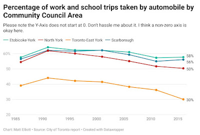
Matt Elliot anticipates and solves problems before anyone anyone can make something of it.

Best. Graph. Subtitle. Ever.

Line graph whose subtitle reads, "Please note that the Y axis does not start at zero. Don't hassle me about it. I think a non-zero axis is okay here."

Hat tip to Michael Hoffman. 

• • • • •

Nuria Melisa Morales García has a Twitter thread about graphical abstracts. Much of which applies to posters.

09 December 2021

Posters should not be rated like Yelp reviews

WHhn I was on the PolicyViz podcast, there was one joke I left on the floor that I wish I'd told. When Jon asked me about poster competitions, I should have said, “I know: academia isn’t competetive enough. Let’s organize the backstabbing.” Molly Gordon describes her experience at an ASCB conference:

When someone rates my poster 1 ⭐️ at the American Society of Cell Biology... my thesis work, that I pushed forward through a pandemic, poured my heart and soul into, and did my absolute best to summarize into a 5 minute video.

Also, it is not unnoticed that my labmate got a single ⭐️ as well. Someone is actually out there targeting research from certain labs with bad reviews? Geeeeeeez science feels hopeless at times.

If you thought my research and or presentation style was that abysmal, why not offer advice or critique in addition to your rating? Thanks for making the field a more inclusive space ❤️/sarcasm /rant.

I have no idea what is going on here. Neither the meeting’s poster information page nor information for presenters say anything about this rating system. Molly confirms that the ratings are anonymous.

ASCB replied that this is part of the meeting platform and they cannot turn it off. So... maybe a good reason not to use that platform? The person in charge of their Twitter account wrote:

Hopefully we won’t have to organize a virtual meeting on this scale again. It takes all year and 1,000s of hours of planning and team work. It just goes to show you, it’s always something.

I know that the person running a social media account is not the entire leadership of the organization, but this response is a too low key for my taste. If this kind of behaviour took place in a face-to face environment, it might violate a code of conduct.

The ASCB Twitter account also took a moment to complement Molly but not apologize.

Update: ASCB says most one star ratings were  “accidental.” The society does have a code of conduct. It was just hard to find, because it was under “Meeting policies and terms.”

Aside: The ASCB poster template is pretty shocking.

No alignment, switching reading order, and more.