28 October 2021

Link roundup for October 2021

I’ve cautioned against outdoor poster sessions before. They always seem to me to be Just Asking For Trouble™. But with the COVID-19 pandemic, outdoors is safer than indoors, so...

Outdoor poster session

This looks lovely. But do other places have Lisbon’s weather? And were there back-ups in case the weather turned bad?

From Megan Carey, via Patricia Churchland.

• • • • •

Ajanji and colleagues have what I think is a preprint that tests the effectiveness of decluttering and annotation (which they call “focusing”) on graphs.


Author Steve Franconeri says, “We found that decluttered graphs make you look more professional, but no evidence of cognitive benefits. Focusing led to far better memory for key data patterns.”

• • • • •

MyFonts has a PDF primer on justified versus ragged right text. It contains a simple rule of thumb I had not heard before:

Don’t justify text if the average line of text contains less than nine words.

• • • • •

Duarte Communication surveyed a lot of people about online presentations. Seeing how most conferences are now online and look to keep some kind of online presence, there are lots of things that apply to poster sessions going forward.


Most virtual presentations are just "Meh"

Key suggestions:

  • People want presenters to vary their voice, tone, and pitch.
  • You need to earn the audience’s attention by telling compelling stories.
  • Focus on one idea per slide.
  • Be prepared for what might go wrong during a virtual presentation.
  • Familiarize yourself with the most preferred virtual platforms (which is Zoom, by a long way).
  • Both audiences and presenters prefer cameras on.
  • People will hang around longer for an interactive talk than a one way one.

You can get a copy of their report if you let them know your name and email address. This is clearly an attempt to drum up business for the company... but there is real information there that is worth perusing.

• • • • •

Speaking on online presentations, this description of an online conference shows how meaningless the word “poster” is becoming in an online context. Emphasis added.

For Journées Ouvertes en Biologie, Informatique et Mathématiques (JOBIM) 2020, we held a poster session with a homemade solution based on the Jitsi Meet platform(.) The idea was to dynamically create a room for each poster. After a search on the conference website using poster filtering facilities, the attendees were able to join the poster room and meet the authors or other attendees interested in the topic. To encourage more dynamic and interactive discussions, we also proposed to the authors to present their work through a few slides instead of the classic poster format(.) The idea was also to avoid zooming in to view figures or texts. We also invited the authors to prepare a short video of their work, and we selected a few of them to present during the breaks. One can also imagine allowing attendees to schedule meetings for the poster session.

First, I am not sure why conferences keep using these homebrew solutions instead of just using Zoom. 


Second, there is nothing wrong with “zooming in” to see text and figures: the problem is that most tools, like PowerPoint or PDF documents, suck at it.

Prezi seems ideally suited to an online poster format for exactly this reason. It was built on the “whiteboard” model rather than a “slide deck” model and zooming was its original differentiation from PowerPoint.

• • • • •

And that’s the round-up for this month!

25 October 2021

Ten simple rules for conference posters

I am being a lazy blogger and turning a Twitter thread into a blog post. John Butler asked for, “Something like 10 steps for a good conference poster.”

So I made something up off the top of my head.

  1. Read the instructions. Sounds easy, but printers say “wrong size” is the #1 problem they see.
  2. Your title is most of your communication effort. It’s all most people will ever read. Spend a lot of time on your title! Don’t just use the first one that comes to mind. Simple declarative statements of the main finding work well.
  3. You should be able say what your poster is about in one sentence. Too many people want to show everything they have done. Focus.
  4. Make you one sentence in an ABT (and, but, therefore) format. What are a couple of facts? (“We know X and Y...”) What is the problem? (“But X doesn't hold in this case...”) What is the consequence of that? (“Therefore...”)
  5. Make a grid. A three column grid is really hard to screw up. It’s not the only way. More or fewer columns can work. Rows can work. But three columns is a robust layout.
  6. Leave space. Lots of people, because they did not focus enough (#3), make skinny little margins to try to fit more stuff on. It’s hard to read. Be generous with margins between columns, and with white space between text and graphics.
  7. Be consistent. Consistent fonts. Consistent colours. Consistent column width. A common is that people make graphs before the poster, and don’t go back to make the graph fit with the rest of the poster.
  8. Bigger is better. A common question is, “What’s the minimum font size for a poster?” (This is often coming from people trying to shove too much stuff on the page.) Accessibility guidelines usually recommend type be several times bigger than what many people use.
  9. Practice what you are going to say. Do this before you print your poster. Sometimes you’ll find the order you laid stuff out in (because “It just fit there”) is not the natural order when you talk it through. The visuals and your explanation should follow the same order.
  10. Do the “arm’s length” test. When you’re done layout, print your poster scaled down to a single letter sized piece of paper. Hold it at arm’s length. If your vision is reasonable, you should be able to read your shrunk down poster at arm's length. If you can’t, it’s too small.

The Twitter thread has marginally related GIFs.

External links

Ten simple rules for a good poster presentation

(PLOS Computational Biology)

14 October 2021

“Ooh, it’s the one with...”

Doctor Who classic series episode guide - It's the one with
Years ago, the BBC website for Doctor Who had a “memory jogger” to help viewers recall the title of some episode. (Still online, in fact!) After all, the original classic show had run over 25 years and had hundreds of stories. Easy to let a title slip.

I loved the prompt it gave people.

“It’s the one with...”

Because titles are good and all, but they aren’t always the things our memories glom on to.

Imagine that someone who saw your poster tells a friend they should see your poster, and tries to help their friend find it.

“Ooh, it’s the one with…”

How would they complete that sentence? What obvious feature could someone use to point out your poster?

“It’s the one with the shark.” 

“It’s the one with the kabuki mask.”

“It’s the one with the big red triangle.” 

Those could all work. Those are all specific, concrete nouns that are easy to recognize.

But “It’s the one with the bar graph” is unlikely to be helpful. “It’s the one with the analysis of history of Japanese theatre” is unlikely to be helpful.

30 September 2021

Link roundup for September 2021

Look, we’re scientists, not artists, and rats are hard to draw so you might just have to settle for a rat made out of ovals.

Figure showing scientific method in which rat is made entirely out of ovals.

This is the lead example in this great Twitter thread on scientists making figures as best they can.
• • • • •

Goodsett and colleagues have suggestions for creating online conferences, based on their experiences in conference planning for Association of Academic and Research Libraries. Here’s how they handled posters:

Each presenters recorded a short 1 to 3 min introduction about their poster. The overall format of the poster was left open to presenter creativity. Feedback, comments, and questions were submitted and answered asynchronously using a discussion board.

A notable addition to their planning was creating contact personnel that they called “shepards.”

The CPC adopted a “shepherd” support system for presenters... Shepherds served as the (programming committee) contact for each presenter, shared important details, and answered questions, especially any related to media creation and file formats, since pre-recorded videos and online poster presentations had not been required of previous... presenters.

Some participants asked for the online component to be kept when conferences move back to face-to-face:

“The online posters (especially those with recorded descriptions) were very helpful for me (it's hard for me to see physical posters at times, so we might want to keep this option when we move back to a physical conference).”
• • • • •

Marvel comics character or font? Take the quiz! See if you can beat my score of 17 out of 20. 😉 Hat tip to Melissa Vaught

• • • • •

 That’s it for this month!

23 September 2021

Deliver more, not less

< = >
A common thing people say about poster design is the old adage, “Less is more.”  

The phrase probably originated in Robert Browning’s poem, “Andrea del Sarto.”

Well, less is more, Lucrezia: I am judged. 

But it was popularized in architecture by Ludwig Mies van der Rohe

I don’t like this expression as it applies to poster design.

I have this memory of watching an interview with songwriter Jim Steinman. I think it was for Bat Out of Hell II: Back into Hell.* I have never been able to find it again, but from memory, Steinman said something like:

Less can never be more. Less is always less. Only more can be more.

I suppose the problem I have with the “less is more” aphorism is that there’s too much emphasis on the “less” and not enough on the “more.” 

Just hacking away at poster content with no rhyme or reason so that there is “less” will not do anything. 

Rather than prioritizing “less content”, think about how to deliver:

More focus.

More efficiency.

More value for the reader.

* Maybe I associate this quote with Bat out of Hell II because it contains a song that so perfectly describes Steinman’s style, “Everything Louder Than Everything Else.”

16 September 2021

Critique: Soil ontologies

Today’s poster comes from Nicolas Le Guillarme. This was presented at the S4Biodiv workshop. As always, you can click to enlarge!

Soil ontologies poster.

My first reaction was, "Ooh, this is really nice.” The bold use of colours and moving the dividers a little off the horizontal give the poster a lot of energy. 

In fact, there is so much life here that I didn’t notice there is still quite a bit of text. I would like to see that edited back a little if possible.

My second reaction was to look at the title and headings. The typeface is open, so the colours of the background and the foreground of the text are the same. This can make it a little hard to read some of the letters, and I particularly worry about readability from a distance.

Here’s a quick and dirty attempt to fill some of the letters.

Soil ontologies poster with headings filled with colours instead of matching background.

The white fill in the “Introduction” heading works very well, but I didn’t find the right colours for the other headings. I do think that this revision shows that filling the letters increases the visibility, though, even though I didn’t take the time to optimize the colours.

Similarly, I would like to see a little more contrast in Figure 1. 

Figure 1 from soil ontologies poster.

The labels overlap parts of the figure, and makes some of the labels hard to see. In particular, I’m looking at the “Tropic assignment” label over the spiralling arrow. I might try to stick a semi-transparent box under the labels. You can see the technique in the graphic I made for this post:

Picture of Neil Gaiman with quote in the upper left saying, "When someone tells you there's a problem, they are usually right. When they tell you how to fix it, they are usually wrong."

Notice how the books are light and sharp by the elbow but darker and blurry where the quote is? That’s the kind of effect I’m thinking of. Something to make the text a little more distinct from what it sits on top of.

Some of the labels in the network diagram over on the right are also nearly impossible to read. The “Resources” label is almost the same colour as the background. While under most circumstances, having the text and dot be the same colour reinforces the connection, that should not come at the cost of readability.

Figure 1 excerpt from soil ontologies poster, with network labels tunred black.

So in the revision above, I just made all the labels black.

Nicholas wrote:

This is my first attempt to create a poster that is both informative and visually appealing. I am quite satisfied with this first draft, but I am pretty sure that there is plenty of room for improvement.

I think Nicholas is right on both counts. It is very satisfactory – more than satisfactory – but constant improvement is The Way!

09 September 2021

Same research, different presentation: Lessons from Nature

It’s instructive to look at how academics present their results compared to journalists. Compare!

Original article title:

“He who pays the piper calls the tune”: Researcher experiences of funder suppression of health behaviour intervention trial findings

Nineteen words, two part title divided by colon, containing a cultural reference that may not familiar to all.

Original data:

Researcher reports of funder efforts to suppress trial findings.

It’s presented in an 8×8 table in fine print.

Now see how Nature reported on it.

News article title:

Health researchers report funder pressure to suppress results

Eight words. It’s shorter than the article title, even if you took out the quote. It’s clearer than the article title.

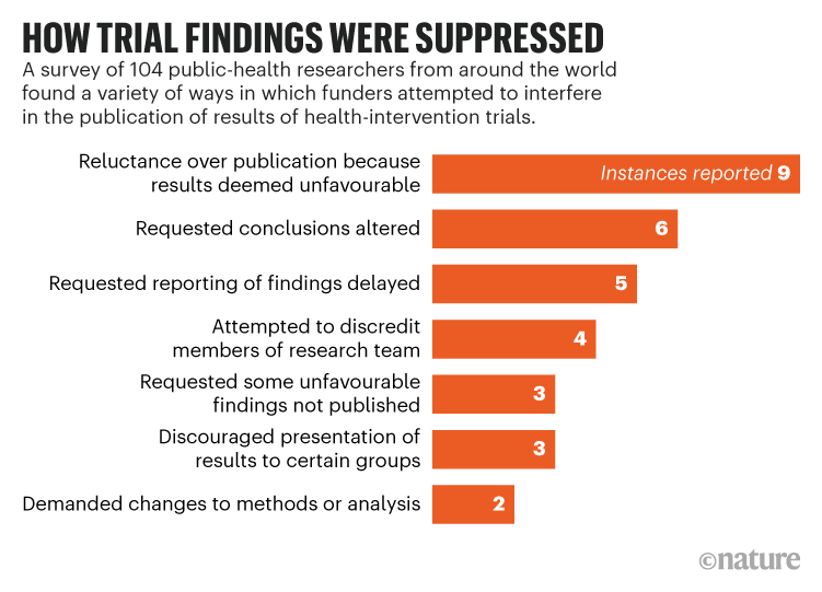
Revised data:

Horizontal bar graph titled, "How trial findings were suppressed."

The table has been replaced by an easy to read bar graph. The graph has a clear and bold take-home message. Yes, there is less information. It’s effectively a 2×8 table, but it is easier to read and understand.

Too many conference posters look like the journal article. Posters will be better if they look more like the Nature article.

External links

McCrabbe et al. 2021. PLOS ONE 16(8): e0255704. https://doi.org/10.1371/journal.pone.0255704

Watson C. 18 August 2021. Nature. https://doi.org/10.1038/d41586-021-02242-x