29 April 2021

Link round-up for April 2021

My fellow biologists will be interested in BioIcons, a library of free to use icons from Simon Duerr. Over 1,600 icons so far.

BioIcons landing page

• • • • •

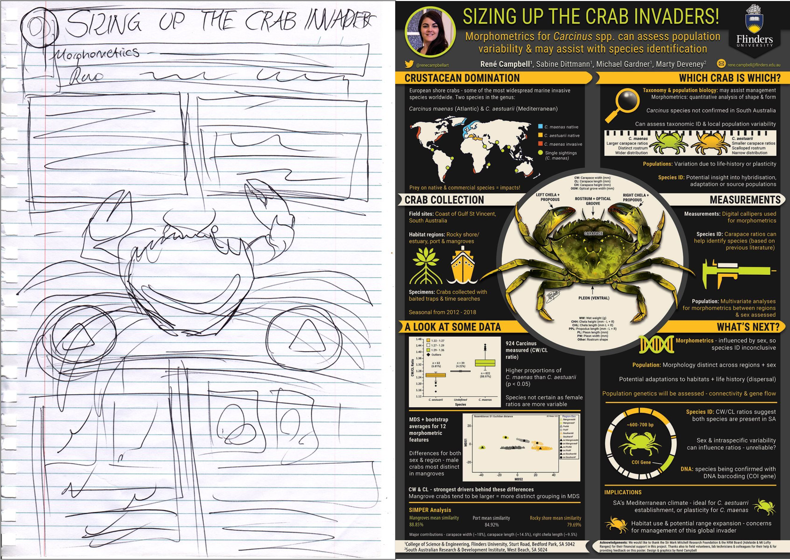
René Campbell shows off the before and after of one of her old posters:

Left: Pencil sketch of poster. Right: Comompleted poster titled "Sizing up crab invaders".

She noted that she didn’t remember doing the sketch at all!

• • • • •

As goes Microsoft, so goes academia. At least in regard to design. 

For years, we’ve looked at a lot of posters and slide talks that looked kind of similar because they all used Calibri, because it is Microsoft’s default font in Office.

Calibri’s days as default are numbered. Microsoft has announced it will be retiring Calibri as their default Office font. Click to enlarge to see the candidates to replace it.

Chart comparing Calibri with teh five candidates to replace it: Skeena, Grandview, Bierstadt, Tenorite, and Seaford.

Skeena looks closest to Calibri. 

Bierstadt looks like a Helvetica imitator (and the name doesn’t exactly roll off the tongue). 

Grandview looks tiring for extended blocks of text because of its angles and high x-height. 

Tenorite’s geometry appeals to me in the way Futura does.

Seaford is my current favourite.

• • • • •

An instructor shares students’ comics about making comics.

Color for emotion

• • • • •

Fog City Gothic is a new typeface based on San Francisco street signs.

FOg City Gothic sample

Not in contention to replace Calibri.

• • • • •

We know that graphs be be art. But did you know they can also be furniture?

Shelves in the shape of box plots.

 Made by Deneuse Andamidiya.

• • • • •

Next month: The Better Posters book arrives in your hands!


27 April 2021

Variable fonts: A quick introduction

Variable fonts are here
 

Recently, I talked about type as a form of technology. I was more interested in the idea of the shapes of the letters and numbers and the amount of special symbols, so overlooked something kind of obvious. 

Fonts are technology, too. And more obviously so.

(Aside: Typefaces are styles and shapes of letters. The fonts are the way those style get implemented. Type is like a song, font is like the recording of a song.)

One of the biggest additions to type technology is the addition of variable fonts.

The issue that variable fonts can solve is that because of various optical effects, you can’t make a thin letter into a thick letter just by thickening the lines. Well, I suppose you can but it doesn’t look right. And two letters that should be the same point size no longer are the same height.


Thin letter "a" and thick letter "a"

Type creators go to great lengths to tweak letter forms so that thick and thin letters both “work.” In the example below, notice how the width of the lines making up the thin letter are uniform, but the lines making up the thick letter vary. It’s particularly noticeable where the bottom loop connects with the right vertical.

Thin letter "a" and black letter "a"

Here’s another way of comparing the light and black weights.

Thin "a" superimposed on black weight "a".

In the past, you were limited in your choices by the number of specific weights a type designer decided to create and release. If the designer made medium and black weights, too bad in you wanted a thin weight. If their “thin” was too thin and the next step up was too thick, you had no options.

Variable fonts let you change the weight of letters as little or as much as you want. Instead of buying half a dozen separate fonts, you can buy one and scale it to your needs.

In the examples above, the letter “a” came from “Thin” and “Black” weights. But a single variable font lets me go all the way from one to the other.

In CorelDraw, variable fonts are controlled by a simple sliding bar that appears when a variable font is selected.

Corel Draw menu showing variable font drop down menu

For this particular font (Goldman Sans VF), the “Weight” goes from 200 to 900. I do not know what those numbers signify. They vary from font to font.

But wait! It gets even better! Some variable fonts allow you to control the width, too!

The word "Thinner" with descreasing width and weight with each letter

Again, the numbers presented as options have seemingly arbitrary high and low points. Width for this font, Bahnschrift, vary from 75 to 100. I think those numbers are set by the type designer.

But wait! There’s more! Some variable fonts allow you to control the slant, too! I don’t have an example myself, but it is mentioned in the description for Sharpe Variable. 

Photoshop, Illustrator, and Indesign: Powerful variable font technology. Use sliders to set any weight and slant

Snare is a variable font where you can control the height of the typeface.

Snare typeface sample

 The price for variable fonts is, not surprisingly, higher than individual fonts. But you have to realize that a single variable font can take the place of two, three, or more fonts and give you finer control over the letters.

I happen to have used a couple of fairly conservative sans serif fonts here, but more and more variable fonts are being released. Some new, elaborate, beautiful script and display fonts are coming out. Some old classics like Univers have been upgraded with variable fonts. You can filter Google Fonts to show only variable fonts.

The font names usually specifically say, “Variable” in them. So searching for that word in a font shop will usually bring up fonts with that option.

Having said all this, you probably would not need to use variable fonts on a poster very often. Usually I’m telling people to pull back on the variation in their text, not add even more. But it is always nice to know what your options are.

Related posts

Type as technology

22 April 2021

Posters from before they were famous: A dream project

 Recognize the woman below? (It might be easier if you’re American.)

Alexandria Ocasio-Cortez with her Intel 2007 science fair project.

Alexandria Ocasio-Cortez with her Intel 2007 science fair project and Yorktown high school teacher Michael Bluegrass.

Alexandria explaining her project to Craig Barrett, retired Chief Executive Officer/Chairman of the Board, Intel Corporation and Society Board of Trustees member.

It’s federal politician Alexandria Ocasio-Cortez, eleven years before she was elected to the American House of Representatives in 2018. When she was in high school, Ocasio-Cortez was a second place finisher in her category in the 2007 International Science and Engineer Fair.

Yes, technically she is not presenting a poster, she is presenting a tri-fold. But I will let it go to make my point.

Lots of people present posters at conferences. Some of them go on to become better known than the average student. 

Ocasio-Cortez is unusual but not alone in being a politcian in her science background. German Chancellor Angela Merkel had a scientific career. Before that, Margaret Thatcher did an undergraduate chemistry dissertation.

I once spotted a poster co-authored by filmmaker James Cameron (whose interest in deep sea exploration is well known; pretty sure he only contributed samples and was not involved in making the poster).

Many well-known scientists have probably given posters at some point in their careers, too. Nobel prize winners have given posters. Science communicators who write books and appear on late-night talk shows have given posters. You know, the “rock star” scientists.

I wonder if Carl Sagan ever gave a poster.

I would love a project that showed these people with their posters. I would love to hear them talk about their poster session experiences. I would love to show students, “Look, what you’re doing is something that even science ‘celebrities’ did. They made posters, too.”

External links

Alexandria Ocasio-Cortez won a prestigious science-fair prize for research involving free radicals

Alexandria Ocasio-Cortez puts Yorktown Heights on the map 

Intel ISEF alumna headed to Capitol Hill


18 April 2021

Sunday scraps: Third book cover draft

 We went through a few iterations of the “icon” cover that I showed last week.

Unused Better Posters cover concept in yellow


I asked to see a few colour variations and got them.

Unused Better Posters cover concept in blue

The red was my favourite.

Unused Better Posters cover concept in red

Some subtleties that I appreciated: 

The crayfish / lobster icon, a nod to my own area of biological research.

The flow of icons from top to bottom sort of follow the poster making process. The things you observe as a scientist are up at the top. The tools that you use to make a poster are down at the bottom.

The cover designer went back more to the concept of “make the cover a poster” is a less literal way than I had first tinkered with.

16 April 2021

Conference posters books: the numbers

Scientist’s Guide to Poster Presentations: 128 pages. Academic & Scientific Poster Presentation: 170 pages. Better Posters: 305 pages.

As far as I know, there have only been three books specifically about conference posters ever. I wondered how they compared.

Title Author Year Pages Figures
Scientist’s Guide to Poster Presentations Peter J. Gosling 1999 128 ?
Academic & Scientific Poster Presentation: A Modern Comprehensive Guide Nicholas Rowe 2017 170 26
Better Posters: Plan, Design, and Present an Academic Poster Zen Faulkes 2021 305 153

I’m not saying mine is the best. But it it is the biggest to date.

Related posts

Review: Scientist’s Guide to Poster Presentations

Review: Academic & Scientific Poster Presentation: A Modern Comprehensive Guide

References

Gosling, PJ. 1999. Scientist’s Guide to Poster Presentations. Kluwer Acedmic / Plenum Publishers: New York. https://doi.org/10.1007/978-1-4615-4761-7.

Rowe N. 2017. Academic & Scientific Poster Presentation: A Modern Comprehensive Guide. Springer: Cham, Switzerland. https://doi.org/10.1007/978-3-319-61280-5

15 April 2021

What the HEIC? WEBP is going on with image formats?

A while ago, I wrote about how fonts are technology. And like any technology, it changes. Same is true for images. 

I just learned about HEIC images. (I’ve read this is supposed to be pronounced “heek,” but I think “hike” or “aych-ee-eye-see” should be equally acceptable.) Strictly speaking, HEIC is a file extension, and the actual format is HEIF (High Efficiency Image File).

I hadn’t heard about HEIF images before, because:

  1. The format is not supported by any web browser yet.
  2. The format is almost exclusively being used by Apple.
  3. The format isn’t supported by much graphics software yet.

Webp logo
I also have increasingly been running into WEBP images on the web. These are super frustrating, because almost nothing else supports them, so you can’t easily take a *.webp image and paste it into PowerPoint or most other kinds of standard productivity software. I can’t import them into Corel PhotoPaint. I’ve become a regular visitor to this online WEBP to PNG converter.

How do these two new formats stack up to the older formats, particularly in print?

Format Colours Transparency
JPG 8 bit No
PNG 24 bit Yes
HEIF 16 bit Yes
WEBP 24 bit Yes

It seems the major impetus to create even more image formats was file size. Both HEIF and WEBP files are smaller than either of the more common formats, JPG and PNG. If you are running a huge corporate website with zillions of images, like Apple and Google do, this is incredibly important. 

For creating a single user creating print content like a poster, this advantage is probably not terribly important.

For most academics, I think your best bet to to convert HEIF and WEBP images to PNG format. Looks like those online image converters will be getting a real workout in months to come.

External links

A new image format for the web

14 April 2021

How a scientist wrote a book on graphics: Some things never change

Starlog magazine #133 cover with Bob Hoskins and Roger Rabbit

Buried in the back of Starlog magazine #133, you’ll find one of my earlier appearances in print. And what am I doing? 

Complaining about graphics.

Some things never change.

A letter given the title “Beasty covers” by the editors reads in part:

… Let’s take the first thing that anyone sees of a new issue: the cover. They are getting progressively more cluttered with copy, which is getting obtrusive. The cover layout is unattractive and confusing because of the excessive amount of copy. However, the recent Ron Perlman cover was very nice (even if it also suffered from being too crowded). It's the sort of cover that the magazine used to have more of.

For context, this was the cover I liked:

Starlog magazine #128 cover with Ron Perlman

I guess if things had been different, the Better Posters blog could have been the Better Covers blog.

(I also complain about Doctor Who not getting enough attention. Fortunately, that is less of a problem now.)