Biogreography has a poster session guide:
How to poster session: 1. Grab a snack. 2. Wander until you see someone standing alone by their poster. 3. Say “Hi.” 4. Repeat.
Hat tip to Jacquelyn Gill.

How to poster session: 1. Grab a snack. 2. Wander until you see someone standing alone by their poster. 3. Say “Hi.” 4. Repeat.

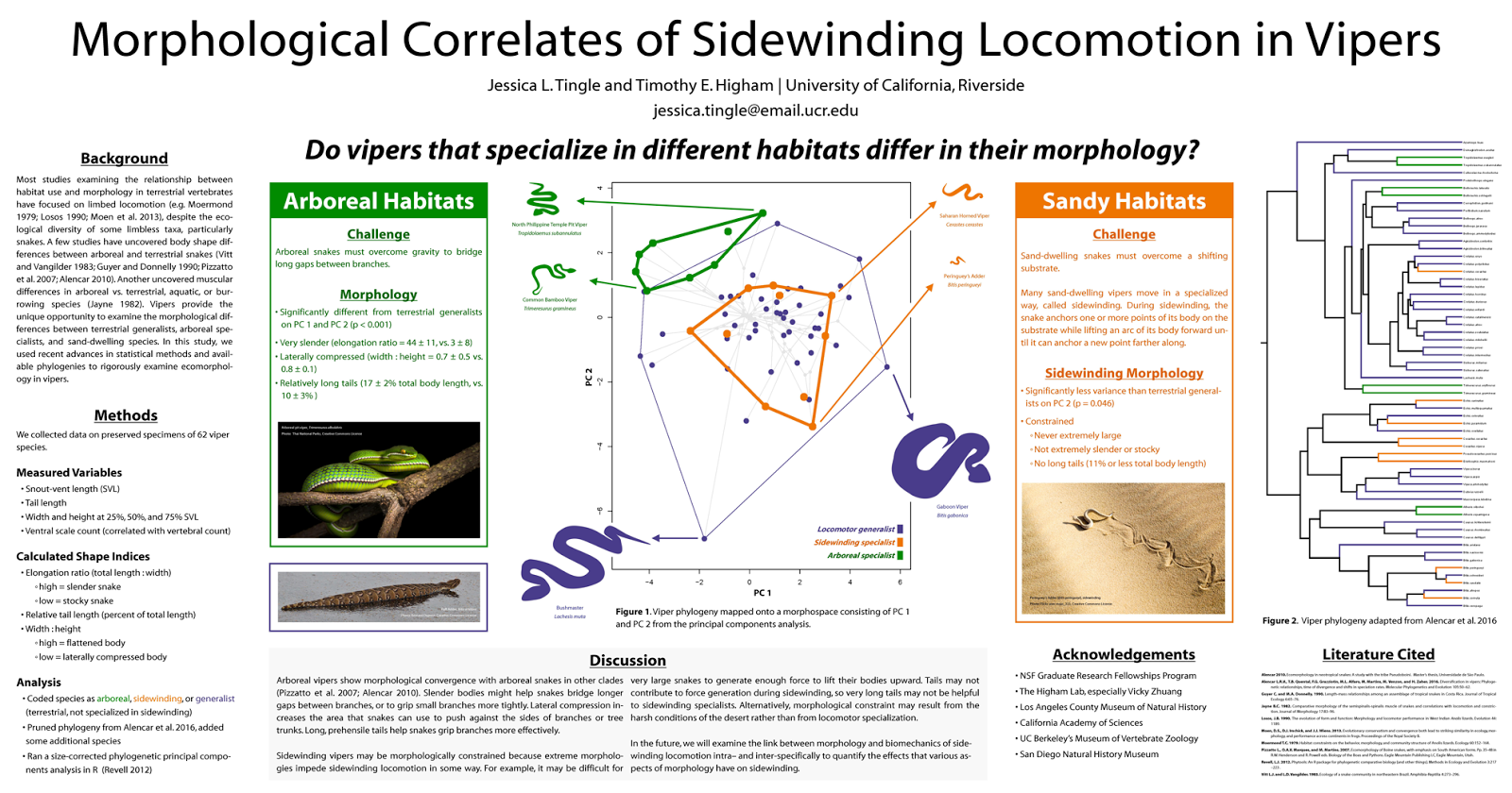
Almost all of the elements of the poster were created using open-source graphic design software. Some preliminary work (especially editing the reference image of the frog icon) was done in GIMP. The vector images were developed in InkScape, and the whole thing was assembled in InkScape. I used an individual layer for each section.
The fonts used are Steve Matteson’s Open Sans and Open Sans Extrabold, both freely available through Google Fonts.

I actually used your blog - especially your design critiques - to get design ideas for my poster.

(I)t really is a precious resource in a field where graphic design is important but rarely (if ever) taught formally(.)

Tenured profs at conferences: adopt a “grad students and adjuncts don’t pay” rule at dinner/bar. Some did this for student-me and I never forgot.
I was once in a grad-student dinner group that got stiffed by tenured profs who skipped out; I never forgot that either.
I never assume that just because (someone is a) tenured prof = moneybags that can pick up $$$ dinner checks. Should be voluntary.
I do it as much as I can, but as a prof in a state school in California, my conference budget is usually tied.


(E)ven with the best-crafted headline in the world, for every person who clicks on it, there are hundreds, if not thousands, who see it, digest it, and simply move on. People get their news from headlines now in a way they never did in the past, just because they see so many of those headlines on Twitter and Facebook.
Posters > Talks
I was repeatedly told this by SfN veterans and I’m glad I listened. The few talks I went to (that were directly incredibly relevant) were fairly useful but I definitely got more out of interacting with poster presenters. Also, for presenting, I would almost unreservedly give a poster for the longer interaction it offers with attendees (five minute Q&A vs. Four. Whole. Hours.).
- Keep your eyes open. Due to the aforementioned advice, I ended up getting more free time than anticipated, and was able to randomly wander around quite a few times. The most interesting things I saw at the conference were often not planned. A few times I ended up double-taking because the poster I just walked past was being presented by authors of papers I’ve used as inspiration for my work or read because they were doing very similar things. Additionally I ended up walking past some very interesting work that may not be relevant but were still cool to learn about.
- Budget for only a few posters per session. For me, 3-5 posters per session was the sweet spot for really getting the time to engage with posters (15-30 minutes each). However …
- Keep a back-up list. In case the posters are busy or withdrawn, or maybe turn out to be less interesting than you anticipated, save a list of 5-10 others of secondary interests or friends if you get the time (which I did, frequently).
- Priority label your itinerary. With the above said, it’s super useful (if you’re over-organised like me) to label your posters by priority (you can export your itinerary to google calendar!). Sounds like overkill but this gave me a quick way to see how many posters were essential per session and ration my time accordingly. Perhaps most importantly, it also let me (once) see which morning I could give a miss after a late night..

Over centuries, print media developed a visual language of credibility that became second nature to most readers: crisp type and clean, uninterrupted columns communicate integrity, while exaggerated images, messy layouts, and goofy text inspire doubt. On a physical newsstand, it’s still easy to tell the National Enquirer from, say, The Atlantic Online, it’s becoming increasingly difficult to differentiate between the two. ...
Over the last several years, upscale publishers that don’t draw a large percentage of revenue from banner display advertising, like Medium and Vice News, have embraced an extreme minimalist style that features text and blank white space above all else — the better to differentiate themselves from the noise of fake news and chum boxes. This visual austerity is the new mark of an upscale publisher.
Yet questionable outlets are starting to adopt these very same aesthetics of reliability, albeit on a delay of several years. Sites like Civic Tribune and the satirical National Report look no worse than The Huffington Post or Drudge Report, which are seen as legitimate publishers, more or less. Some, like the semi-satirical Real News Right Now, have even echoed the clean, gridded layout and decisive typography of sites like Digg and the defunct Atlantic Wire, an aesthetic that once suggested value-added aggregation.
It was easy for me, as a Brooklyn-born creative director, to describe the hat as bad design. But the hat was worn. It was simple, unisex, familiar, and practical during a summer of hot crowded rallies throughout the South. Design-wise, it was lazy and loud, but also deceptively brand-aware and unmistakably Trump—a brash and calculated brand extension for a house whose luxury properties are awash in Gotham, understated bling, and lots of white space.


 Inkscape is a free software that creates vector-based illustrations. As such, it’s the freeware answer to Adobe Illustrator and CorelDRAW.
Inkscape does have text boxes though – created by click and dragging the text tool. Resizing is trivial then!

Out now from Pelagic Publishing and fine bookstores.
Pelagic Publishing page for Better Posters
Bookshop.org page for Better Posters (hub for local retailers)
Amazon page for Better Posters
Chapters page for Better Posters
 Posts
All Comments
Posts
All Comments


