25 July 2013

Link roundup for July 2013

The NIH has been giving workshops on poster presentations. Here is the latest one from earlier this summer (embed link doesn’t allow graceful resizing to fit in blog column, alas).

That the presentation started with standard bullet point slides did not fill me with hope. And this is reflected in one of the pieces of advice that I am not sure I disagree with: “Use bullet points if at all possible.” I still prefer paragraphs.

The information within is generally quite good, however. Hat tip to Mike Pascoe for spotting these.

PVP illustrates rule 34 of the Internet, regarding type:


This post by Nina K. Simon isn’t about posters, but it is about conferences more generally. Organizers:try more workshops, hackathons, and the like.

It is amazing to actually DO things with colleagues in professional development situations instead of just talking. In 2009, after we hosted the Creativity and Collaboration retreat, I wrote a post about ditching "conferences" for "camp" experiences. Four years later, my appetite for these kinds of experiences hasn't changed. It felt great to once again be working with people--brainstorming exhibit challenges, editing label text, even just messing around on the player piano together.

External links

Creating and presenting a dynamic poster (2010): Event listing (with PDF of slides)
Creating and presenting dynamic posters (2013): Event listing

18 July 2013

Critiqe and makeover: Quackenbush! (Because it’s fun to say)

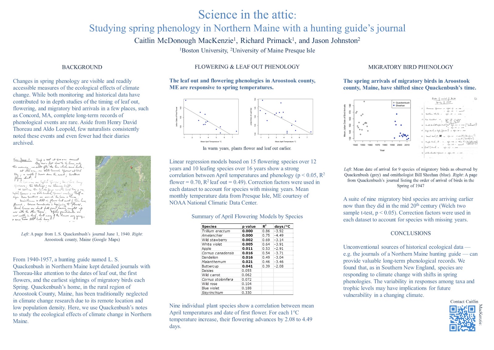
Today’s poster from an upcoming Ecological Society of America meeting comes from lead author Caitlin McDonough MacKenzie and is shown with her permission. Click to enlarge:


Caitlin’s poster has a nice clean layout. However, one thing that you can see by drawing a couple of lines is that the grid is not very tight, particularly in the left column, where the image sticks out further than the text:


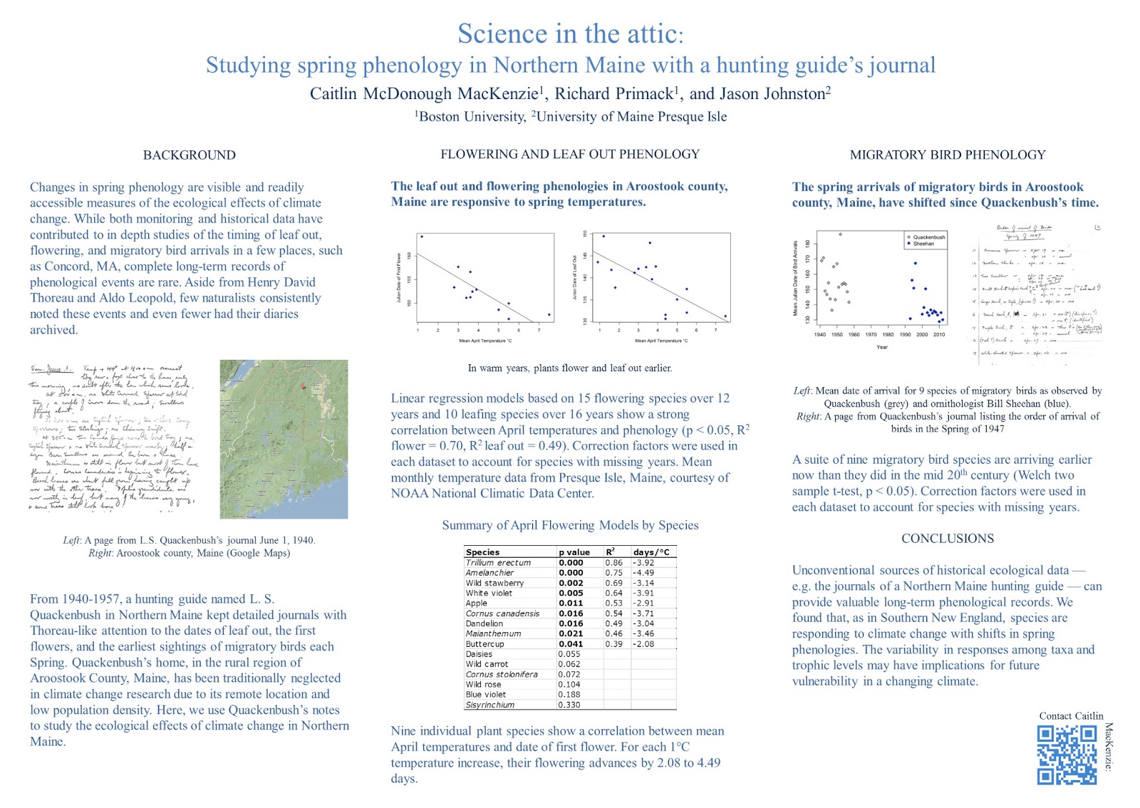
Let’s start cleaning up. Shadowed text? No reason for it. It obscures the letter shapes in the title, where readability from a distance is critical. Also pulled out the colons from the sub-headings, since nothing is following them.


The next change I made was starting to work on the data prison in the table. Lots of vertical and horizontal lines went bye-bye:


I then lined up the table, and tweaked the figure captions. For instance, I spelled “L” and “R” as “Left” and “Right.” Abbreviations almost always make extra work for the reader (exceptions for super common ones, like DNA, where the acronym is better known than the words). If you have space, spell things out!


The biggest change in the next version was to emphasize the message in the central and right columns’ sub-headings. I did that in three ways.
  • I made them bold, creating a cue that these sentences were important.
  • I changed them from questions to statements, making it easier to get the point right away when scanning.
  • I left aligned the text to make it more consistent with the paragraphs below, and to emphasize the grid.


The final changes were to adjust the spacing in the central column. I made the top two graphs a little larger, so their edges would be flush with the text below them. I also moved the QR code a bit to create a more comfortable space between it and the text. And a final adjustment to the figure legends, so that “Left” and “Right” start their own lines.


The final poster looks much like the first poster. All of these little changes together give it a cleaner, classier, more polished look. It’s all about the details.

Caitlin was happy with the end result:

Wow! Thank you so much! It’s amazing how much of a difference those little tweaks can make. I have a renewed appreciation for the power of design in communication.

11 July 2013

Posters should not be usable as drapes

Sometimes, we scientists are the world’s dumbest smart people.

Reader Ewan McNay spotted this at this year’s meeting of the American Diabetes Association:


He wrote:

I think someone inverted length and width of the available posterboard...

Even if someone thought this was a vertical space, how did they think they would hang the poster?

Check the size of the available space. Then double check it. Then make your poster a few inches shorter in both directions in case the organizers chew up space with board numbers.

04 July 2013

The screen vs. the page

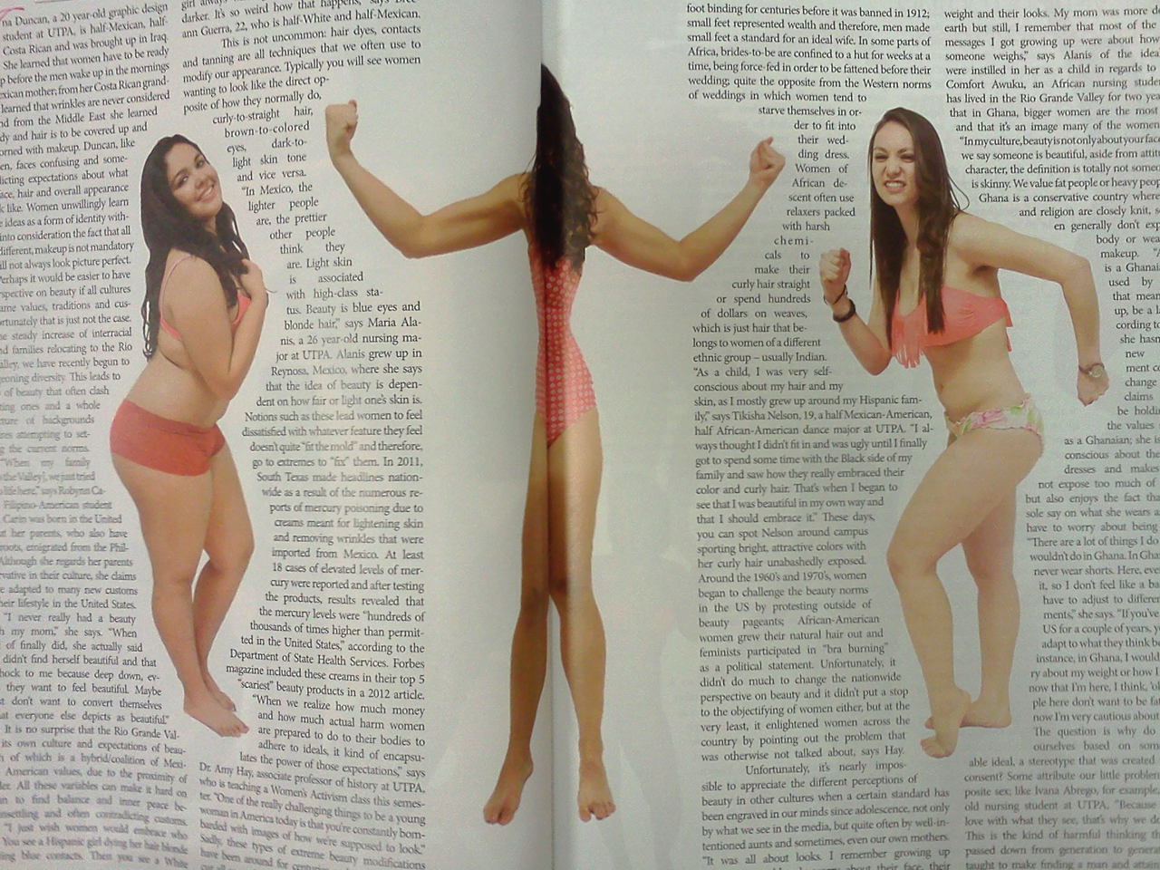
My university has an award-winning annual student magazine called Panorama. The new issue, excellent as always, contained a lesson in this two page spread:


What you see on the screen is not what you see on the page.

I bet this looked great on the computer screen. This is an ambitious layout. Outlining text around the women’s figures is tricky and well done here. And I bet you could see the face of the middle model  on the computer screen.

But the printed paper pages were bound together with glue to give the magazine a square spine. The pages don't lay flat, and there’s a gutter margin where you can’t see anything. And so we have a model who is all limbs.

This particular problem is not likely to arise on a poster, but the principle is the same. For posters, colours that look bright on your computer screen can look muddy in ink. Images that look fine at less than 100 pixels per inch on screen can look terrible when printed at 300 or 600 pixels per inch on paper.

What works in theory on the screen doesn’t always work in practice on the page. 

27 June 2013

Link roundup for June 2013

The British Science Association has published Poster Design: A practical guide for scientists and engineers. Most of the ideas in there should be familiar to regular readers of this blog. (By the way, would making this available as a regular PDF kill you, guys?) Hat tip to Perrin Ireland for finding this.

The Finch and Pea blog makes a persuasive argument that artists should be invited to conferences. Check out the work of conference artist Regina Holliday:


The post says of her work:

Why should conferences invite artists? What do they bring to the table? I asked Regina Holliday,  who has been live-painting at health care conferences for three years. “I disrupt them,” says Holliday. “I give them a different worldview,” adding that her “very visual” take on the proceedings of large meetings can cut through the massive pileup of verbal information that most conferences provide.

I like what John McWade has to say about type:

This power of type is in your hands. It’s a big gun. But you must know it and control it. A few tips:

  1. Choose type for its voice, not your taste. Sometimes the two are the same, but not always.
  2. Don’t add meaningless stuff — outlines, bevels, shadows, flames. Look again at these examples. Their purity is their power.
  3. Space carefully and evenly. Letters are not naturally uniform; the spaces between them are as important as the letters.

Type is the most influential tool to which the designer has everyday access. It is also the most mishandled. Typography is not the same as typing. Typing is e-mail. Typography is architecture, structure, theater, motion, art, life. Type has a voice. Take it seriously.

The point of conferences is to create conversations. Alas, conversations can be difficult to start. Nature Jobs Blog has networking suggestions by Carolyn Beans. While billed as being for grad students, it’s good advice for anyone, really. Let me comment on her second tip:

2) Have an opening ready—Immediately launching into your elevator talk seems unnatural. Instead, open with a question or observation about a scientist’s work. Then he or she will inevitably ask what you study.

Here, remember the “social object” theory (which is why posters work): it’s easier for two people to talk about a third thing. Look for interesting objects or other people in the environment to comment on. That’s easier to start a conversation about than speaking about yourself or the other person.

The issue of how to dress when you’re a scientist. This causes many people much stress, so I like this at the end:

Thankfully, there’s more than one way to do it right.

I want to know where the poster session is in this visualization of conference attendee movement. Hat tip to Flowing Data.

24 June 2013

The most improved graphic award

Making the rounds on Twitter today is this figure from a cancer research paper manuscript (archived in PubMed):


That someone would consider this fit for either submission or archiving is surprising.

And here’s the final version:


How the originals got archived is not clear. Apparently, this should not have happened.

This is a good example of the power of good graphics.

20 June 2013

Critique and makeover: Corn proteins

I’m always grateful to contributors like Madelaine Bartlett from Brigham Young University, who kindly submitted this poster and allowed it to be shown on the blog. Click to enlarge:


This is a nice use of a grid, with all the columns and rows clearly defined. The colours are well chosen, and the fine print is unobtrusive at the bottom.

However, in her email, Madelaine made note of my “attitude towards boxes.” Indeed! Away with them, I say! I banish thee! Let the white space do the work!


In this case, the elements do feel a little tight even after removing the boxes. We can make space by removing the summary under the title. It is difficult to read not only because of the small text, but because the line length stretches almost four feet across. Abstracts on a poster are redundant in any case.

I also shrank the each element by about 95% so that I could make the spaces between the columns wider. This made it clear that these are meant to be read down, and not across.


The section headings in the top row were all coming too near the figures immediately underneath them, so I spaced those out a little more.

Finally, I tried aligning the text to the top of the picture in the “Functional studies in progress.” I’m not sure it’s better, but it’s worth trying such things.

Normally, I would increase the size of the text in the “Functional studies in progress” and “Conclusions” section. Changing text size without changing column width is hard to do with the file I had, though. Larger text for “Conclusions” would be appropriate, since it is the take home message and thus important. The white space between the conclusions and acknowledgements is also a bit large, and making the concluding text come closer to it would provide a little more continuity.