27 June 2013

Link roundup for June 2013

The British Science Association has published Poster Design: A practical guide for scientists and engineers. Most of the ideas in there should be familiar to regular readers of this blog. (By the way, would making this available as a regular PDF kill you, guys?) Hat tip to Perrin Ireland for finding this.

The Finch and Pea blog makes a persuasive argument that artists should be invited to conferences. Check out the work of conference artist Regina Holliday:


The post says of her work:

Why should conferences invite artists? What do they bring to the table? I asked Regina Holliday,  who has been live-painting at health care conferences for three years. “I disrupt them,” says Holliday. “I give them a different worldview,” adding that her “very visual” take on the proceedings of large meetings can cut through the massive pileup of verbal information that most conferences provide.

I like what John McWade has to say about type:

This power of type is in your hands. It’s a big gun. But you must know it and control it. A few tips:

  1. Choose type for its voice, not your taste. Sometimes the two are the same, but not always.
  2. Don’t add meaningless stuff — outlines, bevels, shadows, flames. Look again at these examples. Their purity is their power.
  3. Space carefully and evenly. Letters are not naturally uniform; the spaces between them are as important as the letters.

Type is the most influential tool to which the designer has everyday access. It is also the most mishandled. Typography is not the same as typing. Typing is e-mail. Typography is architecture, structure, theater, motion, art, life. Type has a voice. Take it seriously.

The point of conferences is to create conversations. Alas, conversations can be difficult to start. Nature Jobs Blog has networking suggestions by Carolyn Beans. While billed as being for grad students, it’s good advice for anyone, really. Let me comment on her second tip:

2) Have an opening ready—Immediately launching into your elevator talk seems unnatural. Instead, open with a question or observation about a scientist’s work. Then he or she will inevitably ask what you study.

Here, remember the “social object” theory (which is why posters work): it’s easier for two people to talk about a third thing. Look for interesting objects or other people in the environment to comment on. That’s easier to start a conversation about than speaking about yourself or the other person.

The issue of how to dress when you’re a scientist. This causes many people much stress, so I like this at the end:

Thankfully, there’s more than one way to do it right.

I want to know where the poster session is in this visualization of conference attendee movement. Hat tip to Flowing Data.

24 June 2013

The most improved graphic award

Making the rounds on Twitter today is this figure from a cancer research paper manuscript (archived in PubMed):


That someone would consider this fit for either submission or archiving is surprising.

And here’s the final version:


How the originals got archived is not clear. Apparently, this should not have happened.

This is a good example of the power of good graphics.

20 June 2013

Critique and makeover: Corn proteins

I’m always grateful to contributors like Madelaine Bartlett from Brigham Young University, who kindly submitted this poster and allowed it to be shown on the blog. Click to enlarge:


This is a nice use of a grid, with all the columns and rows clearly defined. The colours are well chosen, and the fine print is unobtrusive at the bottom.

However, in her email, Madelaine made note of my “attitude towards boxes.” Indeed! Away with them, I say! I banish thee! Let the white space do the work!


In this case, the elements do feel a little tight even after removing the boxes. We can make space by removing the summary under the title. It is difficult to read not only because of the small text, but because the line length stretches almost four feet across. Abstracts on a poster are redundant in any case.

I also shrank the each element by about 95% so that I could make the spaces between the columns wider. This made it clear that these are meant to be read down, and not across.


The section headings in the top row were all coming too near the figures immediately underneath them, so I spaced those out a little more.

Finally, I tried aligning the text to the top of the picture in the “Functional studies in progress.” I’m not sure it’s better, but it’s worth trying such things.

Normally, I would increase the size of the text in the “Functional studies in progress” and “Conclusions” section. Changing text size without changing column width is hard to do with the file I had, though. Larger text for “Conclusions” would be appropriate, since it is the take home message and thus important. The white space between the conclusions and acknowledgements is also a bit large, and making the concluding text come closer to it would provide a little more continuity.

13 June 2013

More lessons from lingerie: details versus decoration

A few weeks back, I wrote a post about bras. And I ended with a lesson that I thought could use a little more clarification.


Here we have a fairly utilitarian bra. It has everything needed, but no more. It does its job, and but clocks in at 9:00 am and clocks out at 5:00 pm precisely. It does what is needed of it and no more.

Here is a poster equivalent, spotted on my campus recently:


Like the bra above, about the only thing you can say in its favour is that leaving the space uncovered might be more embarrassing. At least it’s covered.


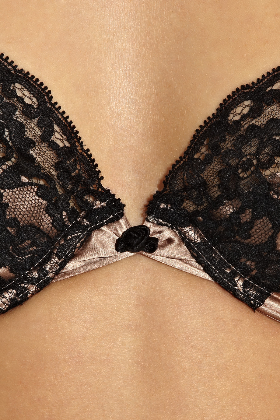
Here we have the sort of bra that is close to what I was talking about. This is a bra that puts in a little extra effort. Someone has made some decisions about fabrics, colours, scalloped edges. It is pretty. And it’s pretty because someone thought about the details. As I wrote a few weeks back:

Lesson 3: Detailing. Most bras are very similar, when you come down to it: cups, straps, and snaps. Sure, strictly speaking, you don’t need that little rosebud here, that extra bit of lace there... but what a difference it can make to the overall impression it leaves. It’s the details that make the difference between boring and daring.

On a poster, the details can be things like the choice of typeface, paying attention to aligning text on the page, picking complementary colours. Most of the posters I show on the blog are at least trying to make an effort in this direction.

But don’t confuse detailing with decorating.


This bra is covered in diamonds. It is something that nobody can use in day to day life. The cost of diamonds make it completely impractical for anyone to wear outside of a runway costume. You can’t afford the insurance to wear it.

Then there’s that big dangling thing in the middle, which seems like it would catch on any clothing worn over top. Bras are generally undergarments, after all.

That’s not detailing. That’s decorating. It is overkill. It is pursuing the aesthetic so hard that it stops being something that anyone can use.

The equivalent on conference posters are things like 3-D effects in graphs and gaudy colours:


Photographic backgrounds  and an overabundance of typefaces:


Sure, you might think it looks attractive in theory, but when you actually get it out into the field, it’s like you suddenly have a big dangly diamond thing under your cleavage that is catching on your shirt. It won’t actually work in real world conditions.

And here we have decoration...


...that is just very odd.

Related posts

Lessons from lingerie
Communicate, don’t decorate

06 June 2013

Critique and makeover: Peruvian medicine

Today’s contribution comes from Kenzo Koike at USF Health Morsani College of Medicine in Florida, and is used with his permission. Click to get the bigger view:


The first things that jumped out at me were:

  1. With three very different logos in the title, it’s impossible for that title to be centered gracefully.
  2. There are myriad things that are not aligned, which is common in PowerPoint posters.
  3. The “peek-a-boo” light blue boxes against the dark blue background are a classic example of boxology.

The first revamp addresses these, while hopefully keeping the style intact. I moved the title to the left and the logos to the right. I eliminated the dark blue and made the light blue even lighter. I started working on the alignment issues.


Evening out spaces and lining things up was a sizable project, and I could probably spend hours fiddling even with the revised version below. But the version below is where I stopped and sent it back to Kenzo.


I moving the single reference from the bottom to directly underneath the table. This means a reader no longer has to go hunting for the reference, because it’s now at the point of need. It also creates a text element under the table, so it parallels all the other images around it, allowing more things to be lined up.

Consequently, this allowed the bottom box to become narrower. The top box was made narrower, too, by moving the purpose statement to the right of the word “Purpose” instead of underneath it. This also let me make the “Purpose” statement bigger, more fitting its importance.

That both the wide boxes got skinnier also let me make the title bigger again. The title should always be the biggest, clearest text element on a poster. In the first version, it’s fighting too much with the dark blue background and the logos.

There are still some design elements of this poster that I dislike, and would normally recommend against. The wide boxes spanning the length of the entire poster at the top and bottom will be something of a nightmare to a reader. The different image sizes of the SIS sign photo and the blog screen capture frustrate me to no end, because there will just be no good solution to make those align as they should.

As always, the goal here is improvement, not perfection.

Related posts

Boxism

30 May 2013

Link roundup for May 2013

SpotON

A bit of old news that came out just after last month’s link roundup. Better Posters was one of the social media case studies at SpotOn (short for Science Policy, Outreach and Tools Online). If I may, I liked how this turn of phrase came out when I was asked for advice on tips:

Find a problem and help people fix it. The Internet produces criticism as easily as most of us produce carbon dioxide and heat – it’s so much part of you, you don’t even realize that you’re doing it most of the time. Creating a resource that people can use, and offering to help, stands out from the crowd.

Logos

Design lessons from game logos. One of the mantras of this blog is “Design is all about decisions.” With that in mind, look at the number of explicit, conscious decisions that were made as you read through this.

Here’s a look at the creation of another logo, this time from Duarte Design. I’ll call out two notes from the article:

  1. Never underestimate the power of music in the creative process.
  2. Always take a moment to step away from intense ideation and give your mind a break from the assignment at hand.

And, here’s a third logo design, this one from Alex Jay. This one was done a while ago, so it was done with paper, pencil, and rulers!

I’ve saved the most familiar logo for last. If you’re a Star Wars fan, you need to read this amazing retrospective of the design of the film’s iconic title. Alex Jay again.

Typefaces

Seth Godin reminds us that sometimes, you should just make simple choices in your type, and embrace the power of pastiche:

(D)on’t call attention to your typeface choices unless you want the typeface to speak for you. Instead, start with the look and feel of the industry leaders and go from there. ...

It’s a bit like wearing a dark blue suit to a meeting with a banker. You can wear something else, sure, but make sure you want it to be noticed, because it will be.

Or, to put it another way... here’s today’s Comic Sans bon mot from David Shiffman:

If you give a conference presentation using Comic Sans font, that's what 100% of the twitter discussion of your talk will be about.

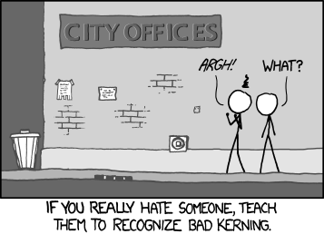
Seth’s piece also reminds us of this xkcd comic:


Garamond will save you ink. (Hat tip to Biochem Belle.)

Would you like to know what that cool typeface is? Type identification is a tricky and subtle art that requires a lot of knowledge. MyFonts provides a tool that might get you part of the way home. (Hat tip to Stacy Baker and Holly Bik.)

Lawsuits

Colin Purrington updates us on the bizarre plagiarism charge for his old poster website.

Fame and glory

Readers of this blog are, I hope, people who care about doing good job on data and graphics and visualization. I would love it of one of my readers were to make a splash in the International Science & Engineering Visualization Challenge, co-sponsored by the National Science Foundation and Science magazine. The rules and entry forms and all that good stuff are here.

The Symbiartic blog has announcements for two scientific illustration conferences this summer. Cool! Now there are two meetings where I’d love to walk through the poster sessions!

23 May 2013

Lessons from lingerie

I have said before that inspiration and design can come from anywhere. Today, I think I am really putting that claim to the test. I want to make the case that there are lessons to be learned about conference posters... from looking at bras.

There’s a phrase in this bra commercial* that you can apply to conference posters:


“Lift... and separate.”

Lesson 1: Lift. A good bra does not allow things to droop. Keep your key information – the question you’re investigating, your critical results, or your take-home message – just underneath your title. If possible, avoid sticking them down at the bottom of the poster.

Here’s another (sort of) bra-related way to remember this advice:


“My eyes are up here.” Remember where people’s eyes are, and you will have a much better chance of getting people to look at the right stuff on your poster, and of having a good interaction with them. Put your important information at eye level. If you’re pointlessely tall or of compact stature, put your information where most people’s eye are, not necessarily where yours are.

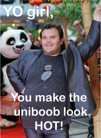
Lesson 2: Separate. A good bra makes it clear that a woman has two breasts. A good bra is structured to create space between them, avoiding smooshing, squishing, and the dreaded “uniboob” look. (Well, normally dreaded...)


Conference posters commit the uniboob mistake all the time. Here is an example that was sent to me recently from Adam Wolfe (click to enlarge):


Adam wrote:

I have already removed one logo (a duplicated “old well” logo with different text for the hospital underneath). I am also going against the grain of a standardize template we usually use in hopes of showcasing some new “standard” designs.

This file showed me the bottom right corner when it opened, and I my very first thought was, “Oooh, that’s a lot of reading.” If it were my poster, I would be trying to shorten the text, and convert it to regular paragraphs instead of so many bullet points.

There’s much to like here. The headers work well at pulling apart the different sections. The colour scheme is consistent and attractive.

When I looked a bit longer, I found the uniboob moments, where there wasn’t enough separation between elements (highlighted in orange):


I first noticed in in Figure 3, which drove me bonkers. Text should not overlap lines. The other examples are not as bad, but “not overlapping” is too lax a standard for separating items on a page.

Margins and white spaces are undervalued. To show this, let’s me ask you for a quick, “off the top of your head” estimate:  

How much of a typical piece of paper is white space?

A standard 8½ × 11" piece of paper (or 93.5 square inches) usually has a one inch margin. That means the space you’re putting your words on is confined to an area of 6½ × 9" (or 58.5 square inches).

The white space from margins alone is taking up about 37% of the page. And we’re not even considering spaces between lines or spaces between words. I’d be willing to guess that most people would probably name a number about half that amount if they were trying to figure out how much white space should be on a poster.

In my revision, I follow the “bra rule,” and separated text with white space. I moved some of the text in the figures away from the edges. Adam’s poster isn’t heavy handed in its use of boxes or the data prison, but I still ended up removing a lot of lines and just using white space, particularly in the tables.

I also removed the “±” sign between the mean and standard deviation from Table 1, following the advice of Curran-Everett and Benos (2004). You can’t have a negative standard deviation, so “±” is “superfluous.”

I also changed much of the text to sentence casing rather than headline casing.

The final result is only subtly different. A major redo would tackle the amount of text on the page, but you can get a lot of improvement in the overall look just by tackling the details.


The details are often things that always end up making the difference between an okay looking poster and a smart one. Just like in a bra.


Lesson 3: Detailing. Most bras are very similar, when you come down to it: cups, straps, and snaps. Sure, strictly speaking, you don’t need that little rosebud here, that extra bit of lace there... but what a difference it can make to the overall impression it leaves.  It’s the details that make the difference between boring and daring.

Related posts

Poster real estate
The data prison

Reference

Curran-Everett D, Benos DJ. 2004. Guidelines for reporting statistics in journals published by the American Physiological Society. American Journal of Physiology - Gastrointestinal and Liver Physiology 287: G307-G309, doi: 10.1152/ajpgi.00229.2004

Pictures from here; here; here; here; here.

* Including this commercial is in no way an endorsement; other bras are available.