I wouldn’t have pegged the British Association of Drama Therapists as being into conference posters, but here we are.
Unfortunately, I do think this presentation’s suggestions lead to some very common traps: emphasis on trying to put in a complete story over something that will start conversations.
• • • • •
Speaking of videos, here is another from Mattias Rillig:
I mostly agree with the advice here, apart from the recommendation to make all the text into bullet points. Short text? Yes. But save bullets for true lists. See my most recent blog post on bullet points.
• • • • •
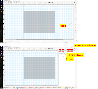
Inkscape has two advantages for making conference posters.
- Vector graphics.
- Free.
Here’s a tutorial that shows the basics of Inkspace in the context of creating a poster.
Same author delves into writing abstracts for conferences.
I reviewed an earlier version of Inkscape some time ago. I found it super fiddly at the time, but that was many updates ago.
• • • • •
Font seller Monotype delves into the subtleties of legibility of type. Excerpt:
What makes a font legible, and how do I find one?
Like many design questions, the recipe for this answer is a blend of art and science and is governed less by rules than by best practices.
• • • • •
Lisa Muth explores the power of gray in graphs over at the Datawrapper blog. Excerpt:•
(G)ray is special and should be treated as such.
Very good article that summarizes a lot of what I have been thinking about in graphing lately. Recommended.
• • • • •
A couple of general papers on communication
A paper on science communication in The Journal of Experimental Biology and a preprint on communicating to the general public in PsyArXiv.
• • • • •
How to convince your boss that a conference isn’t a vacation in disguise. Excerpt:
I understood the need to justify the expense. ... But (the CEO) implied that suspicion should be the default. These sneaky scientists. Always pretending they need to go to conferences for intellectual betterment, when they’re really just looking for the next sweet lanyard to hang from the corner of their bookshelf.
Hat tip to Hiroshi Ishkawa.
• • • • •
That’s the roundup! Thanks for joining me!


No comments:
Post a Comment
Comments are moderated. Real names and pseudonyms are welcome. Anonymous comments are not and will be removed.