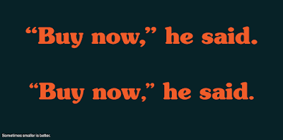
The occasional MyFonts email newsletter gave me a tip I didn’t know before.
When you have large type, punctuation marks usually look too big. If your font is bigger than 24 points, they recommend setting punctuation points a few points smaller.
Obviously, this applies most to titles on posters, which are (or should be!) huge.
Also remember that large type sizes often look better when the letters are spread out a little more than in book size.
External links


Then why don't font designers just make the punctuation the right size?
ReplyDelete(As a Brit, the thing that really leaps out at me in your examples in the comma being inside the quote-marks — one of the American/British English differences where the British convention is just plain correct.